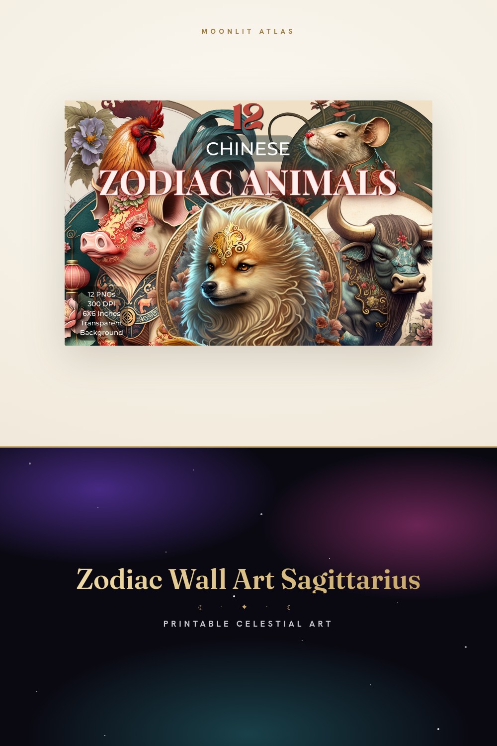
People do not buy a zodiac print. They buy their zodiac print, and the difference is the whole ballgame. I figured this out behind a folding table at a Saturday market on Renn Street, watching a woman pick up a Leo design, hold it to the light, and put it back because, her words, it was too quiet for a Leo. She was right. I had drawn it like a Virgo.
That is the trap with buying by sign. Each one has a temperature. Leo wants a little drama, Cancer wants something soft you could cry near, Scorpio wants the version with teeth. Hand a Gemini a single calm glyph and they will ask where the rest of it is. The style has to match the person more than the symbol, and most listings just slap a glyph on cream paper and call it done.
So this is sorted the way I actually sell it now, sign by sign, with the buyer who taught me each lesson. I run every file through the same flat template, print it at the copy shop on Tasker Avenue because my home printer dies past 24lb, and lean the proof against the baseboard for a week before I trust it. Some links below are affiliate links. Grab one and a little comes back to me. Costs you nothing.
A few links below are affiliate links. If you grab a print through one, it sends a little something my way at no extra cost to you.
The piece I hand the buyer who can’t name their sign yet
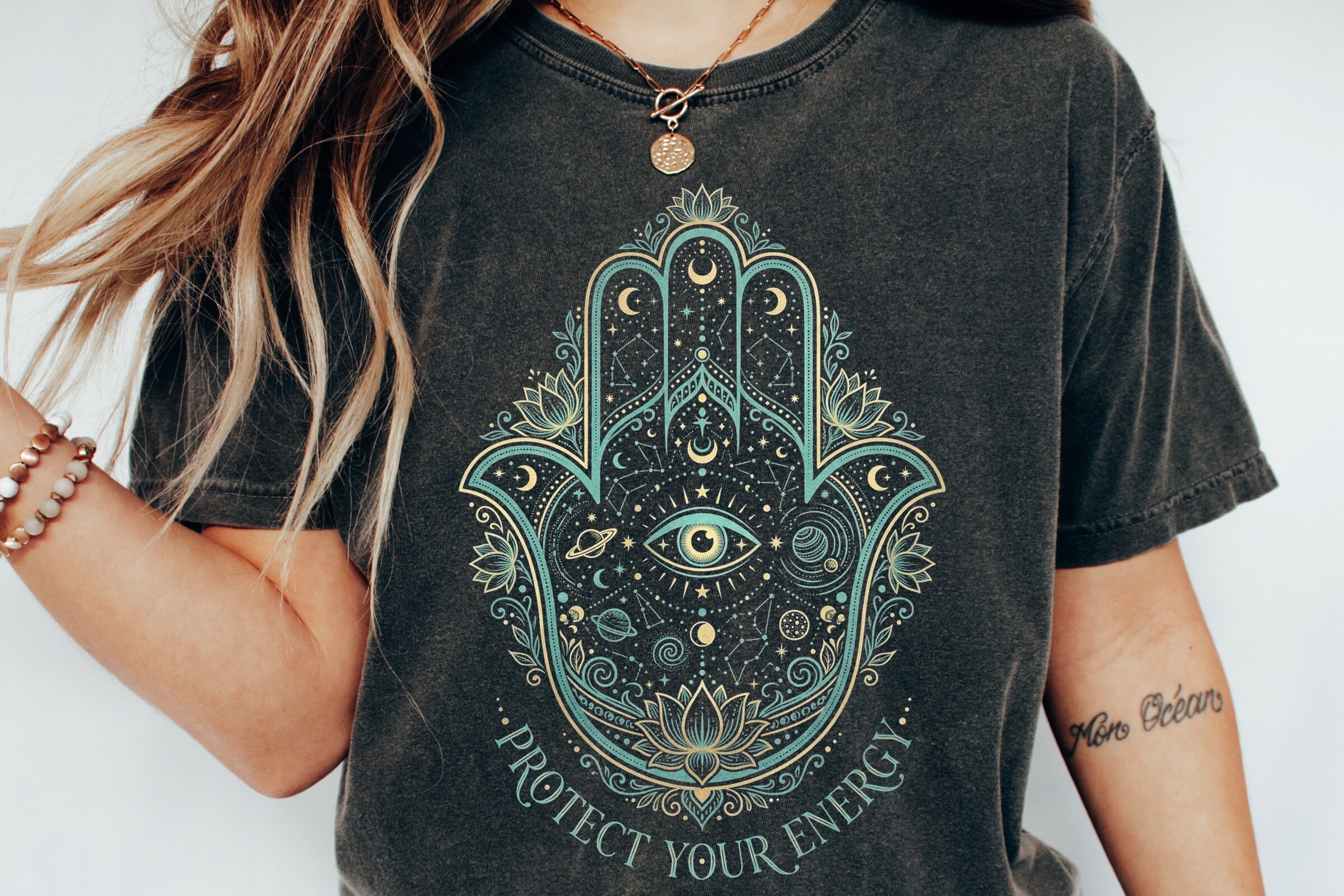
Not everyone walks up knowing their rising from their elbow. A guy named Theo bought this for his mother and could not tell me her sign, just that she keeps a blue glass eye by the door and salt in the corners. This was the one. Hamsa, evil eye, a wash of stars around it, the kind of protective-looking thing that works whether or not you believe a word of it.
I did mine at 8×10 in the entryway, the spot where you glance up while fishing for keys. It carries the wall on its own, no zodiac knowledge required. That is its whole job. The sign-agnostic pick for the person who wants the celestial feeling without committing to a glyph.
One gripe. The eye reads almost too literal up close, a little staring. From across the room it settles into pattern and stops watching you. Hang it where you pass, not where you sit.
For the Gemini who wanted two of everything
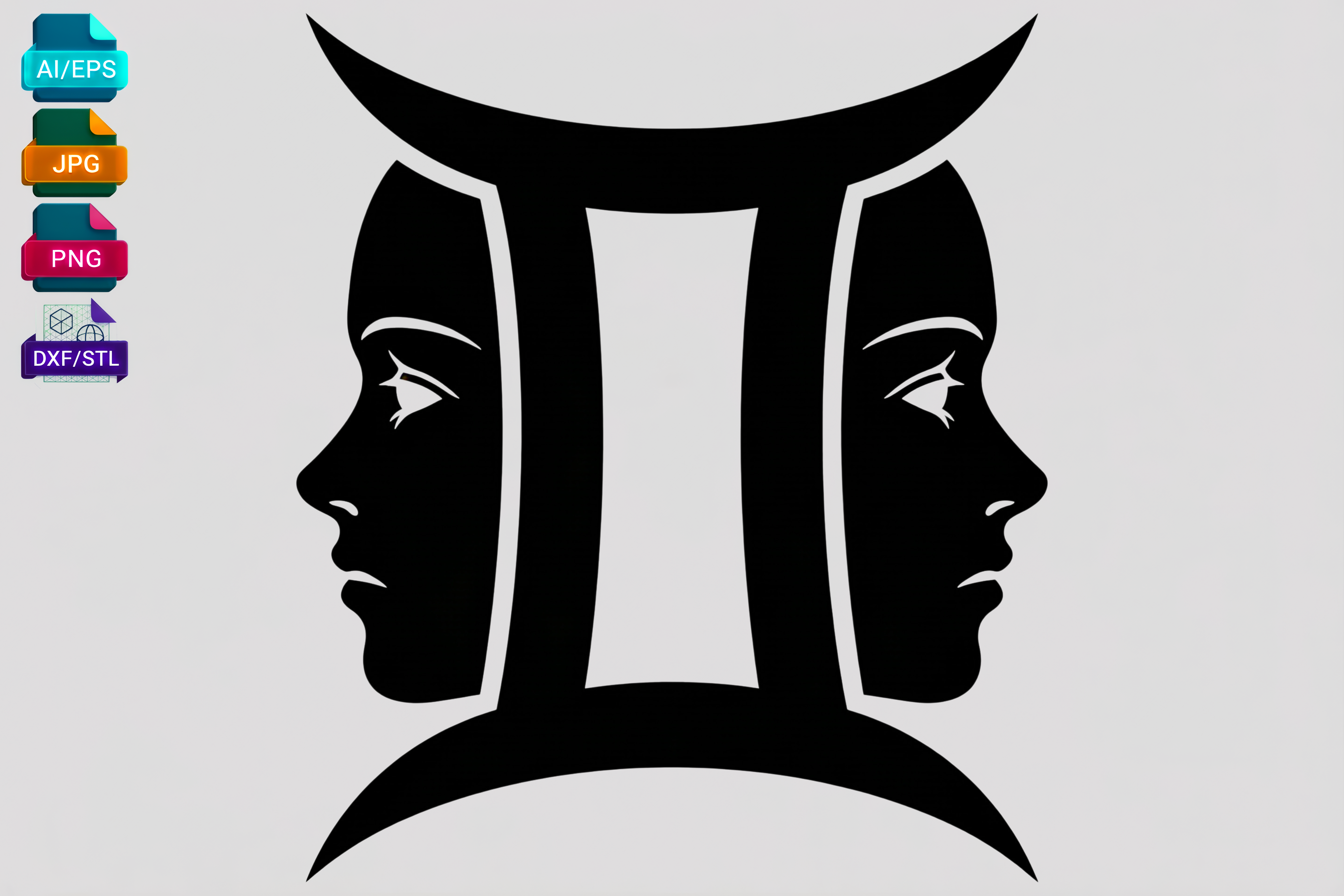
My downstairs neighbor, a Gemini who talks to me through her open window while I take out recycling, asked for her sign and then immediately asked if she could have it twice. Of course she did. The twins glyph already reads as a pair, those two upright bars, so I printed it small and ran two of them side by side above her record shelf. Looked intentional. It was mostly her being indecisive and me leaning into it.
The file comes in enough formats that I cut a vinyl version too, stuck it on the lid of a cheap thrifted box she keeps cables in. Same mark, second life. That is the Gemini move, honestly, one symbol refusing to sit still.
The catch is the line weight runs thin. Print it too small and the two bars start to look like a parking sign. I kept mine at 5×7 minimum and it held.
The soft Cancer print a buyer cried near, on purpose
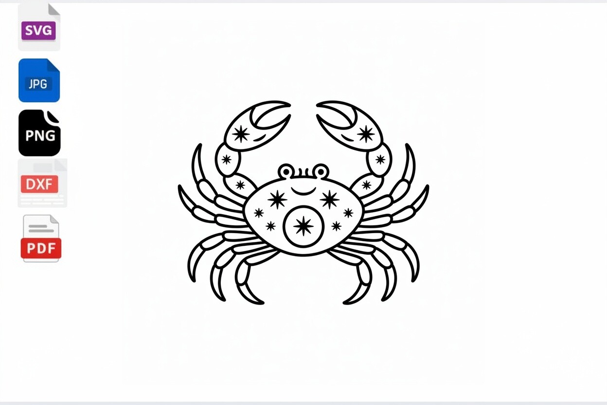
A woman named Delphine bought this the week she moved her late mother’s things into her own place. Her mother was a Cancer. She did not want a loud memorial, just the crab, one continuous line, the kind of drawing that looks like it was done without lifting the pen. Quiet. She hung it over the spot where the urn sits and told me, plainly, that she wanted somewhere soft to look when she cried. I think about that a lot.
The line-art treatment is what makes it work for the gentler signs. No gold, no drama, just the shape of the crab implied more than drawn. I printed her copy at 8×10 on a warm matte and the curve of it photographs softer than it has any right to.
My only nitpick is the claws can read as a smudge if your printer skips. Test on plain paper first, hold it at arm’s length, make sure the whole loop connects.
Stickers for the Libra who keeps redecorating
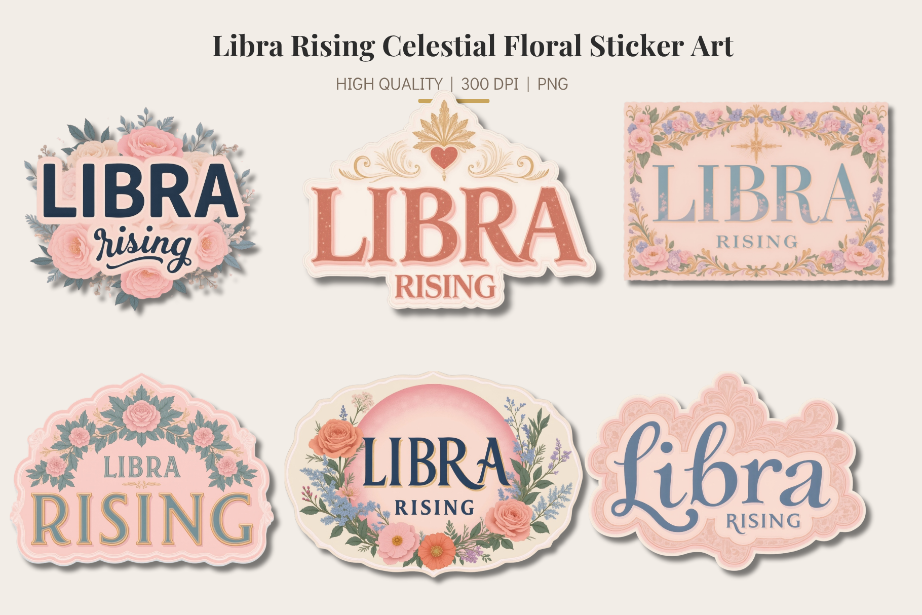
Libras, in my limited folding-table experience, cannot leave a wall alone. A customer named Asha, Libra rising and proud of it, bought these specifically because they are not permanent. Florals wrapped around the sign, sticker form, so she could move them off the laptop, onto a planner, back onto a mirror when she got bored. She told me she rearranges her shelves on a Sunday in March every year like clockwork. These suit that.
I stuck a couple on the inside of a kitchen cabinet door myself, the floral ones, just to have something pretty when I reach for a mug. Low stakes. Peel them later if I want. That is the appeal for the indecisive sign that wants commitment-free.
The gripe is what it always is with stickers. The cheap matte ones curl at the edge after a month near steam. Keep them off the wall behind the kettle and they last.
All twelve in one heart, for the couple who couldn’t pick
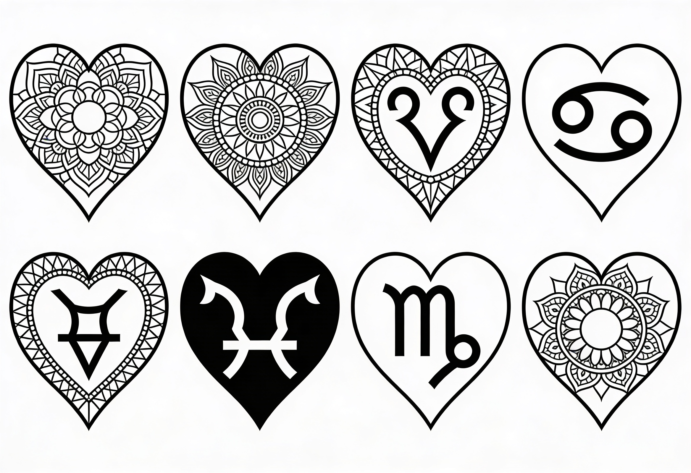
Two buyers, one wall. A couple came by the market last fall, a Taurus and an Aries, bickering pleasantly about whose sign got the bigger frame. I pointed them at this instead. Every sign arranged into a mandala, heart-shaped, so neither of them won and neither of them lost. They bought it on the spot and stopped arguing, which felt like a small miracle.
I cut a paper version for myself at 11×14 and it anchors the long wall in the hall where a single glyph always looked lonely. The all-signs layout is the answer for the household where two people refuse to agree, or for anyone who just likes the whole zodiac at once.
The honest catch is the detail. Twelve signs packed into a heart means the small symbols crowd if you print it under 8×10. Go big or it turns to soup.
The strange one I keep for the Scorpio types
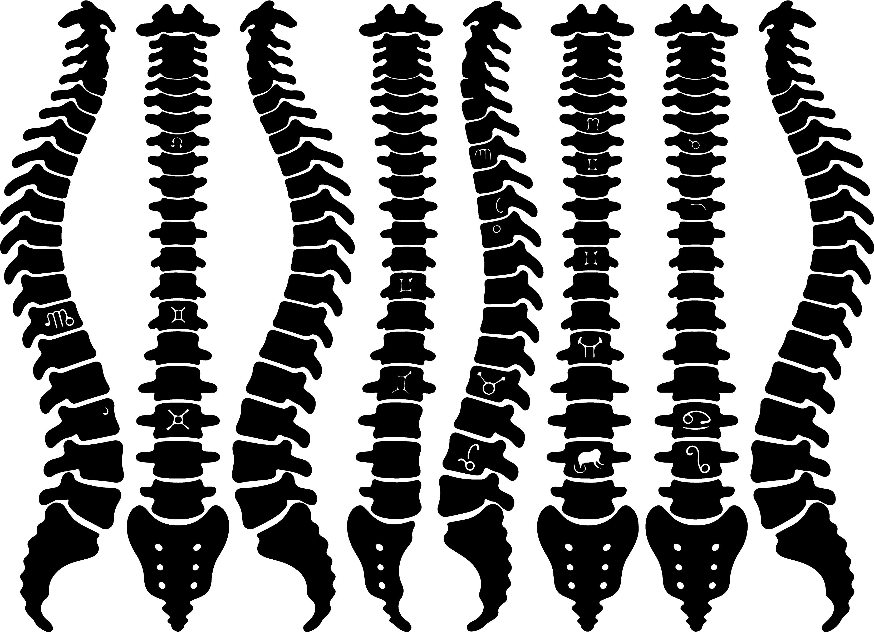
There is a buyer for the weird stuff and she is usually a Scorpio. A regular of mine, Marisol, the kind of person who wears black in July, took one look at this spine running down a silhouette with the zodiac mapped along it and said finally, something with a little death in it. Her words. She framed it narrow and tall in a hallway that gets no light, which is exactly where it belongs.
I printed a test for myself, the spine version, and hung it in the stairwell next to the moon prints because it needed company that would not flinch. The vertical shape solves the tall awkward wall a square print can’t. The signs run down the spine like a chart of something half-medical, half-occult.
The nitpick is it is genuinely not for everyone. Hung it once for a friend’s beige living room and it looked like an anatomy poster lost on the way to a clinic. Know your wall.
The Aquarius print that earned its odd corner
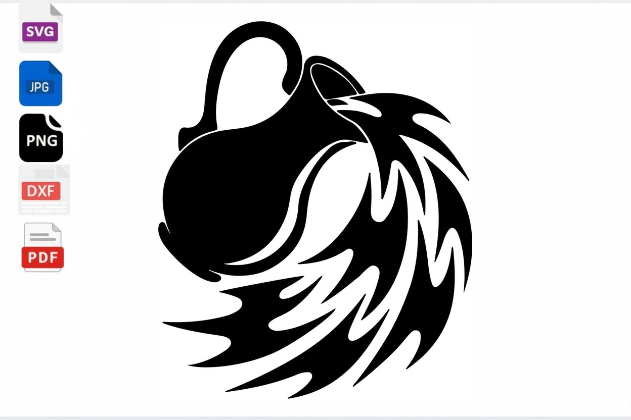
An Aquarius named Kit bought this and told me, before I could say anything, that the standard glyph bored him to tears. Fair. The two squiggly lines do start to look like a wifi symbol after a while. This one leans tribal, the water-bearer’s jug worked into a heavier, blockier mark, and it gave him the version with some weight to it. He hung it in the one weird corner of his studio that catches morning light.
I ran a copy at 5×7 to see, and the bolder linework holds up small in a way the thin standard glyph never does. That is the trick with the air signs, give them something with a little grit or they wander off looking for it.
My gripe is the tribal styling fights a very soft room. Put it on a colored or textured wall and it sings. Drop it on flat white and it can look stranded.
Questions I Get About These
Where do star signs come from?
I only know this because a buyer at the Renn Street market argued with me about it for ten minutes, certain the signs were invented by some app. They are not. They go back thousands of years, ancient sky-watchers who tracked the path the sun seems to walk across the year and carved it into twelve chunks, each one parked under a constellation. The crab, the scales, the water jug, all of it older than basically everything else we still use daily.
What I tell people now is that the art you are buying sits on top of a very long, very stubborn habit of humans looking up and naming what they see. You do not have to believe it controls your love life to like the drawing. The shapes earned their spot the slow way.
What star sign are most artists?
Honestly? I have no data and neither does anyone who tells you confidently. People love to say Pisces, the dreamy water sign, and a customer once insisted to me that every illustrator she knew was a Pisces or a Libra. Maybe. My own circle is all over the chart and the best printmaker I know is a deeply practical Capricorn who would roll her eyes at this whole question.
So I do not buy it. If anything the lesson from selling these is that the sign you are does not predict the art you want. The loudest Leo at my table picked the most minimal print I had. People surprise you. Buy what you keep looking at, not what your sign supposedly demands.
Before You Tape Anything Up
If one thing sticks from all this, let it be that the sign sets the temperature, not the design. A Leo can want quiet. A Cancer can want bold. The glyph on the page matters less than whether it matches the actual person hanging it, which is why I sell it buyer by buyer now instead of by some chart of what each sign supposedly likes.
So do the thing I do. Print the proof flat, lean it against the baseboard, live with it for a week before you frame anything. If you still glance at it on day seven, it is theirs. If your eye slides past, it was the wrong style for the sign no matter what the label promised.