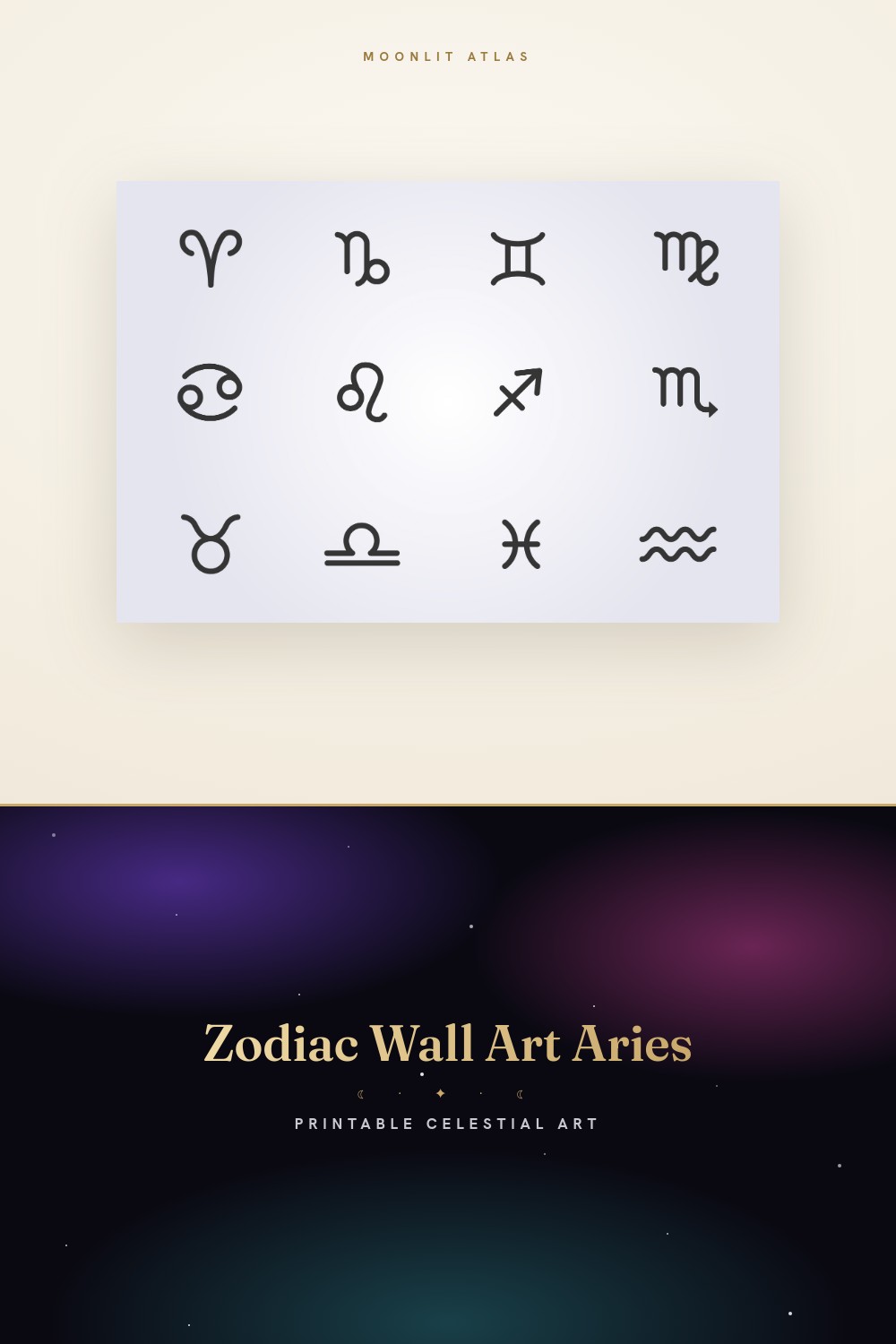
A zodiac poster can go wrong in one of two boring directions. Too much, gold foil and a font doing cartwheels and forty tiny stars, or so plain it looks like a placeholder somebody forgot to swap out. The narrow middle is where the good ones live. One mark for the sign, thin line, a neutral color that doesn’t pick a fight with the couch. Most of my favorites are basically a single glyph and an ocean of cream paper around it.
I got picky about this after a coworker, a very calm Taurus, watched me hang a busy zodiac print in my flat and said, kindly, that it looked like a perfume ad. She was right. I took it down that night. The next version was the same sign, half the ink, twice the white space, and the room finally exhaled.
So these are the minimalist sets I printed and kept, not the ones I saved at midnight into a folder I never reopen. Each goes into the same flat template, then to the print shop on Dabney Row because my home printer surrenders past 24lb. I lean the proof against the baseboard for a week before any frame happens. A few links below are affiliate links. If one lands on your wall it sends a little back my way. Costs you nothing.
A few links below are affiliate links. If you grab a print through one, it sends a little something my way at no extra cost to you.
The single thin line that started the whole spare phase
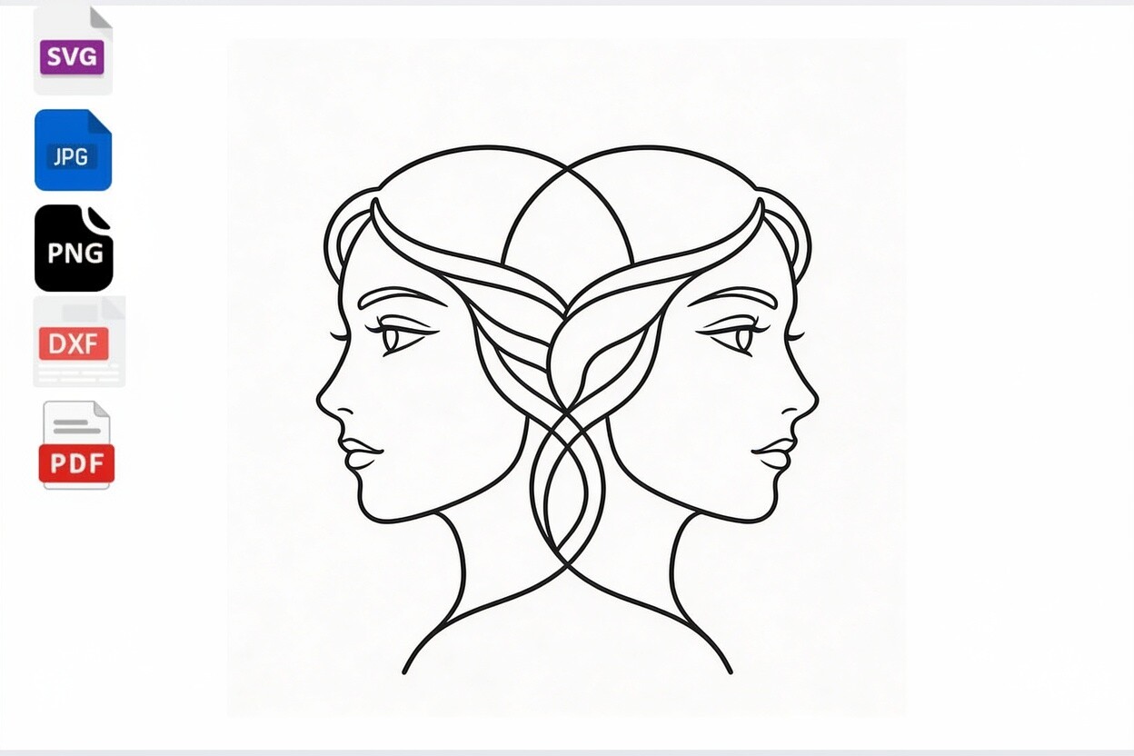
This is the one that converted me. The Gemini twins drawn in one continuous thin line, no shading, no fill, just the path. It reads like someone sketched it without lifting the pen. Run in soft charcoal on cream, it looks more like a museum label than astrology, which is exactly the trick I’m after.
I printed it at 8×10 for over my desk, alone, no companions, a lot of bare wall on every side. The thin line held crisp even small, which is the part I worried about, because a hairline weight is the first thing a cheap print thickens into a blob. Held fine.
One gripe. It’s a single sign, so if you want a matching pair or a row, you’re hunting down the other glyphs elsewhere and hoping the line weight matches. It rarely does. I gave up and let Gemini stand alone.
Tiny stamp-frame signs for people who hate a giant poster
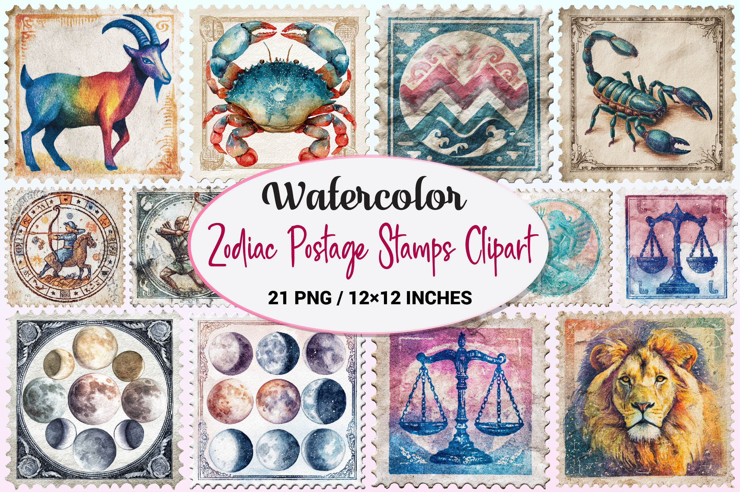
Not everyone wants one big statement on the wall. This set draws each sign inside a little perforated postage-stamp border, small and orderly, the kind of thing that reads as a quiet grid rather than a focal point. I printed six of them at playing-card size and ran them in two neat rows by the entry.
The restraint is built in here, which I liked. Each stamp is mostly empty frame with one small mark in the middle, so even twelve of them together don’t get loud. Black line on warm white. It looks like a collector pinned them up, not like decor I bought in bulk.
Nitpick. The perforated edges are fiddly to cut by hand if you want them as separate little cards. I tried scissors, ruined two, then gave up and printed the whole sheet as one framed block. Honestly better that way.
The plainer stamp version, less ink, more breathing room
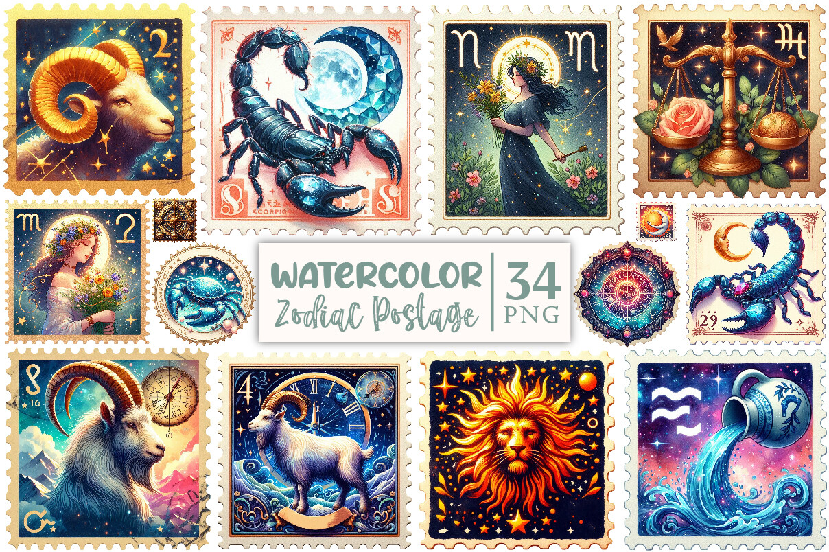
Same stamp idea as the other set, but stripped down further, fewer flourishes inside each frame, the sign reduced to almost nothing. I nearly skipped it as a duplicate. Then I held both up side by side in the afternoon and this one was the calmer of the two. So it stayed.
I did a single 5×7 of just the Aries stamp for a friend who’d asked for something for her tiny rented kitchen, nothing that would crowd the one open wall. One small stamp, slim white frame, done. She texted a photo with it next to the kettle and it looked like it had always lived there.
The catch is the opposite of busy. Blown up large, a single sparse stamp can look a touch lost on a big wall. Keep these small. They’re built to be little, and they fight you if you scale them up.
The floral set I almost passed on for being too sweet
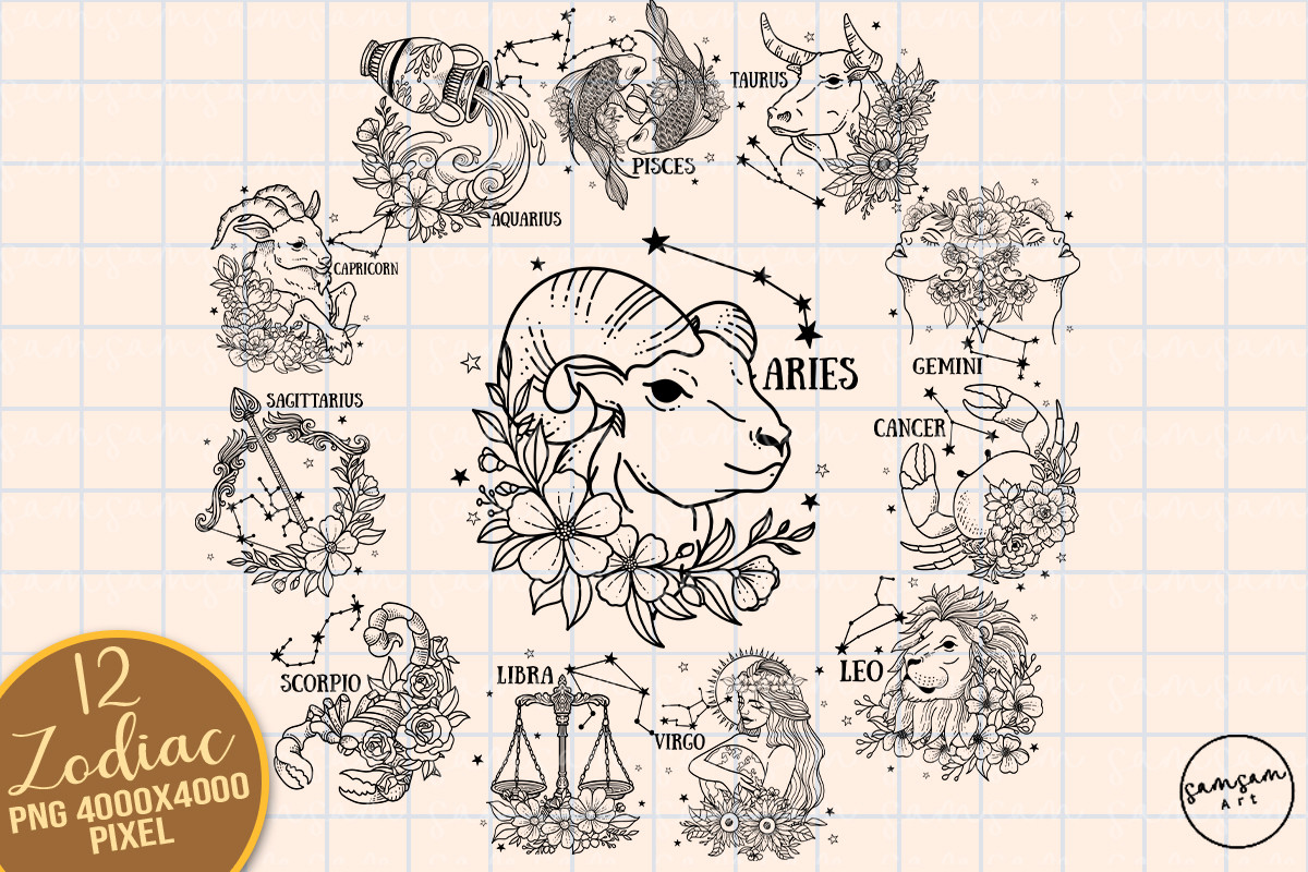
Florals usually break my spare rule on sight. Too much going on. This bundle changed my mind because the flowers are drawn thin and sparse, a few stems wrapped around the glyph, not a whole bouquet. Printed flat in one muted sage on cream, it stays soft instead of busy. Closer to a botanical plate than a greeting card.
I ran one at 8×10 for a cousin who’d moved in March and wanted something gentle over the bed, nothing stark. Her sign with a thin loop of flowers around it, all one quiet color. It warmed the corner without shouting. She kept it taped up unframed for weeks and almost left it that way.
Worth knowing. It’s labeled for sublimation, so it’s built for fabric and blanks, not paper. I printed mine flat anyway and it works fine as wall art, you just lose the point of the sublimation. If you’ve got a press, that’s a different and better story I can’t tell honestly here.
One sign, one stem, for when you only need yours
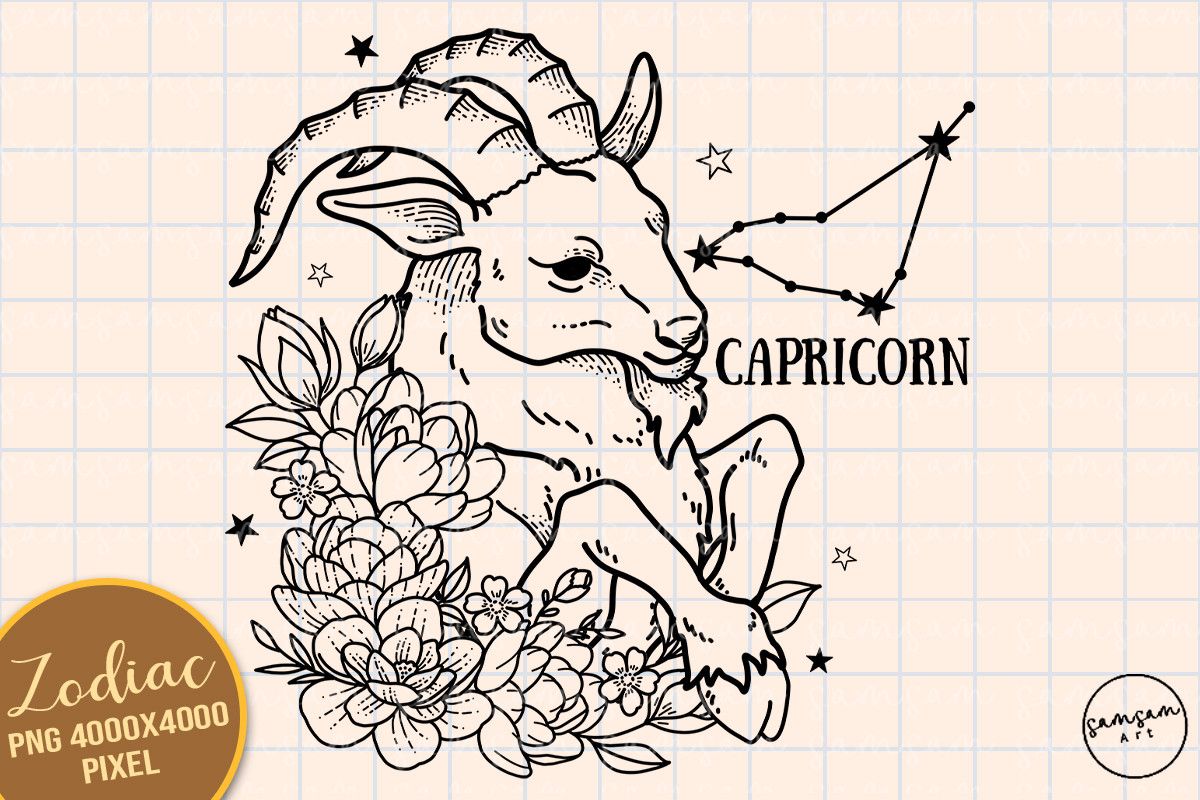
The single-sign cousin of the bundle. Just Capricorn, the goat glyph with one thin spray of flowers off to the side, room for nothing else. I like a solo sign poster more than a full twelve-set, honestly. You hang the one that’s yours and skip the eleven that aren’t.
I printed this at 11×14 for the narrow strip of wall in my hallway where nothing ever fit, the spot that stayed empty for two years. Tall, sparse, one muted color. The single stem kept it from feeling clinical the way a bare glyph sometimes does. Finally made that awkward sliver of wall look chosen.
Same honest flag as the bundle. It’s a sublimation file, meant for a press and blanks. Printed flat on heavy matte it reads as a clean little poster, but you’re using it off-label. Know that going in so you’re not surprised.
The scales drawn so simply it works as a logo

Libra is easy to overdo, all those ornate balance-scale versions with chains and filigree. This one goes the other way. The scales reduced to a few clean strokes with one small star tucked in, the kind of mark you could stamp on a business card. That’s the bar for me with a minimalist poster.
I printed it at 5×7 and slid it into a slim black frame I’d thrifted for a dollar and a half, then stood it on the shelf instead of hanging. Black line, white paper, one star. People pick it up to look closer, which framed prints almost never earn. The small star gives the eye one thing to land on without crowding the glyph.
Gripe, a small one. The star sits very close to the scales on the default file, so at tiny sizes they can nearly touch and read as one shape. I nudged the star out a few pixels before printing. Two-minute fix, but you have to notice it first.
A cut file that ended up framed instead

This is meant for a cutting machine, the Virgo symbol shaped so a Cricut can slice it from vinyl. I don’t own one. I printed it flat anyway, because the cut-file shapes are by nature dead simple, no fine detail to lose, which makes them quietly perfect as minimalist posters. Bold clean glyph, nothing else.
I ran the maiden symbol at 8×10 in solid black for a neighbor who’s relentlessly proud of being a Virgo, the organized kind who alphabetizes spices. It suited her exactly, plain and precise. The simplified shape printed crisp with zero fuss, no thin lines to worry about smearing.
The obvious snag. It’s built to be cut, so if you do own a machine the real payoff is vinyl on a wall or a window, not paper. Printed flat you get a nice bold poster but you’re leaving the actual purpose on the table. Fine by me, I wanted the poster.
Questions I Get About These
What are some good poster ideas?
For a zodiac wall, my honest advice is pick one idea and starve it of everything else. A single sign in one thin line. Or one small stamp-framed glyph. Or your sign with a single stem of flowers and nothing more. The minute you add a second color or a row of stars it stops being minimal and starts being a phone case.
The set I get asked about most is the plainest one, a lone glyph on cream with half the wall left empty around it. People think the empty space is the mistake. It’s the whole point. That breathing room is doing more work than any extra detail ever would.
Where can i print a sign?
I don’t print these at home anymore. My printer chokes on anything heavier than 24lb and the blacks come out gray. So I send everything flat to a copy shop, the one on Dabney Row in my case, and ask for matte on the thickest stock they’ll run. Costs me a few dollars a sheet and the line work stays sharp.
If you’d rather not leave the house, the upload-and-mail places work fine too, you just wait a few days. Either way, print one cheap proof first and hold it up in the worst light your room gets before you commit to a frame. I’ve saved myself a lot of bad framing that way.
Before You Tape Anything Up
If one thing sticks, let it be subtraction. A minimalist zodiac poster is mostly the paper you leave blank. One mark, one thin line, one muted color, and a lot of empty space carrying the weight. Get that balance and a single small print can settle an entire wall, no gallery cluster required.
My own wall right now is the lone Gemini line over the desk and that dollar-fifty Libra leaning on the shelf, both black on cream, both surrounded by nothing. The corner has felt quiet for a month. If one of these grabs you, the links send a little back my way and cost you nothing extra. Print it cheap first, lean it against the baseboard, live with it a week. Then buy the good paper.