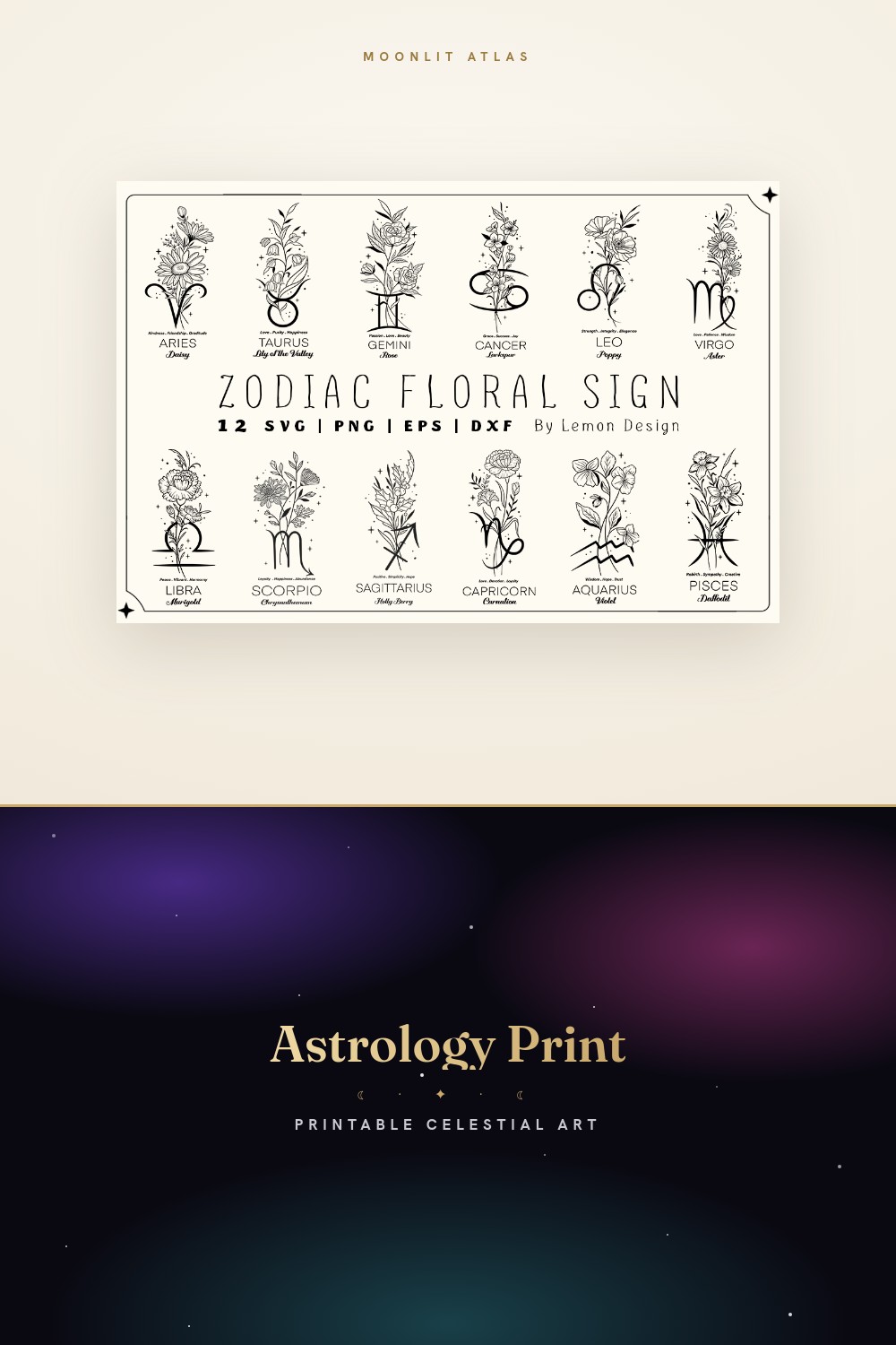
The frame is the part nobody photographs. Everyone posts the print. The clean line, the gold, the little Scorpio glyph that looks expensive. Then you buy it, slide it into whatever frame you had lying around from a college poster, and the whole thing reads cheap. I learned that the hard way with a Leo print I loved and ruined inside a black plastic frame that yellowed by August.
So this list is about the framing more than the art. Which prints survive a thin oak frame. Which ones need a wide white mat to breathe. Which ones look like a kid taped them up if you skip the mat entirely. I run all twelve signs as a set sometimes, sometimes just my own and my partner’s, and I have opinions now that I did not have a year ago.
I print everything flat at the copy shop on Eldridge because my home printer chokes on anything heavier than cardstock. Then I live with a print taped to the hallway for about a week before I commit to a frame, because the frame is forty dollars and the print is two. Some links below are affiliate links. Grab one and a little something comes my way. Costs you nothing.
A few links below are affiliate links. If you grab a print through one, it sends a little something my way at no extra cost to you.
The full twelve, and why they need matching frames
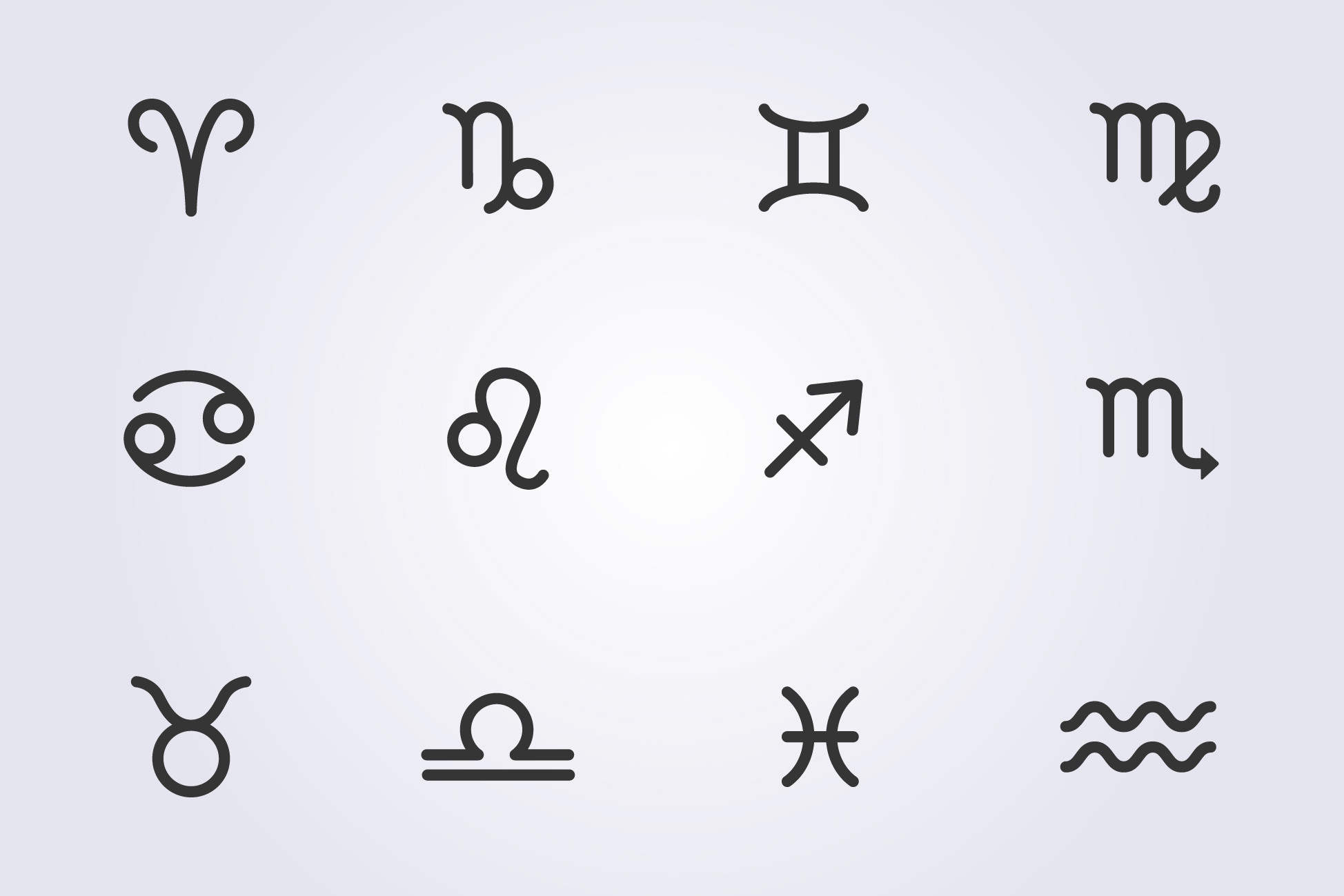
If you want all twelve signs on one wall, start here. The line weight stays even across every glyph, which matters more than you think once they sit in a grid. I tried mixing this set with a different one I had and the stroke thickness fought. Looked like two different hands. This one is one hand all the way through.
Framing this as a set is where people overspend. You do not need twelve fancy frames. I did mine in plain natural-wood frames from the hardware store, same size, hung four across and three down above the stairs. The trick was a half-inch white mat on each. Without the mat they crowd. With it they look like a museum decided zodiac was art.
One gripe. The files come ready to print but the spacing inside each sign assumes a square crop. Print it on a 4×6 and Aquarius loses his feet. Crop square or go 5×5 and you are fine.
When the animal year matters more than the month

Not everyone wants Greek glyphs. My sister-in-law was born in the Year of the Rabbit and could not care less about being a Gemini, so this is what went above her reading chair. The animals here have actual character. The Tiger especially. It does not look like a logo.
For framing I went small and dark. A single 8×10 in a thin black frame, no mat, hung at eye level next to a lamp. The bundle has enough detail that a mat would have felt fussy. Sometimes the print is busy enough to be its own border. This is one of those.
The catch is color. A few of the animals lean toward a flat red that printed slightly orange on the copy shop machine. I ran a test page first, squinted at it from the doorway, then asked them to bump the saturation. Second try was right. Always test the reds.
Loose, sketchy, and forgiving of a cheap frame
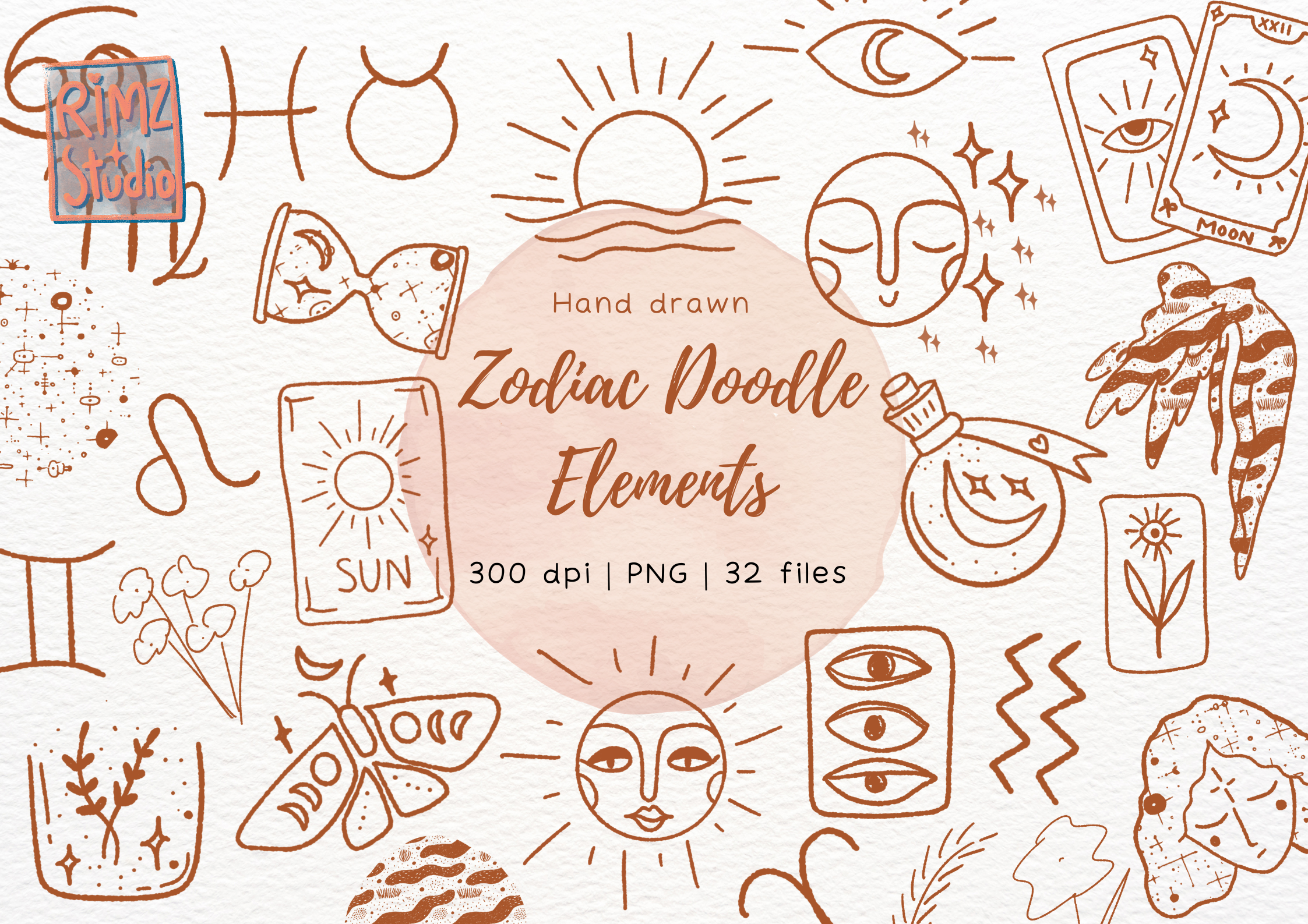
Here is the one I reach for when the frame budget is gone. The hand-drawn look means a slightly wonky frame actually helps. Imperfection talking to imperfection. I put one of these in a thrifted frame with a chipped corner and it looked intentional. Try that with a crisp gold print and it just looks broken.
These are doodle elements, not finished posters, so you arrange them yourself. I dragged a few stars and a sun into a flat layout and printed it as one sheet. Took twenty minutes. The result has a sketchbook-page feeling that suits a kid’s room or a desk corner better than a formal wall.
My complaint is that there is no built-in composition. You are the designer here. If you hate arranging things, this set will frustrate you. I happen to like it, but I have spent a Tuesday in April moving tiny moons around a canvas, so I am not normal.
Card proportions that beg for a tall thin frame
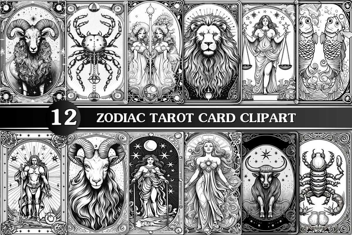
Tarot cards are tall and narrow, and that shape is the whole point of how you frame these. Do not crop them to a square. I made that error once and a beautiful Major-Arcana-style Pisces ended up looking squashed. The tall ratio is what makes it feel like a card and not a sticker.
I hung a single one in a slim 5×7 frame on the wall beside my front door, where the narrow space had been empty for a year. The vertical print filled it without crowding. If you want a row, three of these side by side in identical thin frames reads like a tarot spread. People ask about it.
The sublimation labeling threw me at first because I do not own a heat press. Ignore that. I printed it flat on paper like everything else and it framed fine. The art does not care what it was sold for.
Gold that survives a white mat instead of fighting it

Gold is where most zodiac prints go wrong. Too much foil shine and it screams 2009 ceiling. These read more like brushed brass than glitter, which is the only kind of gold I will hang. I framed a Capricorn from this set in a thin black frame with a wide ivory mat and it looks like something from a small gallery, not a teenager’s locker.
The wide mat is doing heavy lifting here. Gold needs negative space around it or it gets gaudy fast. I used a three-inch mat on an 8×10 print inside an 11×14 frame. The print is small in the frame on purpose. That breathing room is what makes the gold feel deliberate.
One honest note. On the cheap copy shop printer the gold lost a touch of warmth and went slightly greenish on the first pass. The good machine, the one they charge more for, held it true. Pay the extra dollar for gold prints. Skip it on black-and-white.
The mystical set for a moody, frameless wall ledge
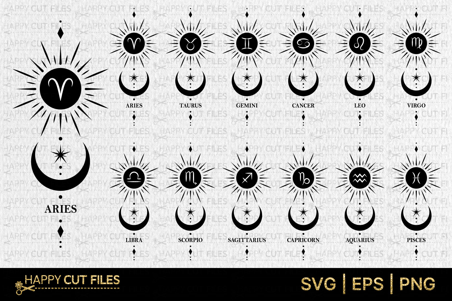
This one does not even need a frame, which is why I love it for a picture ledge. The mystical, stars-and-shadows style looks good just leaning against a wall on a thin shelf, propped behind a candle. I have three of these leaning on a ledge above my desk and have never framed a single one.
When I did frame one, for a gift, the dark background wanted a dark frame. A near-black wood frame, no mat, edge to edge. Light frames make the mystical look fight itself. The darkness has to continue past the print or it feels interrupted. Trust me on the black frame here.
The drawback is that the dark backgrounds eat ink. My first print came out blotchy because the copy shop machine was low on black. Annoying. The reprint, on a fresh cartridge, was deep and even. If your blacks look streaky, it is the machine, not the file.
The nursery-friendly set that earns a soft pastel frame
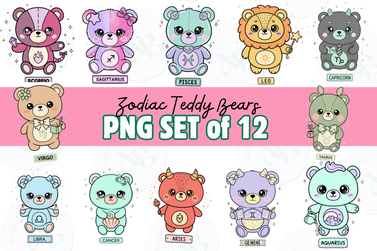
Last one, and the sweetest. Zodiac teddy bears, made for a baby’s room rather than a grown-up gallery. My friend had a December baby and wanted a Sagittarius print over the crib that was not spooky or gold or trying to be art-gallery serious. This was it. A little bear with an archer’s hat.
Framing for a nursery means soft. I helped her put the Sagittarius bear in a pale sage green wood frame with a thick white mat, hung low so the baby could actually see it from the crib. Pastel frame, pastel print, lots of white space. The whole corner went calm.
My quibble is the line work is fine for small sizes but gets a little soft if you blow it up past 11×14. I tried a big version for a playroom and the edges fuzzed. Keep these small and they stay crisp. Bears do not need to be poster-sized anyway.
Questions I Get About These
Where do star signs come from?
The twelve we use now trace back to Babylonian sky-watchers who split the path of the sun into twelve chunks, each named for a constellation it passed through. The Greeks borrowed the system and stuck their own myths on it. So when you frame a Leo print you are hanging a roughly three-thousand-year-old habit of looking up and naming the dark. I find that more interesting than any horoscope.
Why did they change star signs?
Every few years a headline claims your sign is wrong because the Earth wobbles and the constellations have drifted since Babylon, and there is a thirteenth one, Ophiuchus, that astronomers like to point at. Real sky positions have shifted. But Western astrology froze the dates centuries ago and never moved them, so the sign on your print is the traditional one, not the astronomical one. For framing purposes it does not matter at all. You hang the sign you feel like, not the one a telescope insists on.
Before You Tape Anything Up
If you take one thing from all this, let it be the mat board. A two-dollar print in a forty-dollar frame with a good white mat beats an expensive print shoved edge to edge into something cheap. I have ruined enough Leos to say that with confidence. Test your reds, pay the extra dollar for gold, and let the print breathe.
I rotate these depending on my mood and how often I repaint the hallway, which is too often. Right now it is the golden set on an ivory mat, and it has held the wall calm for three weeks. That is the only review that counts in my place. If something below catches you, the links send a little back my way and cost you nothing.