My sister is a Scorpio and will not let anyone forget it. So when she moved into a studio off Carmine Street with one good wall, I printed her sign as a housewarming thing and braced for her to hate it. She cried a little. Then she made me hang it for her because she does not own a level. I do not own one either. We used a credit card and a lot of squinting.
That got me into zodiac prints, which is a genre that goes wrong fast. Half of it is cheap gold foil and a font that thinks it is fancy. The other half is so plain it looks like a phone wallpaper somebody printed by accident. The good ones sit somewhere in the middle. A clean glyph, room around it, a color that does not scream. You can tell within about ten seconds of taping the proof up.
These are the sets I ran for myself or for people I actually like. I drag each one into the same flat template, send it to the copy shop on Eldridge because my home printer chokes on anything over 24lb, and let it lean against the baseboard for a week before I commit. Some of the links below are affiliate links. Grab one and a little something comes my way. Costs you nothing.
A few links below are affiliate links. If you grab a print through one, it sends a little something my way at no extra cost to you.
When you want the meaning, not just the symbol
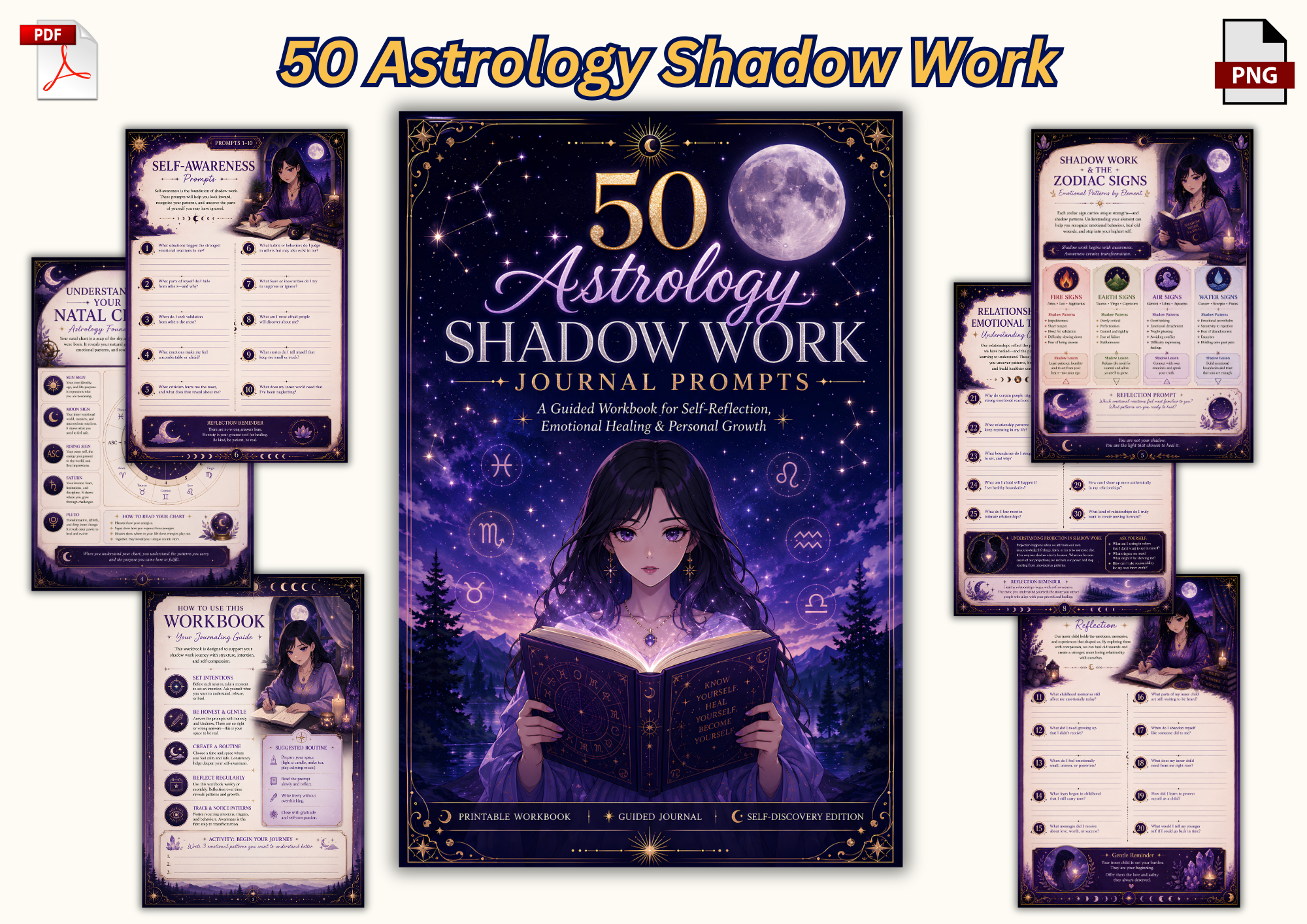
This one is the odd duck on the list because it is a journal, not a wall piece. I almost skipped it. Then I printed three of the prompt pages, trimmed them to 5×7, and stuck them in a little cluster next to my Scorpio sister’s main print. They read like art from across the room and like something to actually do up close. She filled two of them the first night. I filled none. That tracks.
Fifty pages, the kind of black ink that holds when you shrink it down. The prompts lean introspective without getting cheesy, which is a tightrope most astrology stuff falls right off of.
One gripe. The page numbers sit weirdly close to the trim line. I lost the bottom digit on two pages at the copy shop and had to nudge the margins myself. Annoying for ten minutes. Fine after.
Soft florals for someone who hates the spooky version
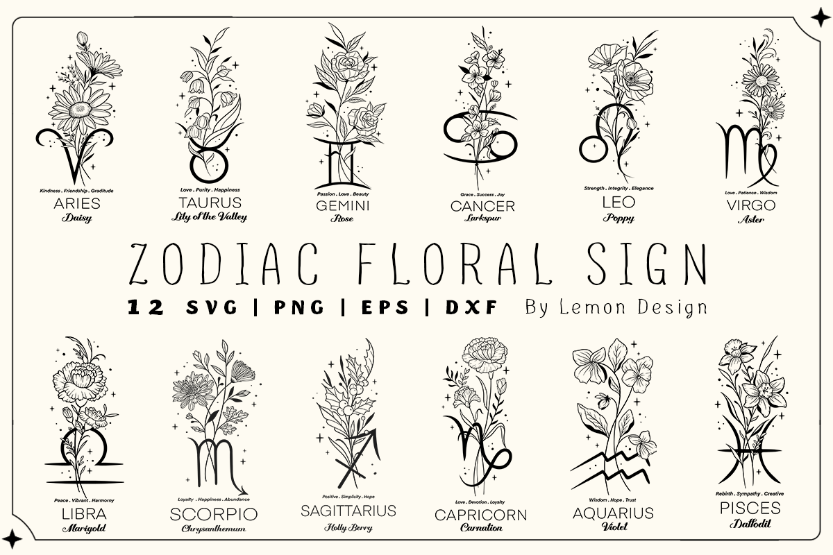
Not everyone wants a moody black-and-gold sign. My friend Priya wanted her Libra scales but kept saying the word soft, over and over, until I understood she meant flowers. This bundle is that. Each sign wrapped in a little botanical frame, the line weight thin enough to feel hand-drawn instead of stamped.
I ran her Libra at 8×10 in a thin oak frame over the entry table. The florals print cleaner than I expected. No muddy clumping where the petals overlap, which is usually where these fall apart.
The catch is the file count. There are a lot of pieces in here and the folder structure is a maze. I spent a real Tuesday afternoon just finding the one sign I wanted. Worth it for the result. Annoying in the moment.
The set I’d buy if I only bought one
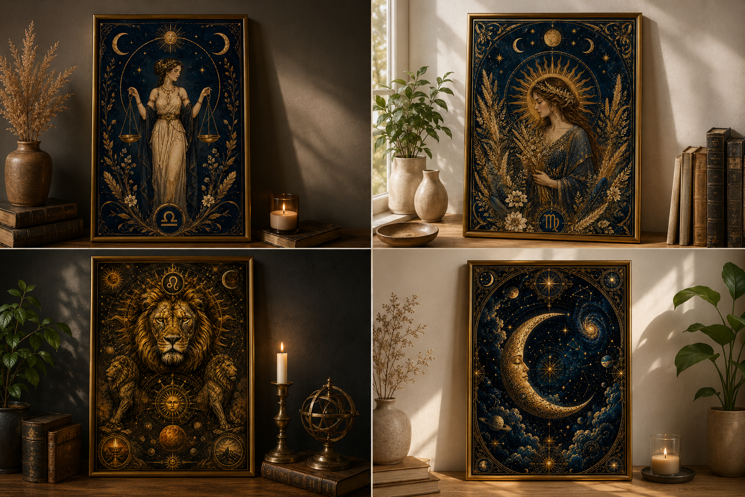
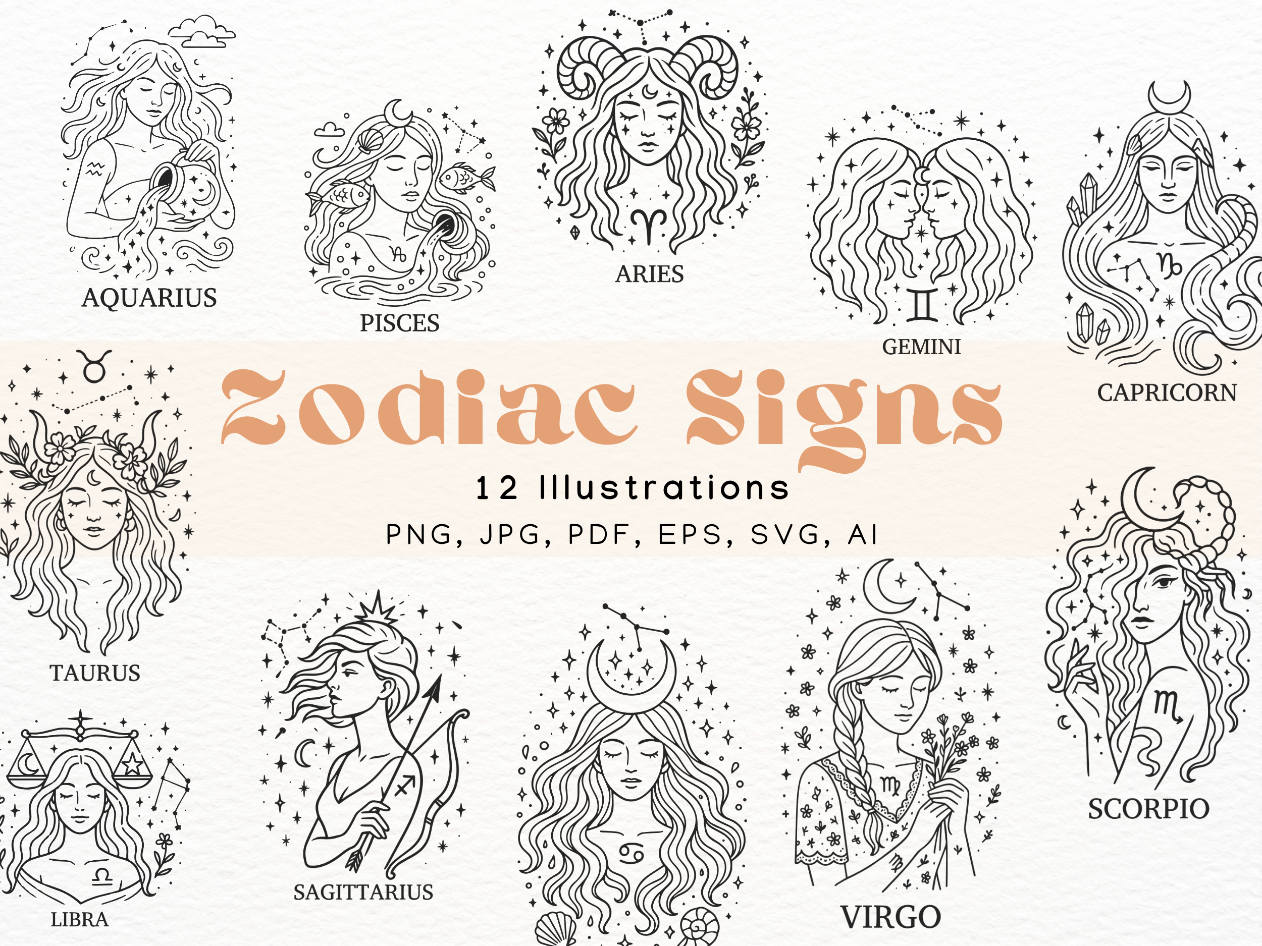
If you are doing a gallery wall and you want every sign to actually match, this is the one. All twelve, same hand, same spacing, same restrained palette. That sounds obvious but most collections drift. The Aries looks like a different artist drew it than the Pisces. This one holds together.
I did a test run of four signs at 5×7 above the light switch in the hall, the same spot I test everything. They sat in a row and looked deliberate. They were not deliberate. I just liked how the spacing fell.
No real complaint here, which is rare for me. The only thing is the full files are heavy and my old laptop wheezed opening the whole folder at once. Open them one at a time and you are fine.
See it on a wall before you waste paper

This is a mockup set, so it is more of a planning tool than a finished print, but it earned its spot. Before I commit to a frame I like to see roughly what a sign looks like hung, not just floating on a white page. These let me drop the art into a styled room and judge the scale before I cut anything.
It saved me from a mistake. I was about to print my own Capricorn way too big for the narrow strip of wall by my coat hooks. The mockup made it obvious in two seconds. I dropped down a size. Crisis avoided.
Gripe: the room scenes lean very beige influencer apartment, which is not my hallway, which is currently a slightly aggressive green. So the color read is off against my actual walls. I just use it for scale and ignore the vibe.
Tiny stamp-style signs for a cluster wall
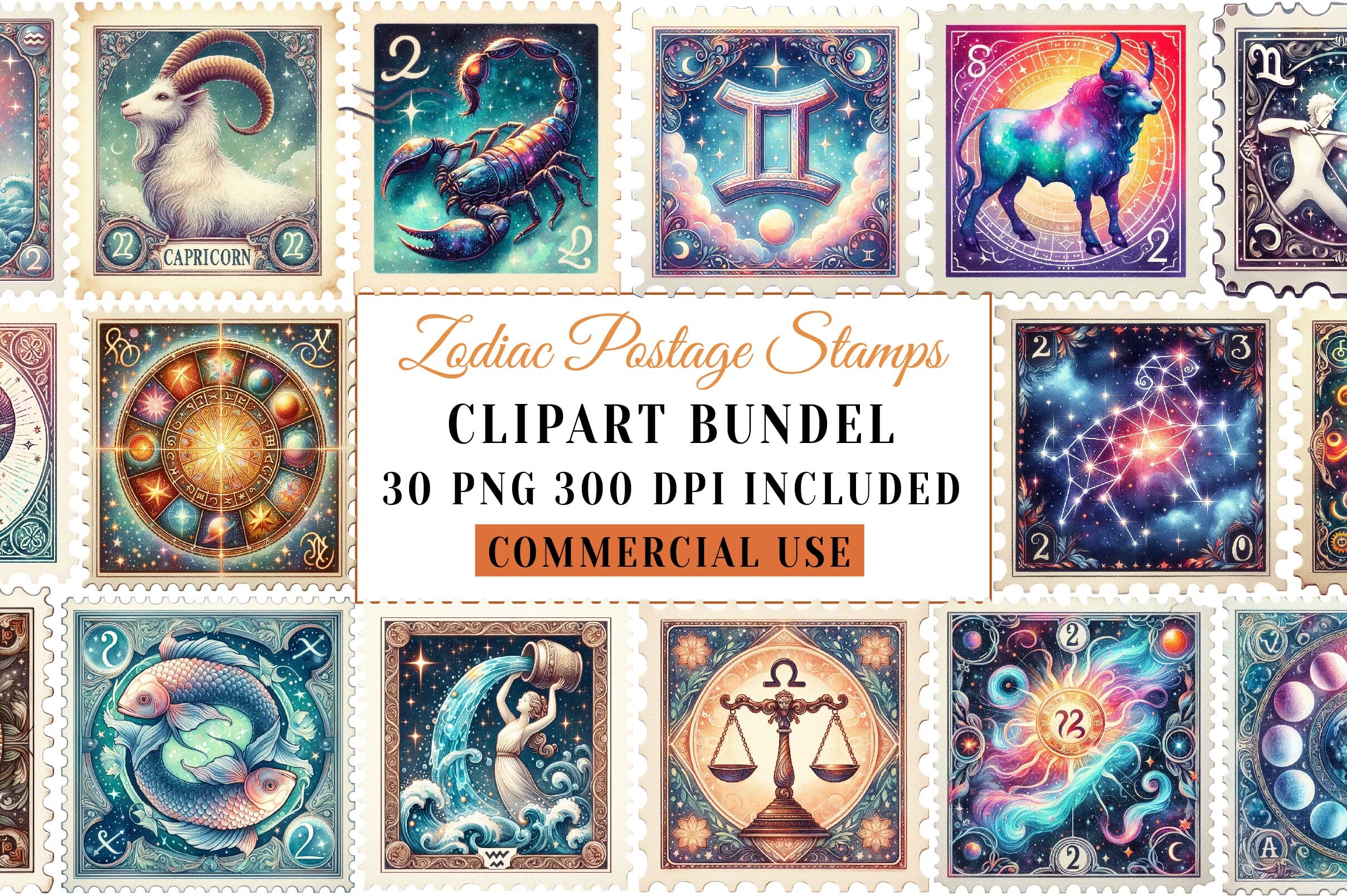
Here is a fun one. Each zodiac sign drawn like a little vintage postage stamp, perforated edges and all. I did not expect to like these as much as I do. They have a collected, slightly bookish feel, like something you’d find pressed in an old atlas.
I printed six of them small, 4×4, and grouped them tight in a grid by the bookshelf. Up close you see the little stamp details. From the couch it reads as one charming block of pattern. That double-life is the whole appeal.
The one thing. The perforated edge is part of the art, it is not a real trim line, and I confused myself for a minute trying to cut along it. Do not do that. Print the whole rectangle, frame it flat, let the fake perforations be fake.
For the kitchen, not the meditation corner
Most zodiac art takes itself extremely seriously. This does not. Each sign reimagined as a cocktail, which is exactly the energy my friend Dana wanted for the little bar cart corner in her kitchen. Her sign is Sagittarius. The drink they gave it is loud and a little chaotic. She felt seen.
I ran four of these as a strip above the cart, 5×7 each. The colors are brighter than the rest of this list, which suits a kitchen and would look unhinged in a bedroom. Pick your room first.
My nitpick is the brightness itself. On regular copy paper the cocktail colors went slightly neon. I had to bump to a heavier matte stock to calm them down. The cheap test print scared me. The real one was great.
The plain, clean glyphs you’ll never get sick of
Saving the quiet one for last because it is probably the one I reach for most. Just the signs. Clean glyphs, no florals, no stamps, no jokes. The kind of art that disappears into a room in a good way and never gets tired.
I printed my own sign and my partner’s, two signs, 8×10 each, side by side over the dresser. Black on warm white. It is the calmest thing I own and the only frame in this place I have not rearranged in months. That is the highest praise I have.
The single drawback is that plain art lives or dies on your paper. On thin stock it looked like a printout. On a heavier matte it looked intentional. So spend the extra fifty cents at the copy shop here. It is the whole difference.
Questions I Get About These
Where do star signs come from?
The twelve signs come from the constellations the sun appears to pass through over a year, a system the Babylonians mapped out a couple thousand years ago and the Greeks tidied up later. So when you hang a Leo print you are hanging a chunk of very old sky-watching. I find that more interesting than the horoscope app version, honestly. It makes the art feel less like decor and more like a record of people staring up and trying to make sense of things.
What star sign are most artists?
There is no real answer and anyone who gives you a confident one is making it up. People love to claim Pisces because of the dreamy, creative reputation, and you will see that floating around a lot. It is a fun party fact and nothing more. I would not pick a print based on it. Pick the sign that means something to you or to the person you are giving it to. That is the only data that matters on a wall.
Are star signs made up?
Made up is a strong way to put it, but yes, the meanings and personality stuff are not science. The constellations are real points of light. The idea that being born under one makes you stubborn or sentimental is a story humans layered on top. I treat zodiac art exactly that way: a nice story, a clean symbol, something personal to hang. You do not have to believe a word of the horoscope to want your sign on the wall. I half believe it and half roll my eyes, and the print looks great either way.
Before You Tape Anything Up
If you take one thing from all this, let it be the paper. I have watched the exact same star sign print look cheap on thin stock and quietly expensive on a heavier matte, same file, same copy shop, fifty cents apart. The art matters less than people think. The stock and the spacing matter more.
So here is my actual routine. Pick the sign, print it on whatever first to check the size, tape it up, live with it for a few days, then do the real one on good paper. My Scorpio sister still has not paid me back for hers. The wall looks calm anyway.