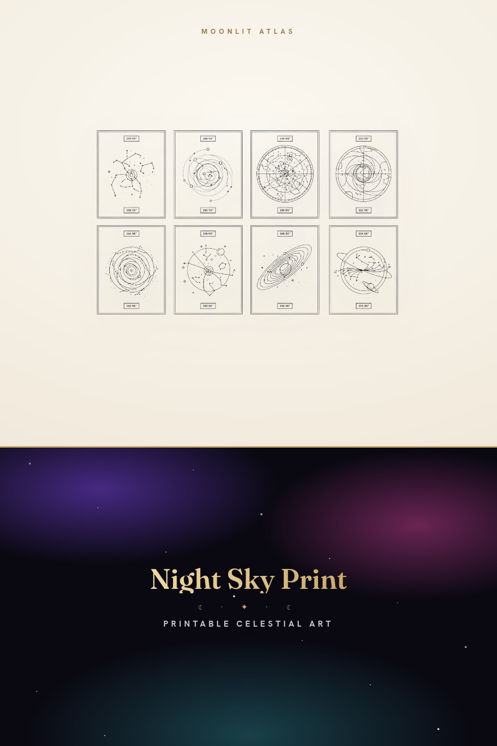
Our anniversary is a Tuesday in April. Nobody plans a milestone on a Tuesday, but there it is, and for the seventh one I decided no more candles that smell like a department store. I wanted the sky from that night on the wall. The actual sky. The one nobody else looked at.
Here’s where it gets sticky. Half the anniversary star prints online are just the same swirl of dots with a date typed underneath in a font that’s trying too hard. You tape the proof up next to the bedroom door and you can tell in two seconds. It reads like a screensaver, not a memory. The good ones have restraint. Less glow, more line.
So these are the celestial pieces I ran at the copy place on Eldridge, held under the hallway light, and squinted at from across the room. Some I gifted. One I kept for myself because my partner forgot to look. A couple of the links below are affiliate links, so if you grab one it sends a little change my way. Doesn’t cost you a cent.
A few links below are affiliate links. If you grab a print through one, it sends a little something my way at no extra cost to you.
Star map of your anniversary date, off the wall
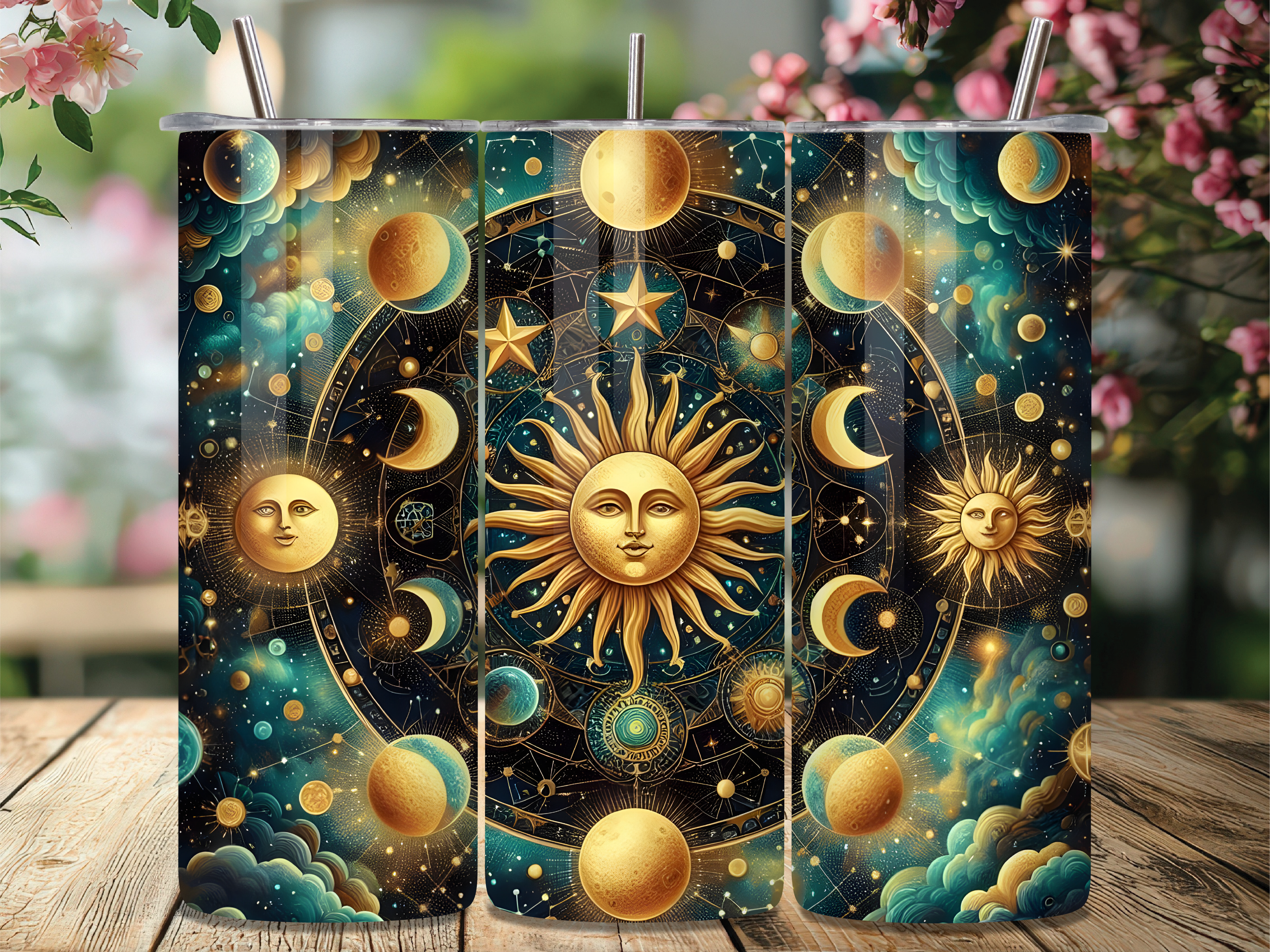
Not everything has to hang. My sister-in-law drinks coffee like it owes her money, three mugs before noon, so the wall gift would’ve gathered dust. This sun-moon-stars wrap went onto a steel tumbler instead and now the anniversary lives in her car cup holder.
The linework is the part that holds up at tumbler scale. Sun, moon, scattered stars, all thin and even, none of that thick clipart outline that turns to mush when you shrink it. I sized it for a 20oz and the seam landed clean at the handle gap. First try, which never happens to me.
One gripe. The gold tone reads almost mustard on a matte tumbler. On gloss it’s fine. Test your blank before you commit the whole batch.
A small gift for the partner who reads in bed
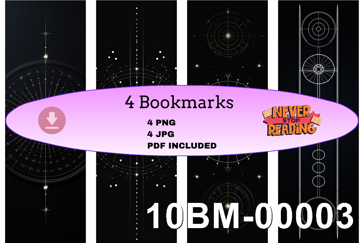
My husband falls asleep with a paperback tented on his chest, every single night, page lost by morning. So the anniversary print became a bookmark set. Cheaper than a frame, lands the same gut-punch when he opens the book and there’s the sky.
The set gives you a handful of celestial alignment designs, and I printed them on 110lb cardstock so they survive being shoved into a back pocket. Cut them down with a paper trimmer, punched a hole, threaded a bit of linen thread I had from a failed embroidery phase. Twenty minutes, start to finish.
What I’d warn you about is the bleed. The art runs close to the edge, so leave a hair of margin when you trim or you lop off a corner star. I lost two before I learned.
The backdrop nobody notices but everybody feels
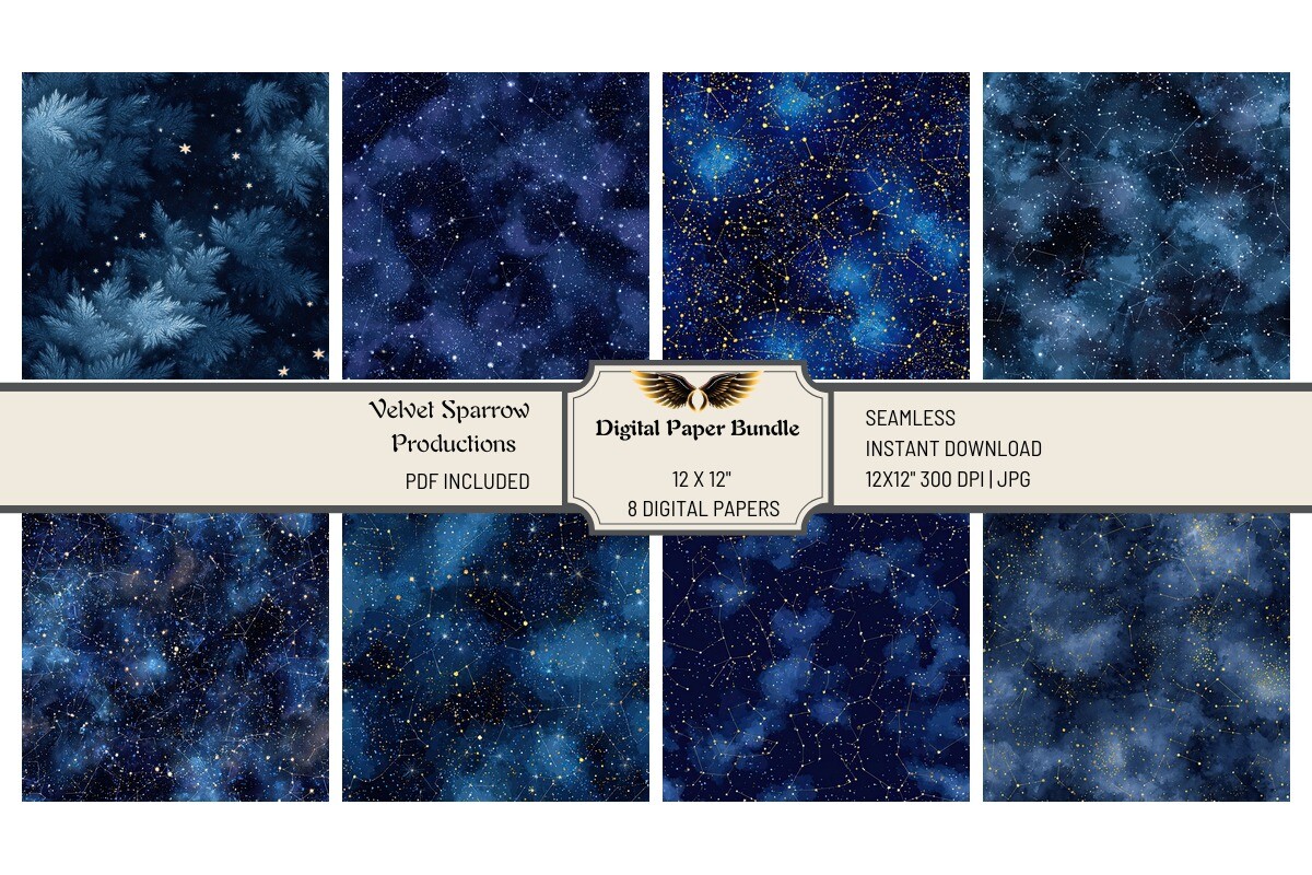
These night sky papers aren’t the gift. They’re what sits behind the gift. I used one as the matting layer under a small dated star print, deep navy with a faint dust of stars, and it took the whole thing from flat to framed-at-a-real-shop.
There are several papers in the set, different densities of star scatter. The sparse one is the keeper. The busy ones fight whatever you lay on top. I printed the sparse navy at A4, trimmed it to sit a centimeter proud of the inner print, and the layering did all the work my framing skills can’t.
The catch is color drift. My copy place’s printer pushed the navy toward purple on the first run. Asked them to knock the magenta down and the second batch was right. Worth the awkward conversation.
For a milestone year that wants a little shine
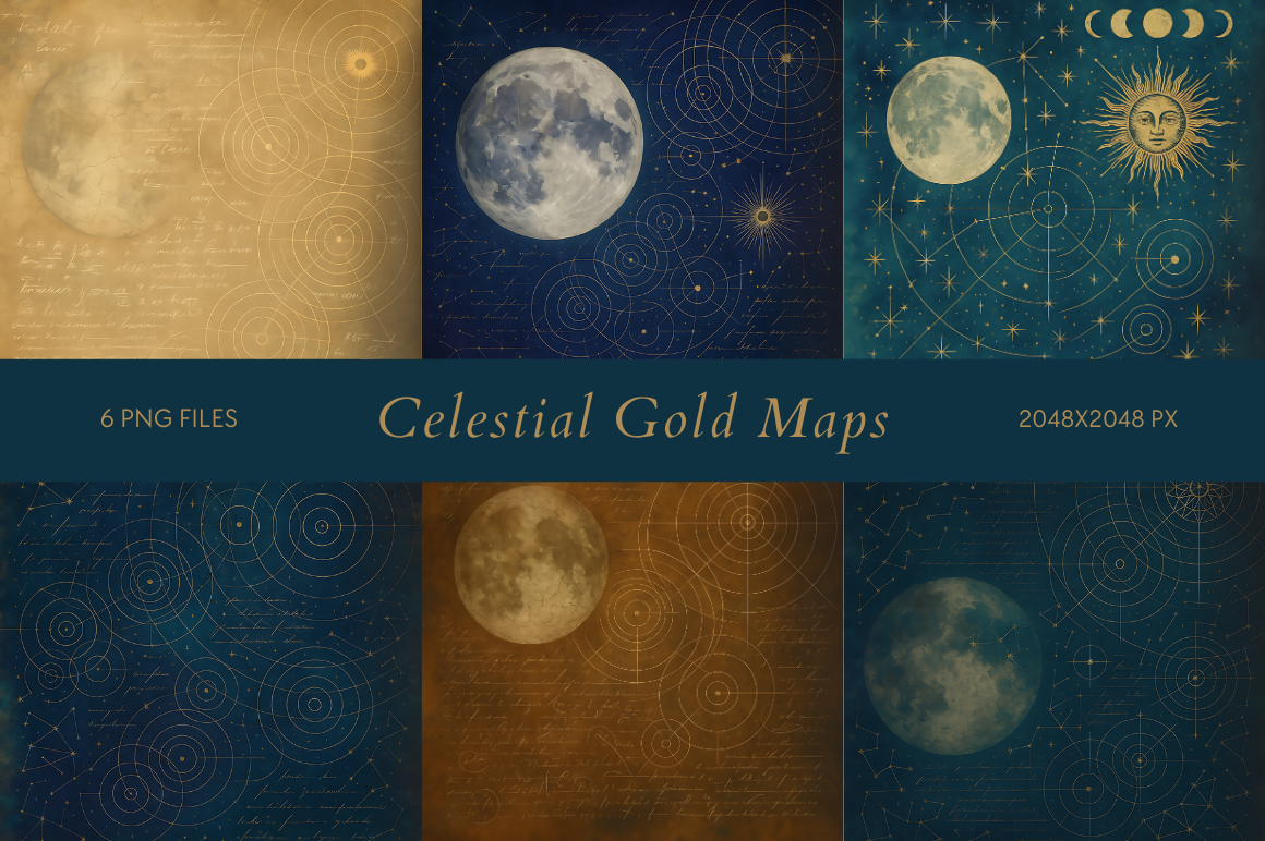
Tenth anniversaries get gold. That’s just the rule, I don’t make them. A friend hit ten this spring and I wanted something that nodded at the night without screaming wedding-shower. These gold celestial maps did it.
The maps come as gold linework on transparent backing, so I dropped one over a charcoal paper and the contrast was the whole point. Printed small, 5×7, framed it in a thin black frame from the hardware store down the block. Looked expensive. Cost me under fifteen dollars all in.
Gold is unforgiving though. Print it too large and the foil-look turns flat and cheap, all surface no glow. Keep it small and let the dark ground carry it. Big is where these die.
When the couple’s place is loud and proud of it
Not every couple wants calm. Some friends of mine painted their hallway a green I can only call aggressive, and a quiet navy star print would’ve drowned in there. The neon boho celestial set was the answer. Bright, loose, a little reckless.
You get a stack of celestial images here, and I picked the loosest one, hand-drawn moons and stars with that uneven hand-pulled feel. Printed it on bright white so the neon kept its punch. Anything off-white and the color went sad. The whiteness of the paper matters more than the ink, turns out.
My one note is restraint, which is funny advice for a neon print. Pick one image, not three. I tried a triptych and it looked like a festival flyer. One bold piece reads as art. Three reads as noise.
The bundle I keep going back to for anniversaries
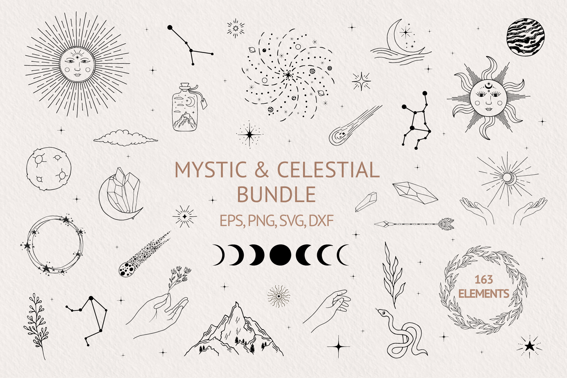
This is the one I open when I don’t know what I want yet. A big hand-drawn mystic bundle, moons and suns and little astrological scribbles, the kind of marks that look like someone actually held a pen. For anniversaries I lift one motif and build the print around the date.
What keeps it on my drive is range. I’ve pulled a crescent for one couple, a sun-and-moon pair for another, a star cluster for a third, and none of the prints looked related. That’s the test of a good bundle. It doesn’t make everything you touch look the same.
The full-res files are heavy. My laptop, which is older than my marriage, groaned opening the bundle and the fan spun like it was angry. Worth the wait. Just don’t try it on a coffee shop wifi.
Their two signs, side by side, finally
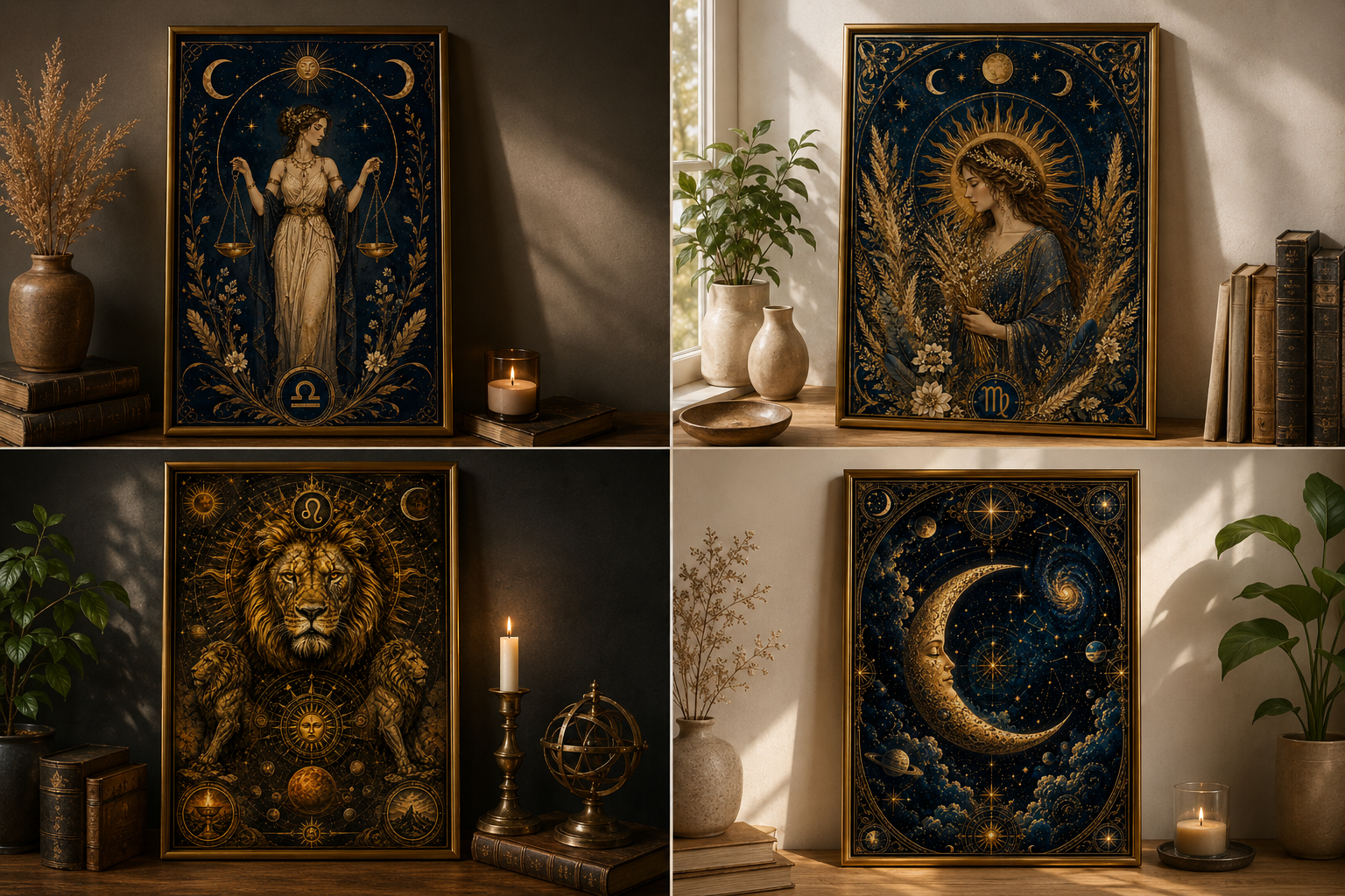
Here’s the anniversary angle that lands hardest. Their signs. He’s a Taurus, she’s a Scorpio, and a print of the two constellations leaning toward each other says more than any date typed in cursive. This zodiac celestial collection let me do exactly that.
The collection covers all twelve signs in a matching style, which is the whole reason it works. I pulled the two I needed, set them at 8×10 each in a side-by-side pair of thin frames, and hung them above the couch with about four fingers of gap between. They read as a couple. Subtle, not sappy.
One honest catch. A few of the signs in the set are stronger than others. Scorpio looked sharp. Libra felt a touch thin next to it. Print both your signs and squint before you frame, because the pairing only works if neither one is the weak one.
Questions I Get About These
How do I make a custom star map for an anniversary?
I do it the lazy-but-careful way. Find the date and the city, generate the night sky for those coordinates, then drop that into one of these celestial prints as the centerpiece. The date is the data part. The art is what keeps it off the screensaver shelf. I add the place name in small text at the bottom, print a test on plain paper first, and live with it taped to the wall for a few days before I pay for the good paper.
Are custom star maps accurate enough for an anniversary gift?
Accurate enough, yes, if you feed it the right night and the right city. The sky genuinely looked different over a different town, so the location matters as much as the date. For a past anniversary it still works fine, the positions get calculated backward. Nobody’s holding a telescope up to your wall to fact-check the gift. They’re reading the feeling, and the feeling lands when the date and place are yours.
Before You Tape Anything Up
I gave four of these away this year and kept one for myself, the gold map, because my partner forgot to look up on our actual anniversary and I decided the sky owed me a consolation print. It hangs by the light switch now, slightly crooked, and I’ve stopped pretending I’ll fix it.
The trick with anniversary prints is restraint, every time. The date is the easy part, any tool spits that out. What separates a gift from a clip-art coaster is the art around it and the paper you put it on. Print small, test cheap, squint from across the room. If it still holds you there, frame it. That’s the only test that’s ever mattered in my hallway.