A woman emailed me once, genuinely cross, because the moon in the print she bought looked “too orange.” She wanted it white. I wanted to tell her the moon does that, it goes copper and rust and sometimes a sad gray-brown, but I’d printed it that way on purpose and she’d seen the listing photo. We went back and forth. I refunded her. Then I sat with my coffee going cold and realized I’d never actually paid attention to why the moon changes color until a stranger got mad at me about it.
Here’s what I know now, and most of it I know because a printer betrayed me. The moon isn’t one color. It’s a copper one night, a flat bone-white the next, a faint blue nobody believes is real. Getting that onto paper is its own small war. The reds go muddy. The whites go gray. The golds turn the color of cheap mustard if your ink is low and you don’t catch it.
So these are the moon-color prints I’ve actually run, framed, and lived with through that whole learning curve. Not the ones I saved to a folder and forgot. I drag each one into my flat template, print a test at the place on Pell Street that stays open till nine, and hold it under the hallway light for a week before I commit. A few links below are affiliate links, so if you grab one a little comes back to me. Doesn’t cost you anything.
A few links below are affiliate links. If you grab a print through one, it sends a little something my way at no extra cost to you.
The warm-toned set that taught me about gold
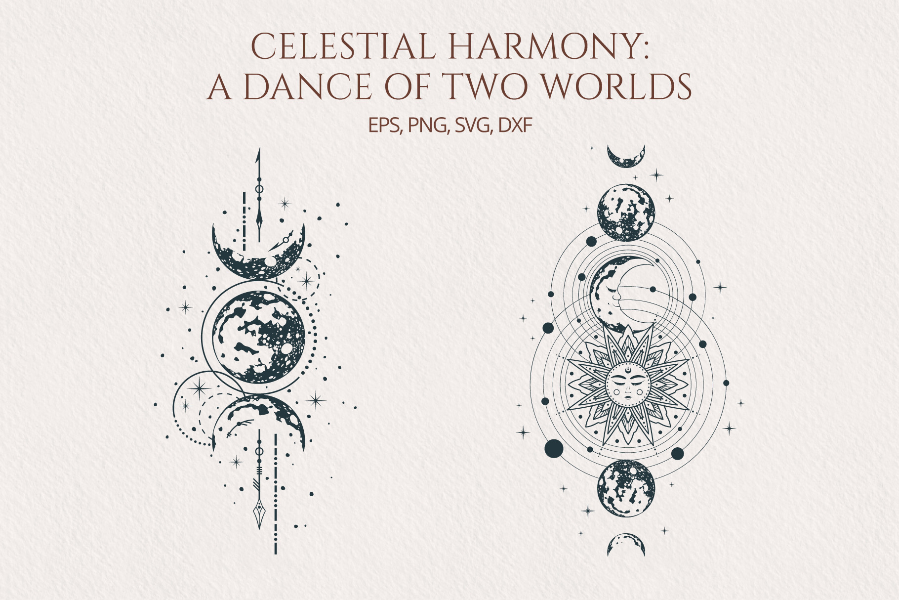
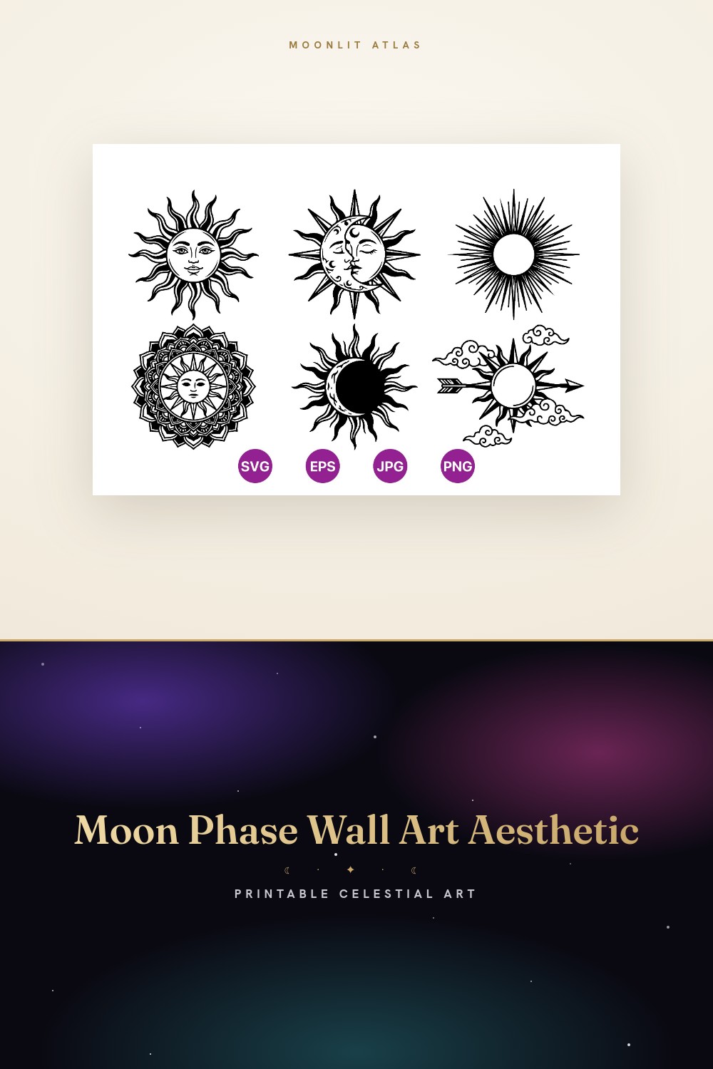
Sun and moon faces in this deep antique gold, the kind you see during a harvest moon when it sits low and the whole thing looks lit from a candle. That’s what pulled me in. I’d just lost that argument with the orange-moon customer, so warm color was on my mind.
I printed a pair at 8×10 and hung them flanking my bathroom mirror, of all places. The gold reads as expensive there, against the white tile. My downstairs neighbor asked where I bought them and didn’t believe they came off a copy-shop machine.
One snag, and it’s a gold-color snag specifically. The first test came out mustard. Sour, cheap-looking. Turned out the printer was low on yellow and faking it. Fresh cartridge and the same file printed like warm brass. So if your golds ever look like ballpark condiment, check your ink before you blame the file.
Where I went when I wanted no color at all
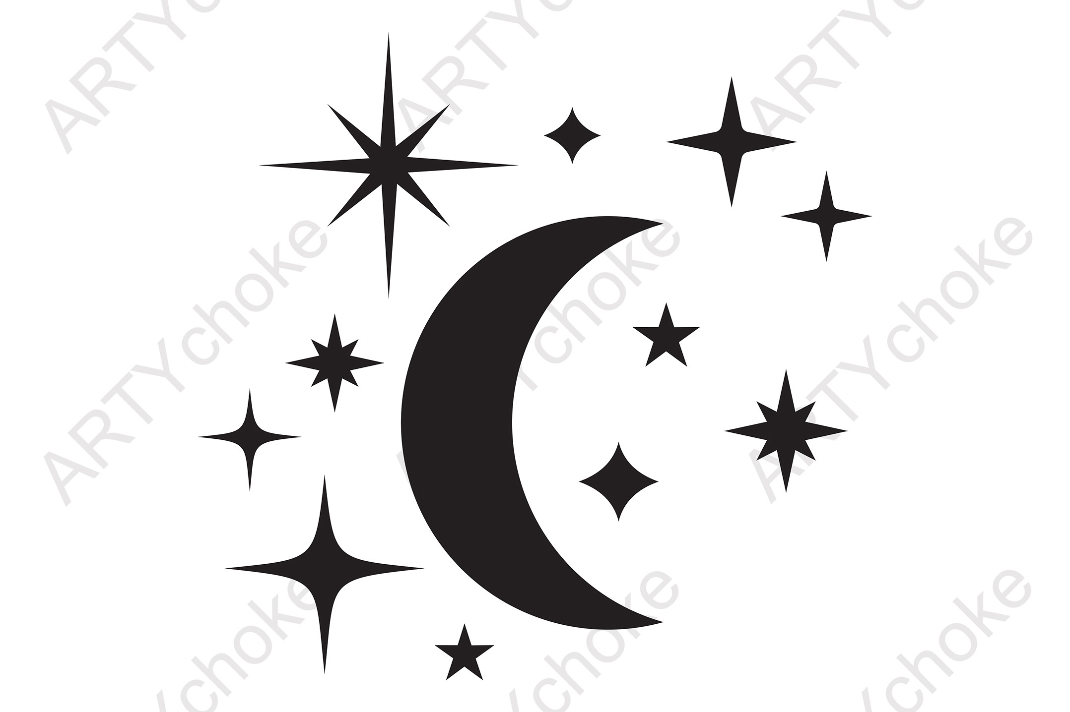
After months of fighting reds and golds I wanted something that couldn’t betray me, and a clean black moon with scattered stars can’t. No color to shift. Black is black. I cut this one in vinyl across a window frame in the spare room and it just sat there being correct.
I also traced it flat in Canva for a quick card mockup when a buyer wanted the design but in white-on-navy instead. Took ten minutes. The line is simple enough that flipping it to a single light color on a dark background still held together.
The catch is it’s deliberately plain. If you came here for moon colors, this is the opposite of that, it’s the one you reach for when color is the thing causing you grief and you just want a shape that behaves. I keep it for exactly those days.
My second pass at warm tones, softer this time
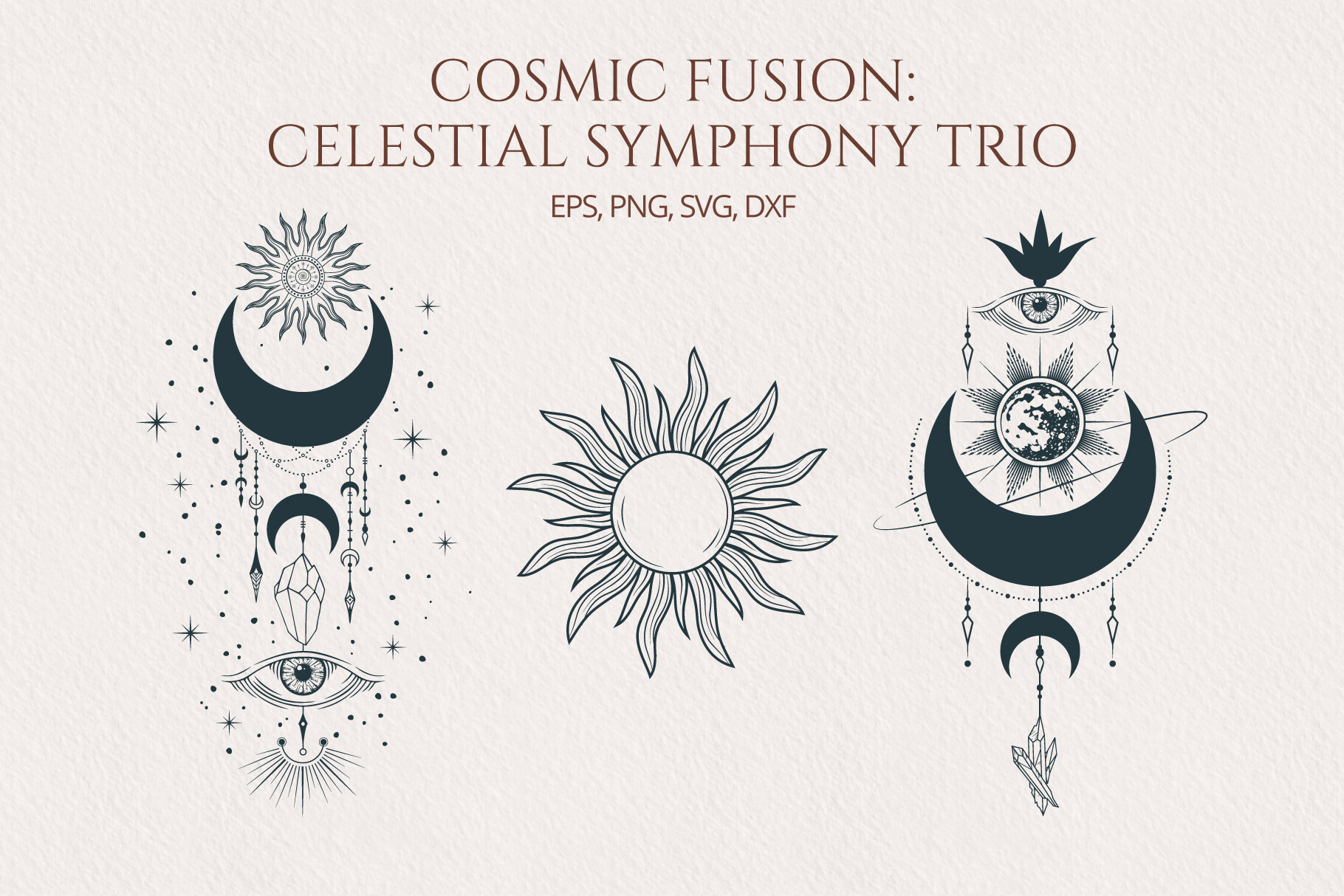
Same warm family as the first set but dialed back, more muted, the gold leaning toward old parchment instead of bright brass. I bought it because the brighter one was almost too much for a bedroom and I wanted the gentler cousin.
I did this one at 11×14 above a dresser for my cousin’s housewarming. She has gray walls and the soft gold sat against them like it had always been there. She kept it. That’s the real test, when somebody who didn’t ask for celestial anything decides to keep the celestial thing.
The softer palette has a cost. Print it too small and the moon and sun start to blur into the background, because the contrast just isn’t there to hold them apart. I tried a 5×7 and squinted from across the room and lost the sun entirely. Keep this one large.
The moody one that finally made a blood moon work
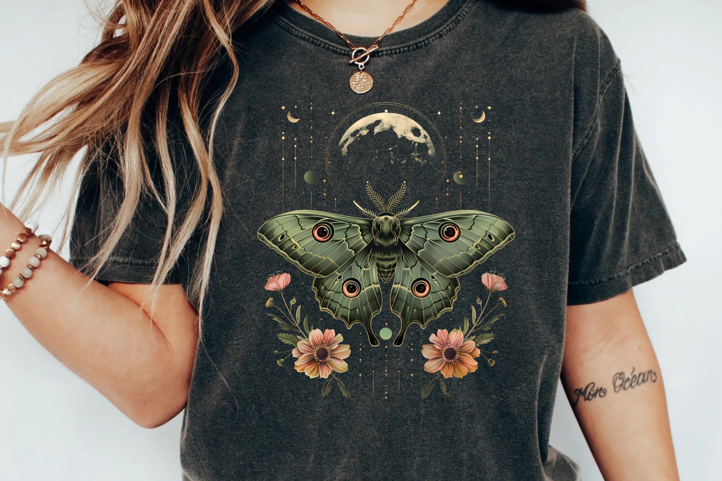
A luna moth under a heavy phased moon with vintage florals creeping around the edges, and the moon here sits in this deep rust-red that actually reads as a blood moon instead of a printing error. That distinction cost me a lot of wasted paper to learn.
I ran it at 8×10 on a slightly cream stock instead of bright white, which I’d started doing for any red-toned moon, and the rust came out rich and a little ominous instead of muddy. Pressed it into a black frame and gave it to a friend who collects gothic-leaning things. She hung it in her stairwell where it’s properly dim and it looks haunted in the good way.
The red is demanding. On pure white paper my first test went brick-pink and cheap. The cream paper saved it. So if you want the actual blood-moon depth out of this, don’t print it on the brightest white you own, it fights the warmth right out of the color.
The one with words on it, which I usually avoid
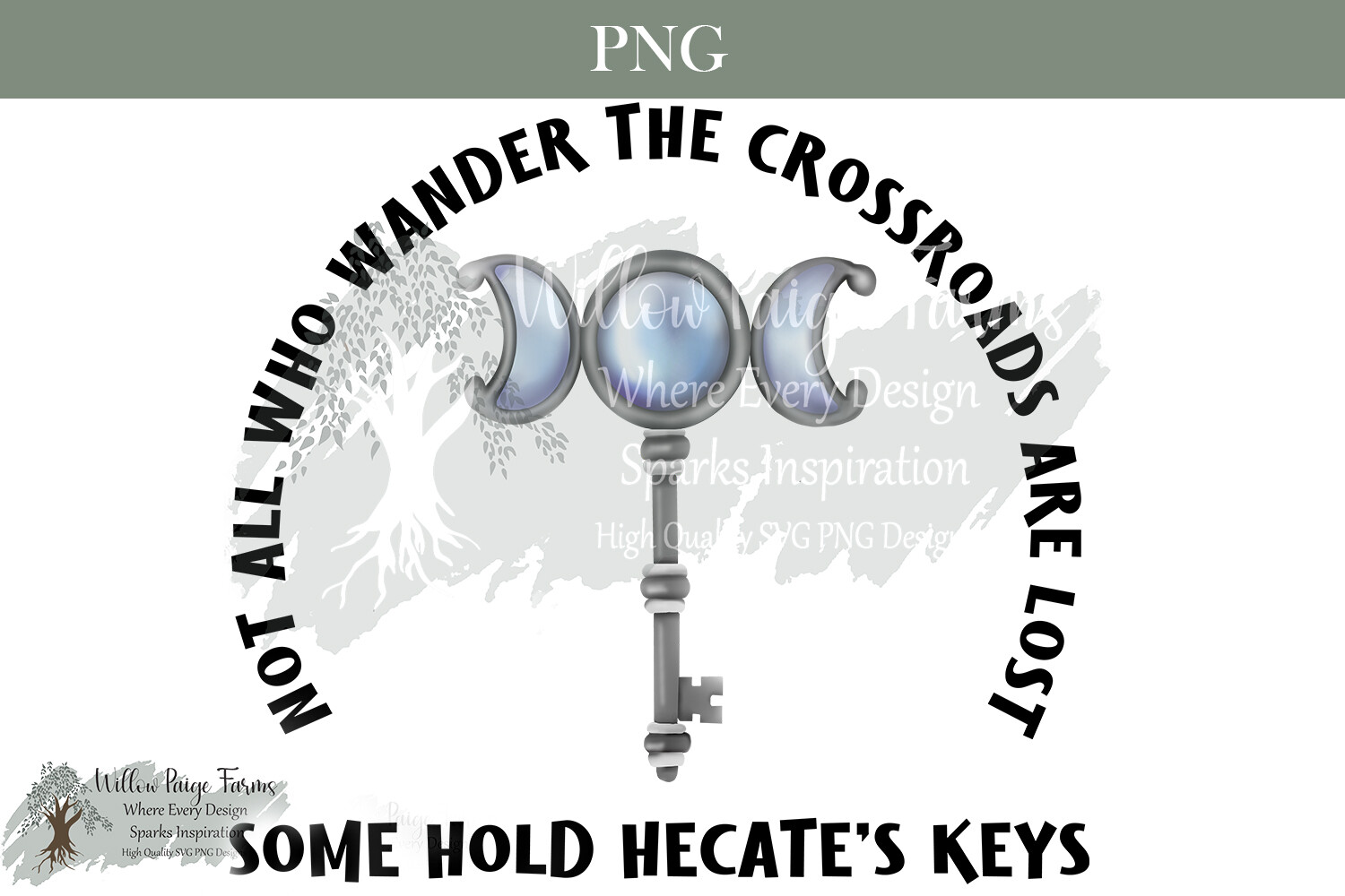
A moon with keys and the line about not all who wander being lost, in a muted slate-and-bone palette. I’m wary of text on prints, they date fast and the font is usually trying too hard. This one didn’t bother me, the lettering is quiet and the moon does the work.
I printed it for a coworker who’d just quit a job she hated to travel, which felt like the only honest reason to hang a wandering-moon quote. 5×7 in a thin frame on her desk her last day. She teared up, which I did not expect from a copy-shop print I made on a Wednesday.
The gray moon is sneaky to print. Grays drift warm or cool depending on the machine, and my first run came out faintly green, which on a moon looks like something’s wrong with it. I nudged it cooler in the file and the second test sat right. Worth a test page if your printer has opinions about gray, and most do.
Peak harvest-moon color, the orange done right
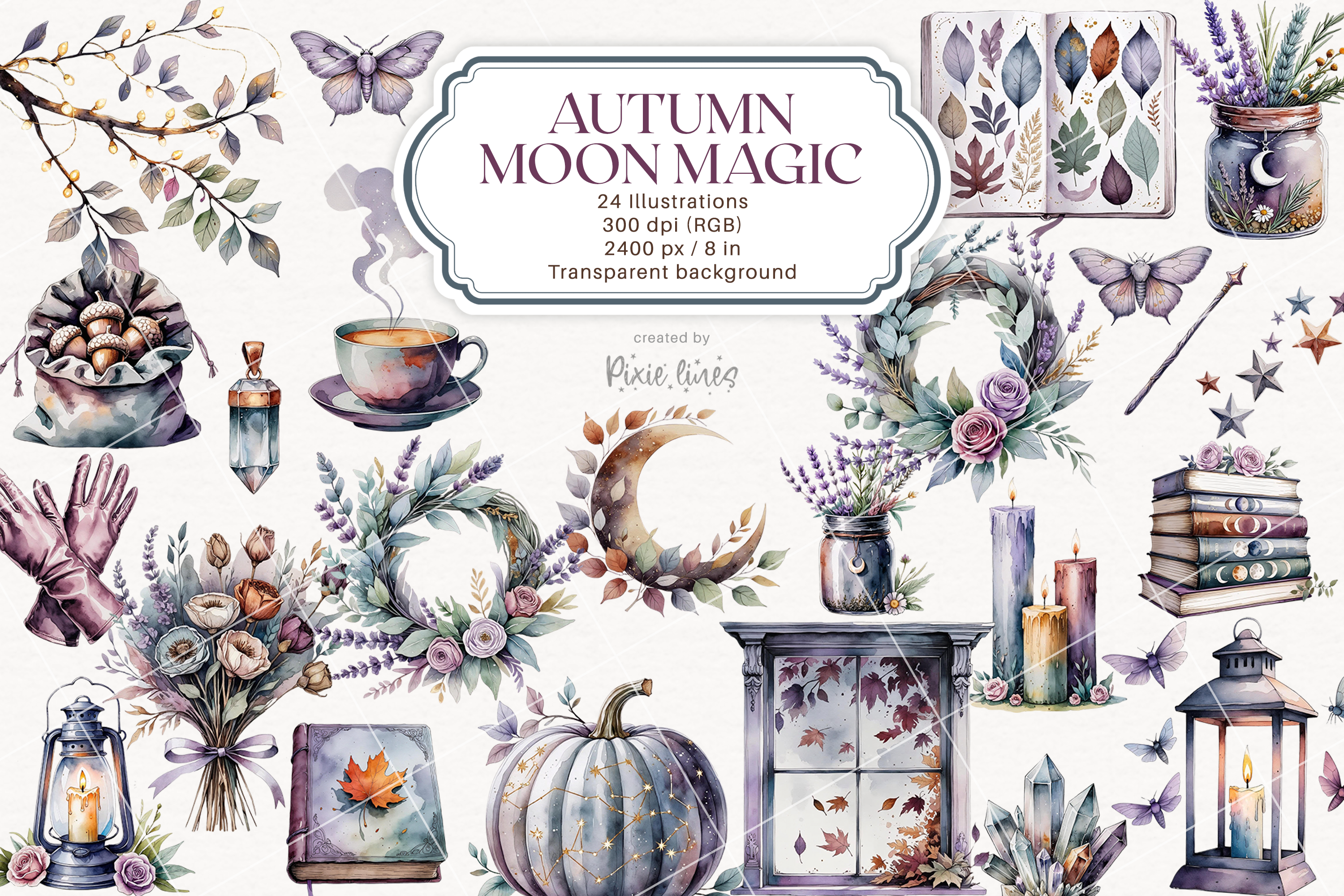
This is the orange the angry customer actually wanted to avoid, and the one I love most. A low autumn moon in burnt amber with fall elements around it. It’s the color the moon really turns near the equinox when it sits fat on the horizon, and seeing it on paper finally made me understand what I’d failed to explain to her over email.
I hung it in my kitchen for the whole of last fall, 8×10, and every guest commented. The amber is warm without going garish, which is a fine line, because one notch too saturated and a harvest moon looks like a basketball.
The orange runs hot out of the file. My first print was nearly neon. I pulled the saturation down maybe fifteen percent in Canva before the second run and it landed in real-moon territory. Test it. Orange is the color most likely to print louder than it looked on screen.
Finally a moon where color isn’t even the question
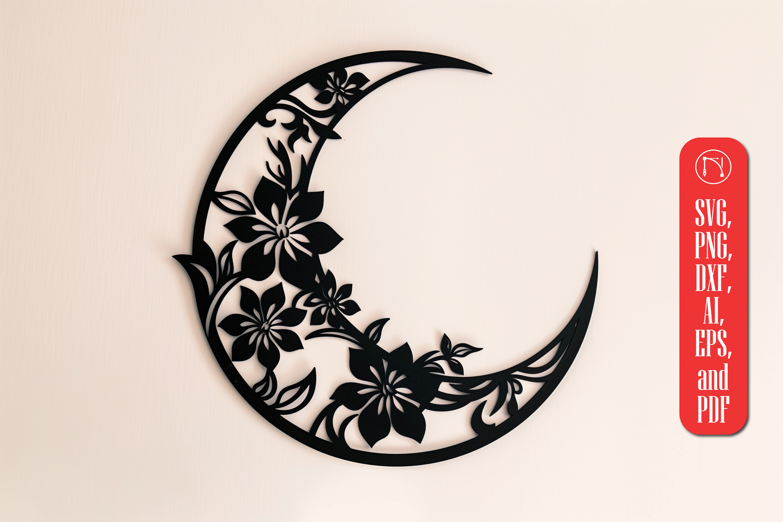
A floral moon built for laser cutting, all clean line and negative space, no color anxiety because the material becomes the color. I had a neighbor with a laser cutter run this in pale birch ply and the wood grain doing the shading was prettier than anything I could have printed.
We hung the cut piece on a white wall in my hallway and the shadows it threw in afternoon light were half the appeal, this shifting second moon on the plaster behind it. No printer involved, no ink to go muddy, nothing to betray me. A nice break.
The one thing to watch is the floral detail. The thinner petal lines need a careful cut or they char at the edges, my neighbor said. On screen it all looks doable. In ply, the finest bits are where it gets fussy. Worth telling whoever runs it to slow down on the delicate parts.
Questions I Get About These
What are moon phases?
Honestly, I had to stop and think about this the first time a kid asked me at a market, because I sell the prints and somehow didn’t have a clean answer ready. It’s just the moon showing us different slices of its lit half as it goes around us. New, then a sliver, then half, then full, then back down the other side. I think of it less like science and more like the moon slowly turning its face toward a lamp and then away. That framing is what finally let me lay a phase set out in the right order on a shelf without second-guessing myself halfway through.
What are the 4 major moon phases?
New, first quarter, full, last quarter. Those are the four people actually recognize, the corners the whole month hangs off of. I learned to care about them because a customer wanted a print of “just the big four” for a small frame and I’d only ever sold the full eight. When I pulled the four out and arranged them, it looked cleaner than I expected for a tight space. The new moon is the tricky one to print or design, because it’s basically a dark disc and on white paper it can vanish into a faint ring if you’re not careful with the contrast.
Are moon phases the same everywhere?
Yes and no, and I only know this because a buyer in Australia emailed to gently tell me my crescent was “upside down” for her. Same phase, same night, everyone on Earth sees the moon equally lit. But the tilt flips depending on where you’re standing, so a crescent that opens to the right up here opens to the left down there. I felt a bit silly. Now if someone tells me they’re below the equator I mention they might want the design mirrored, and a couple of times that little note is the reason they bought.
Before You Tape Anything Up
If there’s one thing all my wasted test pages taught me, it’s that moon color is mostly a printing problem dressed up as an art problem. The reds go brick on bright paper. The golds go mustard when your ink runs low. The orange prints louder than it looked. None of that is the file’s fault, and none of it is yours either, it’s just the machine, and a test page catches every bit of it before you waste the good stock.
These seven are the ones that survived that learning curve. The warm gold sets for harvest light, the rusty luna moth for a real blood-moon mood, the gray-keyed wanderer, the black set for the days color is the enemy, and the laser moon for when you want the wood to do the talking. Pick the color that matches the night you’re thinking of, run your test, and you’ll skip the part where a stranger emails you mad about an orange moon. Mostly.