The first version of my moon wall took me about forty minutes and looked like a kid’s science fair board. Eight circles in a row above the radiator. I’d printed them too dark, used painter’s tape instead of proper hangers, and by Thursday two of them had peeled and curled at the corner like old stickers. I left them up anyway. Out of spite, mostly.
Then I started over. Different set, better paper, a level I borrowed from the guy downstairs and never gave back. DIY moon art is one of those projects that looks like nothing on a tutorial and turns into a whole evening once you’re actually holding a ruler against the wall at 9pm. The spacing is the part that gets you. Too tight and the gibbous moons blur together. Too loose and it reads as five things, not one set.
So this is the honest list. The phase sets and moon graphics I printed at the copy place on Eldridge, taped up, lived with, and either kept or quietly recycled. Some of the links below are affiliate links, which means if you grab one a little something comes back to me. Doesn’t change your price.
A few links below are affiliate links. If you grab a print through one, it sends a little something my way at no extra cost to you.
The mandala one I almost didn’t buy
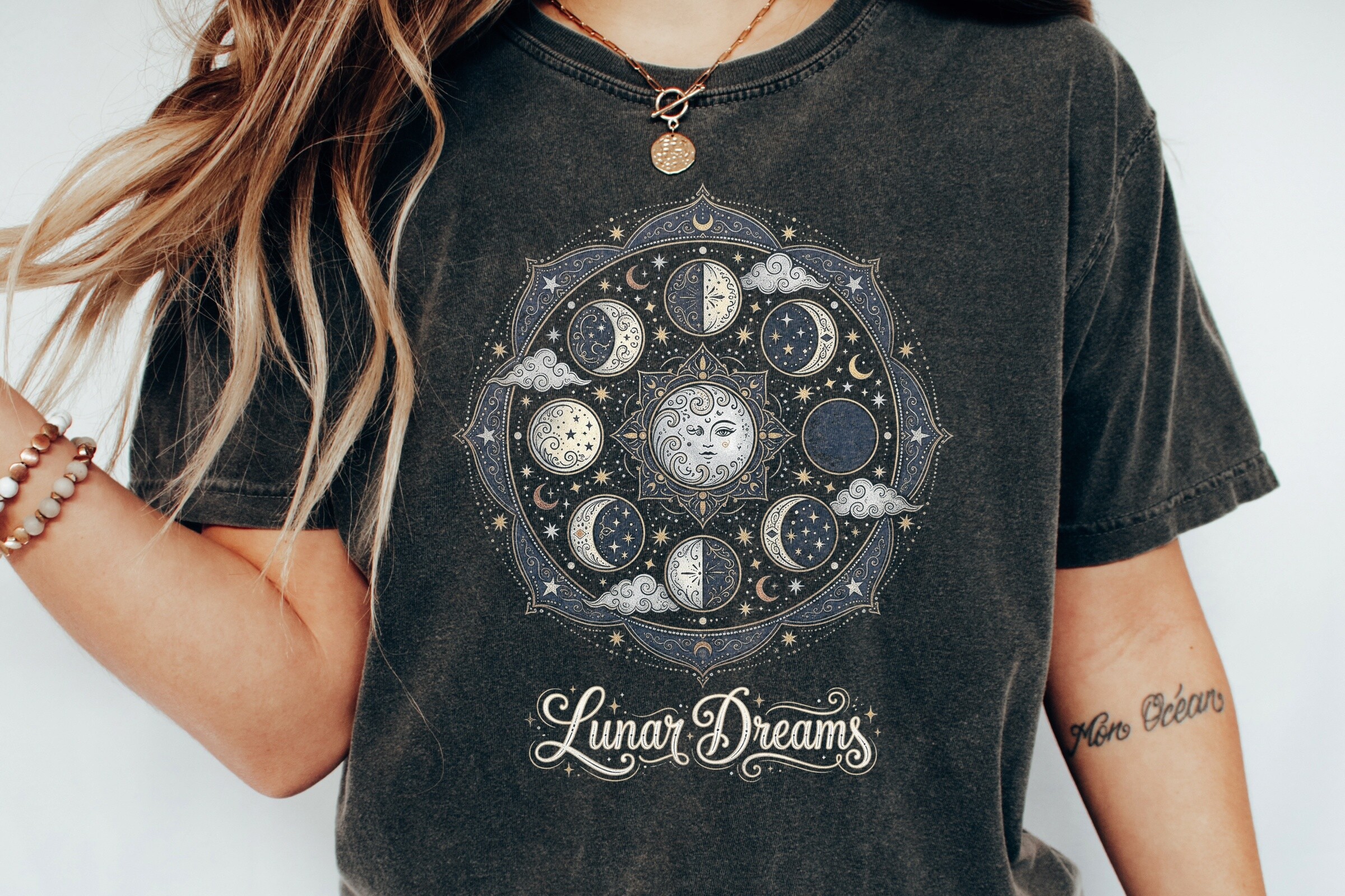
I scrolled past this three times. A mandala plus moon phases sounded like too much, like a tote bag you regret. Then I printed it small, a 6×6 square, and it calmed right down. The detail tightens when you shrink it. That’s the trick with anything busy.
I hung it solo above the light switch in my hallway and it carries the whole corner. No frame yet. Just a strip of removable adhesive because I’m a coward about wall holes in a rental.
My one gripe. The line weight is on the fine side, so my copy place’s machine ate a little of the thinnest detail at the bottom edge. I printed it again one size up and that fixed it. Cost me an extra dollar and a walk back across the street.
Tree of life, for the wall that needed a center
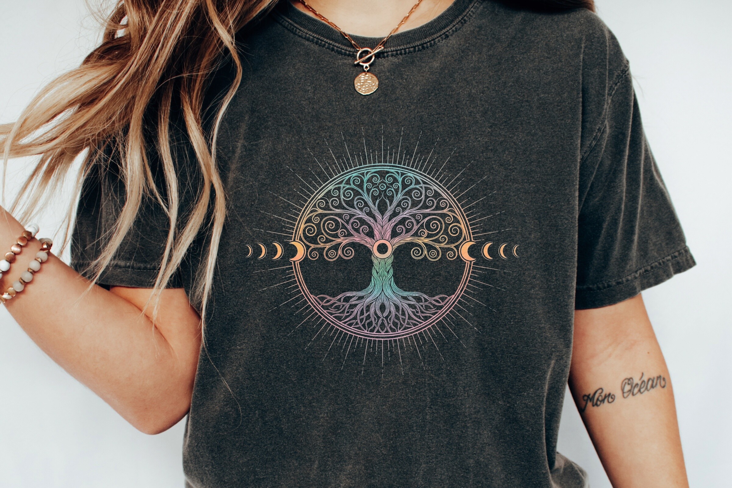
My living room wall had a dead spot above the bookshelf. Nothing wanted to live there. This one did. The tree fills the middle, the phases arc over the top, and somehow it doesn’t feel like two ideas glued together.
I did it as a single large print, roughly 11×14, and that’s the size I’d push you toward. Smaller and the branches get muddy.
Worth saying. It reads warmer than the pure black-line sets. More boho, less astronomy textbook. If your room is all cool greys it might fight you a little. Mine has a mustard throw and a lot of secondhand wood, so it slid right in.
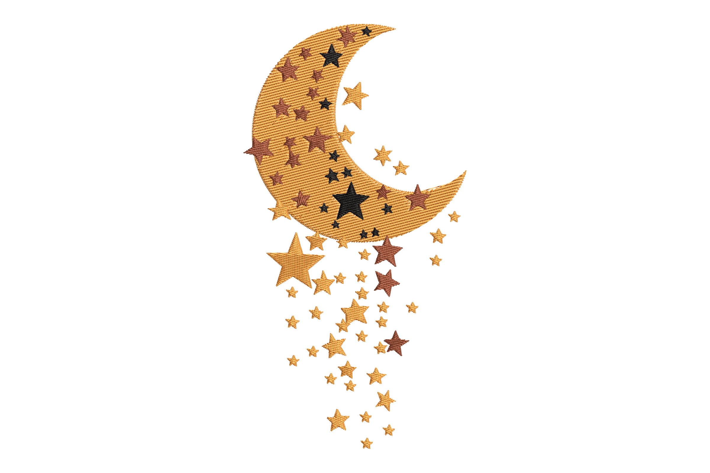
Sun and moon, when phases alone felt cold
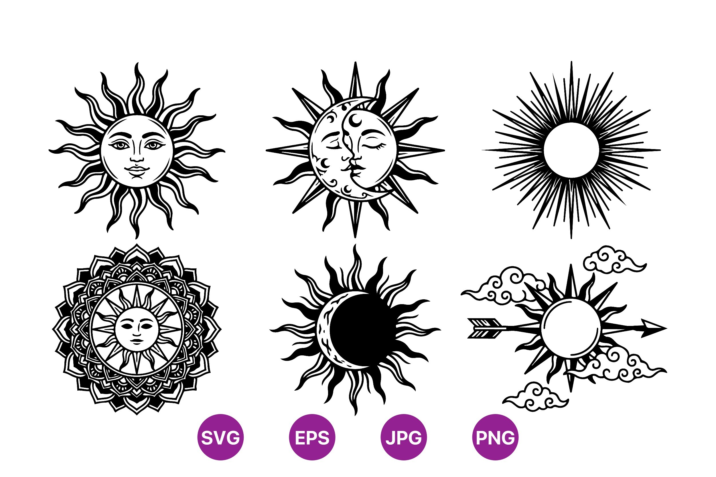
Pure phase sets can feel a touch clinical. All those identical circles. I wanted one piece with a face, something with a bit of warmth, so I grabbed this sun and moon set to break up the row.
I printed the moon half at 5×7 and tucked it at the end of my phase line like a full stop. It works as a bookend. The style is clean, a little folk, the kind of black that stays solid when you print it small.
The catch is mine, not the file’s. I cut the sun out to hang separately and my scissors are dull, so the edge is rough up close. From across the hall nobody knows. Across the hall is the only review that counts in my place.
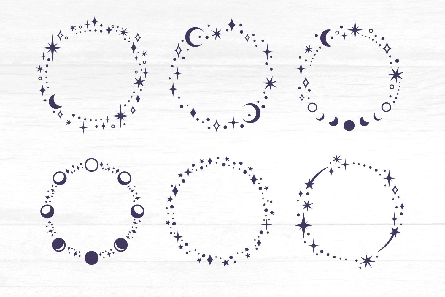
Symbols, for the moodier corner
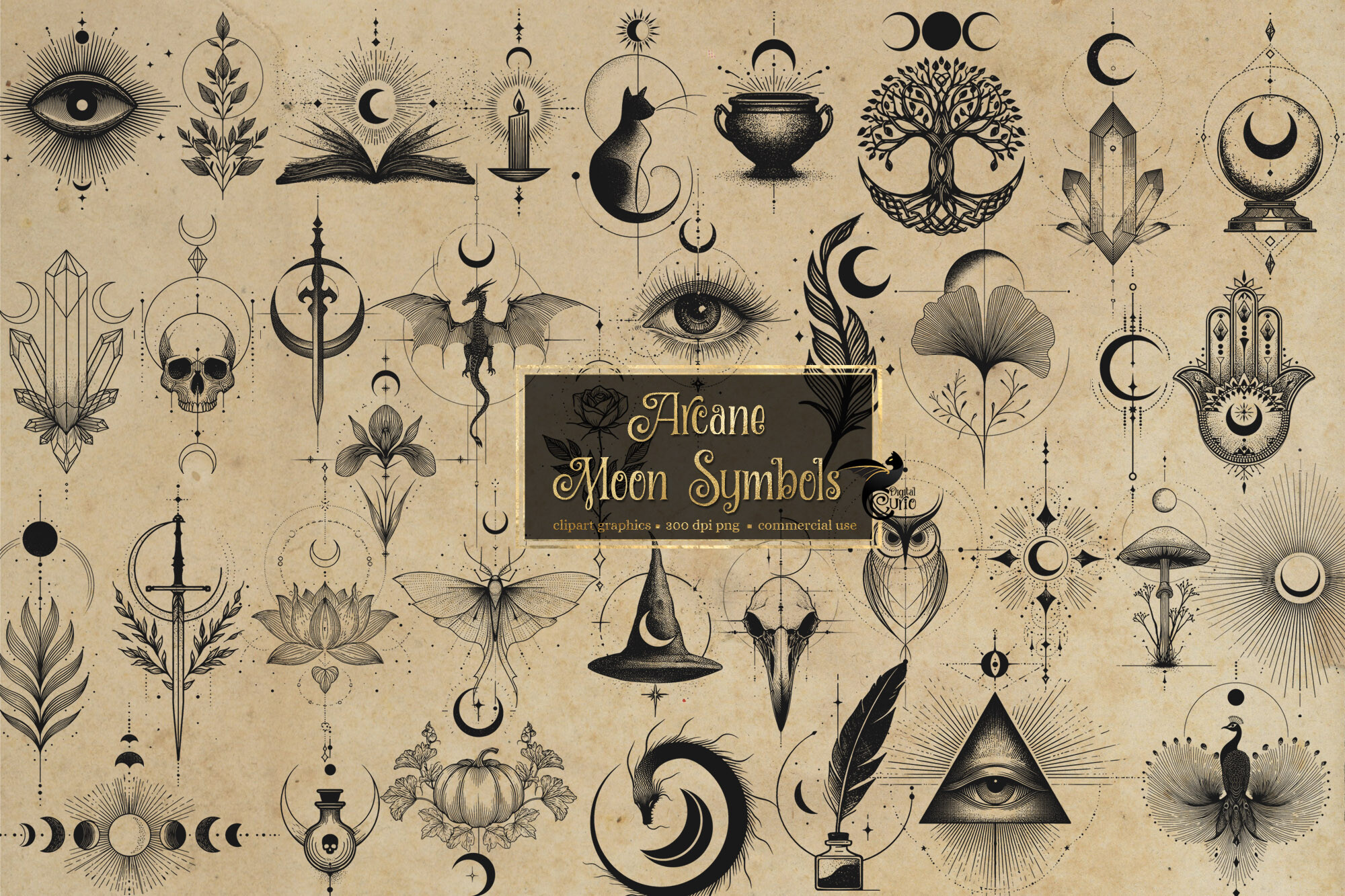
This is the one I reached for when I wanted my reading nook to feel a little witchy without going full Halloween-store. Moon symbols, sigil-ish marks, the sort of thing that looks intentional next to a stack of paperbacks and a half-dead candle.
I printed three of the symbols on separate 4×6 cards and stuck them in a vertical column down the side of my bookshelf. Three was the right number. Four started to look like a chart.
Fair warning. Some of the marks are very fine and very dark, so on cheap copy paper they bleed if your printer runs heavy. I asked the Eldridge guy to drop the toner a notch and that solved it. Ask. They never mind.
Frames bundle that saved my lazy gallery wall
Here’s where I stopped pretending I’d do a proper gallery wall and started cheating. These star and moon frame shapes let me drop in my own little quotes and a photo of my grandmother’s house, and suddenly the wall looked planned. It was not planned.
I ran four of them at 5×7 and arranged them in a loose grid by the front door. The frames do the heavy lifting so the spacing forgives a lot. Which, given how I hang things, is a mercy.
One thing. There are a lot of options in here and it took me a Tuesday night and two cups of tea to pick. Set a timer or you’ll lose the evening comparing nearly identical crescents. Ask me how I know.
The stars-and-moon set my mom now wants
I printed this for my own bedroom and my mother saw it on a video call and demanded one for her hallway. So now I’m making two. The moon and scattered stars read soft, not spiky, which is what I wanted above the bed where spiky is the last thing you need at midnight.
I did mine at 8×10, single print, centered over the headboard with two of those nail-free strips. Held fine through a hot week when everything else in the flat was peeling.
My small complaint. The stars are delicate, so if you go too small the whole thing turns to dust on the page. Keep it 8×10 or bigger and it sings. I tried a 4×6 first and it just looked like a smudge with ambitions.
Watercolor, for when black line felt too sharp
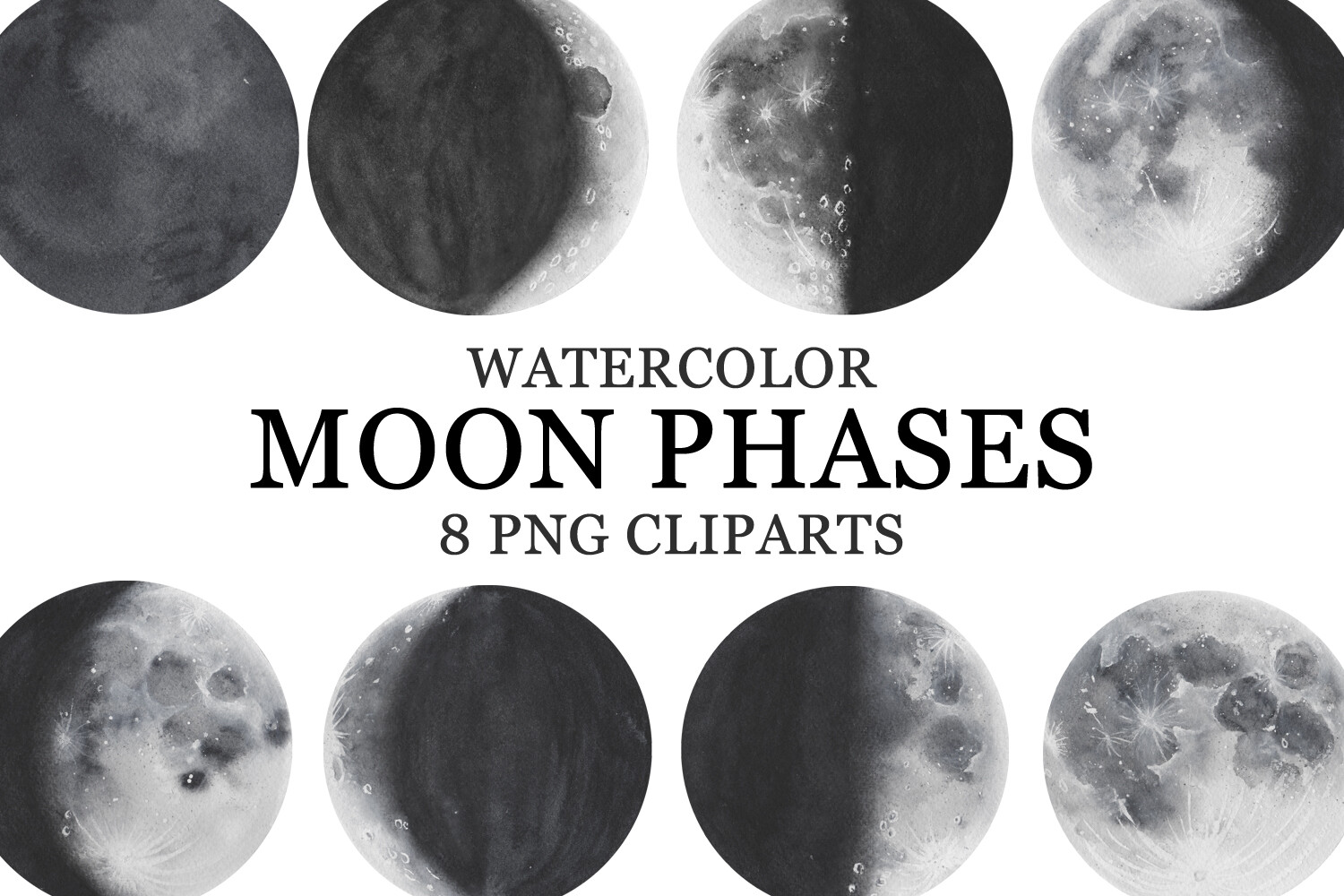
I saved the soft option for last because it’s the one I keep coming back to. Watercolor phases. The edges bleed a touch, the color isn’t flat, and it forgives a cheap printer in a way crisp black line never does. Honestly my favorite kind of file for a home machine that’s seen things.
I printed all eight phases at 4×6 and ran them in two stacked rows of four above my desk. The wash colors tie into the dried flowers I keep meaning to throw out. It looks deliberate now. It started as me using up the last of my photo paper.
The one thing to know. Watercolor wants a little weight under it, so flimsy 20lb paper buckled on me. I bumped to a heavier stock and the curl went away. Worth the extra few cents a sheet.
Questions I Get About These
What does a moon phase wall hanging mean?
Most people hang it as a quiet nod to cycles. Things wax, things wane, then they come back around. I won’t pretend mine carries deep meaning. I put it up because the wall was empty and the symmetry settles a room. If it means something to you, good. If it’s just pretty, also good. Nobody’s checking your intentions at the door.
How many moon phases should a wall set have?
Eight is the standard run, the full cycle from new to full and back. That’s what most sets give you and it’s what I’d start with. If your wall is short, a five-piece run reading left to right still looks complete, and a single full-cycle print in one frame is the easiest of all. I’ve done all three. Eight in a row above a sofa is the one that gets the most comments.
Before You Tape Anything Up
If you take one thing from my two botched attempts, make it this. Print a test on plain paper first, tape it up cheap, and live with it for a few days before you commit to nails or frames. Half the sets I loved on screen looked wrong on my actual wall, and half the ones I almost skipped turned out to be the keepers. The wall tells you. You just have to leave the proof up long enough to listen.
Start with one set, the cheapest paper you’ve got, and a level you trust more than your own eye. Build out from there. My hallway took three rounds to get right and I still nudge the bottom row every time I dust. That’s the fun of doing it yourself. It’s never quite finished, and that’s fine.