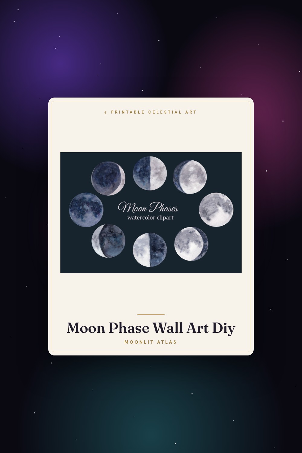
I am not a calendar person. I have a phone, the phone has the moon in it somewhere, and yet every full moon still ambushes me like a tax bill. Last spring I missed a planting window I’d been waiting on for weeks because I trusted an app notification I’d swiped away without reading. That was the morning I printed my first one and pinned it over the kitchen counter.
This is the working kind. Not the poster you hang to look moody, the one you draw on. Mine has a box for every day, the phase marked in the corner, and enough white space that I can scribble “start the basil” or “do not text him, it’s a full moon and you’ll regret it.” One page per month. I run them at home on plain 24lb because nobody needs cream stock for something you’ll cover in pencil, and the smudgy ones I reprint. Cheap. Disposable. Used.
So below are the calendar files plus a handful of phase prints I raid for the corner art, because a grid of empty boxes reads like a chore until you put a little moon on it. A few of the links are affiliate links, meaning if you grab one a few cents wander my way. You pay the same.
A few links below are affiliate links. If you grab a print through one, it sends a little something my way at no extra cost to you.
The clock-style triple moon I built my planner header around
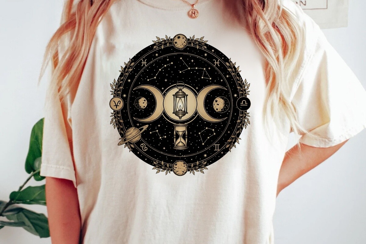
I wanted a header that told me at a glance where in the cycle I was without reading numbers, and this triple-moon-in-a-ring thing does exactly that. Waxing, full, waning, laid out like a clock face. I shrank it down and parked it at the top of every monthly page so the calendar grid below it stops feeling like a tax form. Now the whole sheet has a job before you even read a date.
The zodiac ring around the outside is the part I didn’t think I’d use and now check constantly, because it lines the signs up against the months and I plan around them more than I admit. I printed a header strip at 3×8 to test, taped it above the counter, lived with it a week. The line stays crisp small. My gripe: the ring text is tiny and the first home print turned the sign names into grey fuzz, so I bumped the darkness and reran. Fine after that.
The little witch I drop on the full-moon squares so I stop missing them
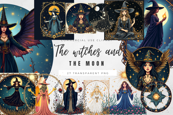
Practical confession. I kept skating past the full moon on my own calendar because every box looked the same, so I needed a stamp loud enough to catch my eye across the kitchen. This set has a witch silhouette and a few moon bits, and I plopped one in the corner of every full-moon date for the year. Now I see it from the doorway. Plant the tomatoes. Pay the friend back. Whatever the moon is reminding me of that month.
It’s playful, more Halloween than solemn, which my partner thinks is wrong for a lunar planner and I think is the whole point. A calendar you smile at is a calendar you look at. I sized the witch to about half an inch so she fits a daily box without eating it. The set comes packed with a dozen elements crammed together though, and prying one clean witch out without dragging a stray cauildron along took longer than I’d like. Patience and a steady cursor.
The floral moon I cut once and use as a real desk marker
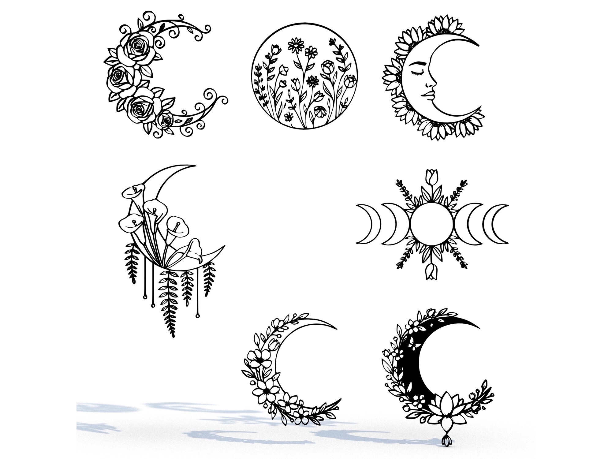
This one broke my own no-decor rule and I don’t regret it. It’s an SVG and STL bundle, so beyond printing I ran the cut file and ended up with a little floral crescent that now stands on my desk next to the planner, propped against the pencil cup. When the printed page says new moon, I turn the cut piece to face the wall. Dumb ritual. I do it every time.
For the calendar itself I used the flat floral version as a recurring corner mark on the seasonal pages, spring especially, where I want the planting notes to feel less clinical. Prints clean, the flowers hold their shape down small. The catch is the STL is genuinely for laser or 3D folks, so if you only want paper you’re paying for files you’ll never open. I knew that going in. Still felt the twinge when I saw the unused folder.
A full phase strip for the people who want every night on the page

Some months I don’t want a planner, I want the whole cycle laid out so I can see the gibbous creeping toward full before it happens. This moth-and-phases strip does that. Eight phases in a row with a moth tucked in, and I run it along the bottom margin of the month sheet as a reference band under the daily boxes. Glance down, know what tonight looks like, plan the walk.
The moth is a strange touch that grew on me. It reads like a field-guide plate, which fits the slightly nerdy way I use these. I printed the strip at 2×9 and it survived plain paper, no muddy phases, the dark side of each moon stayed properly black instead of going swampy grey. One real gripe: the moth’s wing detail is so fine it nearly disappears at strip size, so it’s basically decoration you can’t quite see. The moons are the workhorses. The moth is for me.
The dressier phase chart for the front page of the binder

I keep my twelve calendar pages in a cheap binder and the very first sheet is just a reference: the full lunar year, phases marked, nothing to write on. This mystic moth piece, floral and a bit ornate, became that cover reference because it’s the one print here pretty enough to earn the front without me wanting to scribble on it. Everything behind it is working paper. This is the lid.
It’s busier than the plain moth strip, more flourish, which is exactly why it doesn’t belong inside the planner and does belong on the cover. I printed it at 8×10 and slid it in a sleeve. Held up well, the floral lines didn’t blob even on my home printer. The honest catch is it’s almost too detailed to read as a quick phase reference, so it’s more frontispiece than tool. I have the plain strip for actual checking. This one’s just so the binder isn’t ugly when it sits out.
The sun-and-moon set I use on the equinox and solstice pages

My calendar tracks the moon but the year still pivots on the sun, so on the equinox and solstice months I wanted something that holds both. This boho sun-and-moon phases set does it in one graphic, warm and a little earthy, and I slot it onto the March, June, September and December pages right by the date that turns the season. Reminds me to actually notice the longest day instead of letting it pass.
The palette is soft terracotta and cream, which sits nicely against my otherwise plain black-line pages without fighting them. I ran a test at 4×4, liked it, kept it at that size as a corner block. Prints warm and clean. My quibble is the file leans heavily into the boho aesthetic, lots of fine dotwork, and a couple of the smaller rays got lost at the size I wanted, so I nudged it bigger than planned. Looks deliberate now. Wasn’t.
The vintage faces I scatter when a month looks too empty
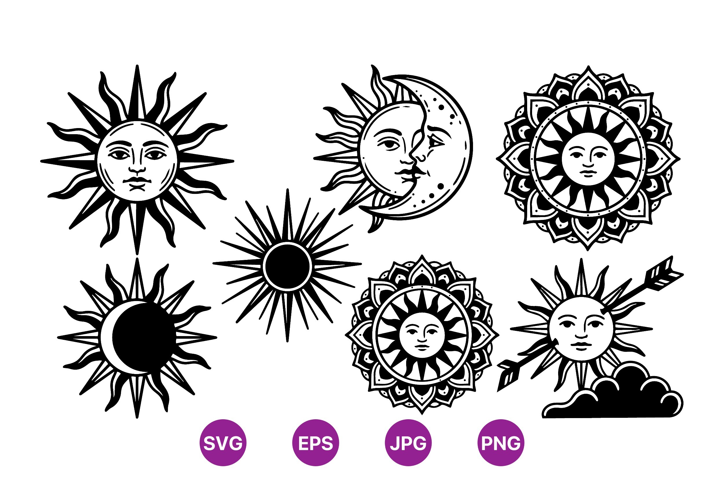
Some months on a planner are just dead, no birthdays, no events, a wall of blank boxes, and a blank month makes me stop using the calendar entirely. So I keep this vintage sun-and-moon clipart on hand purely to patch boredom. A little engraved sun face in one week, a sleepy moon in another, and suddenly the page invites a pencil instead of repelling one.
The style is that old woodcut-engraving look, fine cross-hatching, faces with expressions, the kind of thing that feels lifted from a 1700s almanac, which honestly suits a moon calendar better than anything slick would. I printed a few faces at 1×1 and they held the hatching down small, surprisingly. The catch is the JPG background isn’t transparent, so dropping a sun over a colored box meant erasing white by hand. On plain paper it doesn’t matter. On anything tinted, budget ten minutes with the eraser.
Questions I Get About These
Are moon phases predictable on a calendar?
Completely. The moon runs on a roughly 29.5 day cycle that astronomers have nailed down years in advance, which is the whole reason you can print a 2026 calendar in 2026 and trust every full moon on it. Mine has them marked to the day and it has never once been wrong, unlike the weather app sitting right next to it. That’s the quiet appeal of a printed one. The dates are locked before the year even starts.
What moon cycle are we in this month?
That’s exactly what the printed page is for, so I stop guessing. I glance at the corner mark on today’s box and it tells me whether we’re waxing toward full or waning back to new. If you don’t have a calendar up yet, step outside after dark: a moon lit on the right and growing is waxing, lit on the left and shrinking is waning, and a sky with no moon at all means you’re near the new moon and a fresh cycle is starting. Then go print the page so you stop craning your neck.
Before You Tape Anything Up
A printed moon calendar sounds precious until you’ve used one, and then it’s just the least fussy tool in the kitchen. No notifications to swipe away, no app to open, no battery. Just a page over the counter with the phases on it and enough room to write “basil” and “call mum” in the same box.
If you print one of these, do the thing I always forget to do myself: run a cheap test page first, tape it up where you’ll actually walk past it, and live with the layout for a few days before you commit a whole year to the binder. The boxes that go unused tell you as much as the ones you fill. Mine taught me I plan my whole life around the full moon and never once around the new one. Good to know.