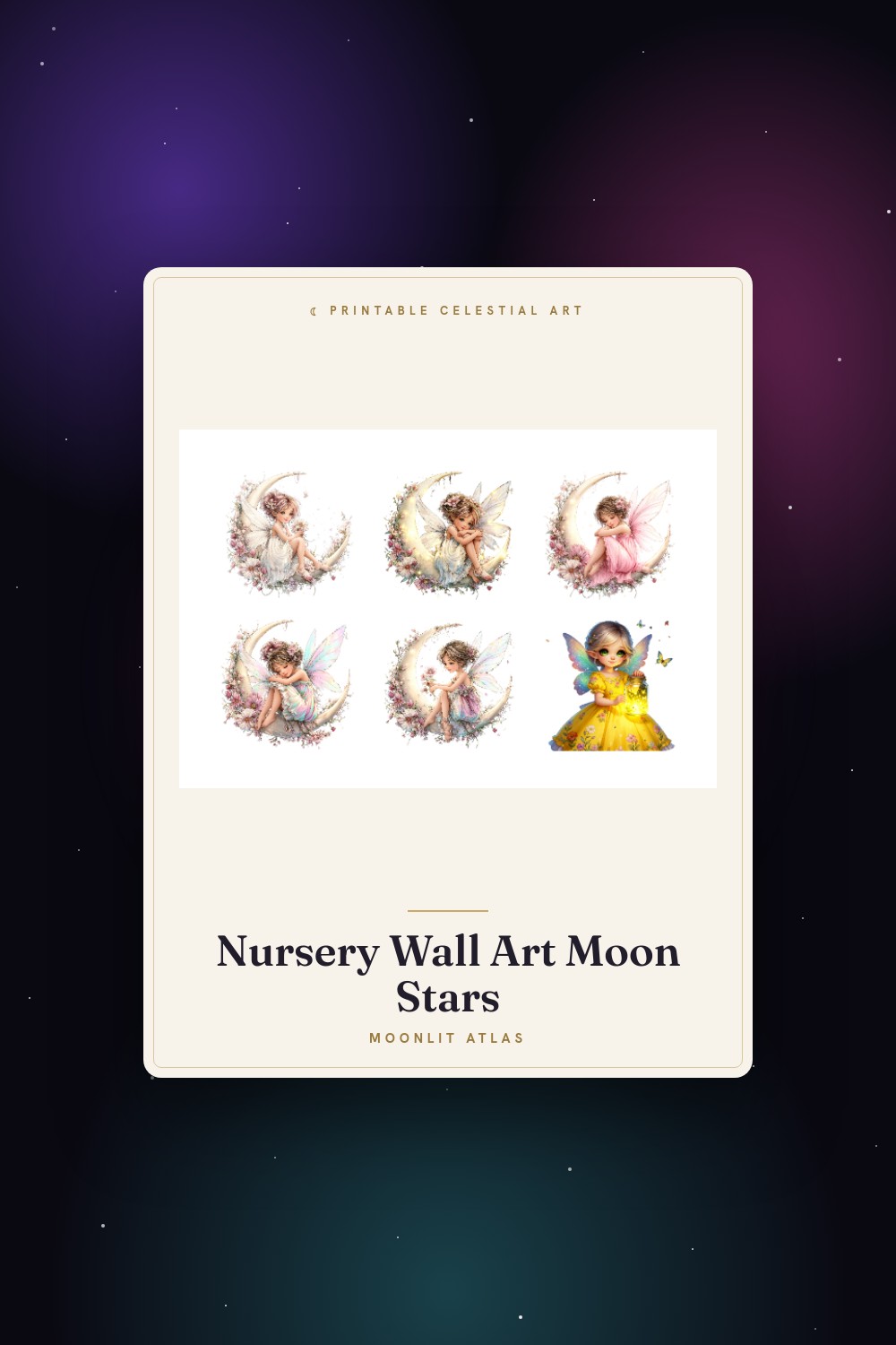
My friend Dahlia found out she was pregnant in February and decided, on principle, not to learn the sex. Her whole family pushed back. She held firm. Then she texted me a folder of nursery inspo at 11pm and said pick the prints, you’re the one with the wall obsession.
So I did. Most of what gets sold as neutral baby art is just a softer beige version of the same thing, and a lot of celestial stuff skews girl by accident the second a star turns dusty rose. I wanted a wall that read calm and a little mysterious without announcing anything. Sand, charcoal, a muddy navy, one warm ochre. Nothing that screams a sex from across the room.
These are the seven I sent her after testing them. I print everything flat at the print counter inside the grocery store on Halsey because my own printer jams on anything thicker than a receipt. I taped proofs above her unbuilt crib and stood back. A couple I yanked the same afternoon. The ones that stayed are below. Some links are affiliate links, so if you grab one a few cents wanders my way. You pay the same.
A few links below are affiliate links. If you grab a print through one, it sends a little something my way at no extra cost to you.
The sun face that anchors the whole wall
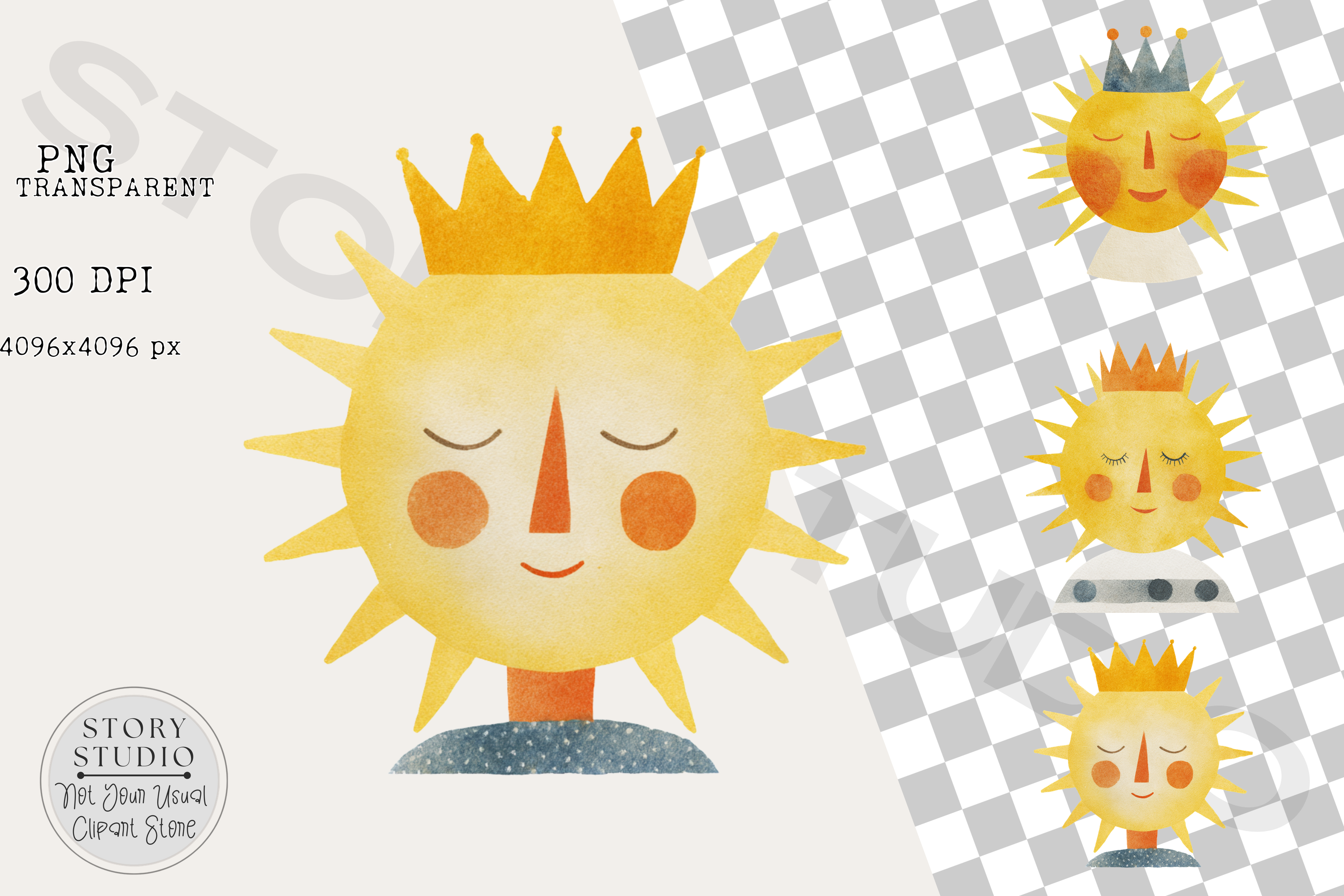
I started here because the room needed one big piece to hang everything else off of. A soft sun with a sleepy face, warm ochre and cream, no gendered cue anywhere in it. I ran it at 11×14 and hung it dead center over where the crib would go. It does the heavy lifting. Everything smaller orbits it.
Dahlia liked that the face reads gentle and not cartoonish. Babies stare at high contrast, and this has just enough of it. The mouth is a tiny curve. The rays don’t spike, they wave.
One gripe. The cream in the background printed a hair warmer than my screen showed, almost butter. Looked fine on the wall, looked off on my laptop. So preview it on paper, not glass.
The one I almost ruined the theme with
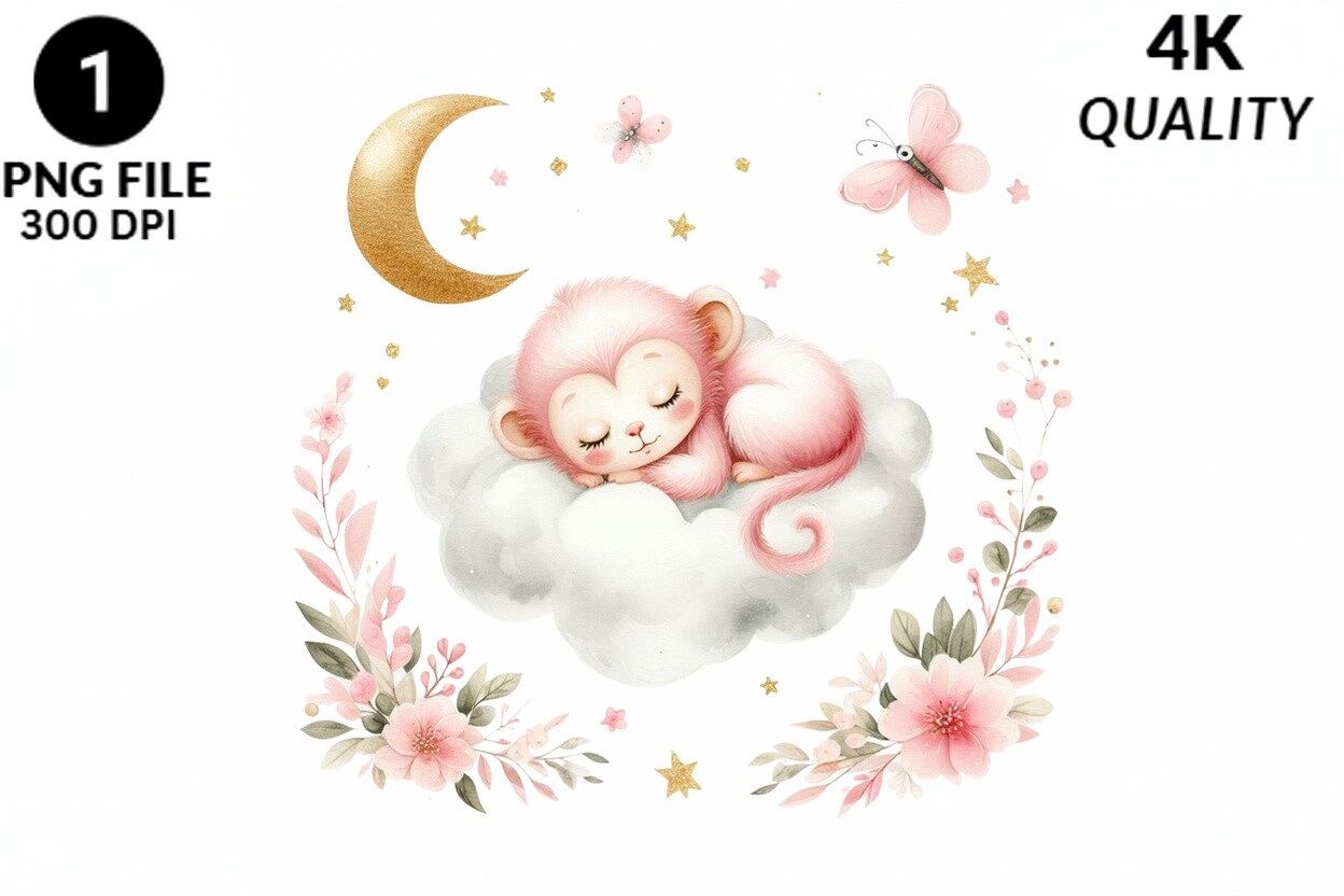
Confession. I added this against my own rule. A little monkey asleep on a cloud, and yes, the title says pink, and yes I figured I could mute it. I dropped the saturation, printed it, held it next to the sun piece. It fought everything. The pink pulled the whole corner toward a sex the parents didn’t want declared.
Then I reprinted it in grayscale and it suddenly belonged. The sleeping pose is genuinely sweet. The cloud has this soft puff to it that sits well above a changing table.
So here’s the honest note. Out of the box it leans girl hard. If you want neutral you have to strip the color yourself, which took me ten minutes and one wasted sheet. Worth knowing before you click.
Small animals, big mileage
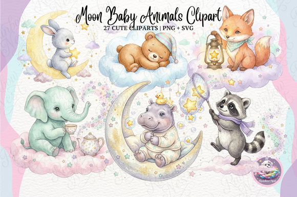
This bundle saved me. A set of tiny creatures tucked into moons and stars, drawn in a flat muted line that doesn’t pick a side. A bear, a fox, a little rabbit, all in the same dusty palette. I printed three at 5×7 and ran them in a vertical column beside the window.
What won me over was the consistency. Half the animal sets you find online look like four different artists got drunk together. These match. Same weight line, same restrained color, so a column of them reads as one thought instead of a scrapbook.
The catch is the file count. There are a lot of pieces in here and the folder structure is a bit of a maze. I spent longer than I’d admit hunting for the fox.
A whale under the moon, oddly the favorite
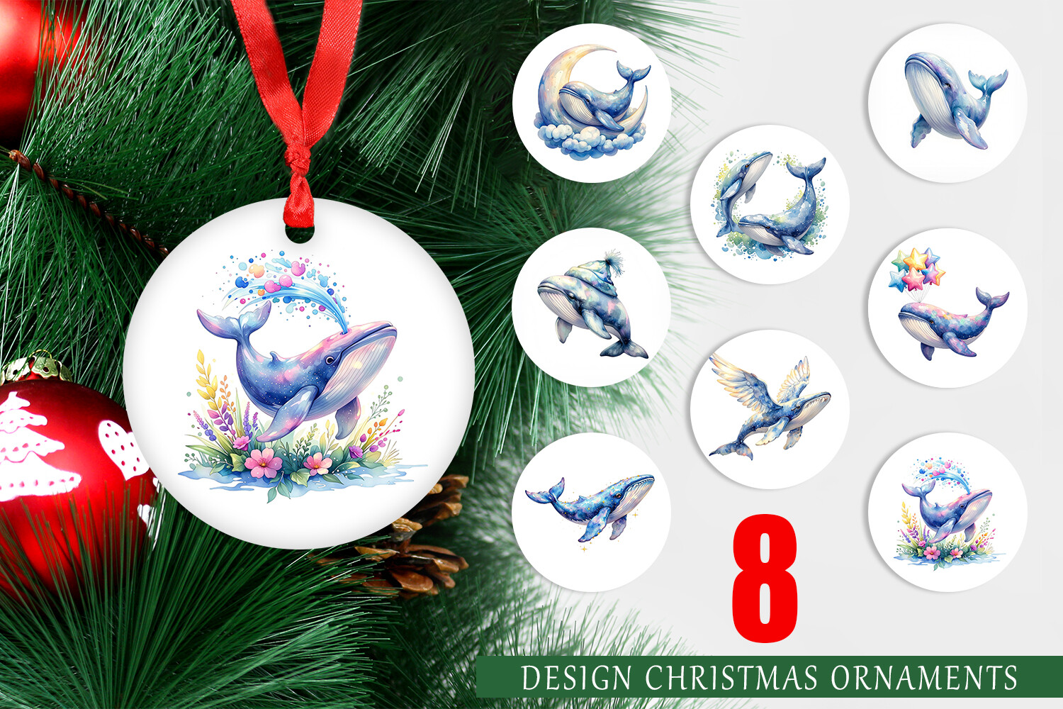
Nobody predicted this would be the piece Dahlia loved most. A whale arcing under a crescent with a scatter of stars. It’s got a deep ink-blue and a touch of teal, which sounds cold but lands soothing. I think it’s the curve of the whale. The eye goes round and slow.
I hung it low, just above the dresser where the parent stands at 3am. That’s the print you actually look at when you’re exhausted and rocking, and a calm one matters there more than the showpiece over the crib.
My one note. The stars are fine and tiny, so they want a clean print. My first proof at the cheaper paper setting smeared two of them into smudges. Bumped the quality, problem gone.
The filler set that turned out useful
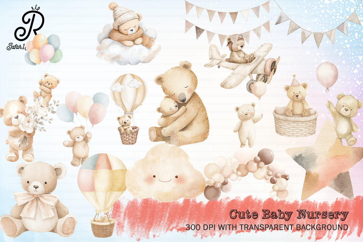
I grabbed this expecting throwaway clipart and got a surprisingly handy grab-bag. Small neutral elements, clouds, stars, a tiny moon, the sort of bits that fill awkward gaps on a gallery wall. Not centerpieces. Connectors.
Gallery walls die in the gaps. You hang three good prints and there’s this dead air between them that begs for something small. This set is that something. I printed two stars at 4×6 and slotted them between the bigger pieces, and suddenly the arrangement looked planned.
Downside, the style is a touch generic compared to the moon-animal bundle. Up close it’s plainer. From the doorway, which is the only distance that matters in a nursery, you can’t tell.
Soft edges for the corner that needed quiet
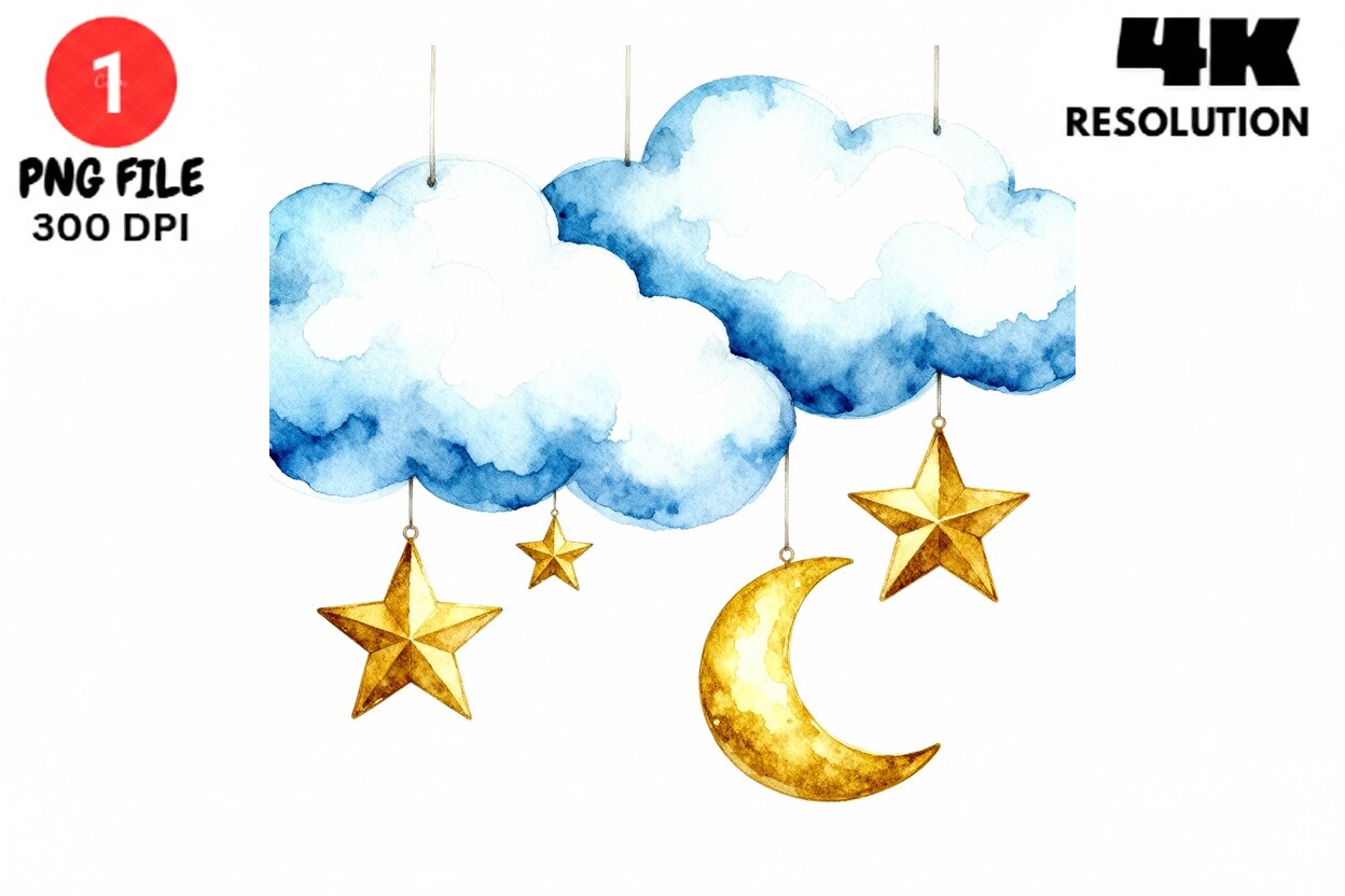
Watercolor was the right call for the reading nook. Moons, stars and clouds in a washed-out palette, edges that bleed a little. I went greige and the faintest dove gray, skipped anything that read blue or pink. It melts into the wall in the best way.
There’s a softness to watercolor that flat line art can’t fake. In the corner where Dahlia planned to nurse, harsh contrast felt wrong. This blurs at the edges and the whole nook goes quiet. I printed one big, 11×14 again, and let it dominate that small space.
The honest snag. Watercolor printing is fussy. On regular copy paper the washes looked flat and dead. I sprang for the slightly heavier matte stock at the counter, an extra ninety cents a sheet, and the depth came back. Don’t cheap out on this one specifically.
The crescent that closed the loop
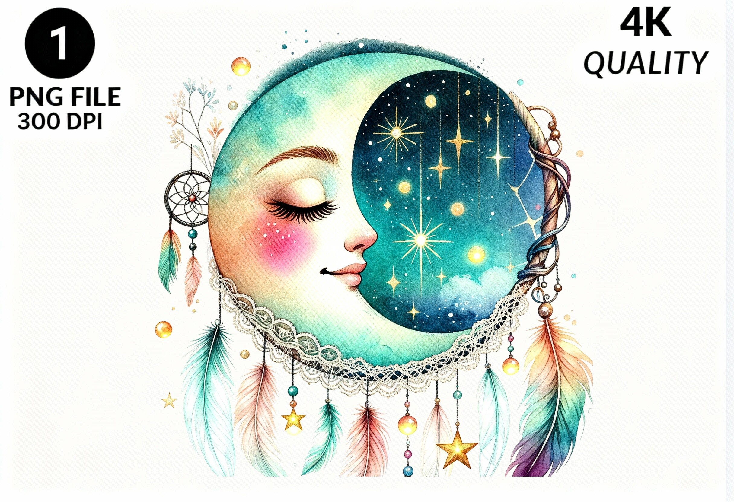
Last piece, and it ties the sun at the center to everything else. A boho crescent moon with a sleeping face, line-drawn, a hint of warm tan in the cheek. It echoes the big sun without copying it, which is exactly what a wall needs. A rhyme, not a repeat.
I hung it opposite the sun, low on the other side, so the room reads sun on one wall, moon on the other, baby in between. Dahlia teared up at that one, which I’m choosing to count as a win and not the third trimester.
My only complaint is petty. The face sits slightly off-center inside the crescent, and once I noticed it I couldn’t unsee it. Probably intentional. Still bugs me a little. Nobody else clocked it.
Questions I Get About These
How to design a baby room?
Start with one big anchor piece and a tight palette, then build outward. I pick three or four colors and refuse the rest. For a neutral celestial room I leaned on sand, charcoal, a deep ink-blue and one warm ochre, and I print proofs on paper before committing to a single frame. Stand in the doorway and judge from there. That’s the only view anyone really gets.
What age can baby sleep in a different room?
I’m not a pediatrician, so on the medical side ask yours, since guidance has shifted over the years and they know your kid. What I can speak to is the decorating side. Plenty of parents set up the separate nursery long before the baby ever sleeps in it, which is exactly when wall art goes up. Dahlia had the whole celestial wall finished months ahead, baby still in the bedside crib down the hall.
Before You Tape Anything Up
If you take one thing from this, let the room not declare a sex and it’ll age better anyway. The kid grows, the theme stays, and you’re not repainting at age four. Neutral isn’t beige and boring. It’s sand and ink and a sleeping whale, and it holds together because you held the palette tight.
Dahlia’s wall went up in a weekend once I’d stopped second-guessing the pink monkey. The baby arrives in August. I keep telling her I’ll come hang the last two frames properly, and we both know I’ll do it badly and she’ll fix them after I leave. Some things don’t change.