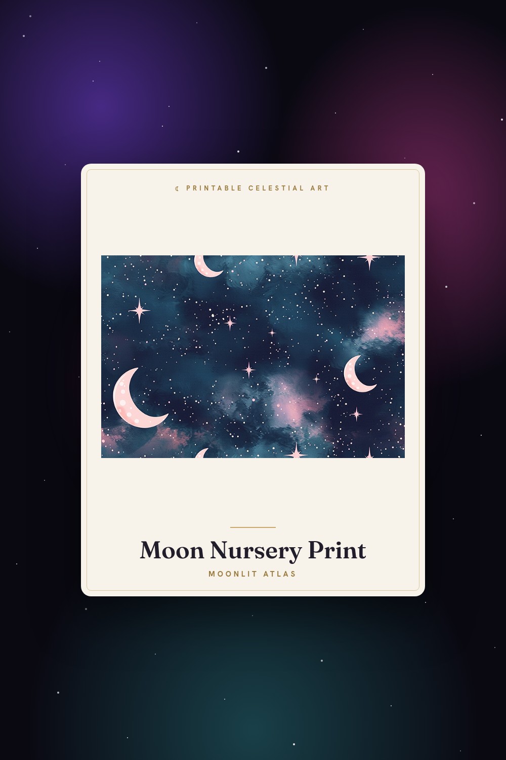
My sister’s nursery faces a brick wall on Decatur, so the room never gets real morning light. She kept saying it felt like a basement. I brought over three little sun and moon prints one Saturday, taped them above the changing table with the blue painter’s tape I steal from my own hallway, and the corner finally looked like somewhere a baby lives instead of a storage nook.
The thing with nursery art is that cute curdles fast. A sun face that looks sweet on a phone screen can look smug at 8×10. I learned this the hard way. I printed one with eyelashes that, once it was up over the crib, looked like it was judging the diaper situation. Came right back down.
So here are the ones that survived the wall. I run everything through the same flat template, print test copies on cheap 24lb at the copy shop two blocks down, and hold them up in the actual room before I commit. A nursery is small. You see these prints at 3am, half awake, and they have to feel kind. Some links below are affiliate links, so if you grab one a little something comes my way. Doesn’t cost you a cent.
A few links below are affiliate links. If you grab a print through one, it sends a little something my way at no extra cost to you.
The fairy moon set that softened a whole corner
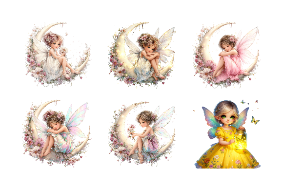
I reached for this first because it doesn’t try too hard. Little moons, a few fairy shapes, nothing sharp or loud. I printed two at 5×7 and stacked them vertically beside the window, and the corner stopped looking like an afterthought.
What I keep coming back to is how gentle the line is. A lot of fairy art goes glittery and busy, the kind that fights with a mobile and a swaddle blanket and everything else already happening in a nursery. This one sits back. My niece is six months and tracks the bigger moon shape when she’s on the changing table, which I did not expect and now find very smug about my choices.
One small gripe. A couple of the tiny fairies get fussy when you shrink them down, the wings blur a touch. I dropped those and used the cleaner moons. Plenty to work with.
A sun and a moon that actually look happy, not creepy

Faces are where nursery art goes wrong. I’ve printed sun faces that came out looking either bored or vaguely threatening. These don’t. The sun grins, the moon has this calm half-asleep look, and side by side over the crib they read like a tiny bedtime story.
I did the pair at 8×10 in plain white frames from the thrift store on Magazine, two dollars each, and honestly they carry the wall. My sister wanted day on one side and night on the other, sun by the window, moon by the door, and it just works without me explaining the idea to anyone.
The catch is the color. The yellow prints a little flat on cheap paper, went almost mustard on my first test. I bumped it slightly before the real print and it warmed right up. Worth the extra pass.
One crescent moon, doing a lot of quiet work
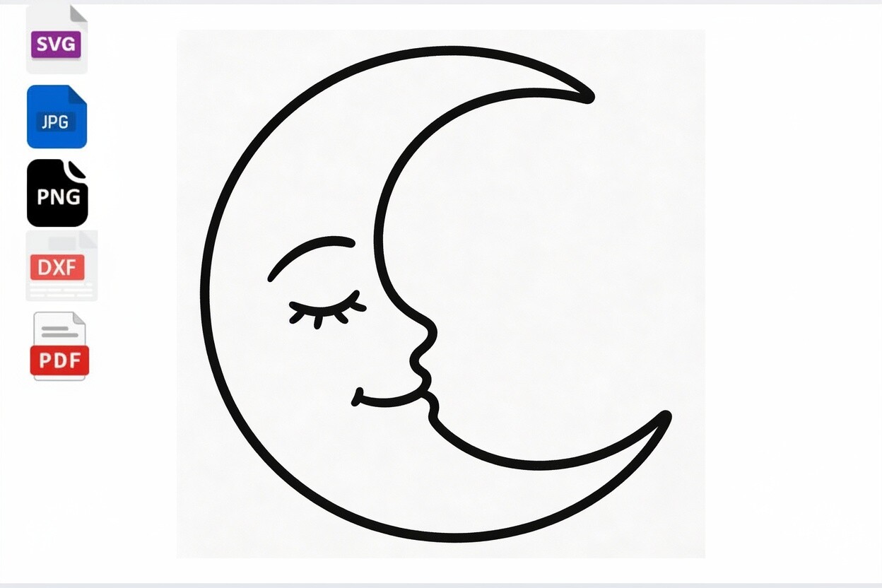
Sometimes you don’t need a set. You need one small thing above the nightstand. This little crescent with a sleeping face is that thing. I printed it tiny, 4×6, and slid it into a frame I already had, and it did more than the big print I’d been planning.
The face is the whole point. Eyes closed, soft curve, the expression of something that finally fell asleep at 2am after a long fight about it. Which, in a nursery, is the dream. My brother-in-law said it was the first piece of baby decor he didn’t quietly hate, and that man hates everything.
It’s billed for crafts more than wall art, so the file is built simple. Fine for a small print. I wouldn’t blow it up past 5×7 though. Push it bigger and the clean little face starts looking bare on the wall.
Moon phases for the parent who wants it a touch grown-up
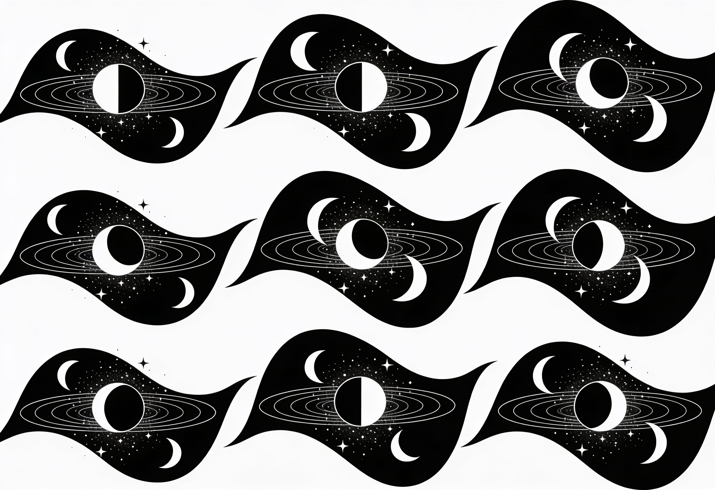
Not every nursery wants cartoon faces. My friend on Prytania did her whole room in sage and cream and wanted the celestial thing without anything cutesy. This phases-and-stars set was the answer. Eight moons in a row, scattered stars, calm enough to grow with the kid.
I printed the phase strip long and skinny to run above the crib like a header, and it anchored the wall in a way a single square never did. The black holds. Some moon art goes muddy and gray when you print it small, this one stayed crisp across the hall, which is my one real test. A toddler will still like it. A teenager won’t be embarrassed by it. That’s rare.
My gripe is the stars. There are a lot of them, and a few land too close to the moons and clutter up. I deleted maybe a third before printing. Took two minutes and made it breathe.
A soft watercolor piece that isn’t trying to be a poster
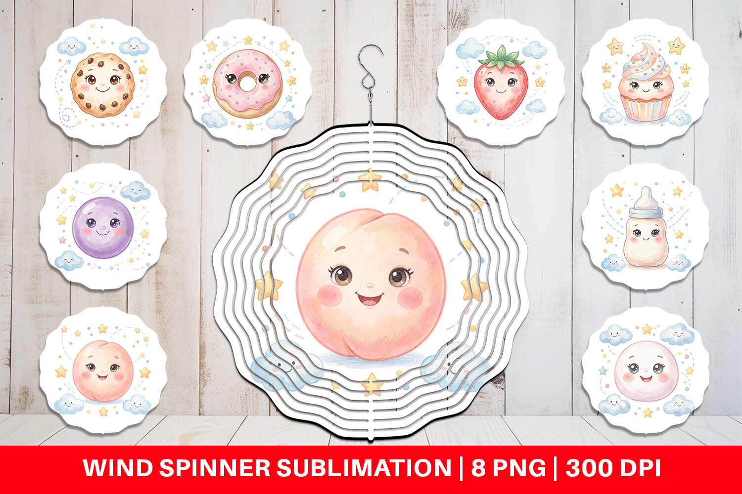
This one surprised me. It’s sold as a wind spinner design, not wall art, but the watercolor babies-and-sweets look is so gentle I printed it flat anyway and framed it small by the door. Reads like a little painting instead of a graphic, which a lot of nursery files can’t pull off.
The colors are the win. Washed-out pinks and creams, nothing neon, the palette that actually matches the muslin blankets people already own. I held a test up next to my sister’s curtains and it sat right in. No fighting. That softness is hard to find in a printable.
Now the honest part. It’s built round, for a spinner, so cropping it square for a frame takes a minute of fiddling and you lose a little off the edges. Worth doing, but go in knowing you’ll be nudging it around in your template first.
The tumbler-wrap version I cut up for a tiny gallery
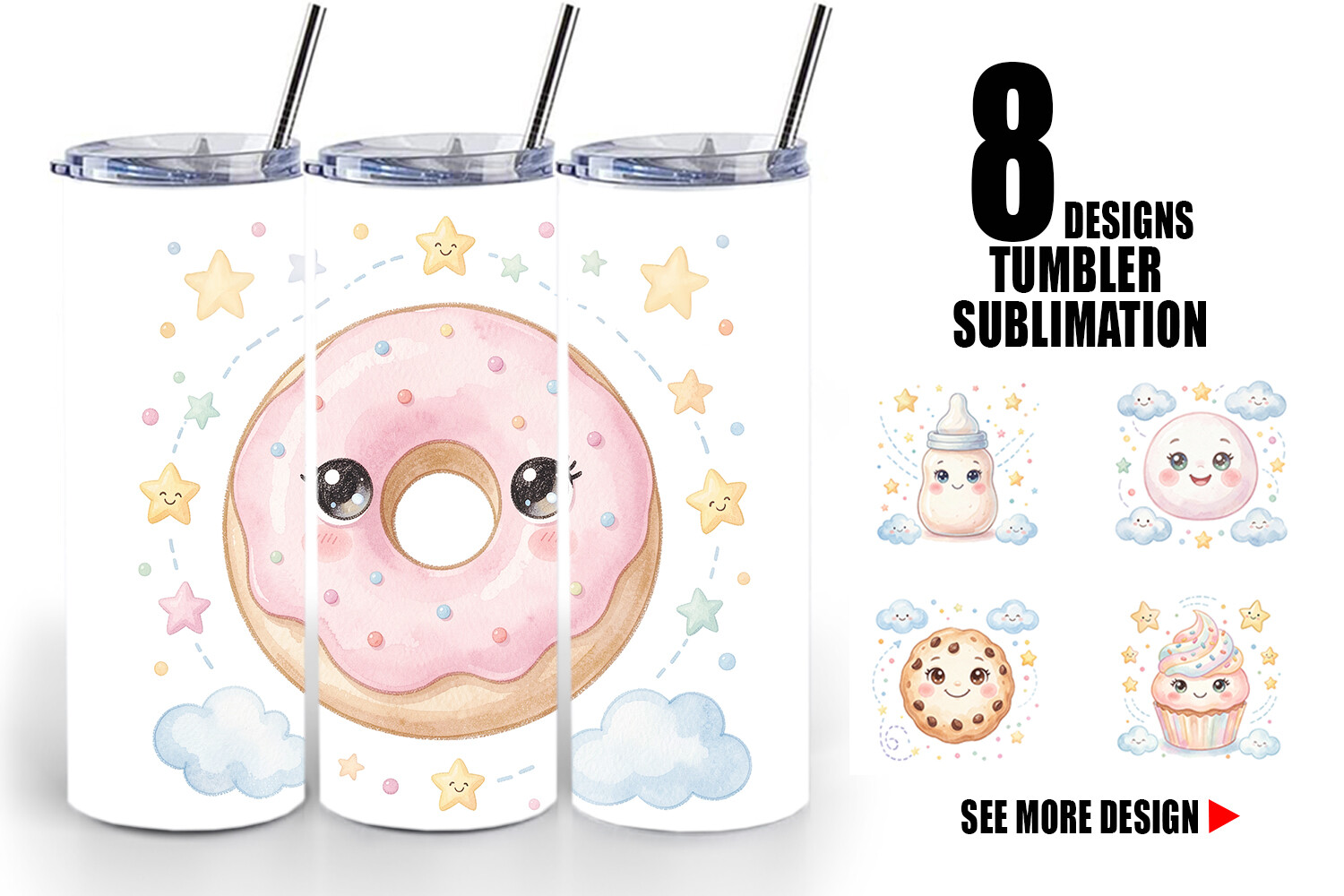
Same sweet watercolor world as the spinner one, but laid out long for a tumbler. I almost scrolled past it. Then I realized a wrap is basically a wide strip of art, and a wide strip slices into three small matching prints really nicely.
That’s what I did. Cut it into three little 4×4 squares, framed them in a row above the dresser, and got a tiny gallery wall out of one file. The repeated palette ties the whole thing together so it never looks like random clipart stuck on a wall. For a nursery that needs to fill horizontal space, this trick works hard.
The gripe is resolution at the edges. Wraps are built to curve around a cup, so the far ends get a bit soft when you flatten and crop. I kept the strong middle section for my squares and tossed the ends. Plenty left over.
A mug design that became the smallest print on the wall
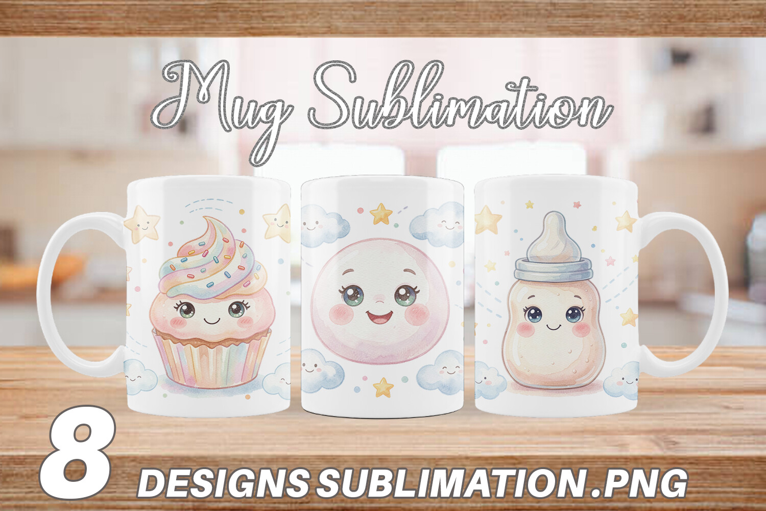
Last one, and it’s the runt of the bunch, in a good way. A mug wrap, so it’s small and contained, one sweet little watercolor scene. I printed it at 4×4 and tucked it low near the light switch where a grownup wouldn’t notice but a kid being carried past would.
What I like is that it knows it’s small. No busy background, no crowded edges, just one clear little image that holds up tiny. So many nursery files fall apart when you shrink them. This one was made compact, so printing it small isn’t fighting the file, it’s the file doing what it was built to do.
My one note, and it’s picky, the white space around the art is uneven. I had to recenter it in my template before it looked deliberate in the frame. Two minutes. After that it sat there like it had always been part of the wall.
Questions I Get About These
Should baby room have a night light?
A soft one helps, mostly for the grownup doing the 3am feeds. You want low and warm, not bright, so nobody fully wakes up. I’d skip anything blue or harsh. The moon prints don’t glow, obviously, but a dim amber light near the crescent print made my sister’s nursery feel calm instead of pitch black.
What age can baby sleep in a different room?
Most guidance lands around six months at the earliest, often closer to a year, but this is a talk-to-your-pediatrician thing and not something a print blog should rule on. What I’ll say from the decorating side: by the time the room is theirs, a moon and stars wall over the crib makes the transition feel a little softer for everyone.
Before You Tape Anything Up
None of these are precious. I printed them on cheap paper, held them up in a small room with bad light, and kept the ones that still felt kind at 3am. That’s the whole bar. A nursery wall isn’t a design statement, it’s the thing a half-asleep parent stares at while a baby decides whether to go back down.
So grab the one that made you feel something, print a test before you frame it, and live with it taped up for a few days. If it still makes the corner feel softer by Friday, it’s a keeper. If it starts judging you over the changing table, you already know to take it down.