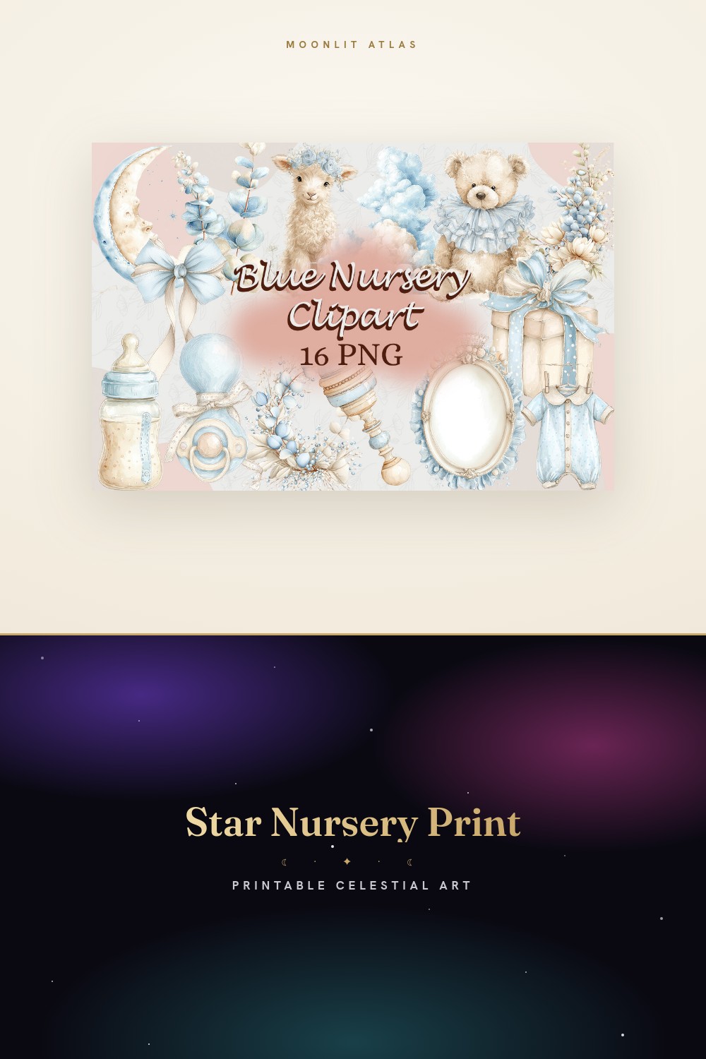
My sister-in-law gave me eleven weeks of notice and a nursery the size of a walk-in closet. Carlisle Street, second floor, one window that faces a brick wall. She wanted stars. She also wanted it done before the shower, which was a Saturday in March, which meant I had a weekend and a printer that jams if you so much as look at cardstock.
Here’s what I learned hanging baby decor that I did not learn hanging my own. A nursery is not one wall. It’s the wall over the crib, the strip by the changing table, the dead corner everyone forgets until the rocking chair goes there. You can’t just slap a moon above the crib and call it cosmic. The room reads as a whole or it reads as a sticker sheet someone exploded. I got that wrong twice before I got it right.
So below are the pieces that survived the test. I printed every one of them at the copy shop two blocks over, taped the proofs up with painter’s tape, and made her live with them for four days before anything got framed. Some of these links are affiliate links. Grab one and a few cents finds its way to me. Doesn’t change your price.
A few links below are affiliate links. If you grab a print through one, it sends a little something my way at no extra cost to you.
Celestial nursery decor wall prints that start with the small stuff

Funny place to start, I know. This is a wrap, not a wall print. But I pulled the soft washed palette off it and ran with that for the whole room. Dusty blue, a little peach, nothing screaming. I printed the artwork flat at 4×6, popped it in a thrifted brass frame, and stood it on the dresser next to the wipes. Looked intentional. The grandparents asked where she bought it.
The washes are the selling point. They don’t go chalky when you shrink them, which is more than I can say for half the nursery files I’ve ruined at small sizes. I held a proof up under the one window on Carlisle Street and it still had depth in bad light.
One gripe. It’s built as a can wrap, so the artwork wants to live in a tall skinny band. You’ll be cropping if you want a square frame. Took me three tries to crop it without lopping a star in half.
Celestial themed nursery decor pieces hiding in the paper pack

Digital paper sounds boring until you cut it up. I used a couple of these sheets as backing inside the frames, behind the actual prints, so the mats had a soft starry tint instead of flat white. Cheap trick. Reads expensive.
The patterns repeat cleanly, so I sliced one sheet into three frame backers and nobody could tell they came from the same page. I also lined a shelf edge with a thin strip of it, which my sister-in-law did not ask for and now refuses to remove.
Watch the scale. A couple of the motifs are tiny, and from across a nursery they vanish into a blur. Pick the bolder sheets for anything going on a wall and save the busy ones for backers. I learned that after framing one that looked like static from the doorway.
Tiny accents that earn their corner of the room

Baby animals under little moons. I was skeptical. Cutesy is a fast road to that 2009-ceiling problem. But printed small and framed in a cluster of three by the changing table, they pulled the whole serious starry thing back toward, you know, an actual baby’s room.
I did mine at 3×3 in matching white frames, hung in a tight triangle. The trick was restraint. Three, not seven. The file gives you a bunch of the little critters and the instinct is to use them all. Don’t. A nursery wall that’s all animals is a zoo, not decor.
The catch is the line weight. Up close the outlines are crisp, but the copy shop’s first run came out a touch thin and pale. Bumped the contrast, reprinted, fine. Just don’t trust the first proof.
The moon face that anchors the crib wall
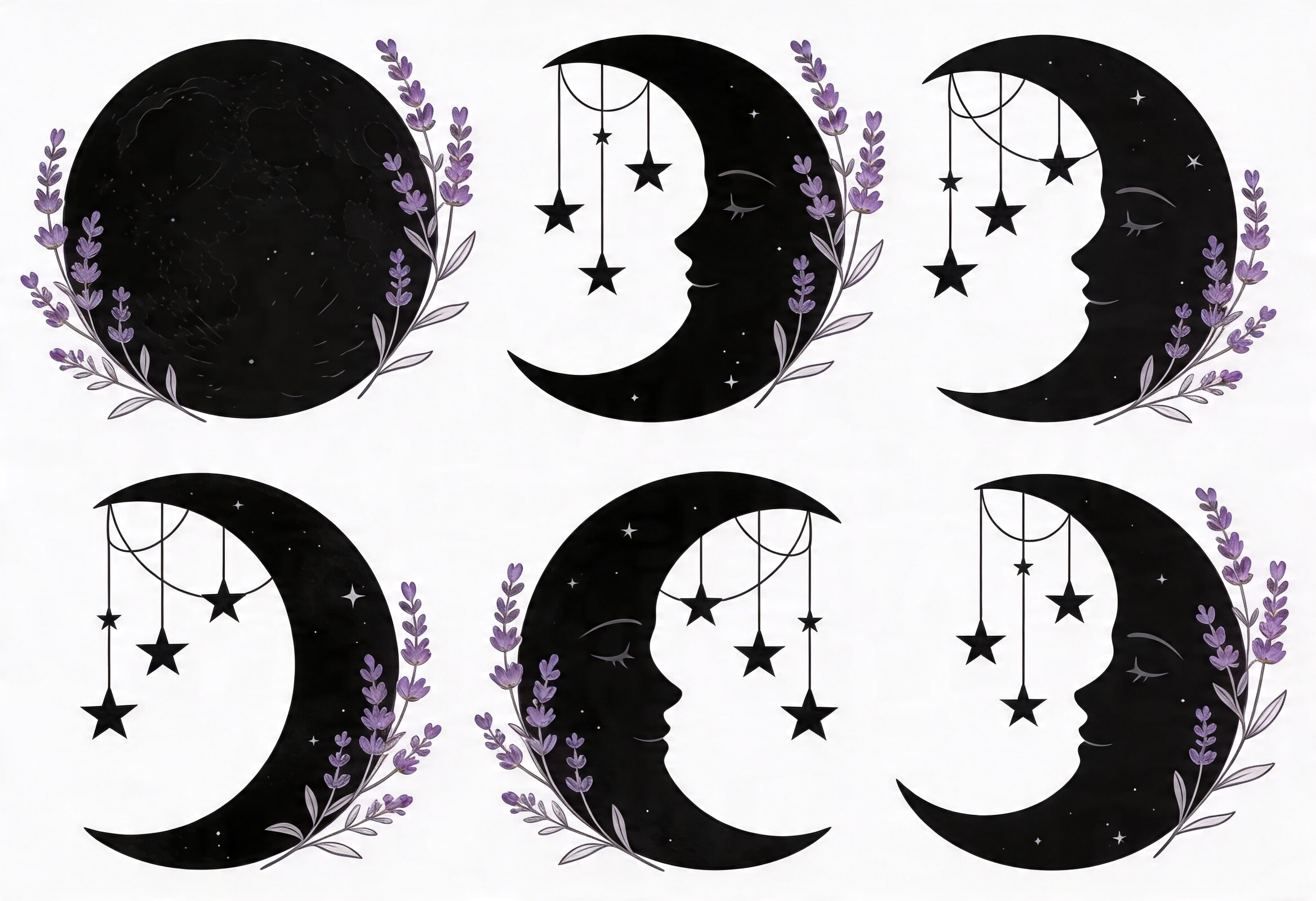
Every nursery needs one piece that’s clearly the main event, and this was it. A sleeping moon, lavender wash, a scatter of stars around the face. I went big here. 11×14, single frame, dead center over the crib. The rest of the room orbits it.
Lavender was the gamble. I usually steer nurseries toward blue or warm neutral, but the purple here is muted enough that it reads calm instead of candy. My sister-in-law cried a little when I taped the proof up, which I’m choosing to count as a win and not as third-trimester hormones.
My one note. The face has a lot of fine shading, and that’s exactly the kind of detail a home printer murders. I would not attempt this on a desktop inkjet. Pay the two dollars at the copy shop. The shading is the whole point and a bad print flattens it into a gray smudge.
Boho rainbow set for the dead corner by the rocker

There’s always a corner. In this room it was behind the rocking chair, too shadowed for anything detailed. So I needed shapes, not shading. This set is exactly that. Sun, moon, stars, a soft arched rainbow, all bold simple line.
I printed the rainbow on its own at 8×10 and the sun and moon smaller beside it, stair-stepped up the corner so your eye climbs. Boho is a word that makes me wince but the look held. Clean enough not to clutter the shadow, warm enough to fill it.
Honest gripe. The palette skews a little muddy on the rainbow bands if your printer runs warm, like the copy shop’s does on Tuesdays for some reason. I asked them to cool the output and it fixed it. If you can’t tweak that, the moon and stars alone hold up fine and you can skip the rainbow.
Mixing and matching the lavender line set
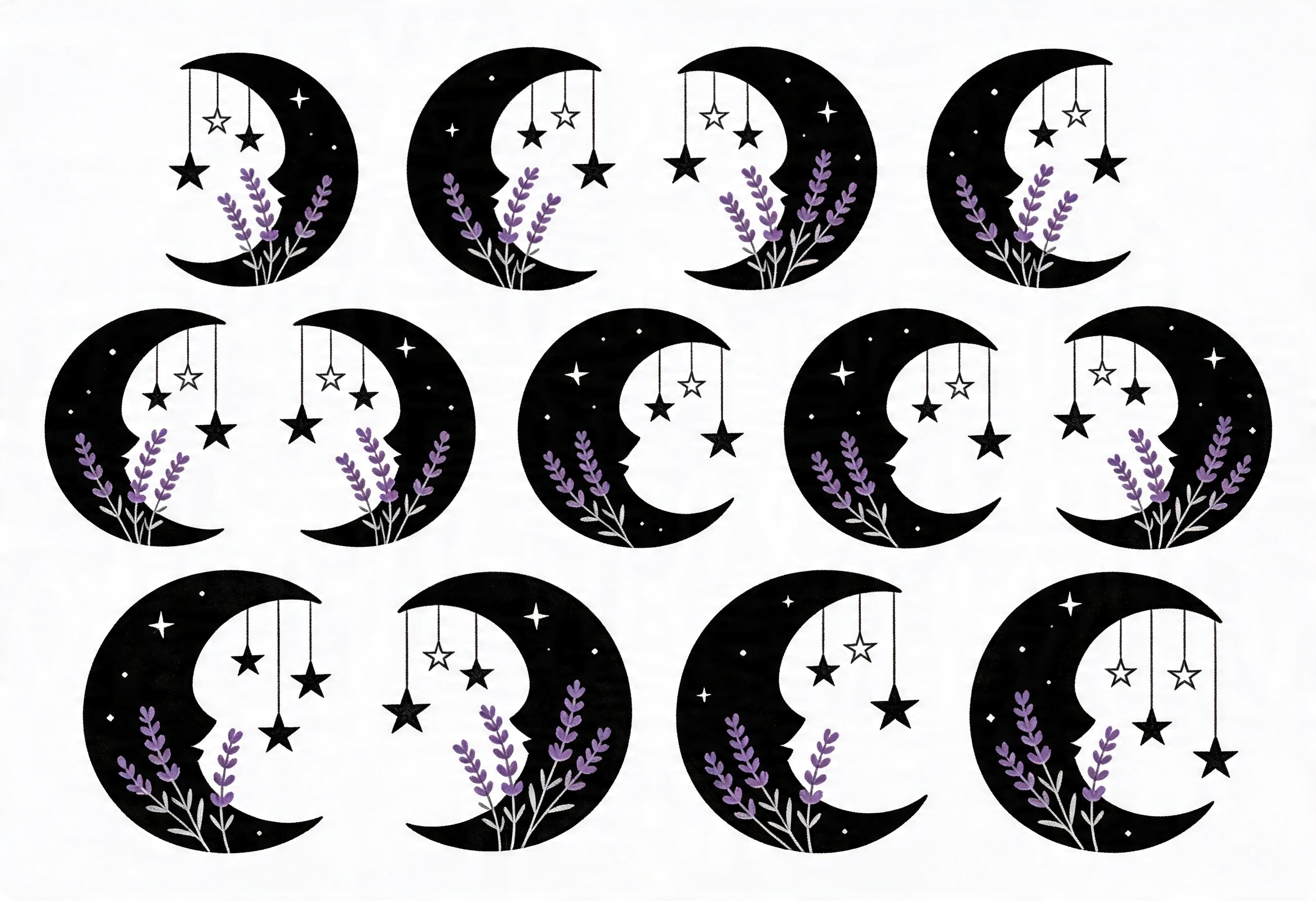
This is the line-art companion to the painted moon over the crib, same lavender family, and pairing them was the move that made the room feel designed instead of assembled. Crescents, stars, a few dotted orbit lines. Simple by design.
I scattered three of these as small prints down the strip by the changing table, in slim frames, leaving real space between them. The matching palette did the heavy lifting. Suddenly the big moon and the little animals and these were obviously one family, not three shopping trips.
The one thing that bugged me. A couple of the star shapes are nearly identical, so if you’re not careful you frame two of basically the same thing and it looks like a mistake. I laid all the options out on the floor first, picked the three that differed most, recycled the rest. Five minutes that saved the wall.
Celestial nursery printable bundle to tie the whole room together

If you only grab one thing off this list, maybe this. It’s a watercolor moon-and-stars collection broad enough to seed a whole room from a single download. I pulled the crib-wall accent, two changing-table prints, and a shelf piece all out of this one set, which is why the room hangs together.
The paint quality is the real draw. Soft edges, that bleed where two colors meet, the kind of thing that prints with actual texture instead of going flat. I ran a test on plain 24lb paper first, because my home printer chokes on anything heavier, and even the cheap proof had life in it. The copy-shop version on decent stock was lovely.
My complaint is volume. There’s so much in here it’s genuinely hard to choose, and I burned an hour pulling pieces I never used. Set a number before you open it. I told myself four prints, ended up with six, and even that was discipline.
Questions I Get About These
How to design a baby room?
Start with the room as a whole, not a single wall. I map three zones every time: the crib wall, which gets one larger anchor piece, the changing-table strip, which gets a few small prints with breathing room between them, and the forgotten corner where the chair lands, which needs bold simple shapes because it’s usually dim. Pick one palette and pull everything from it. On Carlisle Street that was lavender, dusty blue, a little peach. Tape paper proofs up with painter’s tape and live with them for a few days before you commit to frames. The wall always lies on day one and tells the truth by day three.
Should baby room have a night light?
I’m a decor person, not a pediatrician, so take this as a framing answer and not medical advice. A soft warm night light helped the parents I did this room for, mostly for 3am diaper changes without flipping on the harsh overhead. The thing worth knowing for decor: a dim warm bulb changes how your prints read at night. The lavender moon over the crib goes almost gray under a cool white light and stays soft under a warm one. I’d pick the bulb and the art in the same afternoon so they don’t fight each other after dark.
Before You Tape Anything Up
The shower happened. Saturday in March, raining, the brick-wall window doing it no favors, and the nursery still looked calm. Three zones, one palette, painted moon over the crib doing the heavy lifting while the little animals and the line art filled in around it. Nobody noticed the digital-paper trick behind the mats, which is exactly how you know it worked.
If you take one thing from me it’s this: don’t decorate a nursery wall, decorate a nursery. Print flat, tape it up, give it three days. The cheap copy shop two blocks over will save your shading and your sanity. And set a number before you open any bundle, because I will absolutely buy six prints when I needed four, every single time.