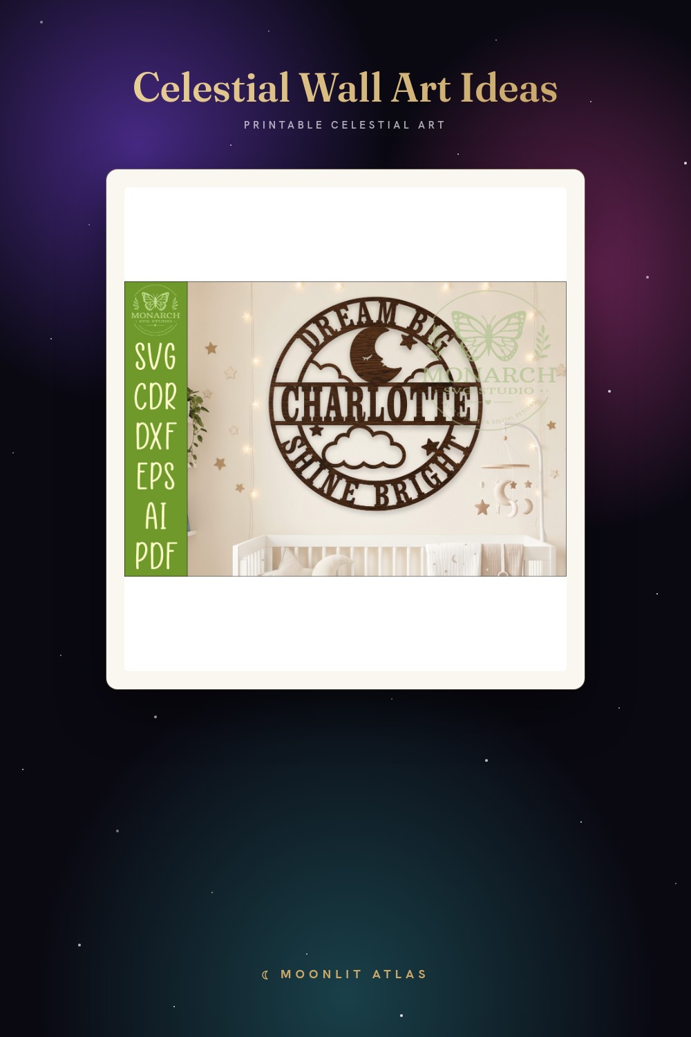
Here is the mistake I keep watching people make, because I made it first and made it loud. They love a celestial print at thumbnail size, order the biggest version because bigger feels like more value, and end up with a four-foot moon hovering over a loveseat like it is about to land. Scale is not loyalty. The print does not love you back for buying it huge.
I hang everything in a rental hallway that is exactly 38 inches wide, which I have measured more times than I will admit, and that narrow strip taught me sizing better than any chart could. A 16×20 in there reads like a billboard. An 8×10 disappears into the trim. The right number lives in a tiny window between those two, and the only way I ever find it is by taping paper to the wall and walking past it for three days.
So this is not a chart. It is the sizes I actually committed to, attached to the moments I learned them. A few of these are tumblers and bookmarks rather than framed prints, and I will be honest about that as I go, because the size lesson came through them too. Some links below are affiliate links. Grab something and a few cents wander my way. Your total does not move.
A few links below are affiliate links. If you grab a print through one, it sends a little something my way at no extra cost to you.
The tumbler that taught me to test a pattern small first
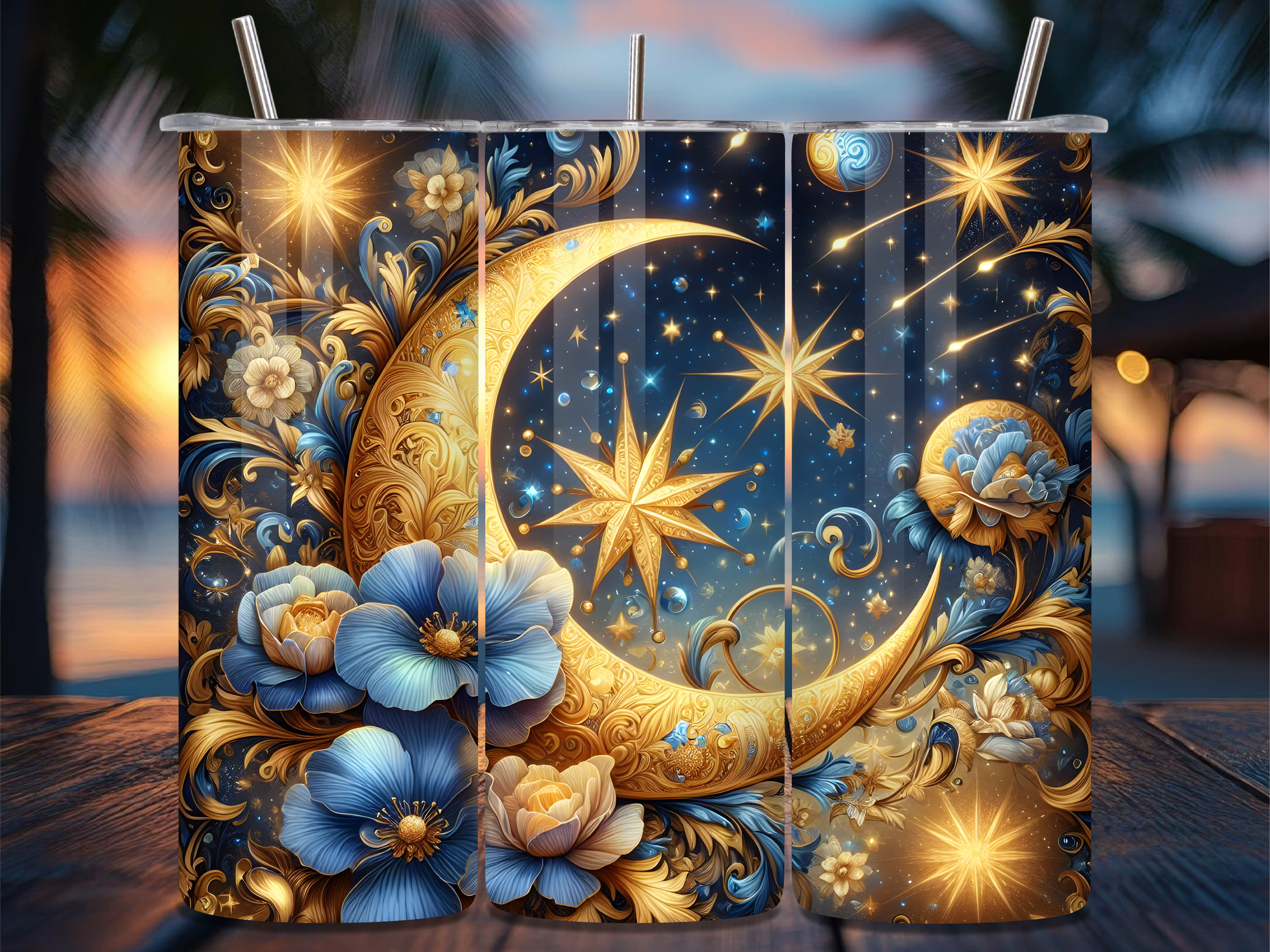
I almost printed this exact star-and-floral pattern as a big 18×24 for my kitchen nook. Glad I didn’t. I grabbed it on the tumbler version instead, basically by accident, and watching the blue florals wrap around a curved 20oz cup is what saved me forty dollars and a wall. The pattern is busy. At poster size it would have eaten the room.
Small is where this design actually breathes. On the tumbler the stars catch light when you turn it, the blue stays deep instead of going flat. My downstairs neighbor saw mine and asked where the “painting” was, and I had to point at a coffee cup.
One gripe. The florals run dense near the seam, so if you’re wrapping a tumbler yourself, line up the lightest section at the join or it bunches visually. I redid mine once. Second try held.
Gold zodiac, and why I stopped trusting a screen for scale
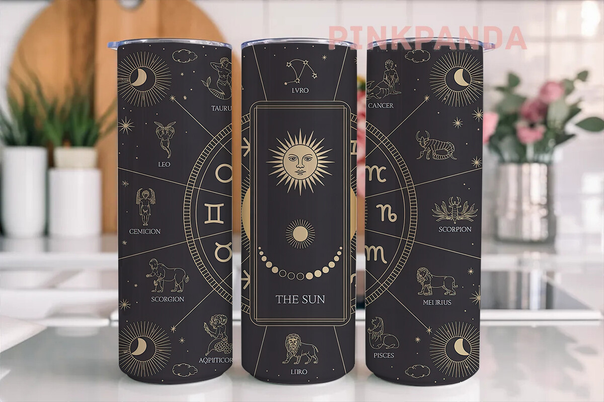
This is the one that broke my habit of judging size off a laptop. The gold zodiac wrap looked delicate on screen, the kind of thing I assumed I’d want printed enormous and framed. Then I saw it at actual 20oz wrap dimensions and the gold lines have weight up close that gets lost the bigger you push them. Tiny constellations want a tiny canvas.
I gave one wrapped tumbler to a coworker who reads her horoscope at her desk every morning, and she texted me a photo of it next to her monitor. It holds the desk perfectly. Would have looked thin and lost on a six-foot wall.
The catch is the gold reads warm on matte, sharp on gloss, and the listing leans warm. If you want the crisp version, plan for a glossy finish. I learned that after the fact, holding a duller print than I expected.
A constellation hat, and the case for art you carry

Not everything needs a frame and a stud finder. The witching-hour constellation design I’d been agonizing over for a wall ended up working better pressed onto a hat, and that reframed the whole sizing question for me. The constellation fills the front panel at maybe three inches across and it is plenty. On a wall I’d have blown it up and lost the fine star detail.
My cousin wears hers on every dog walk now. The design at small scale stays legible from across the street, which is more than I can say for half the giant prints I’ve taped up and squinted at.
Honest note. The PNG has a transparent edge that looks clean on dark fabric and muddy on light. I tested it on a black cap and a cream one. Black won, easily.
The grimoire cover that finally taught me proportion
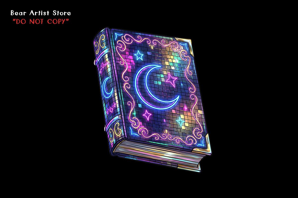
I printed this one at 11×14 first, leaning it on a shelf, and it looked off in a way I couldn’t name for a week. Too much empty around the central moon. The design wants to fill its frame edge to edge, and 11×14 gave it too much air. I reprinted at 8×10 and suddenly the proportions clicked. Same art, completely different read, purely because of the border.
That is the lesson hiding in here. With a dense centered design like this, going smaller tightens it. Going bigger just adds dead margin you’ll keep noticing.
My quibble is the deep black background shows every speck of dust under glass, so frame it last, after the room’s settled and you’ve stopped touching the glass with your thumbs. I did not. There’s a print in my closet with a permanent fingerprint.
A whole bundle, which is how I learned to mix sizes on purpose
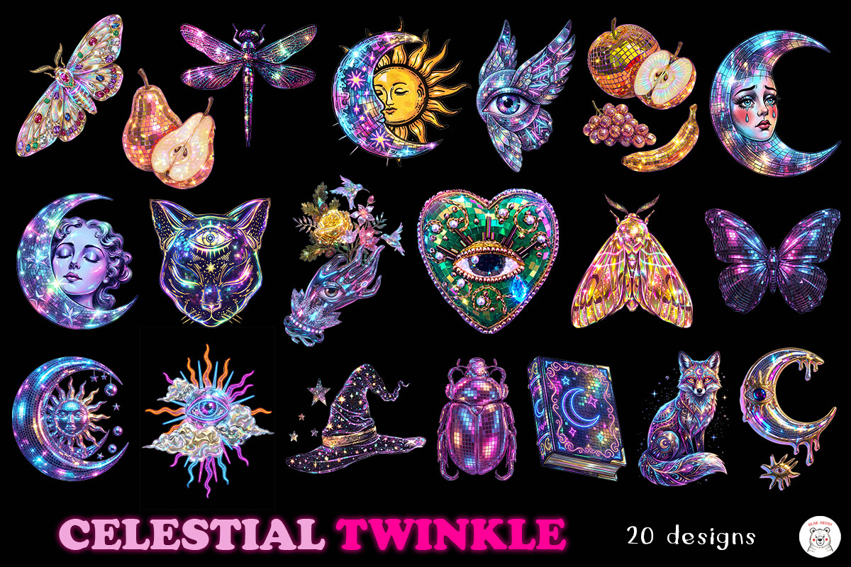
This bundle is what cured me of hanging everything at one uniform size like a hotel corridor. There are enough pieces here to do a real cluster, and a cluster only works when the sizes argue a little. I ran two at 5×7, one at 8×10, one tiny 4×6, and let them sit off-center above a low bookshelf. The mismatch is the whole point.
I did this on a slow Thursday in March when I should have been doing taxes. Taped all of them up with painter’s tape first, shuffled them for an hour, photographed it, lived with it overnight. Moved exactly one piece in the morning. That’s the process.
The one snag is the disco shimmer effect prints flatter than it previews, so don’t expect literal sparkle. It reads as texture, not glitter. I was briefly disappointed, then wasn’t.
A bookmark, and the smallest format I take seriously
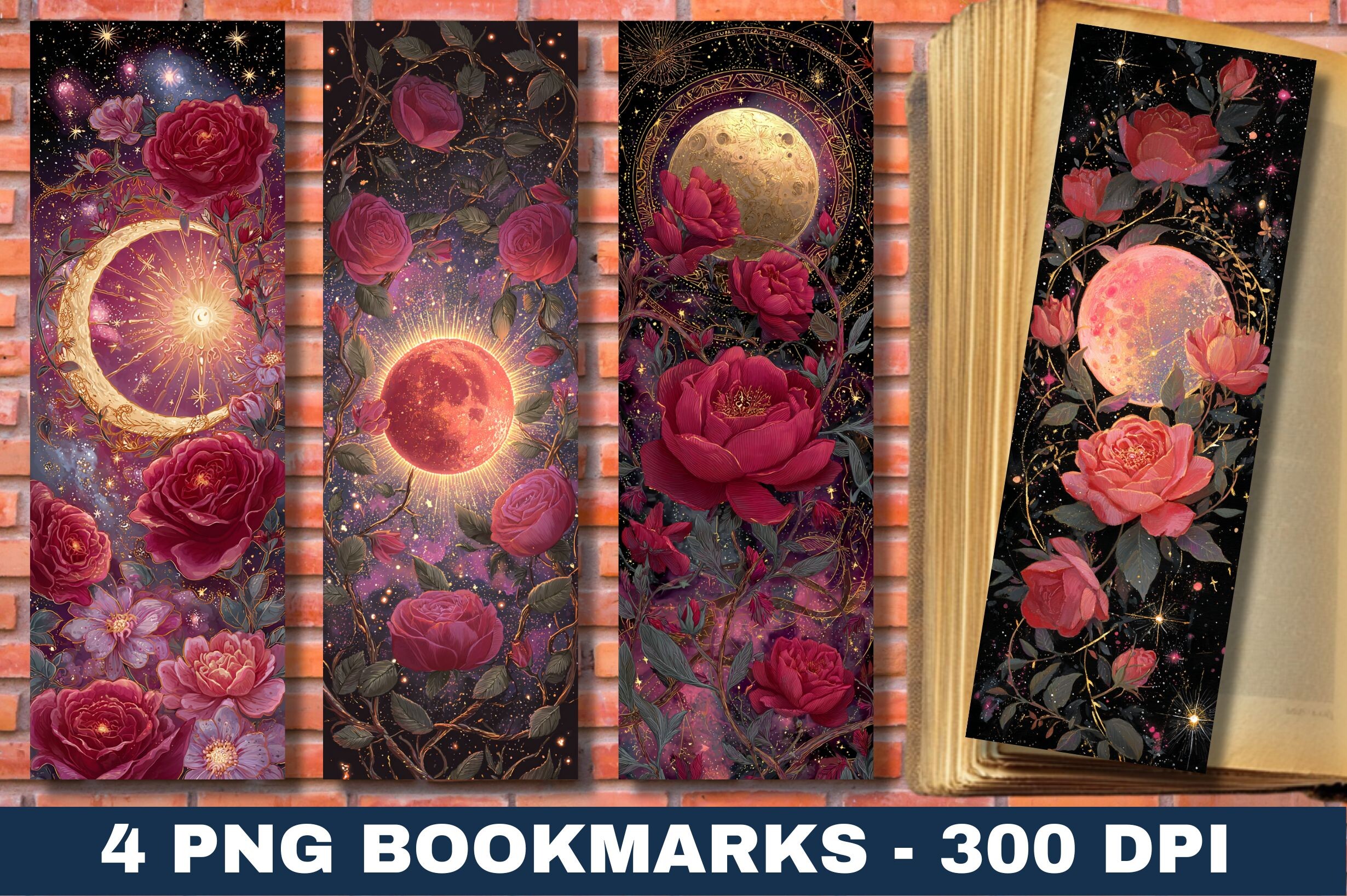
People laugh when I say a bookmark taught me about sizing, but the gothic rose-and-moon design here only works because it’s narrow and tall and committed to it. I tried fitting the same art into a square print once and it fought me the whole way. Some compositions have a shape they want, and this one wants the long skinny bookmark proportion.
I printed a stack on heavier card stock at the print place over on Calloway and tucked them into the books I lent out that month. My book club still has them. The design holds at two inches wide, which honestly impressed me more than most of my wall stuff.
Minor complaint. The gothic detail near the bottom tip gets cut if you trim sloppy, so leave a hair of margin and round the corners if you can. I sliced through a moon on my first three. Wasted card.
Blue and gold sun, and matching a size to where it lives
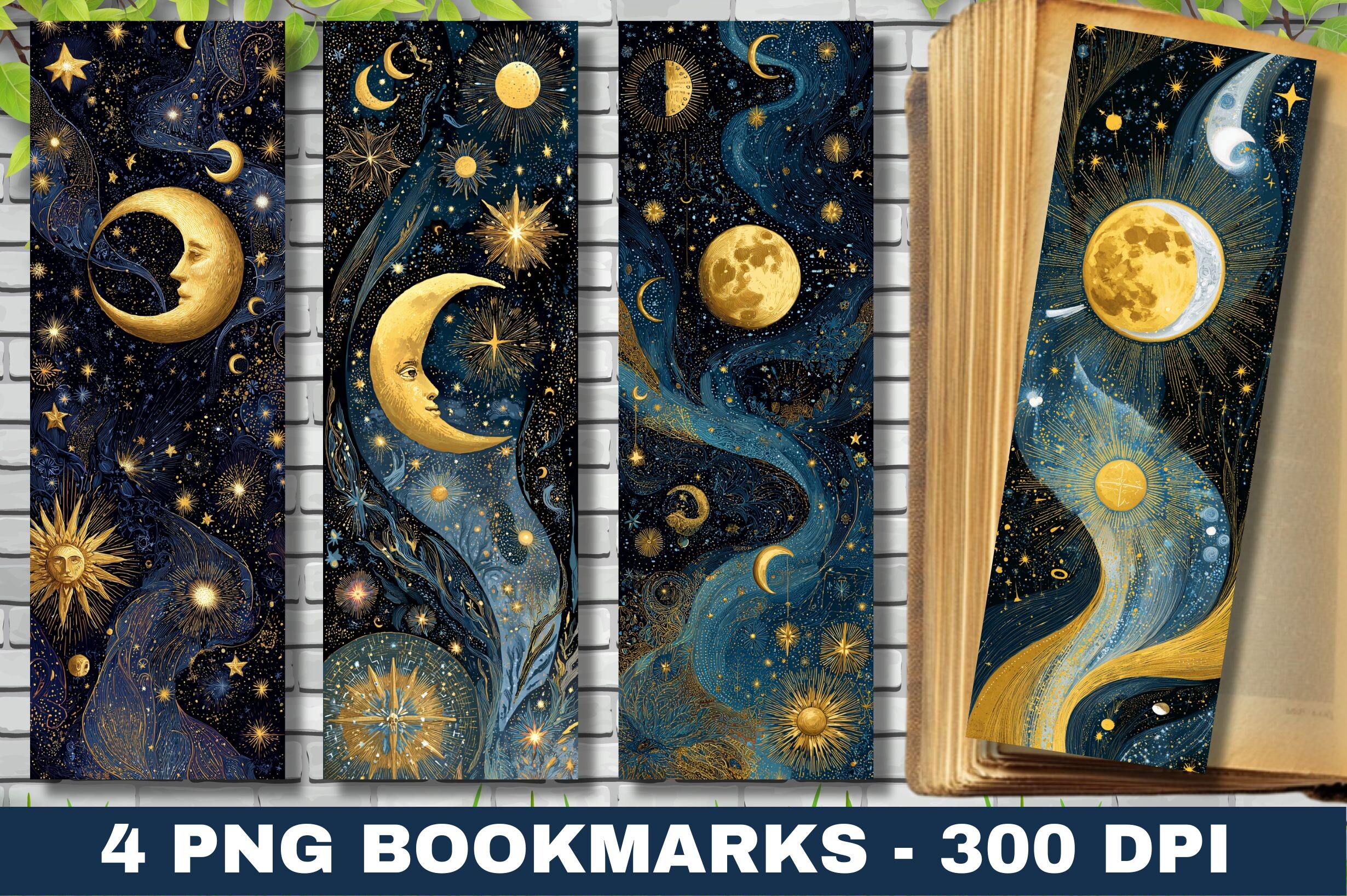
The sizing trick with this blue-gold sun design is that I stopped asking how big and started asking where it goes. As a bookmark it lives inside a book, so it can be small and ornate and nobody’s standing six feet back judging the scale. That freed up the detail. The gold sun rays stay fine and sharp at bookmark width.
I made a batch as little thank-you tucks for a friend who runs a tiny used bookstore, slipped one into every bag for a weekend. The blue is rich on cream card, washed-out on bright white, so I went cream. She sold more bookmarks than books that Saturday, apparently.
The catch is the gold and blue both go slightly dull on matte, and bright on satin. For something this small I’d push satin. Learned that comparing two trial cuts under the shop light.
Questions I Get About These
What does a 12 by 18 poster look like?
Bigger than you’re picturing, every single time. I know this because a buyer once messaged me sure that 12×18 was “a small one,” hung it over a side table, and sent a photo where it loomed over the lamp like a monolith. It’s a foot wide and a foot and a half tall. Roughly the size of two stacked sheets of letter paper, then some.
My honest read after taping a hundred proofs up: 12×18 is a statement size, not a filler size. It wants its own wall or a real gap above furniture. Drop it into a tight spot and it bullies everything around it.
What are the most popular wall art sizes?
From what actually sells and what I keep reordering: 8×10, 11×14, and 16×20, in that order, with 5×7 if you’re building a cluster. I didn’t pick those, the standard frame shelf did. Try printing something at 13×19 and then go hunt for a frame. I’ll wait.
That’s the real reason those sizes win. Not aesthetics, availability. I once fell for a print sized at some artsy 10×13 and spent six weeks and twenty dollars in shipping chasing a frame that didn’t make me cry. Stick to the boring numbers.
How big should art be above a couch?
Roughly two-thirds the width of the couch, and I say roughly because I eyeballed it wrong for years before a friend who hangs gallery shows gave me the ratio. A standard sofa is around 84 inches, so you want art landing near 55 to 60 inches wide, whether that’s one big piece or a few that group up to it.
The mistake I see, and made, is a lonely 11×14 stranded over a long couch. It looks like a stamp on an envelope. Either go large and single, or cluster several so the group fills that two-thirds. A small print alone over a big couch just looks scared.
What size print fits a gallery wall?
The trap is thinking they all match. They shouldn’t. My first gallery wall was nine identical 8x10s in a grid and it looked like a dentist’s waiting room. The good ones mix it up, a couple of 5x7s, an 8×10 or two, one 11×14 anchoring a corner.
What I do now: print everything, cut to size, tape it all to the wall with the blue tape, and shove the pieces around until it stops looking like a spreadsheet. Takes an evening. Photograph it before you put a single nail in, because the camera shows you the lopsided bits your eye forgives.
Before You Tape Anything Up
If you take one thing from all my repainted walls, take this. Tape before you nail. Cut your prints to size, stick them up with painter’s tape, and live alongside them for a few days before anything becomes permanent. Half the sizes I was certain about looked wrong by Wednesday.
The rest is just the boring math of frames and furniture, and you’ll learn it the way I did, by getting it slightly wrong in a hallway and standing there at night wondering why the moon looks too big. It usually is. Go a size down. You can thank me later, or argue with me, plenty of people do.