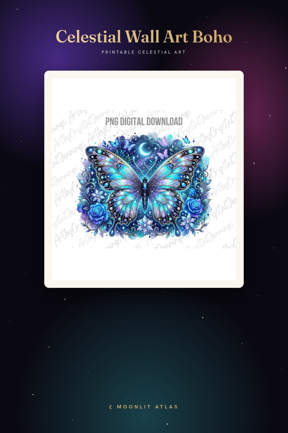
There is a difference between old and vintage, and I learned it the expensive way. Old is when a print just looks dated, like it lost an argument with the sun. Vintage is when it looks like someone meant for it to be that way. The trick is all in the tones. Warm paper, faded ink, a little brown in the blacks instead of true black.
I went through a stretch last winter where everything on my walls was crisp and white and modern, and I hated it. Felt like a dentist’s waiting room. So I started hunting for the ones that read like they got pulled out of an old almanac or a library nobody dusts. Astronomical engravings, planispheres, sun-and-moon plates with that tea-stained look. Some worked. A lot looked like a coffee accident.
These are the survivors. I print them flat at a tiny place on Carver Lane run by a man who calls me by name now, because my home printer chokes on anything heavier than the cheap stuff. Then I tape the proof up and stare at it for a week. Some links below are affiliate links, so if you grab one a little something comes back to me. Doesn’t cost you a cent more.
A few links below are affiliate links. If you grab a print through one, it sends a little something my way at no extra cost to you.
A sun plate that reads like a page torn from an old almanac

The first time I taped this up I thought it was too busy. Sun in the center, floral work crawling out around it, the whole thing leaning tarot. Then I printed it in warm tones on a slightly cream stock and it stopped being busy and started looking like an illustration somebody engraved by hand a century ago.
I hung mine at 8×10 above a little wooden side table that already had a brass candlestick on it, and the two of them started talking to each other. The sepia in the print and the tarnish on the brass. Looked planned. It was not, it was a Thursday and I was procrastinating on real work.
One honest catch. It comes in clean modern color, so if you want the antique look you have to warm it yourself before printing. I dropped the brightness, pulled it toward amber, and killed the pure white. Five minutes of nudging sliders. Skip that step and it looks new, which defeats the whole point of putting it on a vintage wall.
The grab-bag I keep raiding when one wall needs a whole story

Bundles usually annoy me. You buy twelve things to use two. This one earned its keep though, because the pieces actually match each other, same line weight, same mood, so you can build a little cluster that looks like it came from one old book instead of a yard sale.
I used three of them on the wall going up my stairs, staggered, all printed small at 5×7 and 4×6, all warmed down to that faded-ink look. My friend Dilan came over and asked which antique shop I found them at. I let him believe it for a minute before I told him it was a file and a copy shop on Carver Lane.
The gripe is the obvious bundle gripe. Some pieces are clearly stronger than others. A couple I will probably never print. But the strong ones carried a whole stairwell, so I am not going to complain too loudly about the ones I left in the folder.
The one that climbed off the wall and became an object
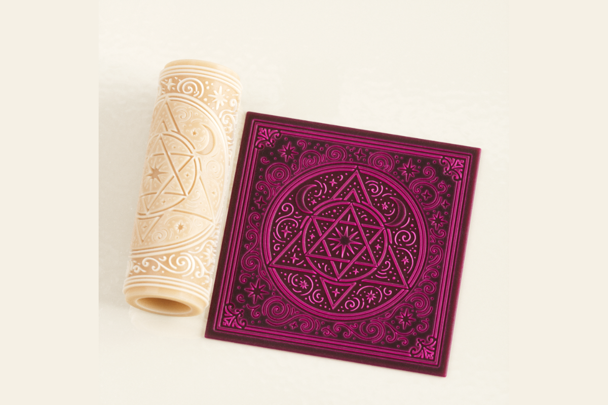
This threw me, because it is not a print at all. It is a tile file, the kind you feed a 3D printer, all sacred-geometry sun rays and circles meant to come out as a physical object you can hold. I almost left it off a wall-art list. Then I got stubborn about it.
I do not own a printer that does this. A maker space near the train station does, and a kid working there ran me one in a clay-colored filament for the cost of lunch. I set it on a shelf leaning against the wall instead of mounting it, next to the framed prints, and the shadow it throws in late afternoon does more than any flat print could. The relief catches the light. That is the whole appeal.
The catch is enormous and I will be plain about it. If you cannot print this, it is just a file staring at you. You need a machine or a service. If you have neither, scroll past. If you do, it is the one piece on this wall people actually reach out to touch.
Sun and moon leaning together for a softer corner

Not everything vintage has to be stern. This is the gentle one. A sun and a moon nearly touching, faces almost meeting, drawn loose and a little romantic. On a true white background it skews boho and modern. Warmed down, it goes tender and old, like a frontispiece from a poetry book.
I gave a printed one to my upstairs neighbor as a thank-you after she watched my plants for two weeks in March. Printed it at 8×10, ran it warm, framed it in a thin black frame I had spare. She put it over her bed. Said it was the first thing she had hung in that apartment in three years, which honestly got to me a little.
The small complaint. The faces have personality, which means if you shrink it too far they lose it and turn into a blob with rays. I tested a 4×6 and the moon looked grumpy and undefined. Keep it at 8×10 or bigger so the expressions survive the print.
Clean line sun and moon for a wall that needs to calm down
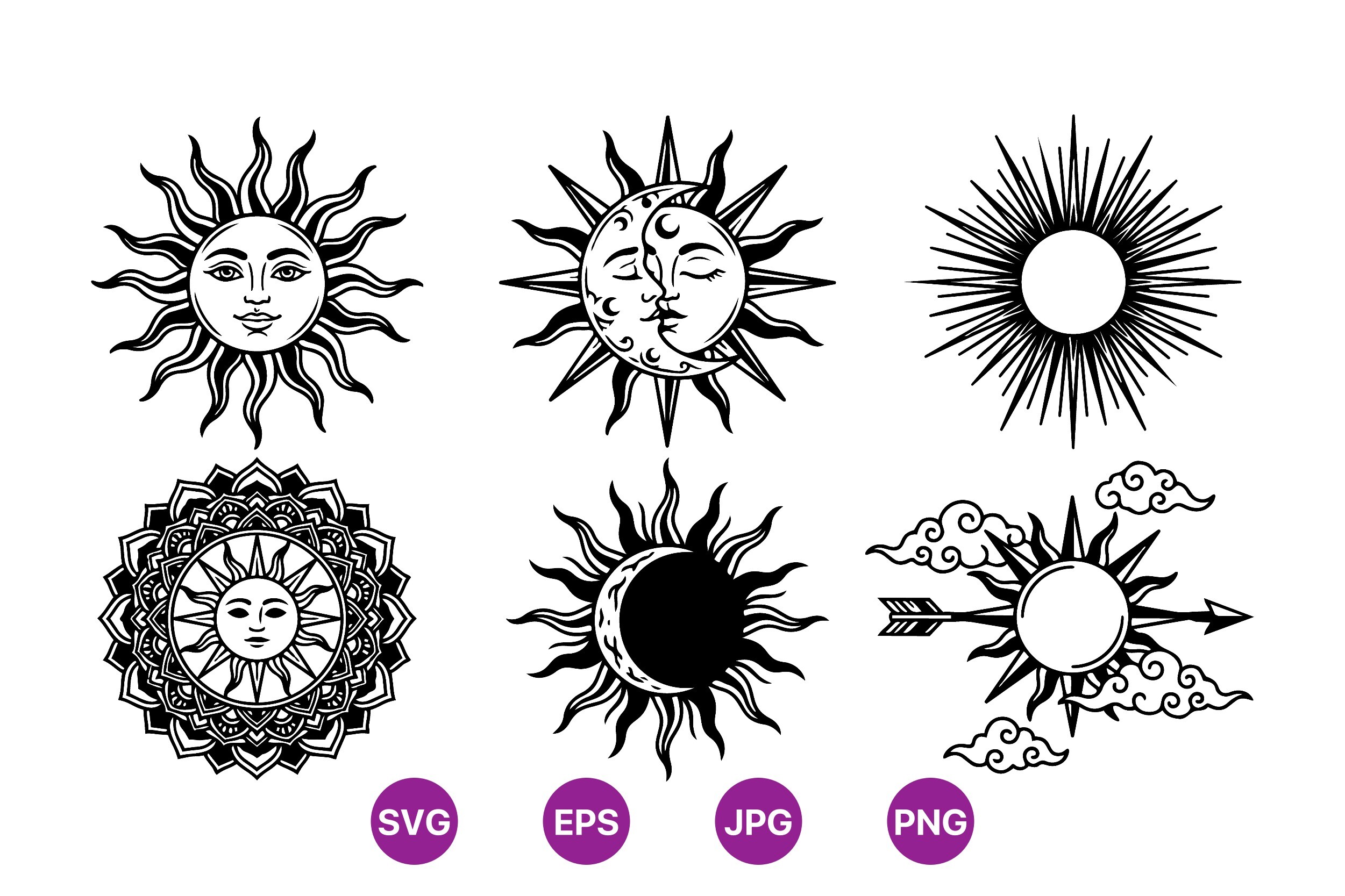
When a wall is already loud, this is the one I reach for. No fuss, no flourish, just a clean-line sun and a clean-line moon. Because it is vector it scales to whatever you want and the line stays even, which matters the second you hang the pair side by side, because mismatched stroke weight reads as a mistake even when no one can name why.
I ran a sun and a moon at 11×14 each, charcoal ink warmed a shade off pure black, and hung them as a pair over a low bench by the door. The space around them does the work. Two simple shapes in a lot of warm paper read like money. Crowd them and they read like clip art, which, fine, technically.
The note here is the same note for any SVG. There is no layout handed to you, so spacing the pair evenly is your problem. I spent a slow Sunday nudging two files into balance in a flat template. I find that soothing. If you find it maddening, know it going in.
The strange one I dared myself to actually hang

This is the wild card and I am keeping it on the list because it surprised me. A panther, a third eye, celestial markings all over it. On paper it sounds like a metal album cover. In practice, printed small and aged down to sepia, it reads like an old occult engraving, the kind tucked in the back of a dusty natural-history book.
I was sure it would clash with the calmer prints. I hung it anyway, 5×7, off in the corner of the stairwell cluster where it could be a little weird without taking over. It became the piece guests stop on. The eye does something. People lean in. My cousin called it unsettling and meant it as a compliment, I think.
The catch is tone, hard. In full color it is loud and modern and absolutely will not sit with vintage work. You have to commit to desaturating it, pulling it brown and dim. Once I did that it belonged. Left bright, it fights every other thing on the wall and loses.
The set that already did the aging work for me

Last one, and it is the one that needed the least fixing. Sun, moon, zodiac touches, and it comes already leaning faded and antique, so I barely had to warm it. Half the time the vintage look is on you to fake. This one shows up dressed for the part.
I built a small grid of these above my reading chair, four pieces at 5×7 in matching thin frames, and let the matched tones do the heavy lifting. Because they came from one set the browns agree with each other, which never happens when you stitch prints from five different sellers. My family has a habit of borrowing files off me, and my aunt took this exact set and made the same grid in her hallway within a month.
The quibble is minor. A couple of the pieces are close enough in composition that hanging all of them together gets repetitive. I used four of the more distinct ones and held the rest back. As a grid of four, it was the easiest win on this whole wall.
Questions I Get About These
What makes a celestial print look vintage?
It is almost never the drawing. It is the tone. I figured this out after a buyer emailed me annoyed that a print she bought looked new on her wall, and when I asked her to send a photo, the thing was bright white and true black. Crisp. Modern. The art was old-style, the color was not.
Warm the paper toward cream, pull the blacks toward brown, dim the whole thing a notch so nothing glows. Suddenly it looks like it lived in a drawer for fifty years. The engraving style helps, but the tones are what sell the age. I tell people to print one warm and one bright and hold them side by side. The difference is not subtle.
Where do vintage celestial prints look best?
Anywhere that already has something old in it. They die on a bare new wall and come alive next to anything with patina. I learned this by accident. The sun plate sat dead on a fresh white wall for a week, then I moved it next to an old brass lamp and a wooden shelf and it finally made sense.
Stairwells, studies, a wall of books, a hallway with a wooden table. The print wants company that has aged too. Put it in a sleek glass-and-steel room and it just looks confused, like it wandered in from the wrong century.
How do I frame an antique celestial map?
Plainer than you think. I wasted money early on ornate gold frames thinking they would match the old look. They fought it. The frame got loud and the print got lost behind it.
What actually works is a thin frame in dark wood or plain black, and a generous mat if the print can carry one. The mat gives it that museum-plate breathing room. For the bigger maps I skip the mat and let a slim frame do the talking. Let the print be the old thing in the room. The frame is just the quiet edge that holds it there.
Before You Tape Anything Up
If there is one thing a year of this taught me, it is that vintage is a tone, not a drawing. The same celestial file can look like a 2010 dorm poster or a plate from an old observatory book depending on whether you warm it down before you print. So warm it. Every time. Then live with the proof on the wall for a few days before you commit a frame.
My stairwell right now is the little cluster of aged sun-and-moon plates with the strange panther lurking in the corner, and the place finally feels like it has a history it did not earn. If one of these catches you, the links send a little back my way and cost you nothing extra.