My sofa wall sat empty for a year and four months. I counted. I kept buying prints, holding them up, putting them back in the drawer with the takeout menus. A sun and a moon together feels like an easy win until you try it. Then one is too cute, the other is too cold, and the whole thing reads like a dorm.
The couch is a faded mustard thing from a curb on Bergen Street. Anything I hang above it fights that yellow. So warm sun art turns sickly, and a stark black moon looks like a hole punched in the plaster. I learned that the slow way, with painter’s tape and a lot of squinting from the kitchen doorway.
These are the seven I lived with longest. A couple I print and hang and forget about, which is the highest praise I have. A couple I keep meaning to swap and never do. Some links below are affiliate links, so if you grab one a few cents drift my way. You pay the same.
A few links below are affiliate links. If you grab a print through one, it sends a little something my way at no extra cost to you.
The starter pile I keep going back to
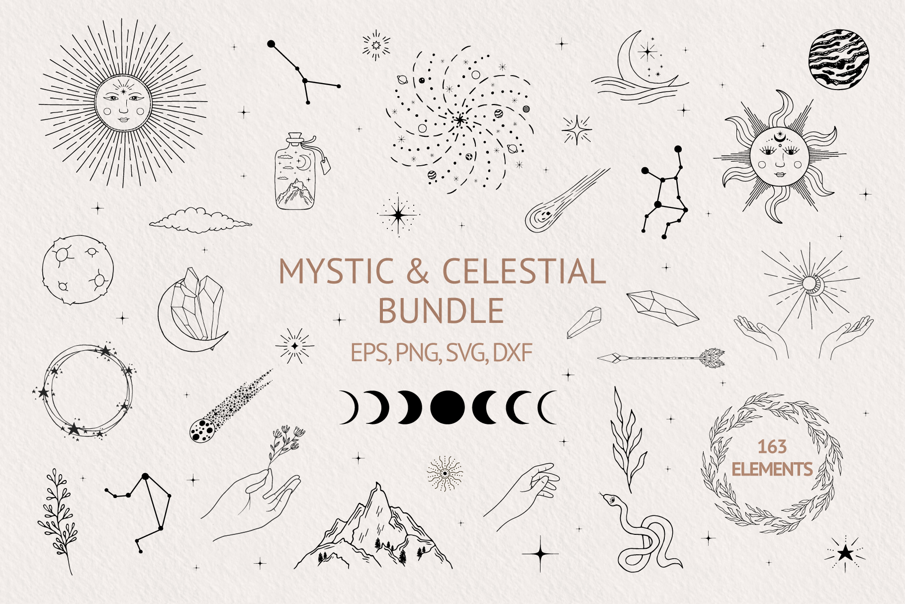
I bought this one on a Tuesday in February when I was supposed to be doing taxes. It’s a big grab-bag of hand-drawn sun and moon bits, stars, little flourishes, the lot. Not a finished poster. More like a box of parts.
That’s the appeal and the catch. I pulled one sun and one moon out, dropped them into Canva side by side, and printed a pair at 8×10. Took twenty minutes and they anchored the sofa wall better than three things I’d paid more for. The line is loose, a little wobbly, which kept it off the dorm-ceiling cliff.
The catch. There’s so much in here you can drown in it. I opened the folder, got overwhelmed, closed it for a week. Pick two pieces and stop. Worth it once you do.
When the moon needs flowers to behave
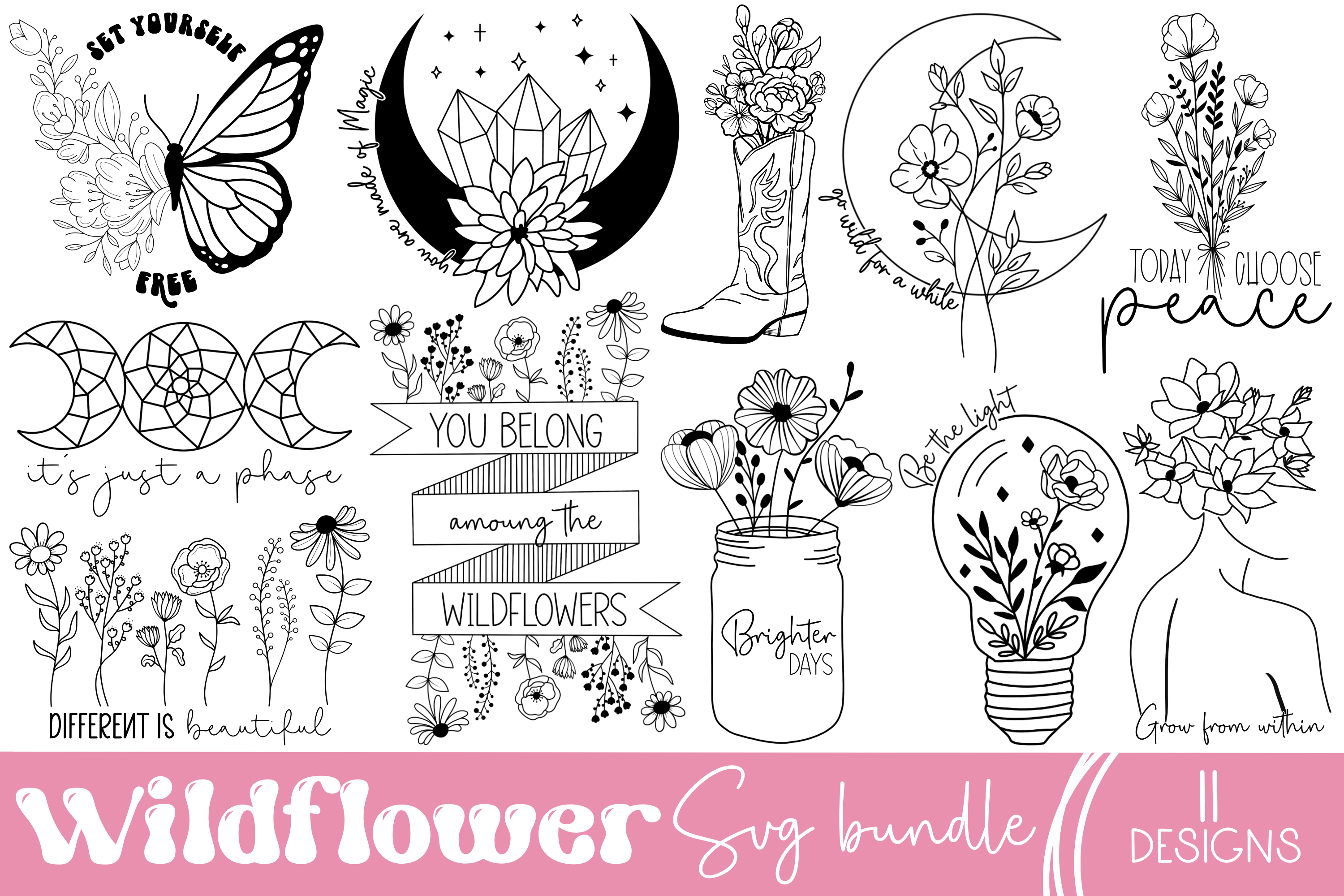
A straight sun-and-moon pairing read too severe over my mustard couch. Cold. This set softens it. Wildflowers wound through the celestial shapes, so the moon stops looking like a coin and starts looking like something somebody drew on a porch.
I did a single piece, 11×14, dead center above the cushions. The warm and cool argument I keep having with this wall just stopped. The botanical line bridges them. My downstairs neighbor, who hates everything, said it looked expensive. It was not.
One gripe. A few of the floral elements lean a touch crafty, a touch Cricut-mug. I avoided those, used the cleaner ones. If you cherry-pick you’re fine.
Editorial, if you have the nerve for it
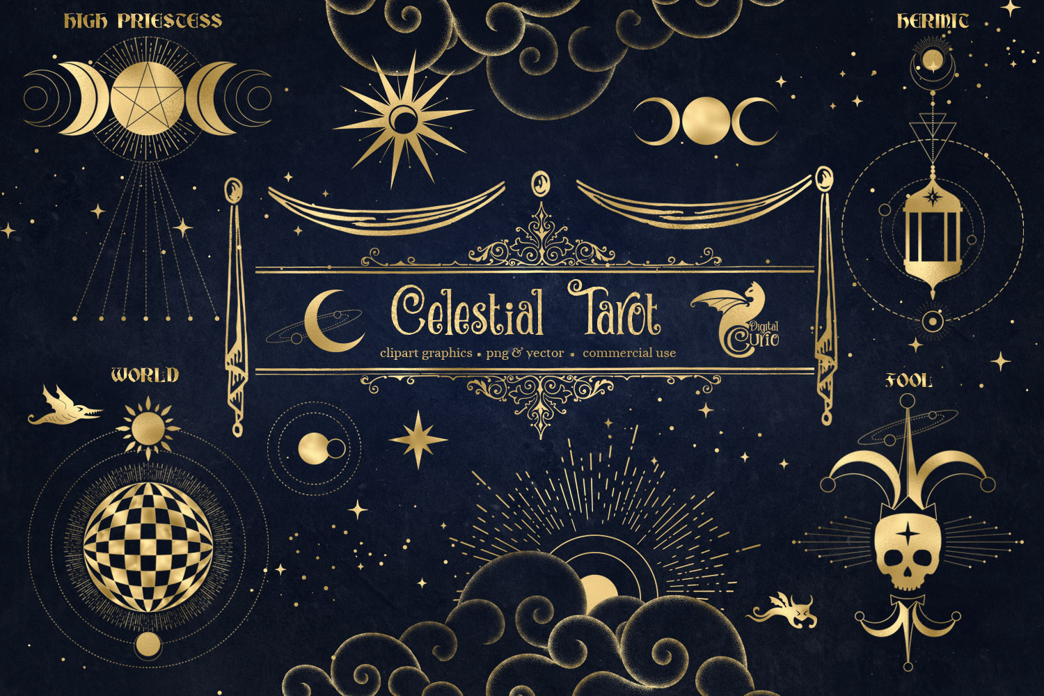
This is the moody one. Tarot-style sun and moon illustrations, heavy on detail, the kind of faces drawn into the celestial bodies. Old-engraving energy. I went in skeptical because faces on a sun usually tip straight into kitsch.
These mostly don’t. I printed The Sun and The Moon cards as a matched pair, 5×7 each, in thin black frames flanking a bigger blank. Looks like a tiny gallery moment over the couch. Guests ask about it, which never happens with my other walls.
The honest part. It’s busy. In a small living room with a lot already going on it can feel like one thing too many. I have a cluttered place, and I still made it work by keeping everything around it empty. Give it air.
Soft enough for the cool-side wall
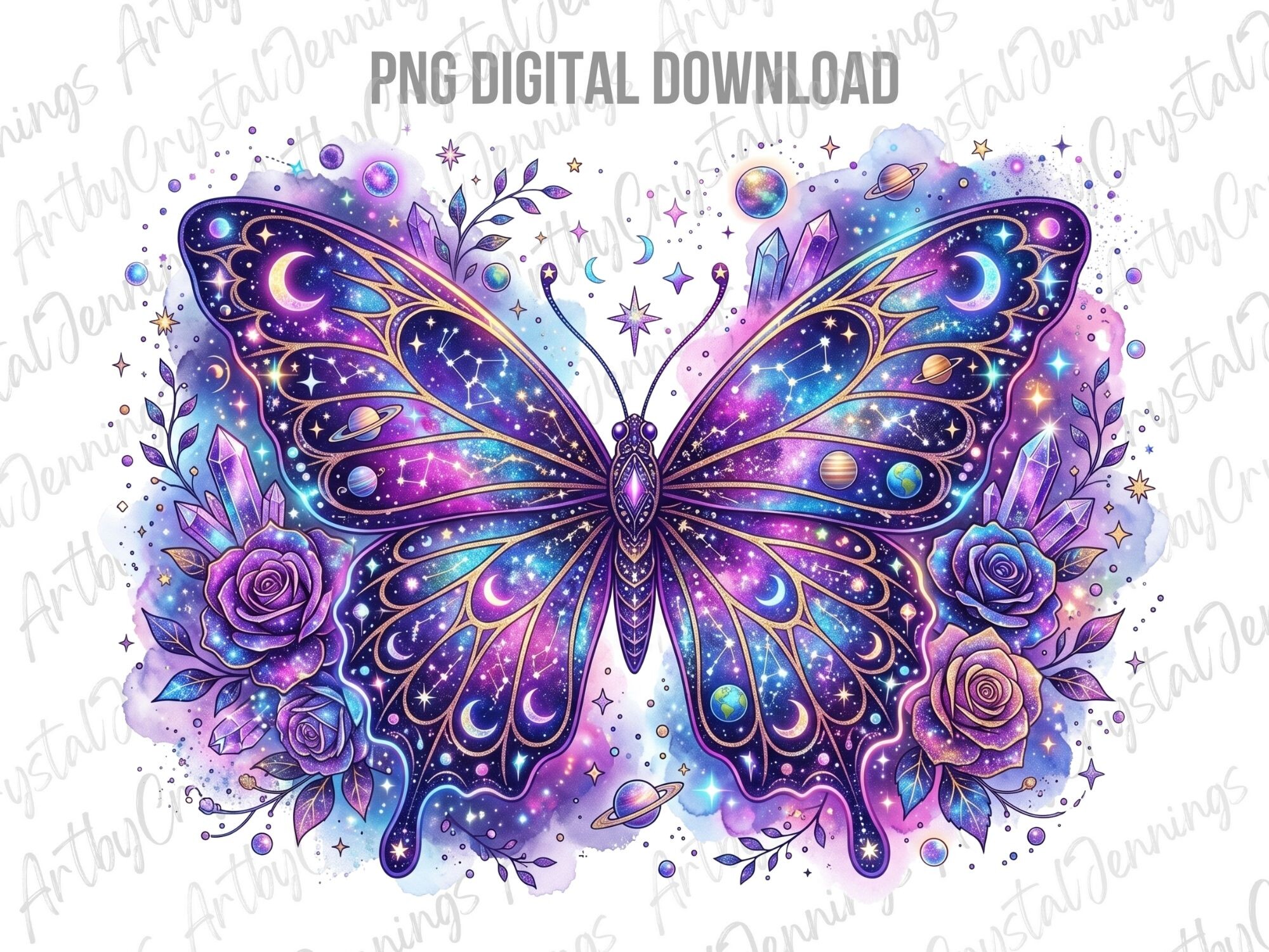
I have a stretch of wall by the window that gets hard afternoon light, and it eats anything dark. This one survives it. Celestial shapes folded into butterflies and florals, airy, lots of breathing room in the art itself.
Printed it at 12×16 on the matte stock I keep for the stuff that needs to look less like a printout. Held up across the room, which is my one real test. The sun and moon are there but quiet, riding under the butterflies instead of shouting.
What bugs me. It tips feminine and pretty, and on a gray day it can read a hair thin, like it’s missing weight. I balanced it with one heavier piece nearby. On its own over a big sofa it might float away.
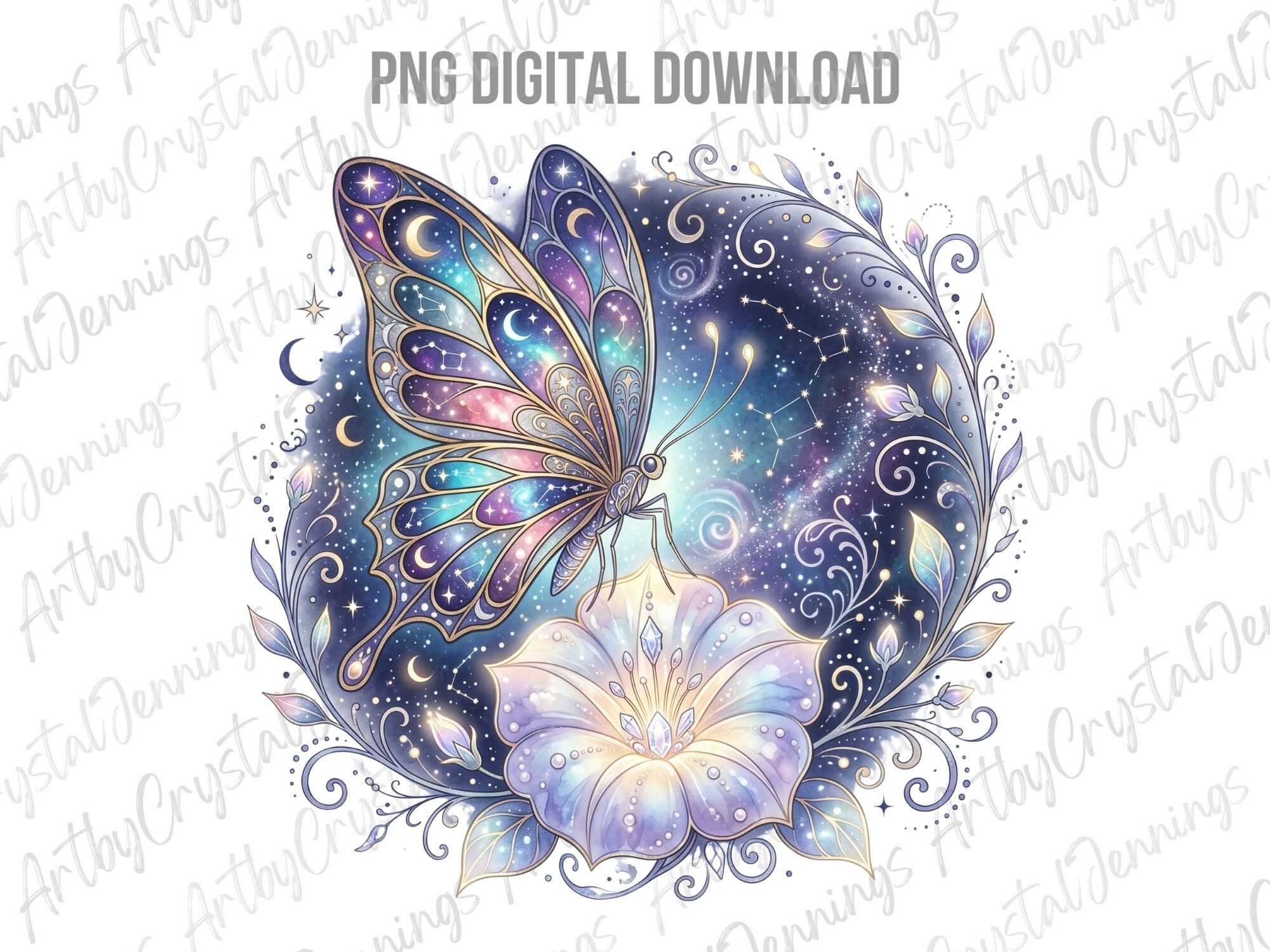
The purple gamble that paid off
Purple scares me on a wall. It dates fast, it clashes, it shows up in every photo looking like a different color than it did in the room. So I almost skipped this. The deep plum and the butterflies pulled me back.
I committed to a single statement print, 16×20, and hung it slightly off-center over the couch arm instead of dead middle. The off-center thing was an accident, I measured wrong, and it looked better so I left it. The celestial bits glow against that mustard sofa in a way I did not expect.
The catch is real though. Get your color profile right or the purple prints muddy and brown. My first run at the copy place on Eldridge came out the color of a bruise. Second run, after I fixed the file, was the one I framed.
For the day you want a whole wall, not one frame
Most of this list is single prints. This one is the opposite move. Patterns and repeat tiles plus loose clipart, built for covering a lot of space cheap. I used it when one frame over the couch felt lonely and I wanted a grid.
I made a nine-piece grid, all 5×7, sun and moon and stars scattered across them so your eye travels. Cost me maybe four dollars in printing. People assume it was a set I bought as one thing. It wasn’t, I just kept the spacing tight and the frames identical.
Gripe. The pattern tiles can go busy fast if you use too many in a row. I leaned on the simpler clipart for the grid and saved the dense patterns for nothing, honestly. Half the pack I’ll never touch.
The seasonal swap I rotate in
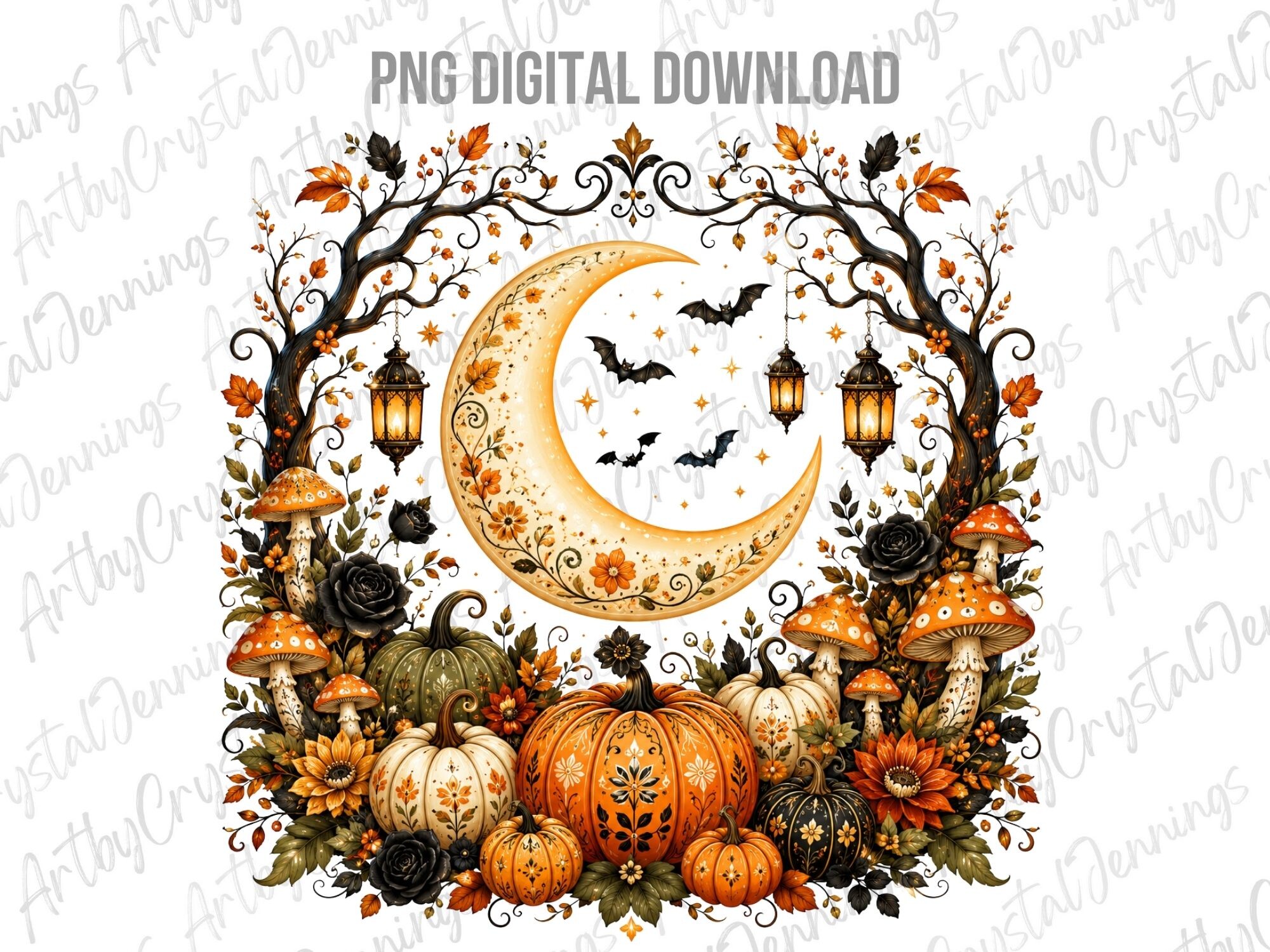
I don’t hang this year-round. It’s a fall thing. Warm moon over pumpkins, autumn palette, the kind of cozy that would look ridiculous in July. From late September to about Thanksgiving it lives over my couch and the rest of the year it sits in the folder.
The warm tones finally agree with that mustard sofa instead of fighting it, which is the whole reason I keep it around. Printed at 11×14, swapped into the same frame my summer print lives in. Five-minute job, big seasonal shift.
What I’d flag. It is firmly autumn. If you want a sun-and-moon piece that hangs all year, this is not it. I treat it like a sweater. Out in October, away by December, and that’s fine by me.
Questions I Get About These
What does sun and moon art mean?
People hang it for the balance idea, opposites that need each other, day and night, the two halves of a person or a couple. That’s the romantic read and it’s fine. Honestly most folks I know, me included, hang it because a warm circle and a cool circle on one wall just looks settled. You don’t have to assign it meaning for it to work over a couch.
How many prints do I need for a living room wall?
Depends on the wall, not a rule. Over a standard sofa I’ve had one big statement piece work and I’ve had a nine-square grid work. What flops is two prints floating with a weird gap, that reads unfinished. If you go with two, hang them close, like they’re talking. If you want to fill space, go to a tight grid of small ones, three across or three by three. One huge print or a packed grid. The lonely middle is the trap.
Do sun and moon prints work with neutral decor?
Better than with anything, actually. Neutral walls and a plain couch are the easiest place for this stuff because nothing fights the art. My problem is the opposite, a loud mustard sofa, and I have to pick warm-leaning prints so the room doesn’t go to war. If your decor is beige and gray, you can hang almost any sun and moon pair and it’ll land. Lucky you.
Before You Tape Anything Up
If you make me pick, the hand-drawn mystic bundle is where I’d start, because it’s parts not a finished thing, and you can pull exactly two pieces and stop. The wildflower set saved my cold-moon problem. The purple one is the showoff if you nail the color file.
My actual advice, dull as it is. Tape the proof up first. Live with it a few days. I have ignored my own rule a dozen times and ended up with prints in a drawer and a wall that stayed empty for over a year. Print cheap, squint from across the room, then frame the one that’s still right on day four.