My godson outgrew his nursery in about a weekend. One day the soft little crib animals were fine, the next he announced, age six and a half, that the room was “for babies” and he needed it to be “cooler.” His mom texted me a photo of the half-stripped wall with a single sad cloud decal hanging by one corner. Help, basically.
That in-between age is its own whole problem. Too old for sleepy moon faces and pastel lambs. Way too young for the moody black-and-white grown-up stuff I’d hang over my own bed. A kids’ room that’s still a kids’ room but not a baby’s, that’s the line, and sun-and-moon art turns out to be one of the few things that walks it. Cheerful enough to feel like theirs. Not so cute it gets embarrassing the year they turn nine.
These are the seven I printed and lived with, some in his room, a couple in his little sister’s playroom corner downstairs. I run them through the same flat template, print test copies on the cheap 28lb stock at the print counter inside the hardware store on Lark, and tape the proofs up at kid height before I frame anything. A wall a child picks at and bumps and decorates over has to survive being theirs. Some links below are affiliate links, so if you grab one a little something comes back my way. Costs you nothing.
A few links below are affiliate links. If you grab a print through one, it sends a little something my way at no extra cost to you.
The galaxy piece that became the big kids’ headboard art

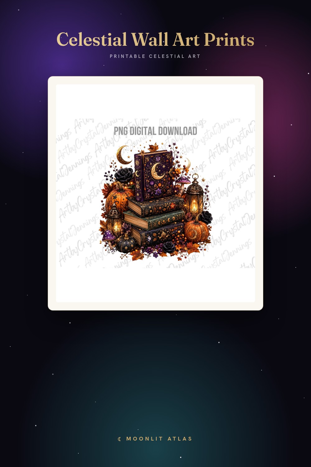
I’ll be honest about what this one is. A galaxy cross with a phrase on it, more faith-room than starry-playroom, and I almost passed it by for a kids’ wall. Then my godson’s family does the whole Sunday thing, and his mom wanted something for over his bed that felt like them without a cartoon anywhere near it.
The galaxy wash is the reason it works in a kid’s room and not just a hallway. Deep purples and blues, scattered light, the kind of space-y color a seven-year-old points at and calls “the cool one.” I printed it at 11×14 and centered it above his headboard, and it reads grown-up enough that he feels like a big kid and soft enough that nobody’s room turned into a billboard.
One catch. The text is the whole design, so this isn’t a piece for a family that wants the words gone. If you’re after just the galaxy, this isn’t the file to fight with. For the room it was meant for, it landed.
Simple line icons a kid can’t really wreck
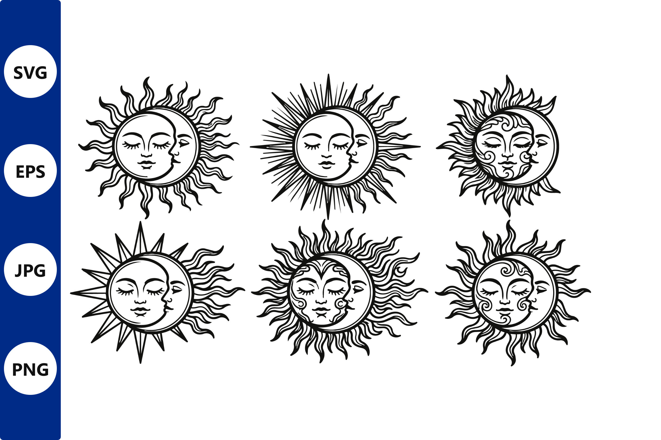
This set saved me the week the playroom corner needed art and I had zero patience. It’s a pile of clean sun and moon line icons, single weight, no color to muddy up, the kind of thing that prints right the first try even at the hardware store counter.
The plainness is the trick with kids. I pulled one sun and one moon, printed them at 8×10 in matching white frames, and hung them low where his little sister parks her crayons. Bold simple shapes hold up when a four-year-old is standing six inches away breathing on them. Busy art falls apart at that distance. These don’t. She “reads” the moon shape like it’s a letter.
My gripe, and it’s small. A few of the icons in the set lean decorative-swirly and get fussy shrunk down. I stuck to the cleanest sun and the cleanest crescent and left the rest. Plenty in there to pick from.
A portrait piece for the kid who wants their room to look older
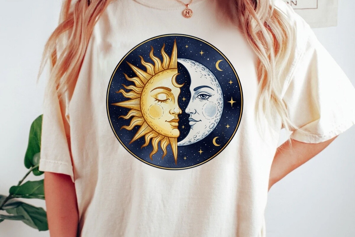
There’s an age where a kid desperately wants their room to look like a teenager’s and you are not ready for that. This was my compromise. A sun-and-moon face folded into a portrait design, a little artsy, a little editorial, enough that my godson felt like he’d graduated from the lamb decals without me handing him a poster of a band.
I did it at 12×16 on the matte stock I save for the pieces that need to look less like a printout, and hung it on the wall by his desk where he does homework he hates. Holds up from across the room, which is my one real test. The face has character without tipping into spooky, which a lot of celestial-face art gets wrong fast.
What I’d flag. It’s the most grown-up piece here, so in a younger kid’s room it might read a touch serious next to the bright stuff. I balanced it with the cheerful icons nearby and it sat fine. On its own it’s almost too cool for a six-year-old.
Vintage faces that somehow don’t scare the kids
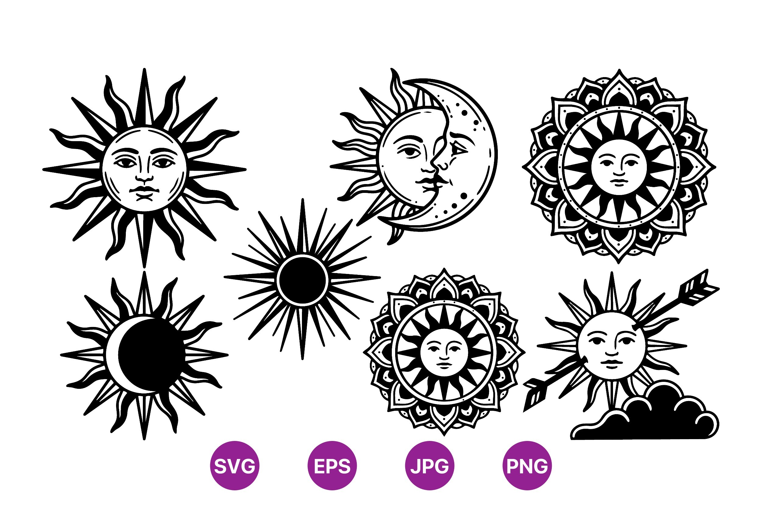
Old engraving-style suns and moons with faces drawn into them, the storybook kind. I went in wary because vintage celestial faces can go straight to creepy, and a kid’s room is the last place you want a moon that looks like it’s plotting something. These read friendly. Slightly mischievous, like a character from a picture book the kid already owns.
I printed two as a pair, 5×7 each, in thin black frames flanking the closet door. They look like a tiny scene, sun watching over here, moon over there, and my godson decided they were “the morning one and the night one” entirely on his own. Kids assign stories to this stuff if the art lets them. This one let him.
The catch is the aged look. There’s a faint distressed texture built in, and on cheap copy paper it can read as just dirty rather than vintage. I printed it on slightly heavier matte and the texture turned intentional instead of grubby. Worth the upgrade.
The embroidery-look print I framed for the playroom

This is sold as an embroidery design but the sun-and-moon-and-stars look prints flat just fine, and I framed it that way for the little sister’s side of the playroom. The stitched-style line gives it a homemade, soft feeling, like something a grandmother made, which in a kid’s room reads warm instead of slick.
What sold me was the friendly faces with the stars tucked around them. Cheerful, rounded, nothing sharp. I printed it at 8×10 and the four-year-old immediately claimed it as “the happy one.” Bold enough to hold the wall at her eye level, gentle enough that it doesn’t shout over her toy chaos.
One gripe. Embroidery files are built with that thread texture baked in, so blown up large the stitch lines get a touch coarse. I kept it at 8×10 and under and it stayed crisp. Don’t push this one to poster size, it’s happiest small.
Its softer cousin, the one with the word built in

Same stitched sun-moon-and-stars family as the last one, but this version has a sweet little “love” worked into it. I almost didn’t grab both. Then I realized the pair, one with the word and one without, made a matched little duo for the playroom corner instead of one lonely frame.
That’s what I did. Printed this at 8×10 to sit beside its plainer sibling, and the repeated stitched style ties them together so it looks deliberate, like a set somebody planned. For a kid’s space that needs to feel cozy rather than designed, the homemade-embroidery look does heavy lifting. The little sister calls these two “the twins.”
My honest note. The word makes it more of a sentiment piece, so if you want pure sun-and-moon with no message, go with the plain embroidery one instead. For a young kid’s room where a little sweetness is welcome, the word didn’t bother me at all.
A sticker design that I let the kids actually use as stickers
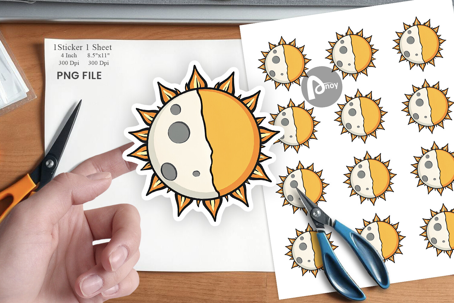
Last one, and it’s the most fun because I didn’t frame it. It’s a sun-and-moon sticker design, so I printed it on sticker sheet from the craft store, cut a batch out at the kitchen table, and handed them to both kids to go wild. Water bottle, lunchbox, the side of the toy bin, the headboard my godson now considers his.
What surprised me is how it pulled the room together for free. The same little sun and moon showing up on objects all over the room echoes the framed prints on the wall, so the whole space feels like it’s saying the same thing. Cheap trick, big effect. The line work is bold and survives being shrunk to sticker size, which a lot of cute designs don’t.
My one note. Cheap sticker paper peels at the edges after a few months of a kid picking at it. I’d spring for the slightly better matte sticker sheet next time. The design held up fine. The paper was the weak link.
Questions I Get About These
What colors work for kids’ celestial art?
I used to overthink this until a mom I print for just said “whatever doesn’t keep him up.” Which is the real answer. The galaxy and portrait pieces I hung lean deep blue and purple, and they read calm, not loud, even though they’re not pastel. The cheerful stuff, the icons and the embroidery faces, I kept warm and friendly. What I steer away from is anything neon or harsh white, that stuff feels jangly in a room a kid is supposed to wind down in. Warm and a little muted for the bright pieces, deep and rich for the space-y ones. Past that, let the kid pick the one they point at.
Are celestial prints good for toddler rooms?
Yes, with one tweak. A toddler isn’t reading anything, they’re grabbing it. So I’d skip glass frames at their height entirely and either hang the art up high where they can’t reach or use the sticker route on objects. The bold simple sun and moon shapes actually work great for little ones, they track the round shapes the way they track faces. The four-year-old in this story “reads” the moon icon like it’s a picture book. Just keep the breakable stuff out of arm’s reach and let the unbreakable stuff live down low.
How high should I hang art in a kids’ room?
Lower than you think, and lower than you’d hang it for yourself. The default rule people repeat is center at 57 inches, which is gallery height, which is your eye, not theirs. In a kid’s room I drop it so the center of the piece sits roughly at the child’s standing eye level, sometimes lower if it’s art they’re meant to interact with. I taped a phase row along a bookshelf bottom for one kid because that’s where he actually looked. The grown-up height makes a room feel like a waiting room. Hang it for the short person who lives there.
Before You Tape Anything Up
If you make me pick a place to start, it’s the line-art icon set, because it’s cheap, it prints right the first time, and a kid can stand an inch from it without it falling apart. The galaxy piece is the move for the older kid who’s done with anything that looks babyish, and the sticker sheet is the secret weapon for tying the whole room together without buying more frames.
My actual advice is dull. Hang it low, print a test first, and let the kid have an opinion. The wall I’m proudest of in this whole story isn’t the one I designed best, it’s the one my godson decorated over with his own stickers until it looked like his. That’s the bar in a kids’ room. Not whether it photographs well. Whether the kid stops calling the room babyish and starts calling it theirs.