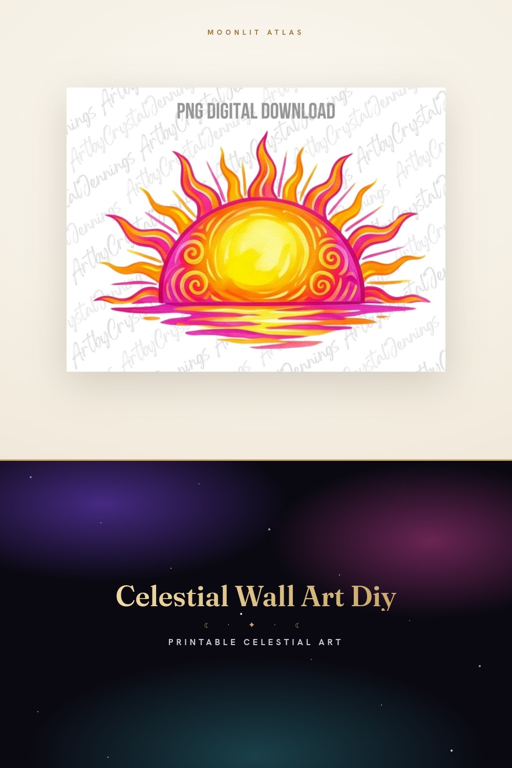
A gallery wall is just a single print’s mistakes, multiplied. I found that out the hard way on the long wall in my entryway, the one you see the second you walk in off Vasser Avenue. One crooked moon you can forgive. Seven of them, in a grid, where every gap is slightly different? That’s a wall that makes guests tilt their heads without knowing why.
So this isn’t about one perfect sun-and-moon piece. It’s about a set of them talking to each other. The trick nobody tells you is that the prints matter less than the inches between them. I laid mine out on the floor first, shuffled them like cards for an entire Thursday evening, took a photo from a chair, and only then put a single hole in the plaster.
These are the pieces I built my wall from, plus the ones I tried in the layout and pulled back out. A gallery is forgiving that way, you can swap one tile without redoing the whole thing. Some links below are affiliate links, so if you grab one a little something comes my way. Same price for you.
A few links below are affiliate links. If you grab a print through one, it sends a little something my way at no extra cost to you.
The connective tissue between the big pieces
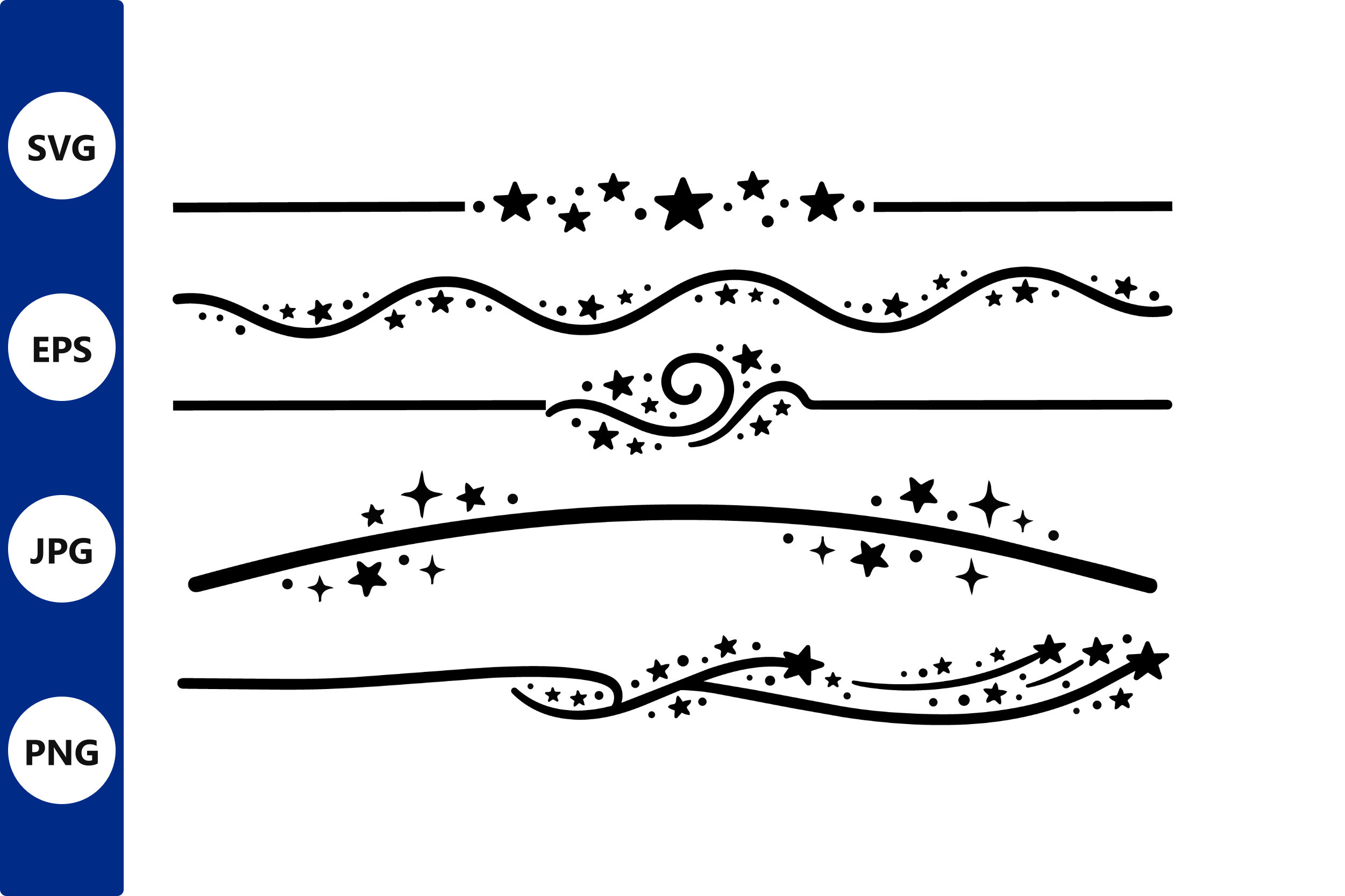
A gallery wall dies in the gaps. Two strong prints with nothing between them just look like two lonely prints. This set of swirl dividers and little star clusters is what I tuck into those gaps, the visual mortar between the bricks. I printed three of them tiny, 4×6, and slotted them between the bigger sun and moon frames so the eye has stepping stones across the wall.
What sold me is that they’re parts, not posters. I pulled one swirl, mirrored it, ran a matched pair to flank a center piece. Took ten minutes in my flat template. The symmetry it bought me made the whole left half of the wall finally read as on purpose.
One gripe. There’s a lot of ornamental flourish in here, and a little goes a long way. I used three elements and ignored the rest. Cram too many swirls into one grid and it starts to look like a wedding invitation from 2014.
The off-center anchor that breaks the grid on purpose
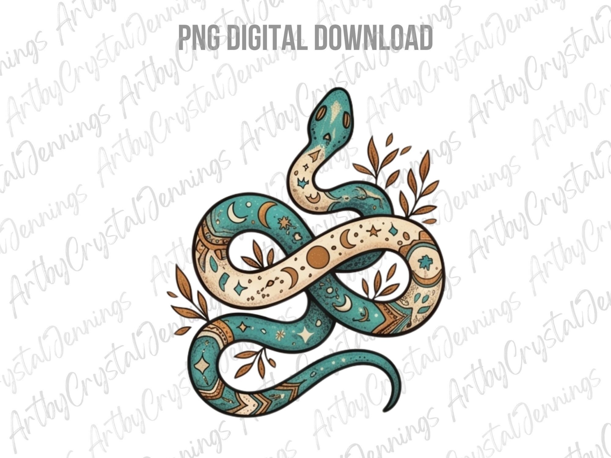
Every gallery wall needs one piece that refuses to behave. A grid of identical squares gets boring fast, so I hang one taller, narrower thing that snaps the rhythm. This boho snake, curling around its moon, did that job. I ran it at 8×10 in portrait and set it just left of dead center, deliberately taller than its neighbors.
The snake line is loose and a little earthy, which keeps the wall from going too precious. It gives the cluster a spine, literally. People’s eyes land on it first and then wander out to the smaller moons around it, which is exactly the path I wanted.
The catch. It reads moody, almost occult, depending on the light. In my north-facing hall it looks calm. A friend hung the same print in a bright kitchen and it suddenly looked like a tattoo flash sheet. Know your wall before you commit it to the center of a set.
A storytelling corner for the bottom row

Gallery walls let you cheat in a little narrative, and I love a bottom corner that rewards a closer look. This black cat curled with a book under a moon is my detail piece, the one nobody clocks from the doorway but everybody finds when they’re waiting for me to find my keys. I put it low and to the right, 5×7, where the eye finishes its trip across the wall.
It’s black on a pale ground, so it prints clean and cheap and doesn’t fight the color in the bigger pieces above it. The cat gives the celestial theme a wink instead of taking itself too seriously. A whole wall of solemn moons needs one piece with a sense of humor.
My nitpick is scale. Printed any bigger than 5×7 the cat starts demanding attention it shouldn’t have in a corner role. I tried it at 8×10 first and it stole focus from the snake. Kept it small, kept it in its lane, and the balance came back.
The one I cut instead of printed for a bit of depth
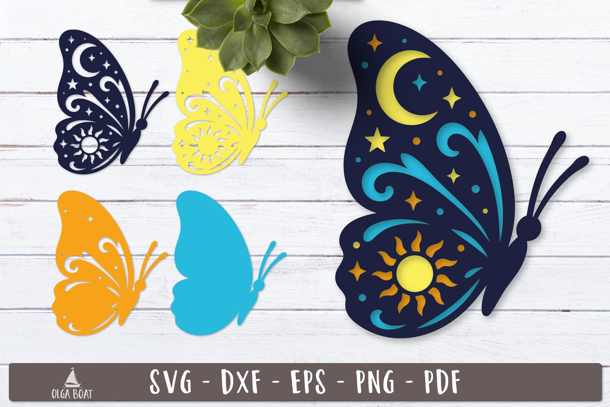
A wall of flat frames can go a little airless. So one tile of mine isn’t a print at all. This layered butterfly file I cut from cardstock, stacked the layers with foam dots behind them, and framed it shadow-box style so it sits proud of the wall. Up close you can see the layers throw tiny shadows. It’s the piece that makes people say wait, is that paper.
In a sun-and-moon set the butterfly reads as the soft counterweight to all the hard circles. I kept it in the same black-and-cream palette as everything else so the medium changes but the color story doesn’t. Hung it at 8×8 in a deep frame on the upper right.
The honest part. This one is work. Cutting and stacking the layers ate a Sunday afternoon and a fresh blade. If you want a wall you can finish in an hour, skip the cut piece and print a flat moon instead. I just liked having one thing on the wall that had my fingerprints in it.
Symmetry insurance for the two outer edges

The two ends of a long gallery wall are where balance goes to die. If the left edge is heavier than the right, the whole thing leans, and you’ll feel it without being able to name it. This hamsa with the evil eye is symmetrical down its own center, so I used a matched pair of it to bookend the cluster, one at each far edge.
The shape is so balanced in itself that it does the heavy lifting for me. Both ends now weigh the same, and the moons and snake in the middle can be as lopsided as they like. I ran the pair at 6×8, same frame, same matting, the only two truly identical tiles on the wall.
What I’d flag. The evil-eye motif is loud with meaning for some people, and a guest of mine asked, politely, what it was about. If that conversation isn’t one you want by your front door, this isn’t the edge piece for you. I like the talisman angle, so it stayed.
Warmth so the grid doesn’t go cold and clinical

A sun-and-moon set tips icy fast. All those clean circles and black lines, and suddenly your wall has the warmth of an eye chart. This vintage fox under a floral moon was my fix. The aged, slightly faded palette throws a little heat into the cluster so the whole thing feels like an old book plate instead of a spec sheet.
I hung it center-left at 8×10, near the snake but lower, so the warm tones sit in the middle of the wall where they spread. The fox keeps the celestial theme grounded in something living. It’s the print that stops a stranger and makes them step closer.
My gripe is the color file. The vintage wash prints muddy if your profile is off, and my first run at the copy shop on Vasser came out the color of weak tea. Second run, after I tweaked the file warmer on purpose, landed where I wanted. Test it before you frame it.
The repeat motif that ties the whole set together
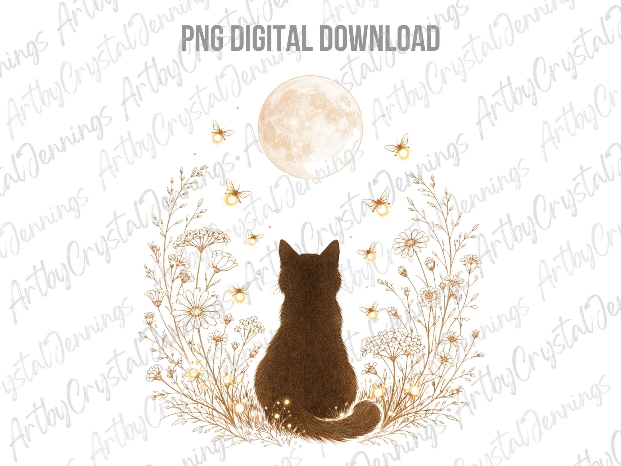
The best gallery walls rhyme. One shape or subject echoes across the layout so your eye knows the pieces belong together even when they’re wildly different. I already had the black cat in the corner, so this mystic cat with its moon and florals became the echo, hung up and across from it, a quiet rhyme on the diagonal.
The florals link it to the fox piece, the cat links it to the corner, and the moon links it to everything. That’s three threads from one print. I did it at 8×10, upper left, where it could answer the cat below without crowding the hamsa edge.
The one catch. It’s the busiest piece in my set, a lot going on in a small frame. From the doorway it can blur into a pretty smudge. I made peace with that because up close it earns its keep, but if you want every tile readable from across the room, size it bigger or pick a calmer one for the rhyme.
Questions I Get About These
How do I arrange a sun and moon gallery wall?
Lay it all on the floor first. I cannot say this enough. Shuffle the prints around on the rug until the spacing feels even and one piece anchors the rest, then snap a photo from a chair and look at the photo, not the floor. The camera shows you the imbalance your eye forgives. Cut paper templates the size of each frame, tape them to the wall, live with the ghost layout for a day, and only then drill. Keep the gaps between frames consistent, two to three inches usually, and let one piece sit slightly off-grid so the whole thing has a heartbeat instead of looking like a calendar.
How many prints make a good celestial set?
Odd numbers behave better than even ones. Three is the easy win, a sun, a moon, and one connector piece between them. Five or seven gives you a real cluster with room for a corner detail and an edge anchor. I’d avoid four in a tidy two-by-two unless you want it to read formal, like a chart on a wall, because a perfect square reads stiff. The number matters less than the mix, one big anchor, a couple of mid pieces, and a small detail or two to reward a close look.
Should frames match in a celestial set?
Not all of them, no. A wall of identical frames reads safe and a little flat. What I do instead is pick one thing to keep constant and let the rest vary. Same frame color, mixed widths. Or same wood tone, different shapes. On my wall the only two truly matching frames are the hamsa pair at the outer edges, because those need to weigh the same. Everything in the middle is a deliberate mix of thrifted and bought. The trick is that the matting, or the palette, or the frame color carries the unity, so the variety reads as collected, not chaotic.
Before You Tape Anything Up
If you’re starting from nothing, build out from the snake. It gives you a center with a spine, and you can hang moons and small details around it until the wall fills. The hamsa pair at the edges is what kept mine from leaning, and the swirl dividers are what filled the dead gaps that wreck most gallery walls.
The boring truth is that a gallery wall is mostly arithmetic and patience. Floor first, photo second, paper templates third, drill last. I skipped straight to the drill exactly once, on the entryway wall, and spent a Saturday patching holes that taught me to slow down. Get the spacing right and even mismatched frames look like you meant every inch of it.