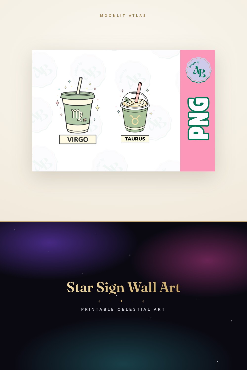
Astrology art has a tipping point. On one side it is a quiet wall that makes you feel like a grown-up who reads books. On the other it is a dorm room circa 2010, all purple gradient and a font doing cartwheels. The gap between the two is mostly taste and about four ounces of paper.
I sell prints, so I have a stack of these I rejected and a smaller stack I live with. The mystical ones, the planet glyphs, the tarot-shaped ones. Not the cute horoscope memes. The stuff that holds a wall down instead of yelling at it. I went through a phase of buying every constellation set I saw at midnight and printing none of them. This is the opposite. These got printed.
I run everything flat at the little copy shop on Marl Street because my home printer treats anything past 24lb like a personal insult and jams. Then I tape the proof to the hallway and let it sit a few days before a frame gets involved. Some of the links below are affiliate links, so if you grab one a little something lands in my pocket. Doesn’t touch yours.
A few links below are affiliate links. If you grab a print through one, it sends a little something my way at no extra cost to you.
Words on the wall when a glyph feels too quiet
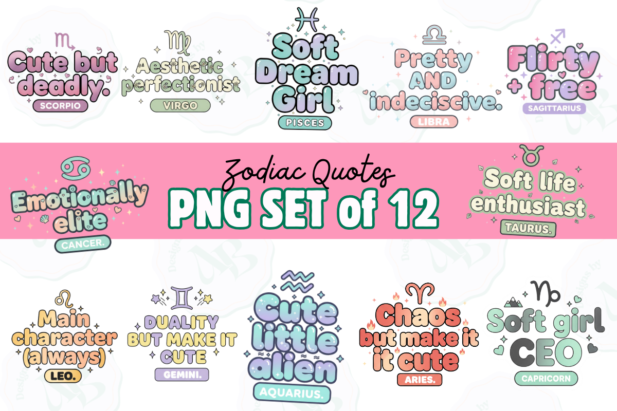
Some walls want a line, not a symbol. This is the set I pull when a plain constellation print feels too cold and I want the room to say something. Little zodiac quotes, the kind that read as personality instead of a fortune cookie. I put a Virgo one over my desk that basically describes me organizing pens, and I cannot prove it isn’t true.
I printed three at 5×7 and lined them down the narrow strip of wall beside the kitchen doorway, where nothing else fit. Black ink on warm white, no color, so they read like type and not decor. A neighbor asked if they were from a stationery brand. They were not. They were a Tuesday afternoon and a copy shop.
My one gripe is the longer quotes get tight if you print small. The Sagittarius one has more words and at 4×6 it crowded the edges. Go 8×10 for the wordy signs and let them breathe.
Flowers doing the heavy lifting instead of symbols
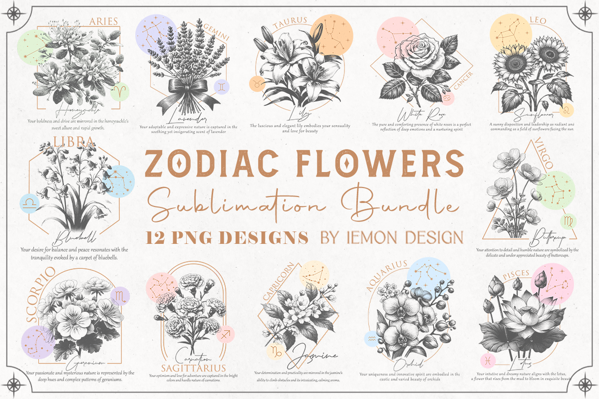
This one snuck up on me. I am not a flowers-on-the-wall person, usually. But pairing each sign with its birth flower turns the whole astrology thing soft and botanical instead of mystical, and that worked in a room where stars would have felt too much. Less occult, more old field guide.
I gave one to my cousin for her birthday, her sign’s flower, printed at 8×10 on slightly heavier matte stock so the petals didn’t go flat. She framed it in plain oak and it sits in her kitchen next to actual dried flowers and nobody can tell which is the print from across the room. That was the goal.
It is sold for sublimation, which I do not do, no heat press, no mug ambitions. I printed it flat on paper like everything else and it looked fine. The flowers do not know what they were meant for. One catch, a couple of the lighter pastels printed paler than the screen promised, so I bumped saturation a touch on the second run.
Card shapes that fix a tall, awkward empty space
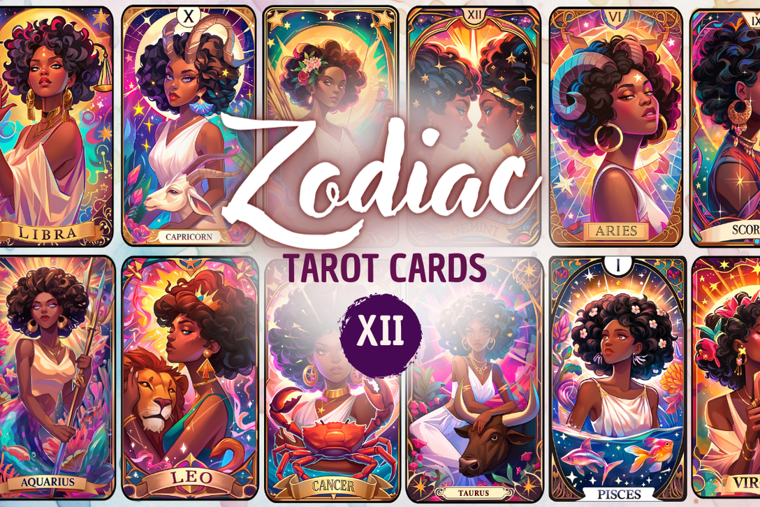
Tarot proportions are the secret weapon here. Tall and narrow, which is exactly the shape of every annoying skinny wall gap in a rental. I had a dead vertical strip by the front door for a year. One of these, printed long and slim, killed it.
Twelve cards in the set, one per sign, and the illustration style leans old and a little witchy without going full Halloween. I ran my own at 5×7 in a thin frame, no mat, because the card border is already doing the framing for you. Three of them side by side reads like a spread laid out on a table. People stop and look.
Do not crop these square. I learned that the hard way, squashed a Pisces into a 5×5 once and it looked like a sticker that lost a fight. The tall ratio is the entire charm. Keep it tall.
Clean glyphs for the minimalist who hates clutter
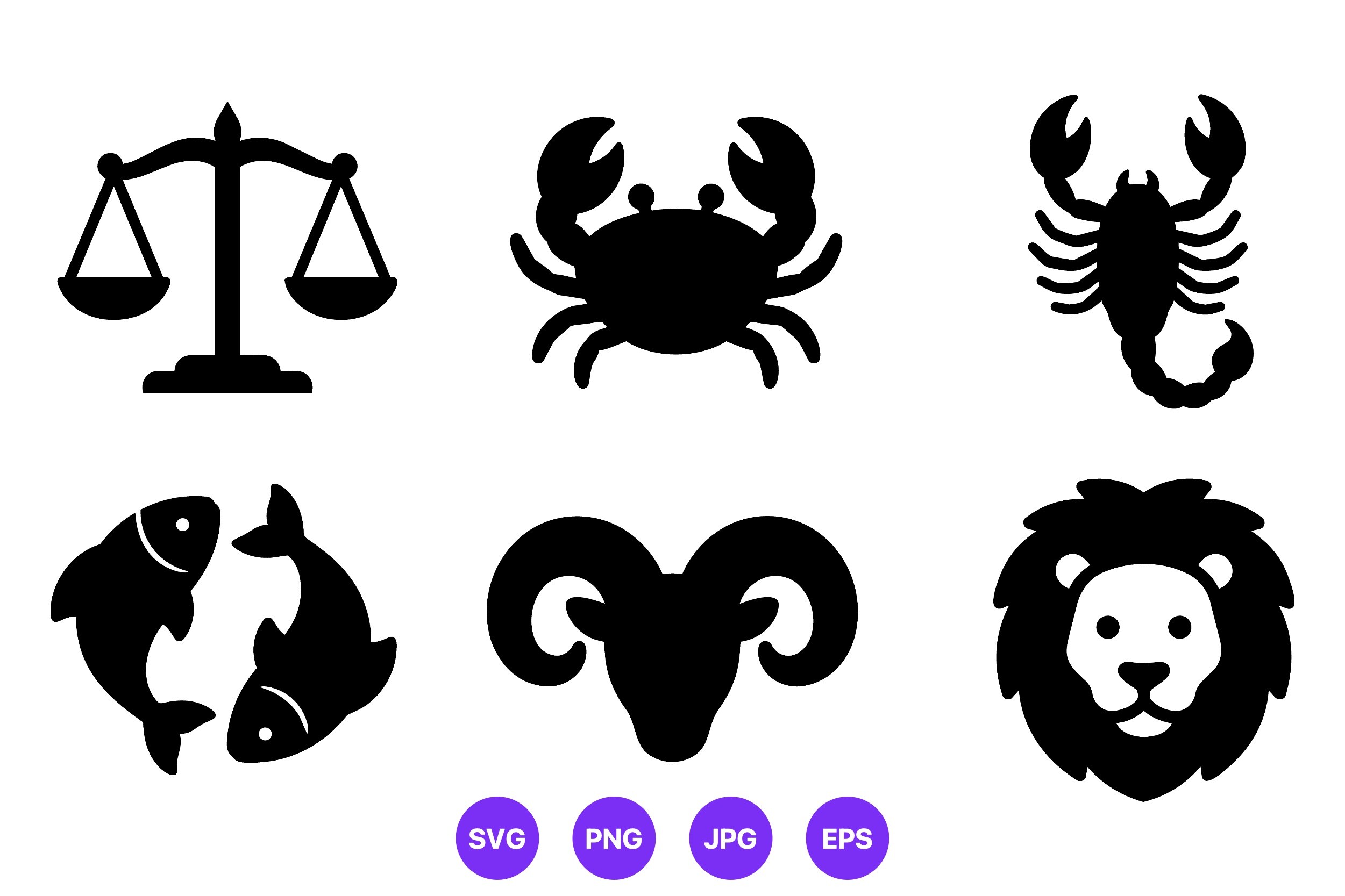
When I want the wall to shut up, this is the set. Just the silhouette icons, no flourish, no flowers, no quote. The line stays even across all twelve, which matters the second you hang more than one because mismatched stroke weight looks like two different hands wrote them.
Because they are vectors they scale to anything, so I went big for once. One single Scorpio icon at 11×14, charcoal on bone-white, hung alone above a low shelf. The empty space around it is the whole point. A small glyph swimming in white reads expensive. Crowd it and it reads like clip art, which technically it is.
The honest note, there is no built-in layout, so a grid is on you to arrange. I spent a chunk of one evening nudging twelve tiny icons into even rows in a flat template. If fiddling with alignment makes you twitch, this set will test you. I happen to find it soothing, but I also moved tiny moons around a canvas for fun once, so.
The one that left the wall and became a gift instead
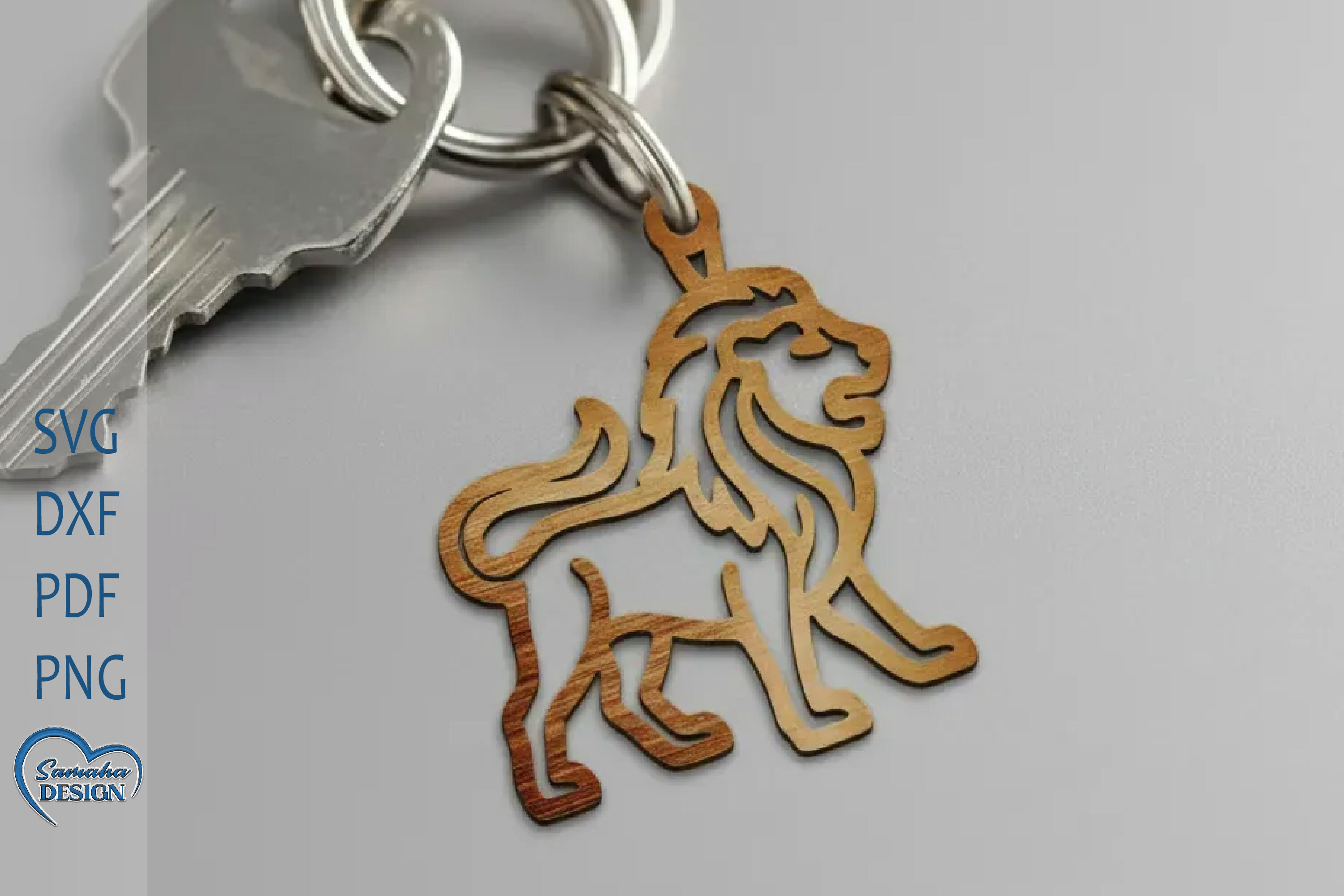
Not everything astrology has to hang. This one threw me, it is a laser-cut keychain file, the lion for Leo, and at first I almost skipped it for a wall-art list. Then a coworker who is aggressively a Leo had a birthday and I had no idea what to get her.
I do not own a laser cutter. A maker space two towns over does, and they cut me one out of birch ply for the price of a coffee. Sanded the edge, slid a ring through, done. She has had it on her keys for months and it has gone soft and shiny the way wood does when a hand touches it daily. Better than another mug.
So this is the odd one out on the list, and I am leaving it in on purpose. The catch is obvious, you need access to a cutter or a service, which not everyone has. If you do, it is the most personal thing here. If you do not, skip to the prints.
Animal versions for people who roll their eyes at horoscopes
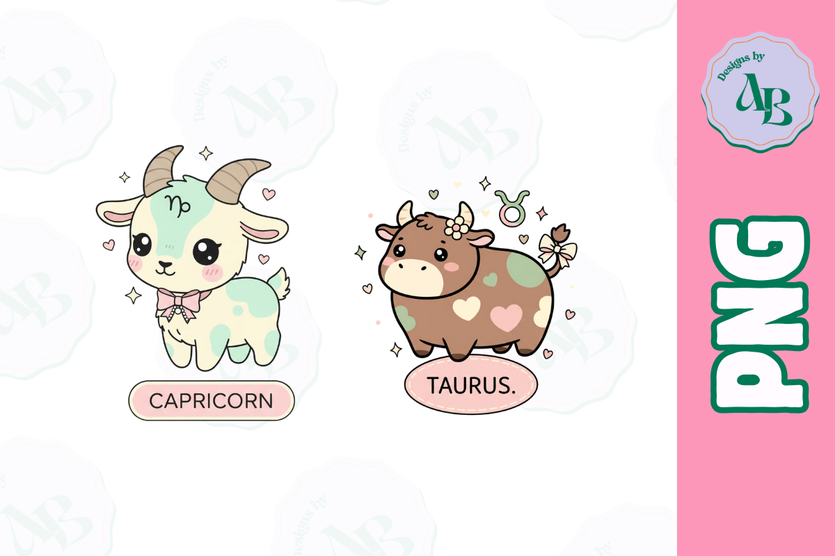
Some of my favorite people think astrology is nonsense but will happily hang a nice illustration of a goat. This is for them. The signs rendered as their animals, ram, bull, crab, lion, drawn with enough character that they read as art and not as a personality quiz.
I used the crab for a friend’s bathroom, of all places, a little 5×7 by the mirror, because Cancer and a beach-y bathroom made a dumb joke we both liked. It works. The animals have weight to them, the lion especially does not look like a sports logo, which is the usual failure mode.
Color is the thing to watch. A few of the warmer tones drifted a little muddy on the cheaper copy shop run. I asked for the better machine on the second batch and the difference was real. Pay the extra dollar when the file has a lot of warm color in it.
The reader’s set for a shelf instead of a gallery wall
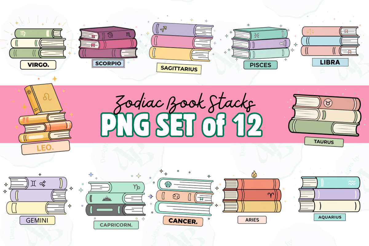
Last one, and it is the coziest. Bookish zodiac, the signs tangled up with stacks of books and reading nooks, made for the kind of person whose love language is recommending novels. I am that person. So is half my family.
I printed a small one and propped it on a picture ledge above my actual books rather than framing it, because it belongs leaning against spines, not floating on a blank wall. Looks like it grew there. My sister-in-law, who has more books than floor, took the file and did the same above her reading chair.
The quibble, the detail is fine at small sizes but softens if you blow it past 11×14. I tried a big version once and the little book spines fuzzed into mush. Keep it modest, prop it near actual books, and it stays crisp and a little smug, in a good way.
Questions I Get About These
Are zodiac signs part of astrology?
Yes, the twelve signs are the alphabet astrology is written in. Astrology is the whole practice of reading meaning into where the sun, moon, and planets sit, and the zodiac signs are the twelve slices of sky those bodies move through. So a sign print is really one small letter from a much longer system. You can hang the letter without buying into the sentence, which is mostly what I do.
Astrology vs zodiac signs?
Think of it as the difference between a language and its letters. Zodiac signs are just the twelve named segments of the sky, Aries through Pisces. Astrology is everything people do with them, the charts, the planets, the predictions. For wall art the distinction barely matters. Most of what sells as astrology prints is really just the signs themselves, dressed up as glyphs or animals or flowers, and that is plenty for a wall.
Before You Tape Anything Up
If I had to boil down a year of printing this stuff, it is this: pick the version that matches how cynical you are. True believer, go mystical or tarot. Eye-roller, go animals or flowers and call it a nice illustration. Either way the wall ends up calmer than a poster ever made it.
Right now my hallway has the silhouette Scorpio swimming in white space and the bookish set leaning on the shelf, and the place has felt settled for a couple weeks, which for me is a record. If one of these catches you, the links send a little back my way and cost you nothing extra.