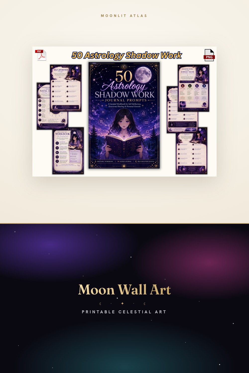
My hallway smells like dust and old terracotta paint. I keep repainting it a shade warmer every spring, and every spring my partner asks why. I don’t have a good answer. The wall just wanted to be browner, so I made it browner.
Boho celestial is a weird tightrope. Get it right and a sun face over a thrifted macrame hanger looks like you meant it. Get it wrong and you’ve got a dorm room with extra steps. Too much gold, a butterfly that’s screaming, a moon the size of a dinner plate next to a tiny moth. The eye notices. I notice on a Tuesday at 7am with bad coffee, which is the harshest jury there is.
So here’s what I dragged into my flat-print template, printed at the cramped copy shop on Eldridge, and lived with for a week before I let it near a frame. Some links here are affiliate links. Grab one and a little comes back to me. You pay nothing extra.
A few links below are affiliate links. If you grab a print through one, it sends a little something my way at no extra cost to you.
The blue butterfly that warmed up a cold corner

My north-facing corner is a graveyard for prints. Anything cool-toned goes dead there by noon. This butterfly should have died too, all that blue, but the florals around it are this dusty rose-clay color that drags the whole thing toward warm. Printed it 8×10, propped it against a clay pot of trailing pothos, and the corner finally stopped looking like a waiting room.
The wings hold detail when you shrink them, which most butterfly art does not. I ran a test at 4×6 first because I am cheap and the copy shop charges by the sheet. Still crisp. The veining didn’t turn to mush.
One gripe. The blue is bluer than the thumbnail sold me on. If your room runs grey-cool it’ll fight you. Mine runs warm so it worked, barely.
A book stack that earned its spot above the radiator

I am a sucker for a book pile and a moon. This one stacks worn spines under a little crescent and some leaves, and it reads autumn without being a pumpkin-spice cliche. The browns are layered, not flat. There’s a faded ochre spine in there that matches a real ottoman I own, which felt like a sign.
Hung it above the radiator at maybe 5×7. The radiator gets warm, the print does not curl, the frame I used was a $4 thrift find with the glass still intact. Looks like I planned it. I did not plan it.
The one thing. There’s a lot going on in a small space here. At 4×6 the smallest leaves blur into the spines. Go 5×7 or bigger or you lose the texture that makes it good.
Watercolor wash that plays nice with linen

Some watercolor art prints turn into a gray puddle the second you shrink them. This one didn’t. The wash stays soft but the edges hold, and the palette leans terracotta and faded sage, which is exactly the boho-adjacent mush I am always reaching for. I have a nubby linen runner on the console and this print sits over it without clashing.
Did mine at 5×7 in a plain wood frame, no mat, leaned not hung. Leaning is my whole personality at this point. Less commitment, more rearranging on Sunday nights.
Gripe time. The white background is true white, not cream. Against my warmer wall it glows a little too clean. I trimmed the border down by half an inch to let the wall breathe through. Fixed it.
Sun face that anchors the rattan shelf

Every boho corner secretly wants a sun face. Mine fought it for a year. I had a bare rattan shelf and a sad fake fern and nothing tying them together. This sun, with its sleepy half-lidded eyes and warm ochre rays, did the tying. Printed at 8×10, propped center shelf, fern demoted to the side.
What got me was the line weight. The rays are thick enough to survive a small print and a cheap frame without looking spindly. I held a 5×7 test up across the hall and it still read as a sun, not a smudge. The across-the-hall squint is the only test I trust.
One catch. The face is bold. It will dominate whatever you pair it with, so don’t hang it next to anything else loud or they’ll brawl. I gave it a quiet neighbor and peace returned.
A repeating pattern I cut up for tiny frames
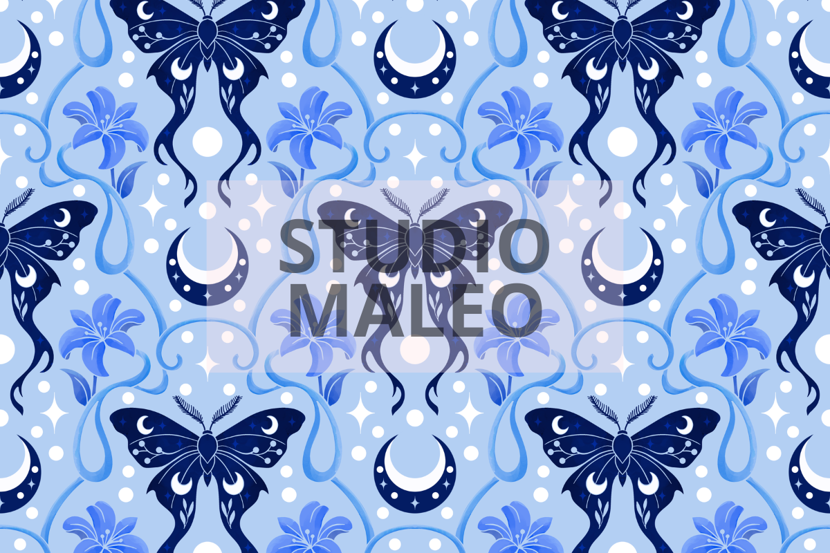
This is a seamless pattern, moths and lilies, and I did something the listing did not intend. I printed one tile, sliced it into three little squares, and ran them in a row of 4×6 frames over the light switch. A cheap trick. Looks expensive. The moth wings are this soft brown-mauve that vanishes into a warm wall just enough to feel mysterious instead of busy.
I open it in Canva, drop it flat, print at the shop, done. No fuss. The repeat means I can crop wherever and never hit an ugly seam, which is the whole point of using it this way.
The nitpick. As a single full print it can feel like wallpaper, a bit much. Cut it up. Treat it as raw material, not a finished piece, and it earns its keep.
The mystic cat my actual cat ignores
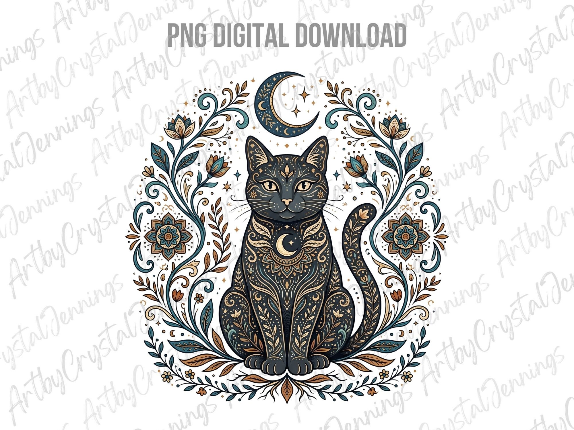
I bought this partly as a joke and it stayed because it’s genuinely good. A cat ringed in florals and little stars, warm palette, a face that’s more knowing than cute. My real cat, Bean, sat directly under it the day I hung it and has never looked up since. Typical.
The colors are the win. Burnt orange, soft cream, a muted plum in the florals. It sits on a shelf next to a dried bundle of something I forget the name of and the whole vignette looks intentional. Did it at 5×7, leaned against the wall, third frame I tried before one stopped fighting the proportions.
Gripe. The composition is tall and narrow, so a standard 8×10 frame leaves awkward dead space top and bottom. Go for a 5×7 or a slim frame or you’ll be staring at empty margins.
One moth, a lot of restraint

After all the florals and book stacks I wanted one quiet thing. Just a moth. Symmetrical, detailed wings, a few stars, and a brown that goes warm rather than muddy when you print it small. This is the print I reach for when a wall is doing too much and needs one calm anchor.
Did mine big for once, almost 11×14, in a thin black frame above the dresser. The detail holds at that size, the wing patterning stays sharp, no pixel mush. I was braced for mush. There wasn’t any.
The one thing. It’s symmetrical, almost clinical, so it can read a touch cold if your room is all hard edges. I softened it by leaning it against a stack of books and a brass candlestick. Warmth fixed.
Questions I Get About These
What colors make celestial art look boho?
Warm and a little faded. Terracotta, ochre, dusty rose, muted sage, burnt orange, plenty of brown. Skip the cold navy-and-gold combo, that reads more art-deco than boho. I learned this by hanging a navy moon print in my warm hallway and watching it look like an orphan for a month. The boho versions all lean earthy, like they got left in the sun a season too long.
How do I mix celestial prints with plants and macrame?
Let the textures do the talking and keep the prints calmer than the room. My rule, learned the hard way, is one loud piece per cluster. A bold sun face gets quiet moth and butterfly neighbors. The macrame and the trailing pothos add the movement, so the art doesn’t need to. If everything is busy at once your eye has nowhere to rest and the corner feels like static.
Is celestial wall art good for a boho gallery wall?
Yes, if you pick a warm palette and vary the sizes. I mix a big 11×14 anchor with a few 4×6 and 5×7 pieces, lean some, hang some, and leave gaps on purpose. The thing that kills a gallery wall is everything being the same size and perfectly spaced. It looks like a catalog. A little wobble, a few leaned frames, and it looks like a person lives there.
Before You Tape Anything Up
None of these went up on a master plan. I printed them cheap on Eldridge, leaned them against the wall, and let the ones that still looked right after a week stay. The moth and the sun face earned frames. The rest are still leaning, and honestly they might stay that way.
That’s the boho-celestial trick I keep relearning. Warm over cool, restraint over more, and the across-the-hall squint over anything a thumbnail promises. Tape the proof up, live with it a few days, trust your own tired morning eyes. They’re harder to fool than you’d like.