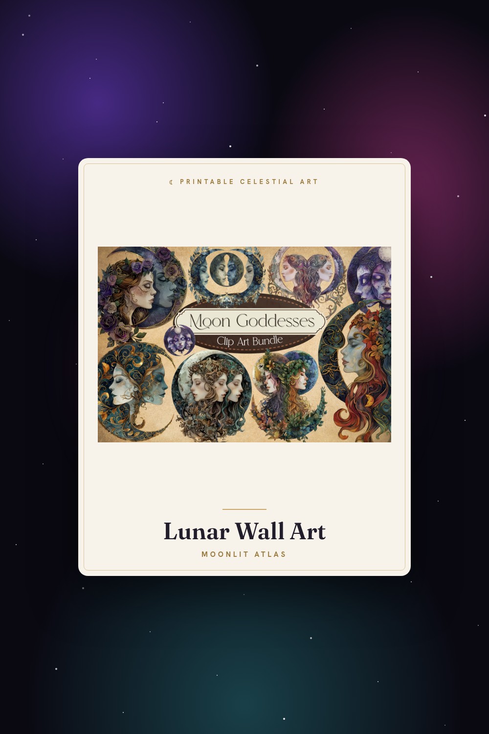
I started tracking the moon the same year I started tracking myself. Not for any deep reason. I bought a cheap wall calendar at the corner shop on Eldridge, the kind with tiny moon icons in the date squares, and I found myself looking at it more than my phone. New moon here. Full moon there. My own little notes crammed in the margins in pencil so I could erase them when anyone came over.
Somewhere along the way the calendar fell apart and I wanted something quieter on the wall instead. Something that didn’t shout dates at me. Just a soft shape that matched the rhythm I was already half-watching. That’s a strange thing to shop for, by the way. Half the moon art out there is either screaming witchy gothic or so pastel it looks like a baby shower invite. I wanted the middle. The grown-up middle.
So these are the ones I dragged into my flat-print template and lived with for a week each, taped above the radiator in the back room where I keep tea and a heating pad and that little notebook. None of this is medical. I’m not promising the moon does anything to anyone. I just like having the cycle on the wall instead of buried in an app I forget to open. Some links below are affiliate links, which means if you grab one a few cents wander my way. Doesn’t cost you a thing.
A few links below are affiliate links. If you grab a print through one, it sends a little something my way at no extra cost to you.
The one with the moth that I almost scrolled past
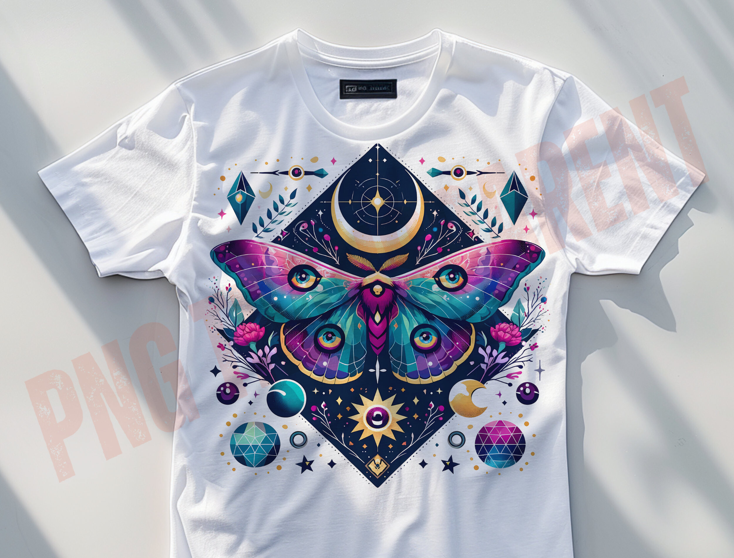
A luna moth sitting under a row of moon phases. I nearly skipped it because the word witchy in the title made me brace for something heavier than I wanted. It isn’t heavy at all. The moth is soft and a little faded, wings spread, and the phases arc above it like a small parade. I printed it at 8×10 and put it right above the notebook where I jot things down. The green-gray of the moth went calmer on paper than it looked on screen, which was a relief.
There’s a tenderness to it that surprised me. Moths only live a week or two as adults. Hanging one over the place where I track my own small monthly turn felt right in a way I can’t quite explain and won’t try to.
One gripe. The detail in the wings is fine until you go below about 6 inches wide, then the texture muddies and it just reads as a brown blob. Keep it bigger. It earns the space.
Soft enough that nobody asks what it means
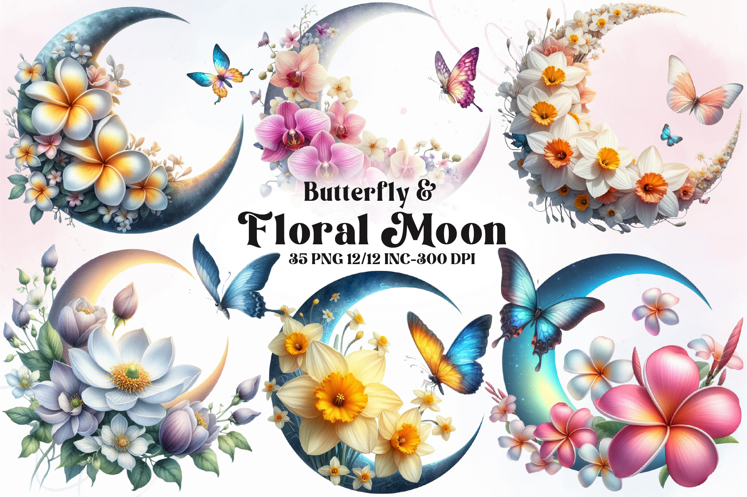
Butterfly, flowers, a moon tucked into the bouquet. This is the diplomat of the bunch. My sister stayed over in February, slept in the back room, and never once asked why I had a moon over the tea station. Which is exactly the point. It reads as pretty florals first and only whispers the cycle thing if you already know to look.
The wash of color is the selling bit. Loose watercolor edges, nothing too crisp, the kind of thing that doesn’t fight with whatever else is on the wall. I have a thrift-store mirror next to it with a chipped corner and the two get along fine.
My one complaint is the file naming inside. Everything’s lumped together with cryptic numbers so I spent ten minutes squinting to find the version without the harsh white box behind it. Found it eventually. Printed it on 32lb at the copy place because my home printer chews anything thicker.
A single flower doing a lot of work
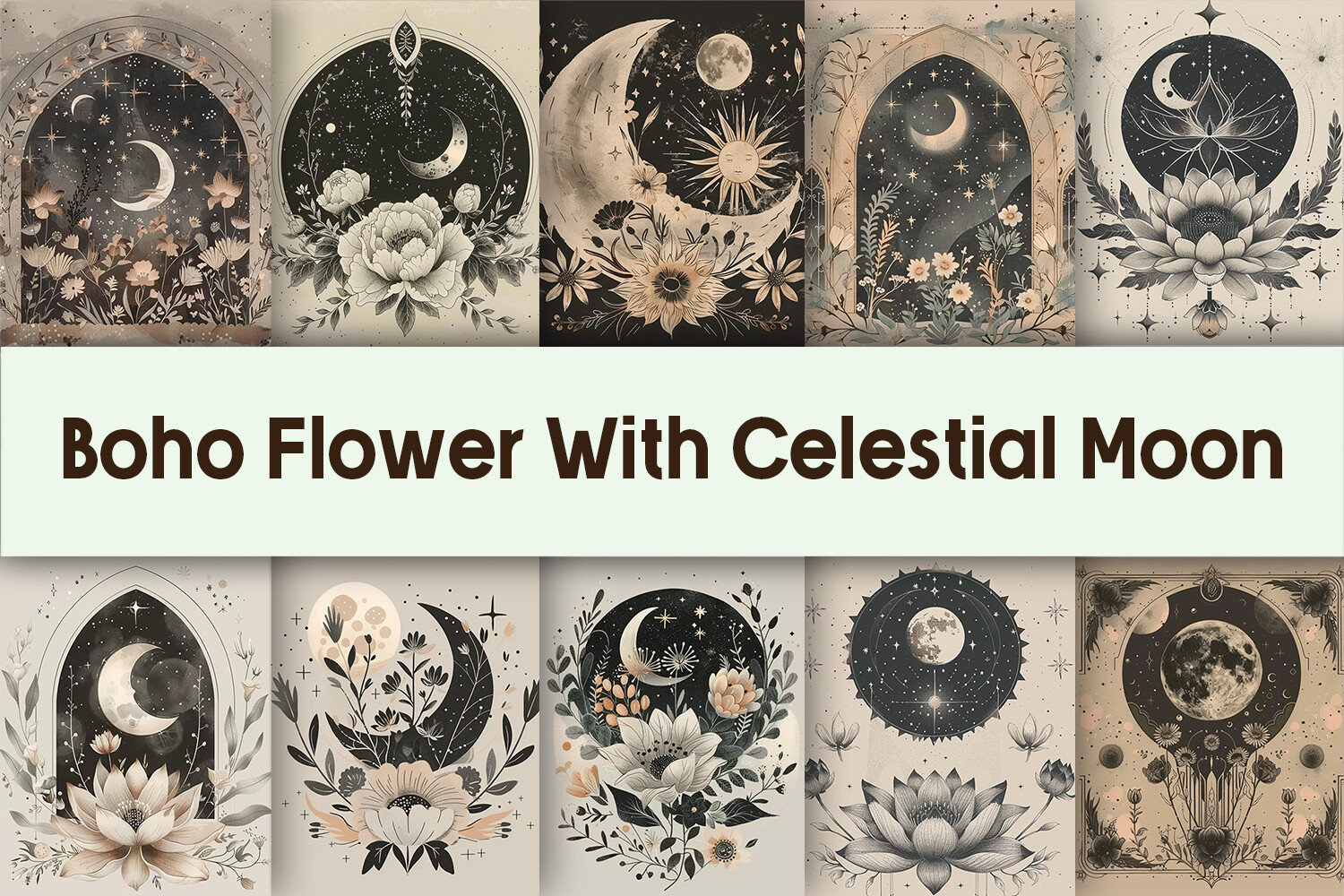
One bloom, one moon, clean line, plenty of breathing room around it. I have a habit of buying busy art and regretting it by Tuesday, so I made myself try the quiet option for once. Glad I did. It’s the print I notice least, which sounds like an insult and isn’t. It just sits there being calm while I’m refilling the kettle.
I did mine small, 5×7, in a thin black frame I already owned. The negative space around the flower is what makes it. Cram it into too big a frame and it floats and looks lost. Tight frame, small print, low on the wall near the nightstand. That worked.
Fair warning, the linework is delicate. At a glance on the listing it looks bolder than it prints. When I ran a test it came out almost shy. I bumped the contrast a touch before the real run and it held up.
The one I had no business buying and bought anyway
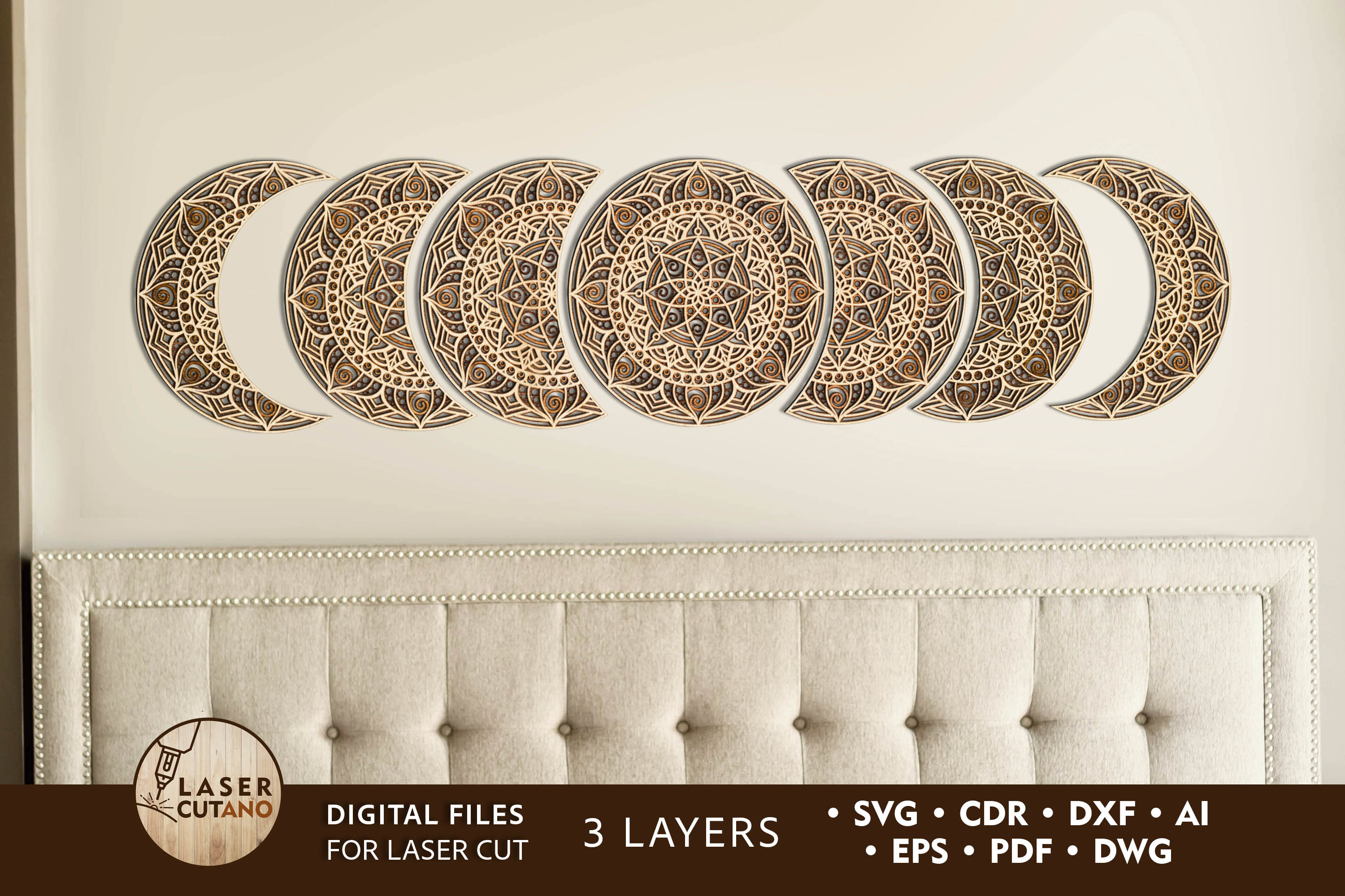
This is the cut-and-stack layered kind, not a flat print, and I knew that going in and bought it on a whim at 11pm. Reader, I do not own the machine that cuts these cleanly. I tried by hand with a craft knife on a Sunday and the third layer came out looking like a raccoon had opinions about it.
So here’s my honest take. If you have the patience and the right tools, the layered moon phases look genuinely lovely, real shadow, real depth, the moons sitting forward off the wall. If you’re me, a person who repaints her hallway more than she finishes projects, you’ll get two layers in and prop it on a shelf half-done and call it intentional.
The files themselves are well separated by layer, which is more than I can say for half my downloads. The fault was entirely mine and my unsteady hand. Still on the shelf. Still two layers. Still telling people it’s a work in progress.
Not really a print, more of a backdrop
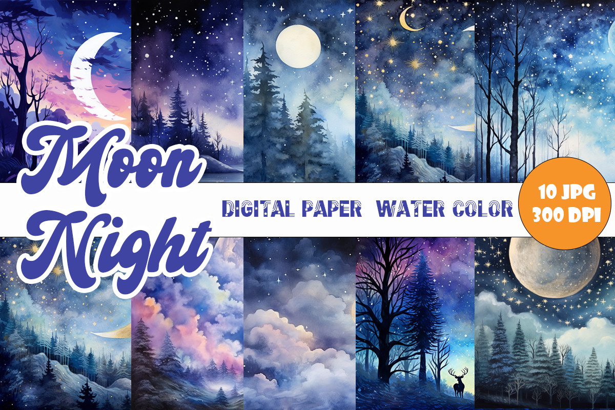
These are sheets of moonlit watercolor texture, deep blue going to that bruise-purple you get right after sunset. I didn’t hang these as-is. I used them as the background and laid a small moon-phase row on top in my template, then printed the whole thing as one piece. Took me three goes to get the moon to read against the dark. Worth the fiddling.
The blue is the good part. It’s not flat navy, it has movement in it, lighter where a moon would glow and pooling darker at the edges. Above the radiator it makes the back room feel like dusk even at noon, which I like more than I expected to.
The catch is the dark printing problem nobody warns you about. Deep blues eat ink and my home printer gave me a streaky mess, so I caved and sent it to the copy place on Eldridge. Came back rich and even. Lesson learned, again, for the hundredth time.
The workhorse I keep coming back to
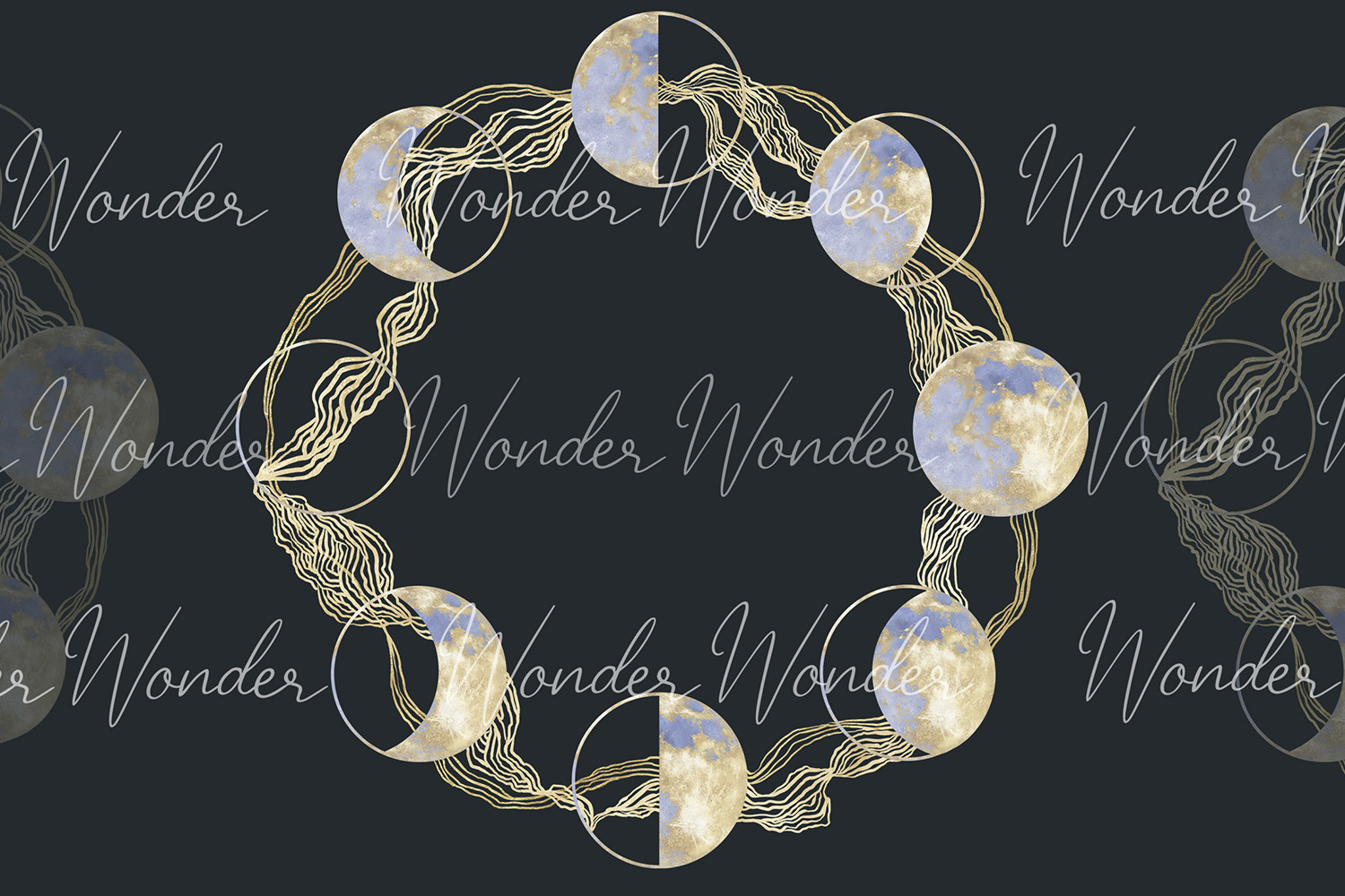
Plain moon phases on transparent backgrounds. Nothing fancy. This is the set I open when I want to build my own thing instead of hanging someone else’s finished art. I dropped a clean phase row above the light switch in the back room and it took maybe twenty minutes. Looks deliberate. It absolutely was not, it was a Wednesday and I was procrastinating.
What makes it useful is that the moons sit on nothing, so I can throw them over my own color, my own paper texture, whatever I’ve got going. I’ve reused these in three different prints now. Best per-use cost in the whole download folder.
The gripe is that the phases are very plain. Too plain on their own. Print them flat on white and they look like a science worksheet. They need a background or a frame doing some lifting. Give them that and they pull their weight.
More than I’ll ever use, and that’s fine
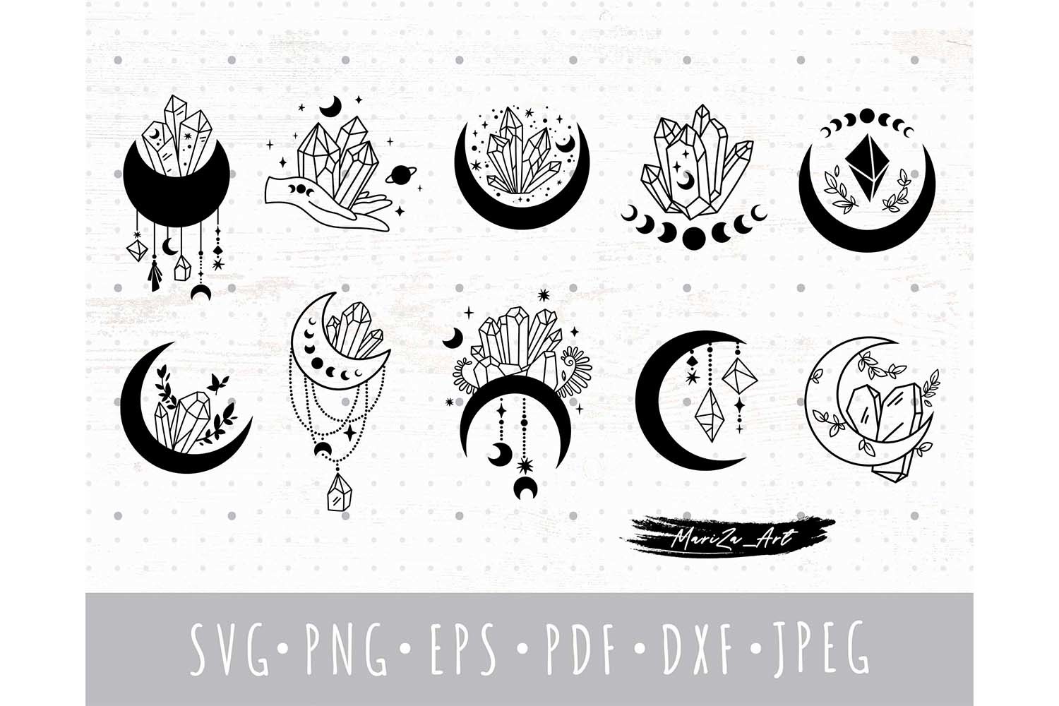
A big bundle of crystals and moons, the moodiest of the lot. I bought it for one crescent-with-a-crystal piece I’d seen and ended up with about forty things I’ll probably never touch. That’s bundles for you. You pay for the one and inherit the rest.
The one I wanted lived up to it though. A thin crescent with a little faceted stone tucked into the curve, printed at 5×7, hung lowest on the wall right by the heating pad. It’s the most personal one of the bunch and the one I’d grab first if the room flooded.
My honest knock is that some of the bundle leans hard into the heavy mystical look, the kind of dense ornament that tips a calm corner into a tarot booth fast. I kept exactly one piece and ignored the rest. No regrets, but go in knowing you’re paying for a pile to keep a single gem.
Questions I Get About These
Does the moon cycle affect the menstrual cycle?
Honestly, the science here is muddy and I’m an art seller, not a doctor, so I won’t pretend to settle it. Some people feel a connection and like marking it. Plenty don’t. I hang the art because I enjoy having the lunar rhythm on the wall, not because I think a print does anything to a body. Track what feels good to track and skip the rest.
Can a full moon change your menstrual cycle?
There’s no reliable proof of that, and I’d be wary of anyone selling art on a health promise. The full moon is just the prettiest phase to print, which is probably why it gets all the attention. If you want a piece that nods to that night, go for it because you like the image. Not because it’ll do anything.
What moon cycle are we in?
That shifts roughly every couple of days, so any answer I type here goes stale fast. I keep a small paper calendar with moon icons on it for the at-a-glance version, and a free phase site bookmarked for the exact one. The art on my wall is the decorative layer on top of that. It sets the mood, the calendar does the actual telling.
Before You Tape Anything Up
If you take one thing from all this, let it be that the quiet middle exists. You don’t have to pick between baby-pastel and full-on occult. The prints I kept are the soft ones that don’t announce themselves, the ones a guest can sleep under without asking a single question.
None of these will do anything to your body and I’d side-eye any that claimed to. They’re wall art. Pleasant shapes for a corner you want to feel a little gentler. I tape mine up, live with them a week, then commit to a frame I probably already own. That’s the whole ritual. The notebook stays in pencil. The moon stays on the wall.