December does something mean to my hallway. The light leaves by 4pm and the whole place goes the color of dishwater, and I start moving furniture around like that will fix it. It won’t. What fixes it, a little, is hanging something on the wall that admits the dark instead of fighting it. Solstice art does that. It’s about the shortest day, so it doesn’t pretend the sun is out.
I bought my first solstice print three winters ago on a Tuesday when I was avoiding a tax form. Pinned it above the radiator. The heat warped the paper by January and the sun motif looked like it was melting. Funny for a week. Annoying after. So now I print these flat at the copy shop on Eldridge, let them sit overnight, and only frame the one that still looks right in morning light.
Below are seven I went through this year. Some are clean line work, some are loud folk-art things I’d only hang for the three weeks around Yule. A couple are quote prints that I’d normally roll my eyes at. One of these links is an affiliate link, so if you grab a set it sends a few cents my way. Doesn’t change your price.
A few links below are affiliate links. If you grab a print through one, it sends a little something my way at no extra cost to you.
The one that’s secretly a teaching kit, not a poster
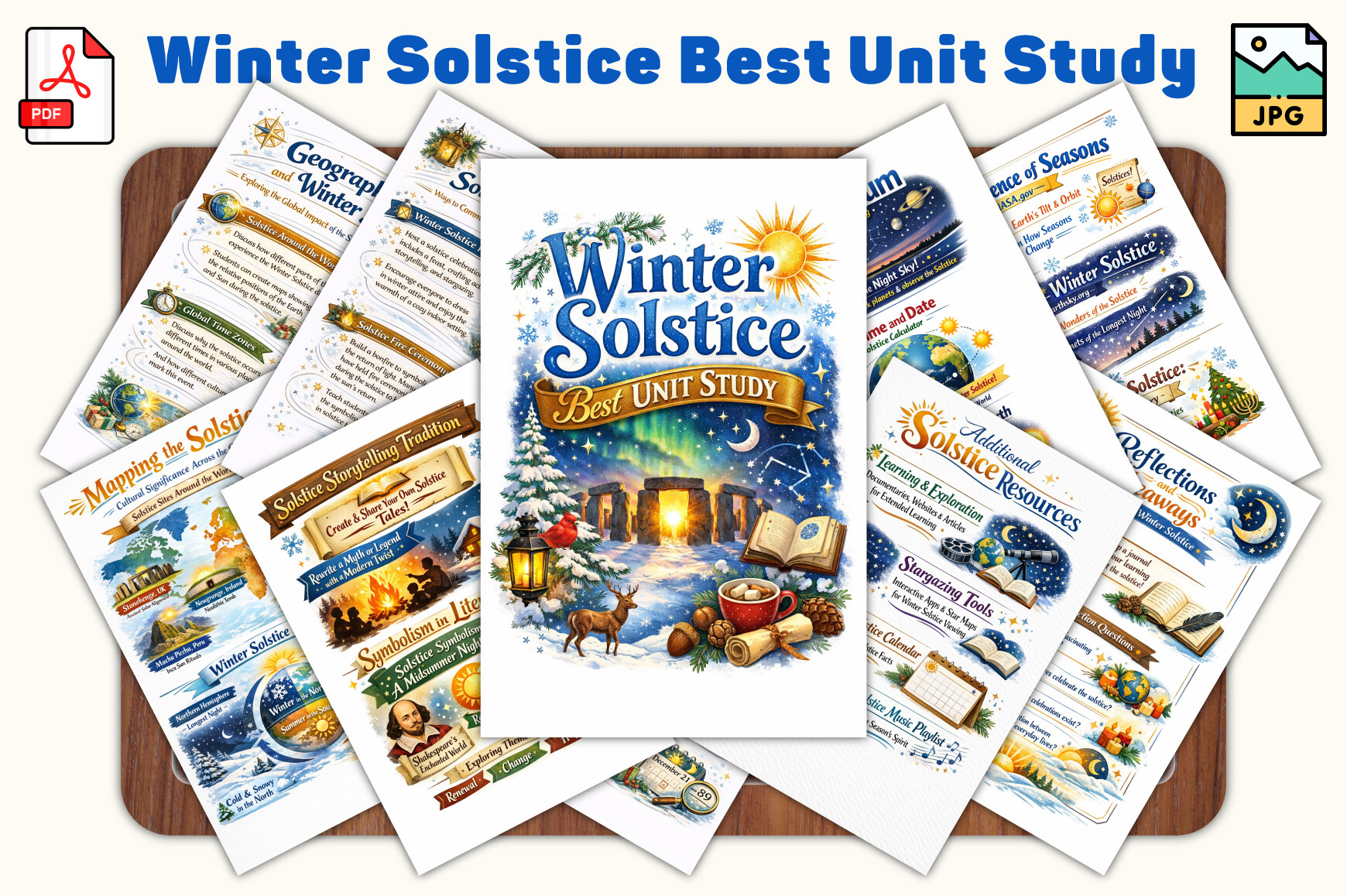
I almost skipped this because it’s built as a unit study, not wall art. My mistake. The pages inside have these spare little diagrams of the Earth’s tilt and the sun’s lowest arc, and printed at 8×10 on the matte side, two of them next to each other looked smarter than anything I’d have designed. I put the tilt diagram and the daylight-hours chart in the spot by the coat hooks. People ask about it.
It leans educational, which is the appeal and also the catch. If you want pretty-only, this isn’t it. The typography is plain. But for a kid’s room or a reading nook where you want the print to actually say something about why the day is short, it earns the wall. I printed the diagram page twice before I got the contrast dark enough.
My gripe is the layout was clearly made for letter-size worksheets, so cropping it down to a frame size meant losing a margin of text on the left. Took me three tries to recenter it in the copy-shop software.
Shortest day, said plainly
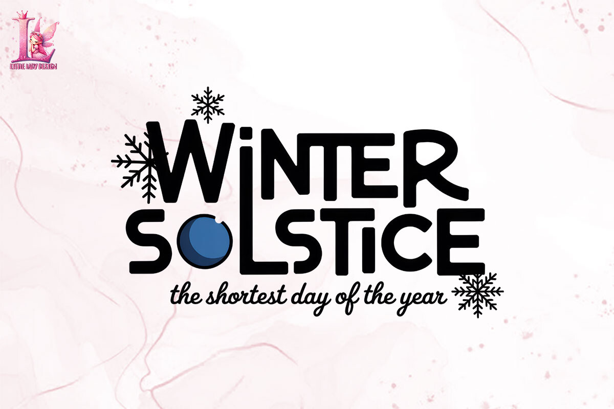
This is the quiet one. A simple sun-on-the-horizon mark with the words about the shortest day underneath, and it reads from across the room without trying. I ran it at 5×7 and it sat above the light switch where the melting-sun disaster used to be. Felt like closing a loop.
The black holds up small, which matters, because half the solstice files I tested went gray and sad once I shrank them. This one didn’t. I held the proof up at arm’s length, squinted, walked to the kitchen and looked back. Still legible. That’s my whole test.
One thing. The file is a flat raster, so I couldn’t recolor the sun to match the warm bulb I have in that hallway. I wanted a deeper amber. Couldn’t get there. Lived with it.
A blessing print I expected to hate

Blessing prints make me itch. They usually go full cursive and full glitter. This midwinter one stays restrained, a short line about solstice blessings over a sparse midwinter motif, and when I taped it next to the plain shortest-day print the pair looked intentional. Warm without being a card-shop thing.
I’d put this where you actually pause. Mine ended up by the kettle, which is where I stand at 6am in the dark feeling sorry for myself. The word “blessings” hits differently at that hour. I didn’t plan that. It just worked.
What bugs me is the spacing between the words and the motif is a hair too tight, so at larger sizes the text crowds the art. I kept it at 5×7 and the problem went away. Bigger than that, it gets cramped.
Bolder sibling of the set
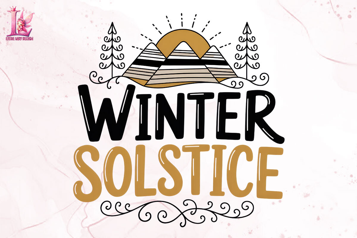
There’s a little family of these solstice files from the same maker, and this is the louder member. Heavier sun, more weight in the strokes, the kind of thing that wants to be the only print on a wall instead of part of a row. I tried it in a trio first. Drowned the other two. Pulled it out, gave it its own nail above the bench by the door, and then it made sense.
Good for a small wall that needs one decisive thing. Bad for a gallery cluster, because it bullies whatever you hang beside it. I learned that by hanging it beside the quiet shortest-day print and watching the quiet one disappear.
The one annoyance is the strong black means it eats ink. My home printer gave up halfway, streaked the bottom third, so this is firmly a copy-shop print for me. At 8×10 on their heavier stock it came out solid.
The starter of the trio
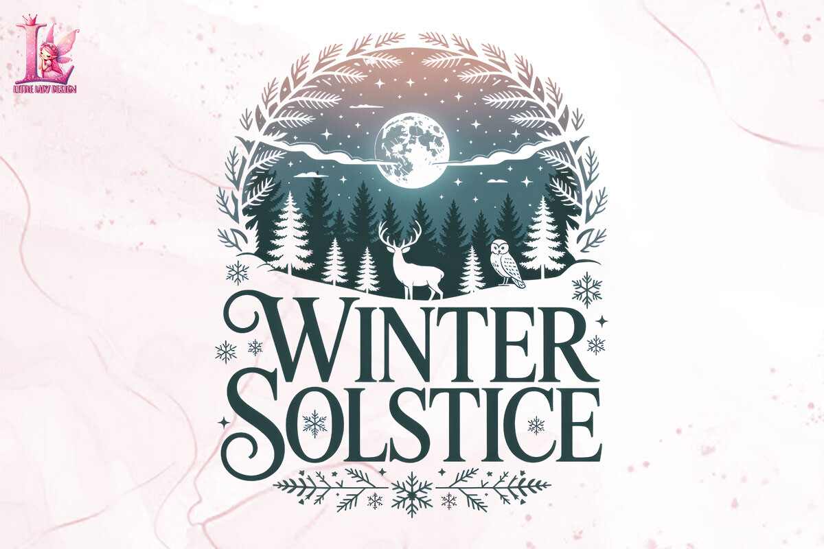
If the bold one is the bully, this is the easygoing first piece. Same hand, lighter touch. A clean solstice sun with a bit of breathing room around it, which I always end up reaching for because it doesn’t demand the whole wall. I hung it at 5×7 just above the nightstand and forgot about it, in the good way. It just sits there being fine.
This is the one I’d hand someone who’s nervous about solstice or pagan-leaning art and worried it’ll look costume-y. It doesn’t. It reads as winter, full stop. My neighbor borrowed the file and put it in her entryway and it suited her beige everything.
My nitpick is small. The sun sits slightly left of true center in the file, maybe two millimeters, and once I noticed I couldn’t unnotice it. I nudged it in the crop. If you don’t fuss over centering you’ll never see it.
The plainest of the bunch

No words, no extras. Just the solstice sun mark on its own. I keep coming back to wordless prints because text dates a piece, and a bare sun I can leave up from November through February without it screaming a specific holiday. Printed two at 5×7 and stacked them vertically by the stairs. The stairwell finally stopped looking like a hallway nobody finished.
Works anywhere a quote print would feel like too much. Works in a rental where you can’t commit to a theme. I rotate this one in when I take the louder solstice piece down in January and the wall needs something but not a statement.
The catch is the file came smaller than its siblings, so blowing it up past 8×10 softened the edges. At 5×7 it’s crisp. At 11×14 the outline went a touch fuzzy and I bailed back down to the smaller frame.
Older take on the shortest-day idea
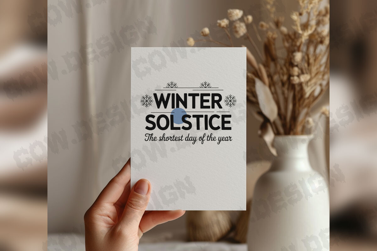
This is an earlier shortest-day design, a different file from the cleaner one above, and I almost passed because I assumed it’d be redundant. It’s not. The mark here is a touch more illustrative, more drawn-by-hand looking, and that texture reads warmer in a room with old wood floors like the place my sister rents. I tested it there over the holidays and it belonged.
Reach for this if your space leans cottage or folk rather than minimal. It would clash in a stark white room. Against her mismatched frames and the radiator that clanks, it was perfect company.
My honest gripe is the file is a JPEG, so it printed with a faint off-white box around the art instead of going clean to the paper. On her cream walls nobody clocked it. On my true-white hallway the box showed, and it bugged me enough that this one stayed at her place.
Questions I Get About These
What symbols represent the winter solstice in art?
The ones I see most across these files are the low sun on a horizon, the wheel or circle standing in for the year turning, evergreen and holly, and the occasional Yule log or candle. The sun is the heavy hitter because the whole day is about the sun reaching its lowest point. When I’m picking a print I look for the sun motif first. Everything else is supporting cast, and a print that piles on holly plus stars plus a wheel plus text usually ends up looking busy on an actual wall. I learned that by hanging a crowded one and taking it down within a week.
What is Yule winter solstice art?
Yule is the old midwinter festival that lands on the solstice, so Yule art and winter solstice art overlap a lot. In practice Yule pieces lean a little more toward the folk and pagan side, candles, evergreen, the returning light, while plain solstice art can be stripped down to just a sun and a date. The blessing print and the return-of-the-light style files in this batch are squarely Yule-flavored. If you want something you can leave up past late December, I’d steer toward the wordless sun marks instead, since they don’t pin you to one festival.
What sizes do winter solstice wall art prints come in?
Since these are files you print yourself, the size is whatever your paper and frame allow, not a fixed thing. I print almost everything at 5×7 because the black stays sharp and small frames are cheap to swap. The bolder solstice piece I bumped to 8×10 so it could carry a wall on its own. I’d skip going much past 11×14 with the smaller files here, because a couple of them softened at the edges when I pushed them big. Print a test on regular paper first, hold it at arm’s length, and if it still reads from across the room you’re fine.
Before You Tape Anything Up
Solstice art is the one seasonal thing I don’t mind hanging, because it isn’t asking the room to be cheerful. It just marks the darkest day and lets the light come back on its own schedule. The prints that survived my wall this year were the quiet ones, the plain shortest-day mark and the wordless sun, with the bold piece getting its own nail when I wanted a single loud thing by the door.
If you’re starting from zero, grab one wordless sun and one short-text print, run them at 5×7 at whatever copy shop is nearest, and live with them for a week before you commit a frame. That’s the whole method. The dark is coming regardless. Might as well put something honest on the wall while you wait it out.