Most star chart advice stops at “buy a nice print.” Then you tape it up dead center on a wall, step back, and the room looks like a hotel lobby. The print was never the problem. Where you put it and what you put next to it, that is the whole game, and nobody tells you because it is boring to explain and easy to get wrong.
I sell these things and I still hang half of them in the wrong spot first. Too high. Too alone. One lonely chart floating over a couch like it is waiting for a bus. The fixes are small and a little dumb once you see them. Stagger the sizes. Let one breathe and crowd the rest. Hang the skinny ones in the skinny gaps everyone ignores.
So this is less a shopping list and more a record of what I did with each of these once it came out of the printer. I run them flat at a copy place on Halsted Row because my home printer treats heavy stock as a threat. Then I move them around the floor like a jigsaw before a single nail goes in. A few links below are affiliate links, so if one follows you home a little something comes back to me. Costs you nothing.
A few links below are affiliate links. If you grab a print through one, it sends a little something my way at no extra cost to you.
Scattering small doodles to fill the gaps a big print leaves
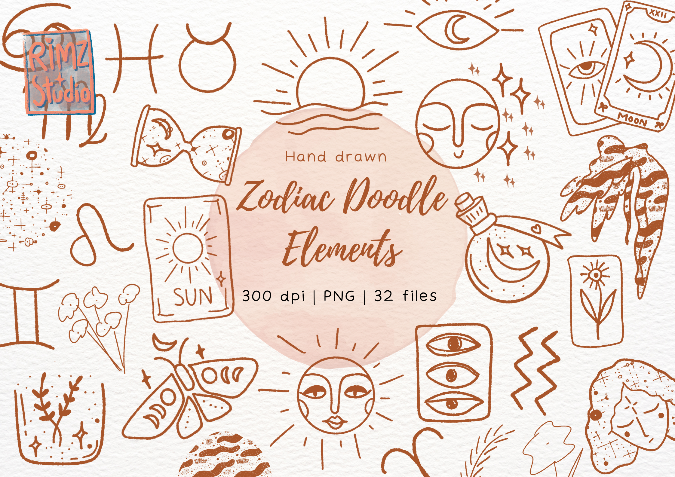
Every gallery wall has these awkward little holes between the main pieces. A big chart anchors the wall, sure, but then there is dead air around it that looks unfinished. This is what I plug those holes with. Loose hand-drawn bits, tiny moons and stars and squiggly suns, the kind of marks that look doodled in a margin.
I printed maybe a dozen at 4×6 and tucked them into the gaps around a larger map, no frames, just washi tape because the casual look is the point. They read like the wall is sketching itself. Did one cluster up a staircase too, climbing the wall as the steps climb, and it is the thing guests actually comment on.
The catch is restraint, which I do not have. My first try I used twenty of them and the wall looked like a teenager’s locker. Pull back. Three or four small doodles around one real piece, and let the rest stay quiet.
The gold accent that lets you go monochrome everywhere else

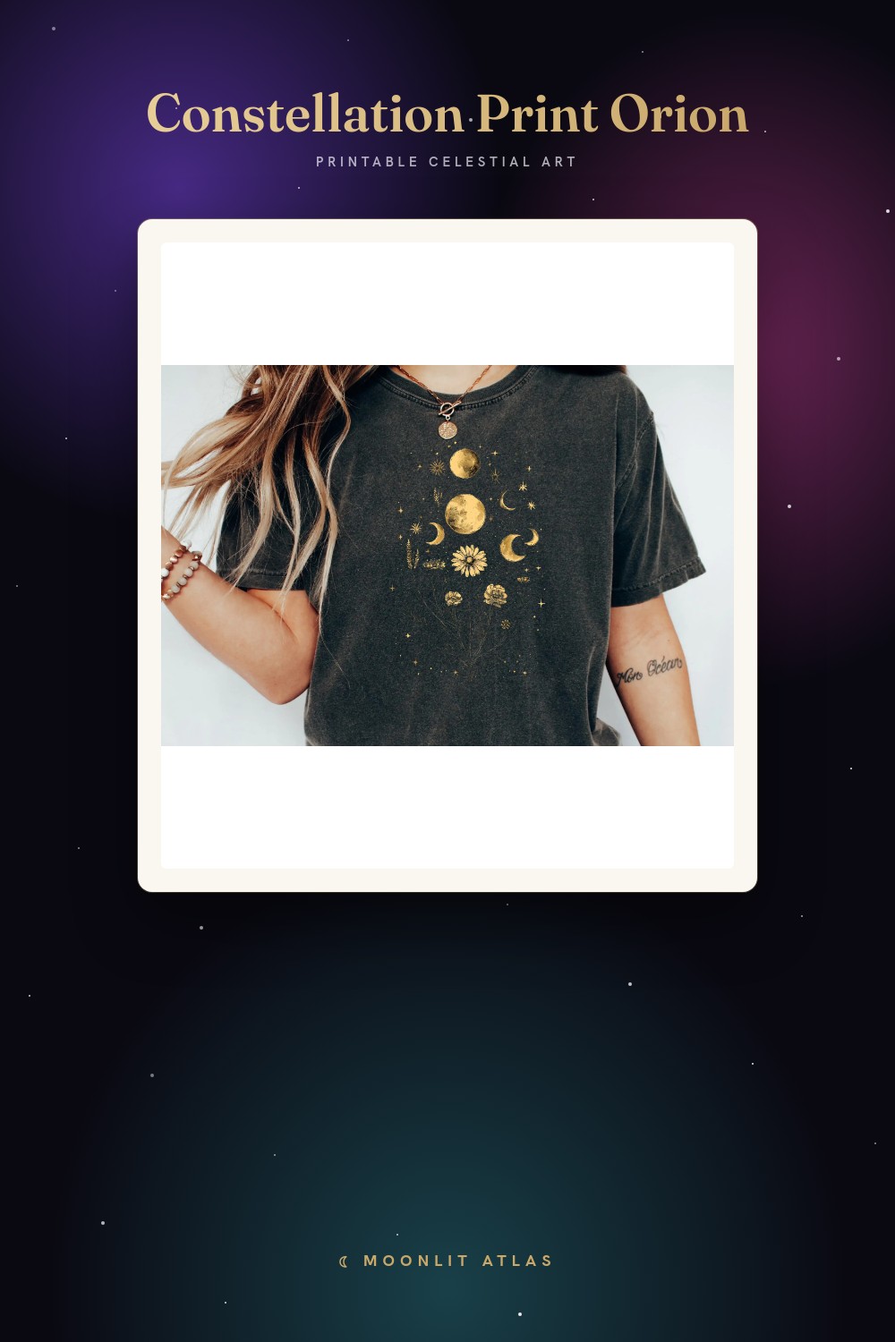
Here is a layout trick I stumbled into. If you want a whole wall of star charts to feel intentional instead of busy, keep almost everything black and white and let exactly one print carry the gold. These glyph logos are that one print. Warm metallic on a dark ground, just enough shine.
I hung a single one at 8×10 in the middle of a row of plain charcoal prints, and your eye lands on it first, then wanders the rest. Without it the row felt flat. With it the whole arrangement had a center. A friend who stages apartments calls this the one-warm-thing rule and she is right more than I like to admit.
Real talk on the gold. It prints as a flat mustard, not foil, so do not expect it to catch light like the screen suggests. I leaned into that and treated it as a warm color rather than a shiny one. Worked better the moment I stopped fighting it.
Soft watercolor for a wall that needs to calm down

Some rooms are already loud. Patterned rug, busy curtains, a couch with opinions. Hard-line star charts fight all that. Watercolor does not. The fish and the soft washes here go quiet next to chaos, which is exactly why I put a set of these in the one room that already had too much going on.
I printed three at 5×7 and stacked them vertically in a narrow column beside a bookshelf, where a sharp graphic print would have screamed. The bleed of the color reads almost like the wall is damp in a nice way, if that makes sense. Bedroom corner, low light, and it softened the whole nook.
Watch the paper though. Watercolor on plain copy stock goes dull and the whites turn grey. I did a run on a slightly heavier matte and the pigment finally looked wet again. That one upgrade was the difference between a print and a printout.
A patterned backdrop so a plain chart pops off it

This one is not a print to frame, it is a layer to put behind the prints. A starry glitter pattern, dense and dark, the kind of thing that works as a backing sheet inside a frame mat or as the actual wall behind a cluster. I use it to give a flat chart something to sit against.
What I did was print a panel of it, slot it behind a simple line-art map in a deep box frame, so the chart floats over a galaxy instead of plain white. Sudden depth. Looked like I paid three times what I did. Also taped a big sheet of it behind a small shelf as a backdrop and the trinkets on the shelf finally had a stage.
The glitter is printed, not real sparkle, so up close it is texture not shine. Fine for a backing layer, where it lives behind glass anyway. Do not try to make it the star of the wall. It is scenery, and good scenery knows it.
The grid of twelve that turns a blank wall into a feature
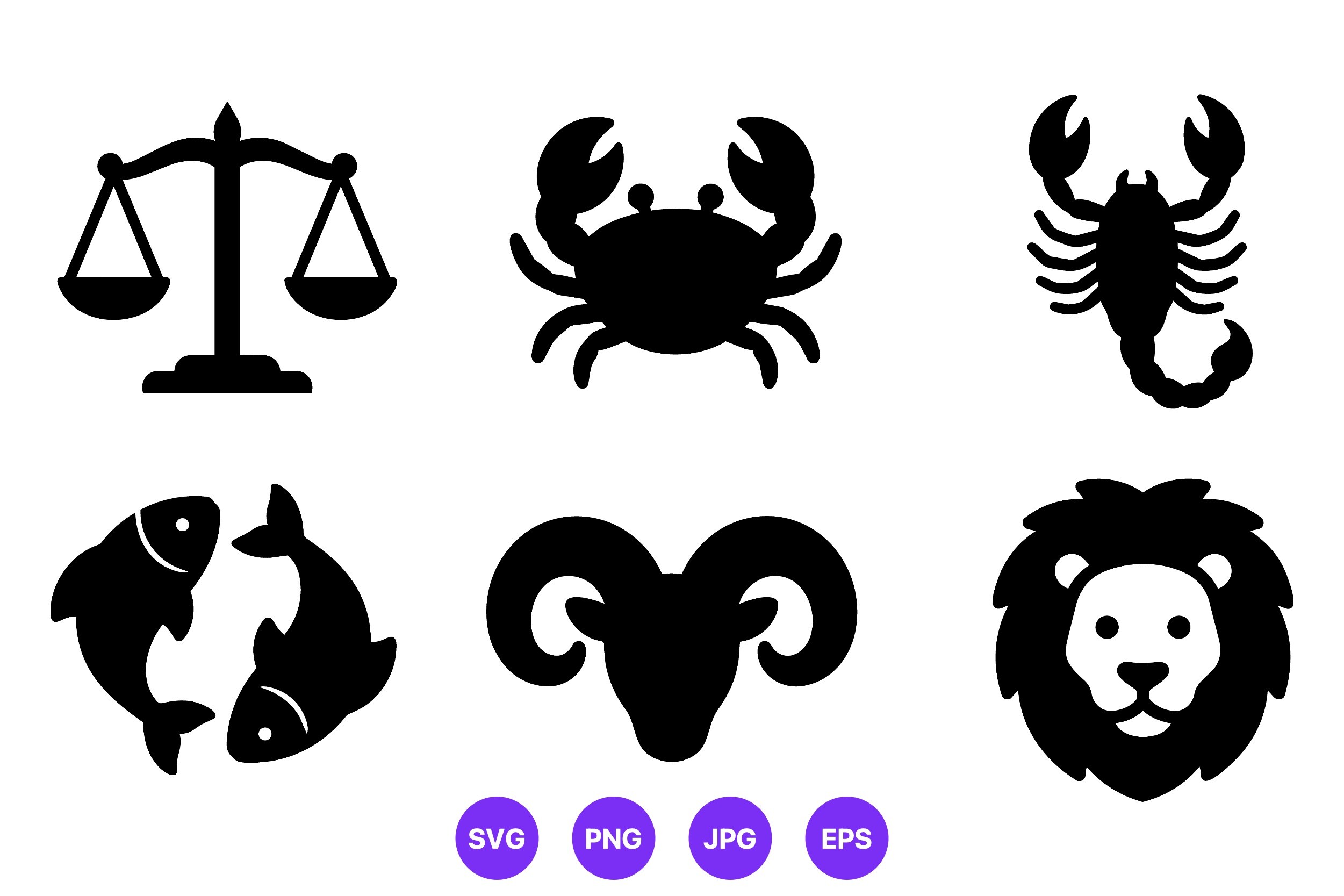
If you have one big empty wall and no idea, this is the answer. Twelve clean icons, identical weight, hung in a tidy grid. Four across, three down, even gaps. The repetition does the work. A single icon is nothing, twelve in formation is a statement.
I ran mine all at 5×7, same thin black frames, and spent an evening with a level and a roll of painter’s tape marking centers before a nail went in. The even spacing is the entire effect, so the measuring is not optional. Off by half an inch on one and the eye snags on it forever. I know because mine was, for a month.
Because they are vectors you can go any size, so the same grid scales from a hallway to a big living-room wall. The honest downside, there is no preset layout in the file, so the alignment is on you. If lining up twelve frames sounds like a nightmare, do a 2×2 of just your favorites instead and skip the marathon.
One weird focal piece to break up all the charts

A wall of nothing but star maps gets monotonous, even good ones. You need one odd note. This galaxy-burst lightbulb is mine. It is not a chart at all, it is a little surreal, a bulb full of cosmos, and that wrongness is the point. It interrupts the pattern so the rest reads as intentional.
I hung it slightly off-center in an otherwise orderly grouping, single 8×10, and it works like a wink. Everything around it is tidy celestial cartography and then there is this one playful thing. Kid who visits points at it every single time. The grown-up charts get ignored, the bulb gets the love.
It is busier than the rest, lots of detail packed in, so it does not want a neighbor crowding it. Give it a pocket of space. I tried sandwiching it between two prints once and it just looked cluttered. Isolation is what makes the joke land.
Tiny outlines for the skinny gaps everyone forgets
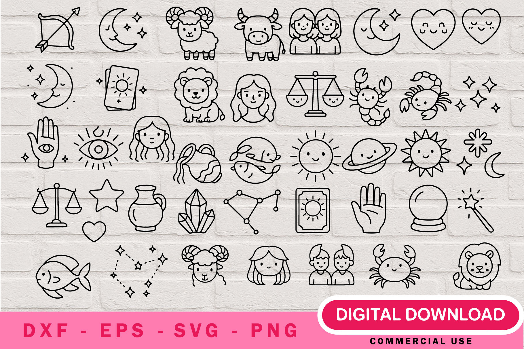
Last layout problem, and it is the one nobody solves. Those skinny dead strips of wall. Beside a door frame. Above a light switch. The slice between two windows. Full prints do not fit and so the space just stays blank forever. These little outline shapes are sized for exactly that.
I cut a few small, 4×4 and under, and stacked three down the narrow strip beside my bathroom door, simple outlines, no fuss. The vertical run draws the eye up and the dead strip stops being dead. Did a single tiny one over a light switch in the entry too, so flicking the lights feels a touch less grim.
They are line outlines, which means they vanish if you print them too small on a busy wall. I lost one against patterned wallpaper completely. Keep them on a plain ground where the simple shape can actually be seen, and let the gap they fill be the whole reason they exist.
Questions I Get About These
What makes a good star chart for wall art?
Honestly, it is less about the chart and more about whether the line holds up small. I had a customer return a digital print, which you cannot really do, and complain it looked muddy. Turns out he blew a delicate engraving up to poster size and every thin line went to mush. The ones that work have weight to them, clean strokes that survive both a 5×7 and an 11×14, and a black that stays black instead of going grey.
The other thing is restraint in the design itself. Too many stars and labels and it reads as clutter from across the room, which is the only distance that matters. I squint at every proof from my hallway. If it still reads as one calm shape and not a busy mess, it is a keeper. If my eye does not know where to land, back it goes.
How many stars are used in a celestial map print?
Wildly different from one to the next, and I only learned this because a buyer emailed insisting a print was “wrong” since it had fewer stars than another she owned. Neither was wrong. A decorative chart might draw a few hundred of the bright ones, just enough to suggest the constellations. A detailed astronomical-style plate can pack thousands of tiny dots, magnitudes and all.
For a wall, more is not better. The dense scientific ones look incredible up close and turn to grey static from across a room. The sparse decorative ones read clean at any distance. I keep the busy ones where people stand near them, a hallway or beside a desk, and save the simple star-light ones for the big walls you only ever see from the couch.
Before You Tape Anything Up
If there is one lesson from a year of moving these around the floor before nailing anything, it is that the print is maybe a third of the result. The rest is placement and what sits next to it. Stagger the sizes, give one piece room and crowd the rest, and hunt down the skinny gaps nobody else bothers with.
My own walls right now run a twelve-icon grid in the living room and a clutter of little doodles climbing the stairs, and the place finally feels arranged instead of decorated. If one of these gives you an idea for your own dead corner, the links send a little back to me and cost you nothing extra.