A kid at a market booth pointed at one of my prints and asked which one was Orion. I didn’t know. The map I’d hung had dots and lines and zero words on it, and there I was, the person selling it, squinting like a fraud. That was a Thursday in May. I went home and reprinted the whole thing with labels.
That is the split nobody mentions. A constellation map with no names is decor. A constellation map with names is something a nine-year-old can stand in front of and read out loud. Both have a place. But if you’re hanging it where a person might actually look up and learn the sky, you want the words on it. Cassiopeia. The Big Dipper. Tiny type that doesn’t shout.
So these are the ones I printed, labeled, taped up, and let sit for a week before I framed anything. A few of the links are affiliate links, so if you grab one it sends a little something my way. Doesn’t cost you a cent.
A few links below are affiliate links. If you grab a print through one, it sends a little something my way at no extra cost to you.
The labeled map that ended up under my mouse instead of on a wall
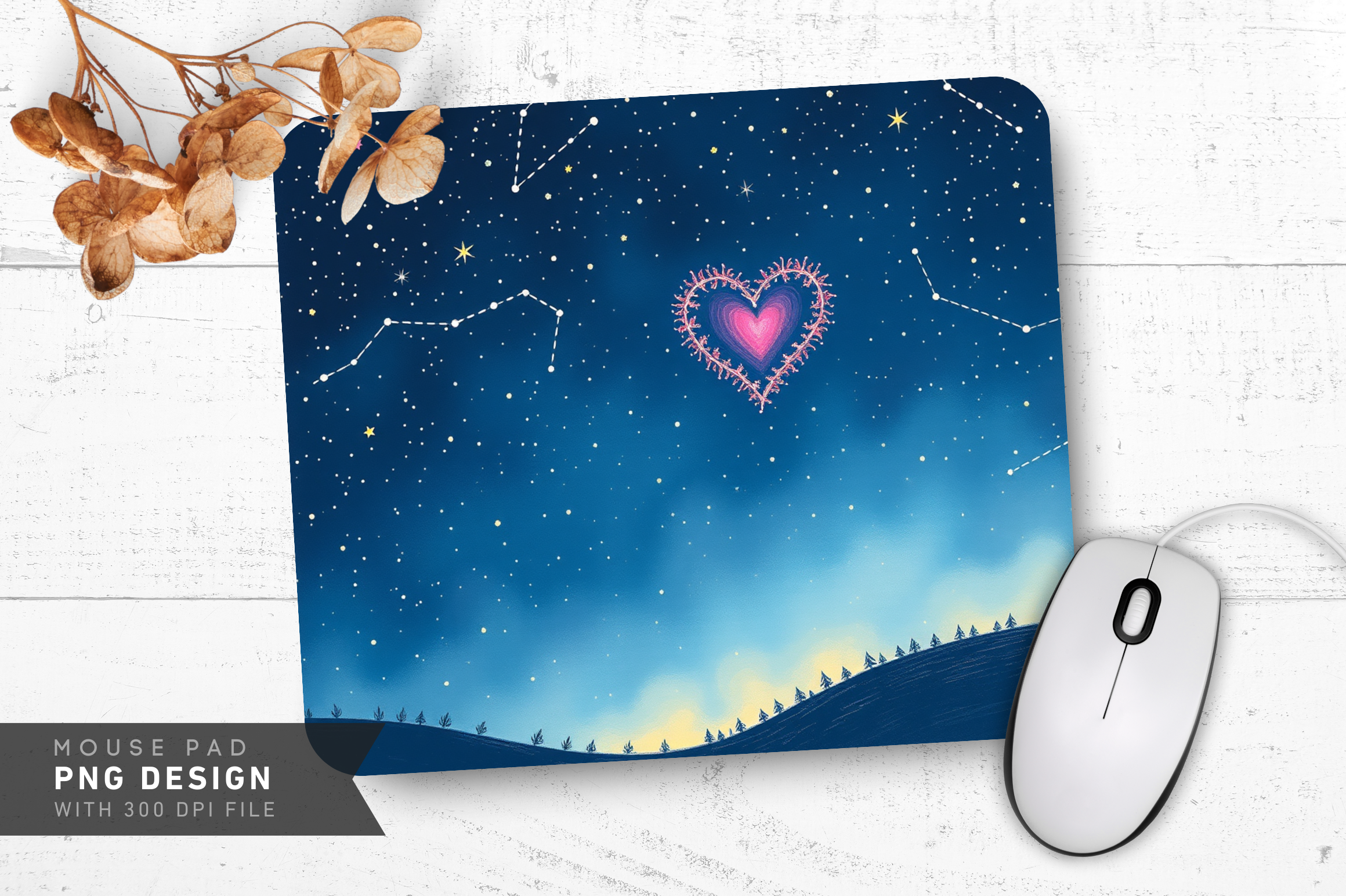
I bought this thinking I’d print the design as a small card. Then I saw it was a mouse pad and laughed, because my desk has been an open star chart of coffee rings for years and this fixed two problems at once. The heart shape stitched out of tiny constellation dots reads from across the room. Up close you can pick out the little named clusters.
My nephew, eleven, claimed it the day he saw it. Now it lives at his desk and he traces the lines while he’s supposed to be doing math. One gripe. The cloth top grabs lint like it’s a hobby. I shake it out by the window every couple days. Still the thing he asks about when he visits.
Twelve signs and the full map, all named, all on one sheet
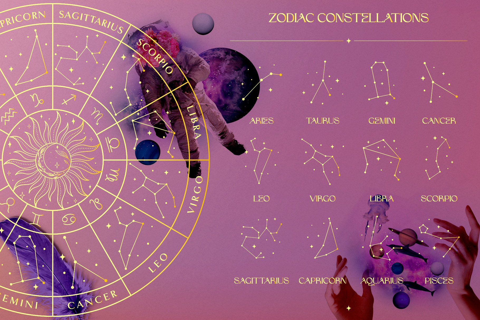
This is the set I reach for when someone wants the whole picture and not just their one sign. Each zodiac constellation laid out with its name, plus a wider map tying them together so you see how they sit relative to each other. I printed it at 11×14 for my friend Dlo who teaches third grade. She pinned it next to her reading corner.
The kids apparently argue over whose sign is biggest now, which she counts as a win. What sold me was that the names are set small and even, not crammed. One catch. The lines between stars are thin, so if you print it pale it can wash out. I bumped the contrast a touch before sending it to the shop. Came out crisp.
Gold-textured signs that somehow didn’t go tacky
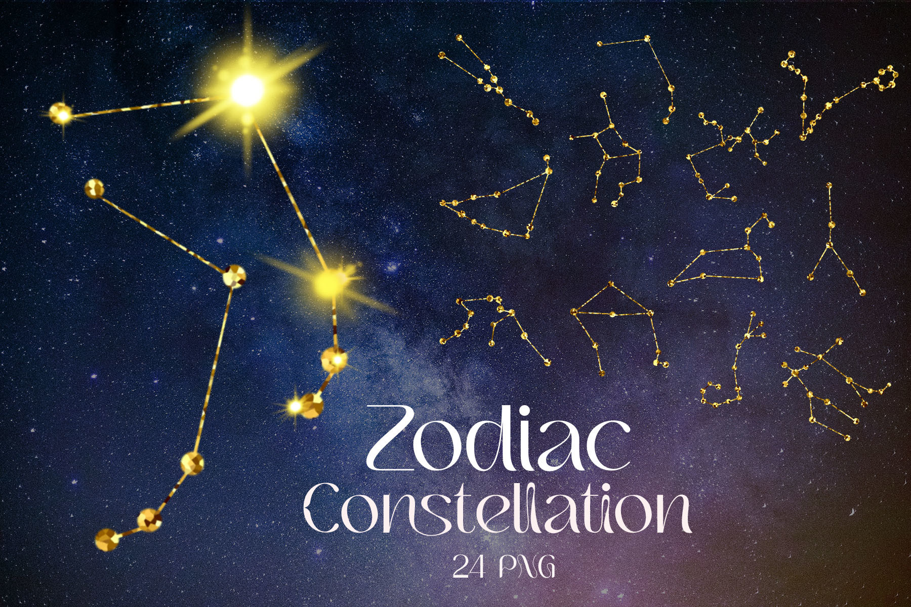
I am suspicious of gold on celestial prints. It’s where things tip into 2009 dorm ceiling fast. This one didn’t. The texture sits on the named zodiac constellations like worn brass, not glitter, and the names stay legible against it, which is the part most gold versions fumble.
I ran a single sign first, Capricorn, on regular paper just to see if the gold read as cheap. It didn’t. So I did three of them in a vertical row above my hallway radiator. One honest note. The full-res files are heavy and my laptop wheezed opening them, same as always. Worth the wait. The gold prints richer than the screen lets you believe.
A constellation map made out of coffee beans, named like a real chart

I almost scrolled past this. A camping scene, coffee beans arranged into constellation shapes, and yet someone bothered to label the clusters the way a proper star map would. That detail is what got me. It’s playful but it still teaches the names, which is the line this whole article keeps circling.
I printed it small, 5×7, and stuck it on the side of the cabinet where I keep the actual coffee. My neighbor Priya saw it and asked where the trail was, then realized the beans were the stars. That little double-take is the whole point. One nitpick. The brown tones can muddy if you print on bright white. I used a warm cream stock and it sat down nicely.
The plain night sky I layer my own labels onto
Not every map comes pre-named, and sometimes that’s the feature. This is a clean starry-sky field I use as a base when I want to hand-place the names myself, in my own font, for a specific person. I drop it into a flat template and type the constellation names where they belong.
Did this for my cousin’s kid who is obsessed with finding the Big Dipper from their balcony. Labeled only the constellations visible from their patch of sky. Felt personal. One thing to know. It’s a background, so the stars are scattered for atmosphere, not astronomically exact. If you need a real accurate chart, start somewhere else. For a named decorative piece, it’s perfect to build on.
Tiny named stamps I turned into a constellation grid
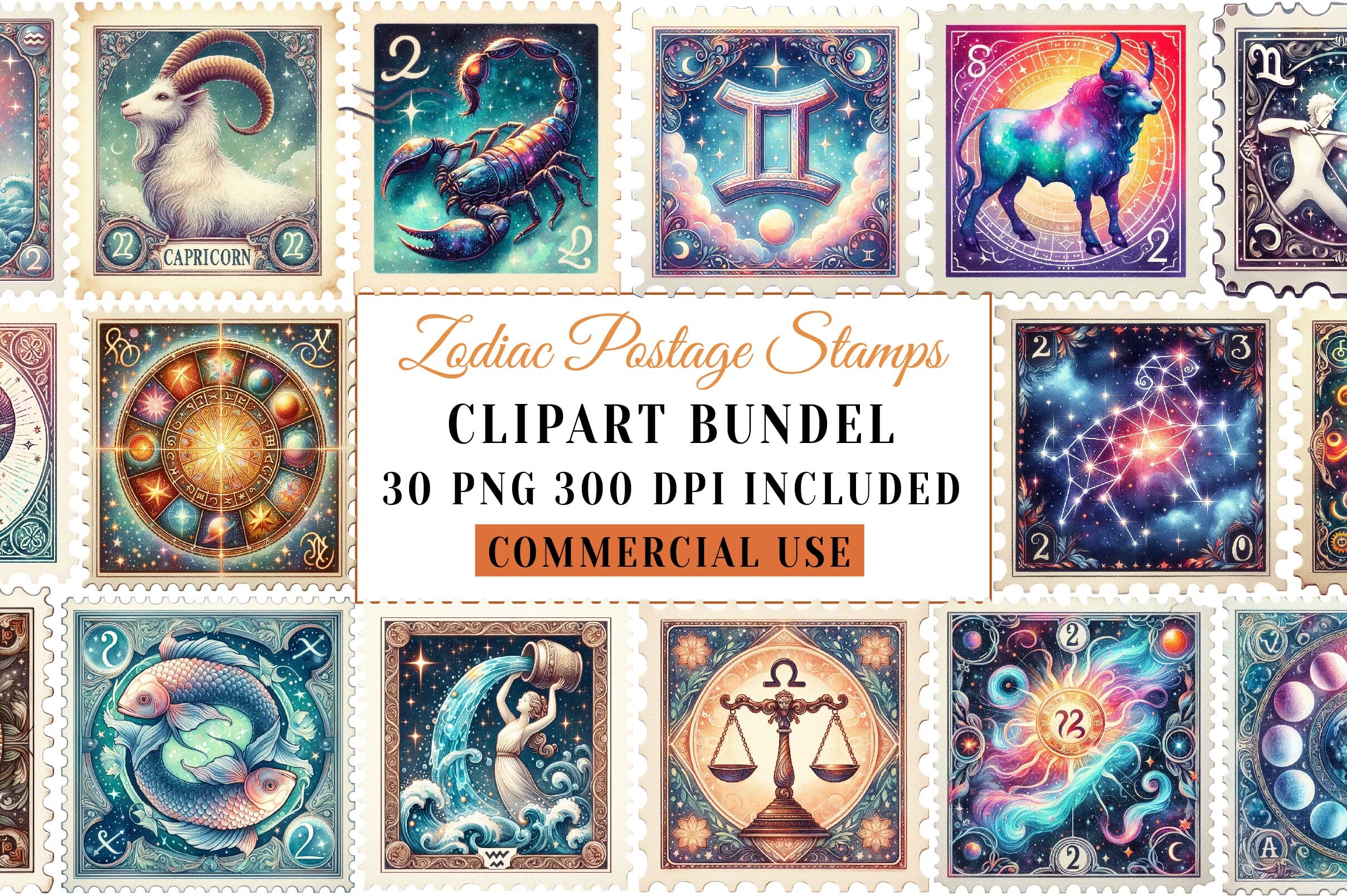
These are little postage-stamp graphics, each zodiac sign and its constellation, each one already labeled with the name. I didn’t expect to like them as much as I do. I printed all twelve and arranged them in a four-by-three grid in one frame, like a stamp collector’s page. The names read clear at that size, which surprised me.
My coworker Bett saw it on a video call and ordered the file before we’d even hung up. Now hers is by her front door. One gripe. Because they’re stamp-shaped with little perforated edges, the alignment matters a lot. I spent a fussy Sunday nudging them straight in the layout. Once they line up, it looks like it cost more than it did.
The clean vector set for when you want names and nothing extra
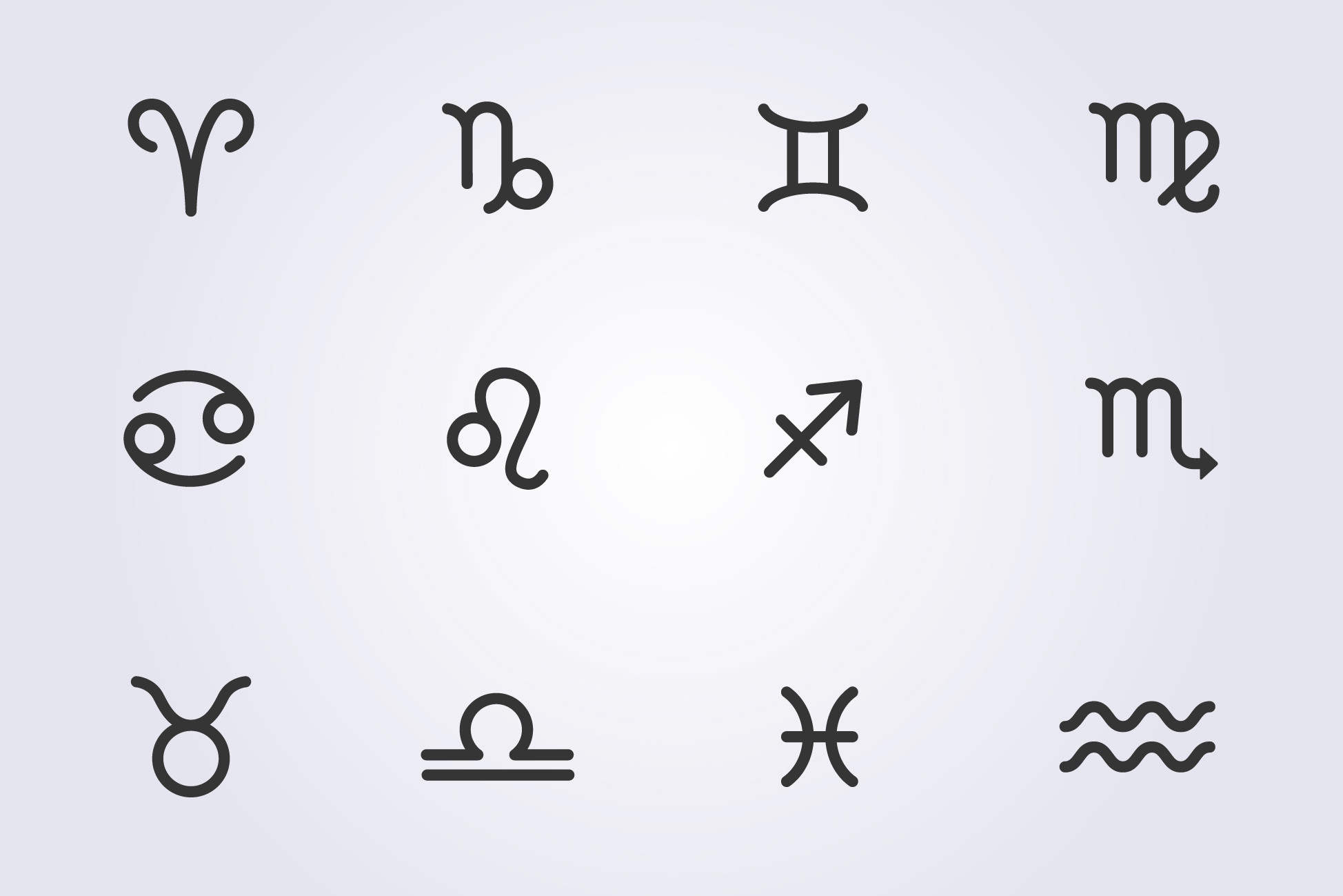
When a wall feels busy already, I reach for this. Plain line-art zodiac constellations, each named, no texture, no gold, no fuss. It scales to whatever size without going fuzzy because of how it’s drawn, so I’ve printed the same set at 4×6 for a shelf and at 16×20 for a stairwell.
I did the big one for a landlord, oddly, who let me repaint the hall on the condition I left him art. Hung the named signs going up the stairs so you read a new one each step. One catch. Out of the box the names sit in a thin font that can vanish on dark backgrounds. I swapped to a slightly heavier weight before printing the large one. Small fix, big difference.
Questions I Get About These
How do constellation maps work?
Honestly? I had to learn this the embarrassing way, after that market kid asked about Orion and I blanked. A constellation map is just a flattened slice of the sky, drawn as if you tipped your head all the way back and someone traced the bright stars into shapes. The lines aren’t real. Nobody put them up there. People connected the dots ages ago and the names stuck.
The labeled ones add the names right on the chart so you can match what you’re looking at overhead to what’s on your wall. That’s the only version I bother hanging now. A map with no words is pretty. A map with words is useful at two in the morning when a kid drags you onto the balcony.
How do you map constellations?
If you mean me, personally, hanging them: I find a print where the names are already set, drop it into my flat template, check the labels are legible at the size I want, and run a test on cheap paper before committing. That’s my whole process. Nothing astronomical about it.
If you mean how the real maps get made, it’s stars plotted by their actual positions, then the named figures drawn over the top. A buyer once emailed me cross that two of my prints had the same constellation in slightly different spots. Both were fine. One was the view from the northern sky, one wasn’t. The sky genuinely looks different depending on where on the planet you’re standing, which I did not know until she made me look it up.
Which constellation can be seen today?
Depends entirely on where you are and the date, which is the answer nobody wants. I keep a free sky app on my phone for exactly this, because I got tired of guessing. You point it up, it names what’s there.
What I tell people who buy the maps: in the northern half of the world the Big Dipper is up most of the year and it’s the easiest first find, which is why half these prints feature it. From there you can hop to the others. I labeled my own hallway map with just the ones I can actually see from my fire escape. Made the whole thing feel less like a poster and more like a window.
Before You Tape Anything Up
The named ones win for me, every time. Not because they’re prettier, often the unlabeled maps are cleaner to look at, but because a constellation map with the words on it earns its wall. A kid reads it. A guest leans in. You stop being the person who can’t point out Orion in your own hallway.
Print a test first, always. Check the names hold up small. Then live with it a week before you frame it. That’s the only rule I trust, and it’s saved me from a lot of crooked, regretted nails.