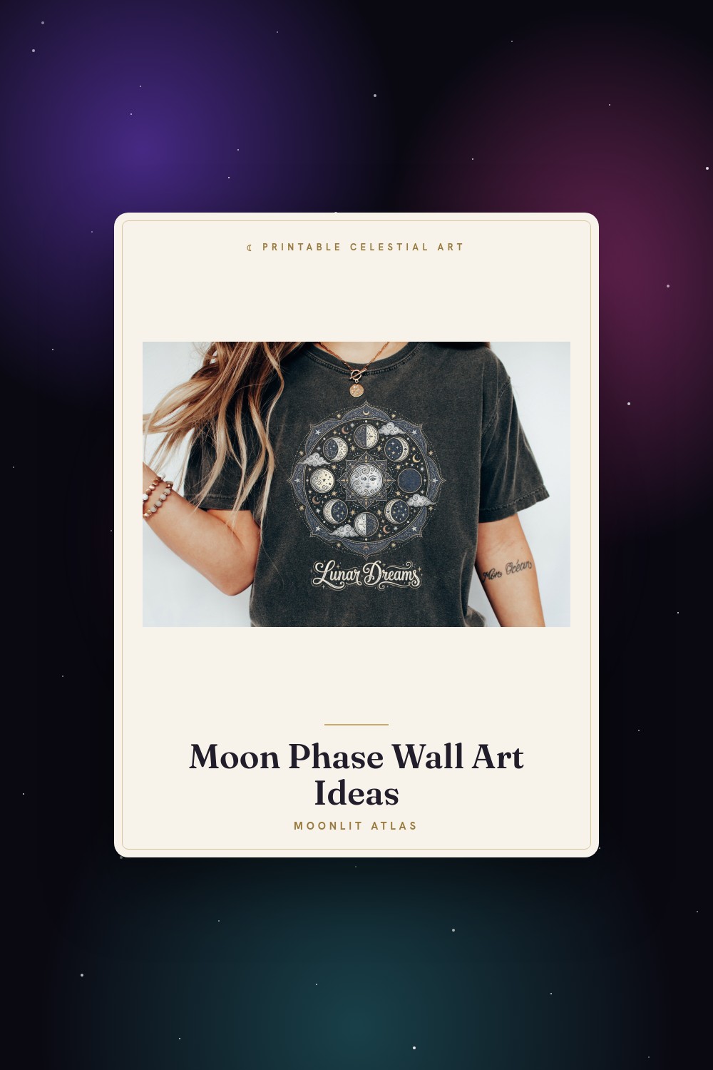
I wanted one big thing on the wall. Not eight little circles in a polite row. One poster, the size of a window, the kind you notice before you notice anything else in the room. The problem is my printer tops out at letter size and laughs at anything ambitious. So I did what broke people do. I tiled it.
The plan was simple on paper. Blow the design up to roughly 24×36, split it into four panels, print each on its own sheet, trim the white borders, and butt them together on the back of the door with a strip of clear tape. The reality was a Saturday afternoon, a craft knife, two ruined first sheets, and a moment around 4pm where I considered giving up and buying a real poster like a normal person. I didn’t. Stubborn.
These are the files I pulled into that project, plus a couple I kept around for the smaller display-board version my niece needed for school. Some links below are affiliate links, so if you grab one a little something comes back to me. Costs you nothing on your end.
A few links below are affiliate links. If you grab a print through one, it sends a little something my way at no extra cost to you.
The background sheet that saved the whole poster
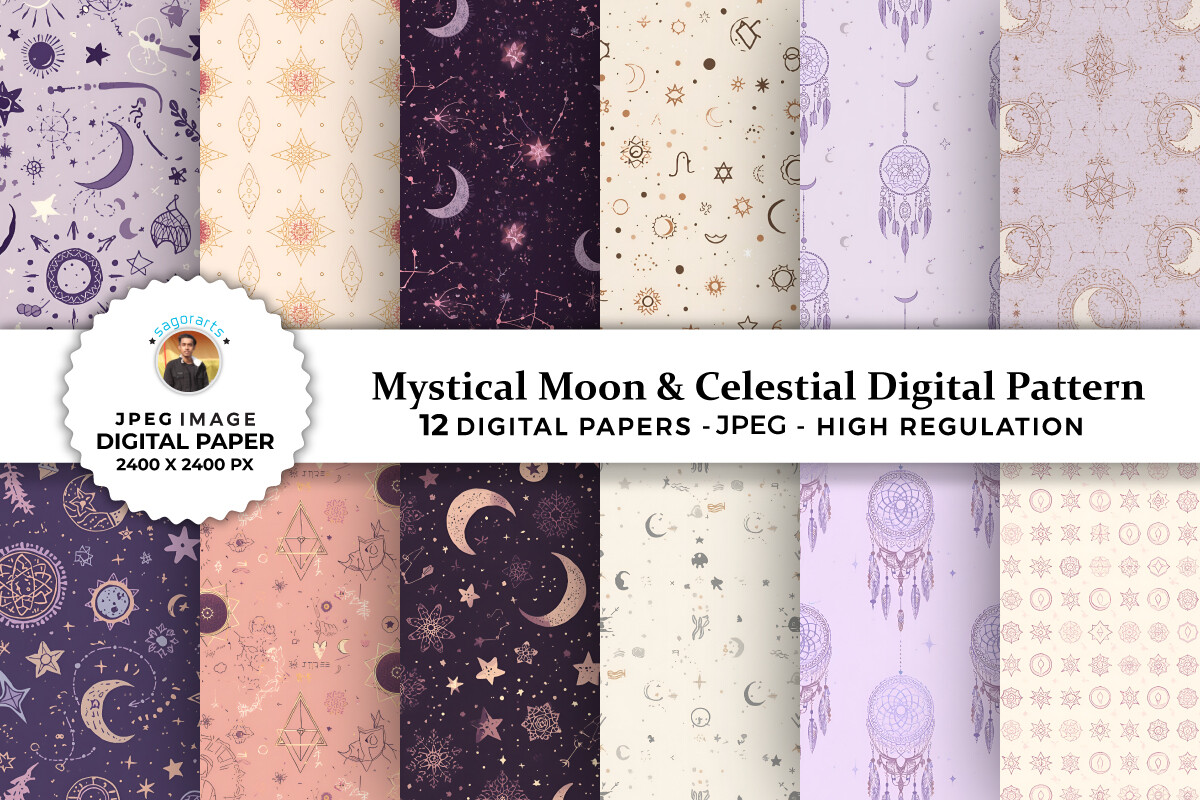
I started this project with a plain phase chart and it looked like a worksheet. Flat. Clinical. Then I dropped one of these papers behind it as a backdrop and the thing finally read like a poster instead of a homework handout. Deep navy, little scattered stars, the kind of texture that doesn’t turn to mud when you blow it up to 24×36 across four sheets.
That last part matters more than you’d think. Most digital papers fall apart the second you scale them past their native size. This held. I tiled one sheet of it across the bottom two panels and the seam barely showed once I taped the back. One gripe, the pattern is busy, so I had to knock the opacity down in Canva before my moon labels stayed readable on top. Five minutes of fiddling. Fine.
A corner motif so the poster didn’t feel like a chart
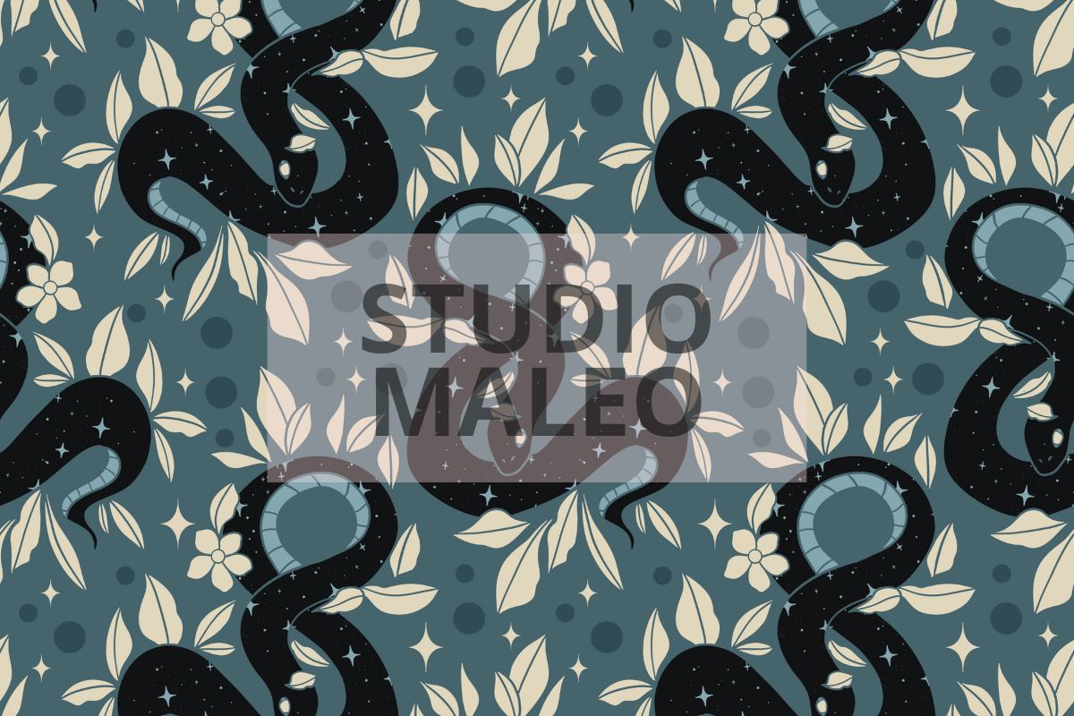
A full-size phase poster can go very stiff, very fast. All circles and right angles. I wanted one soft thing tucked in a corner to break that up, and the snake coiled around a moon with the leaves did it without stealing the show. I shrank it down and parked it in the bottom right panel, near where the tape seam ran, which conveniently hid the seam.
The line work is the selling point. Thin but not spidery, so it survived being printed on a borrowed inkjet at my cousin Renata’s place when my own printer jammed for the third time. It came out clean. The one thing I’d warn about, the green of the foliage prints warmer than it looks on screen. I expected sage, got something closer to olive. Lived with it. Honestly looked better that way against the navy.
The eight phases that became the actual poster
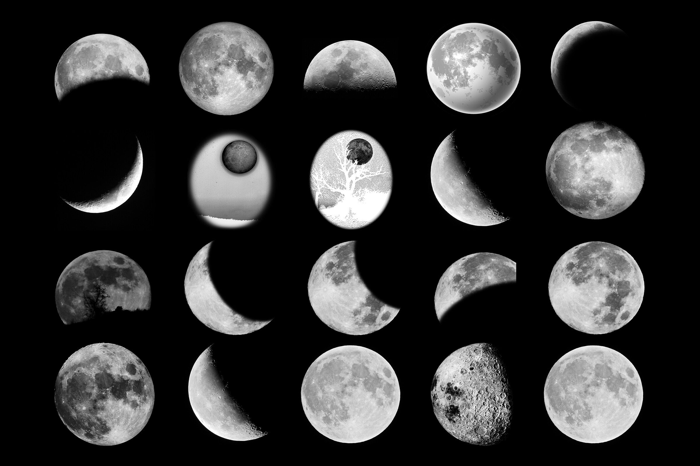
This was the spine of the project. Eight clean phases, evenly weighted, none of that thing where the gibbous moons crowd together and the new moon hangs off the end like an afterthought. I laid them in two rows of four, scaled each one to about six inches, and that became the foreground of the whole tiled poster.
What made it work for printing big is that the moons are simple solid shapes, not fussy gradients. Gradients band and stripe when you scale them up on a home printer. These didn’t. I ran a test panel on cheap copy paper first, taped it to the door, stepped back to the kitchen and squinted. Readable from across the flat, which is my only real test. Small complaint, the file came labeled in a font I didn’t love, so I deleted the labels and lettered my own. Wanted the names anyway since the poster was half for my niece’s display board.
The full moon I used as the focal point
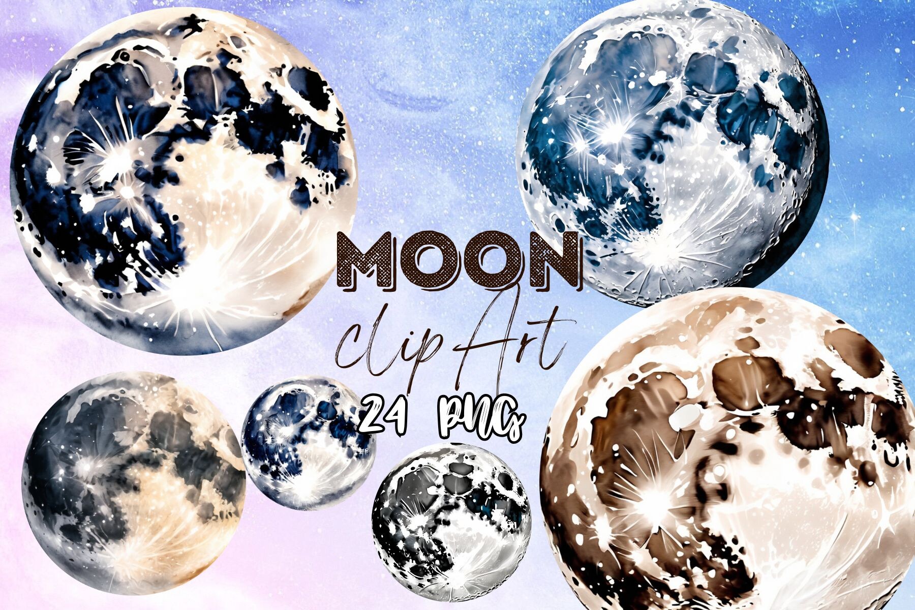
Somewhere in the planning I realized a poster needs one thing your eye lands on first. Eight equal circles give you nowhere to look. So I pulled one of these watercolor full moons, blew it up bigger than the rest, and set it dead center where the four panels meet. The seam ran right through it, which sounds like a disaster and somehow wasn’t, the texture hid the tape line completely.
Watercolor is the gamble with printing. It can go to a grey smear at size. This set has enough contrast in the washes that it held its shape even scaled to nearly a foot wide. I did mine on the slightly heavier stock at the copy place on Brenver Road because watercolor on thin paper buckles. One catch, the files are huge and my laptop wheezed opening the largest one. Took a coffee’s worth of waiting. Worth it.
The cat that ended up on the school version instead
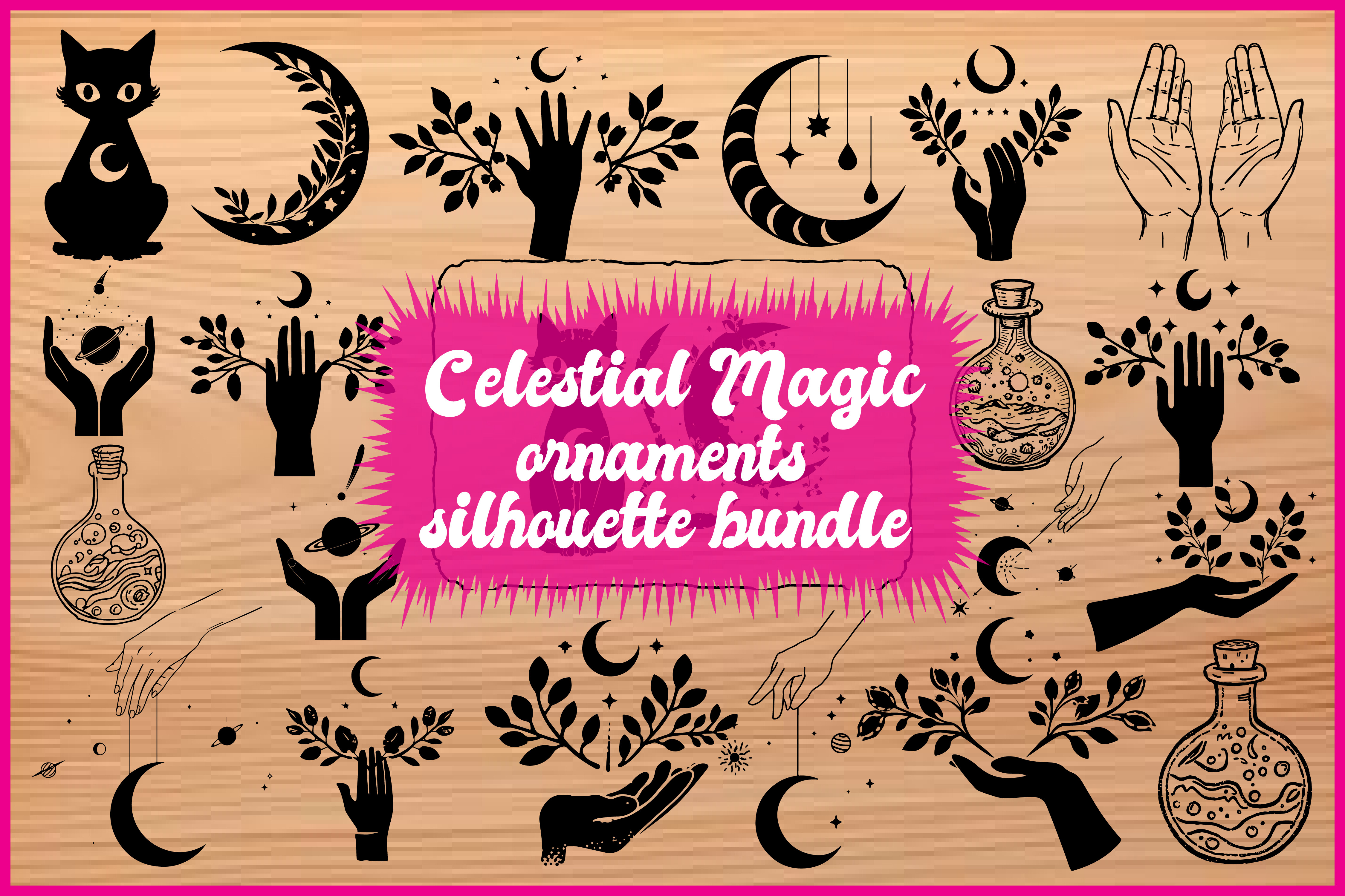
I’ll be honest, this one didn’t make the big hallway poster. It was too cute for the look I was going for, all moody and grown-up navy. But my niece saw it on my screen and that was that. It went straight onto her display-board version of the project, a little moon cat sitting beside the phase labels like a mascot.
For a kid’s poster board it was perfect. Bold outline, prints fine at small sizes, doesn’t fall apart when an eight-year-old cuts it out with school scissors slightly off the line. We did it at 4×6, glued it to the corner of her board, and it survived the bus ride to school, which is the real durability test. My only note, the whiskers are fine lines and one of them faded a touch on her school’s old laser printer. Nobody at the science fair noticed. She got a sticker.
A crescent I tested as an alternate centerpiece
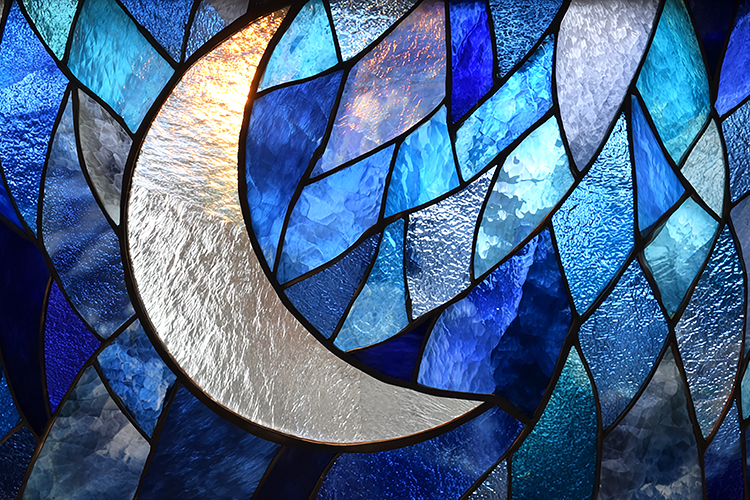
Before I committed to the full moon in the middle, I auditioned this stained glass crescent for the focal spot. Printed it, taped it up, lived with it for a day. The color is the whole thing here, those jeweled panes glow even on regular paper, like someone backlit it. For a single bold poster it nearly won.
In the end it lost to the full moon only because a crescent off-center fought with my two neat rows of phases below it. Too much going on. But I didn’t waste it. It’s framed at 8×10 in the kitchen now, leaning against the backsplash because I still haven’t found a nail. The one drawback, all those dark leading lines between the panes eat ink. My test print drank a noticeable amount of the black cartridge. Budget for it if you go big.
The botanical piece I framed as a companion

A big poster on one wall begs for a small something on the wall it faces, or the room tips lopsided. This dragonfly and moon botanical became that. Fine tattoo-style linework, a moon, some trailing plants, the sort of thing that reads delicate from a distance and detailed up close. I printed it small, 5×7, and hung it across from the main poster so they nod at each other.
Linework this thin is where cheap printing usually betrays you, and I braced for a muddy mess. It didn’t happen. The lines stayed crisp even on my home printer’s economy setting, which I trust with almost nothing. One quibble, there’s a lot of empty space around the design, so it looks small in a standard frame unless you crop in tight. I cropped. Better. The breathing room online doesn’t translate to a 5×7.
Questions I Get About These
What are the moon phases shown on a poster?
A customer once messaged me convinced my poster was missing one, because she counted seven. It’s eight. New moon, then the sliver you can barely see, then the half, the fat lopsided one, the full moon everyone waits for, and the same three running backward as it shrinks. New, waxing crescent, first quarter, waxing gibbous, full, waning gibbous, last quarter, waning crescent.
That’s the standard set you’ll see laid out left to right. I always print all eight even when a design only gives me four, because a half-row of moons on a poster looks like the printer ran out of ink halfway through.
What are the 4 major moon phases?
This is the one my niece needed for her school board, and I got it wrong the first time, so let me save you the embarrassment. The four major ones are new moon, first quarter, full moon, last quarter. The big landmarks. The other four are the in-between stages, the crescents and the gibbous ones, that fill the gaps.
I’d called the half moon a quarter wrong on her draft and her teacher circled it in red. Turns out first quarter and last quarter both look like a half to your eye, the quarter refers to where the moon is in its trip around us, not how much you can see. Counterintuitive. We fixed the label, she still rolls her eyes at me about it.
Before You Tape Anything Up
If you’ve only ever taped single prints to a wall, a tiled poster feels like a different sport. More cutting, more swearing, one genuinely tense moment lining up the seams. But the payoff is a wall that looks like you meant it, not like you collected it.
My advice, print a cheap test panel before you commit the good paper, and keep the craft knife sharp so your edges butt clean. The first version of mine had a visible white gutter down the middle for a week before I redid it. Worth the redo. Now it’s the first thing anyone comments on when they walk in.