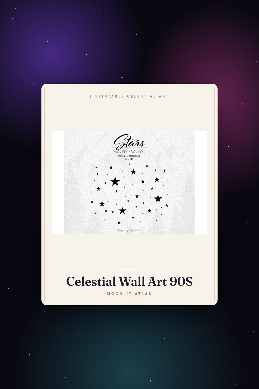
The trick with gold is that real foil costs a fortune and laser-printed gold looks like a coupon. I spent a whole winter convinced I needed a foiling machine. Then a friend who frames for a living told me to just print the gold flat on heavy matte black and let the paper do the work. He was right. Annoying, but right.
So most of what I hang now is matte black stock with a warm gold ink, no shimmer at all, and from across my hallway people swear it’s metallic. It isn’t. It’s a $0.90 print at the copy place near Magnolia, in a thrifted frame I spray-painted on the fire escape one cold Thursday. The luxe look is mostly restraint plus a dark wall behind it.
These are the gold-and-black files I actually committed to, plus a couple of odd ones that aren’t wall art at all but earned their place. Some links below are affiliate links. Grab one and a little something comes my way, costs you nothing.
A few links below are affiliate links. If you grab a print through one, it sends a little something my way at no extra cost to you.
Gold butterfly paper for the glam backing nobody expects
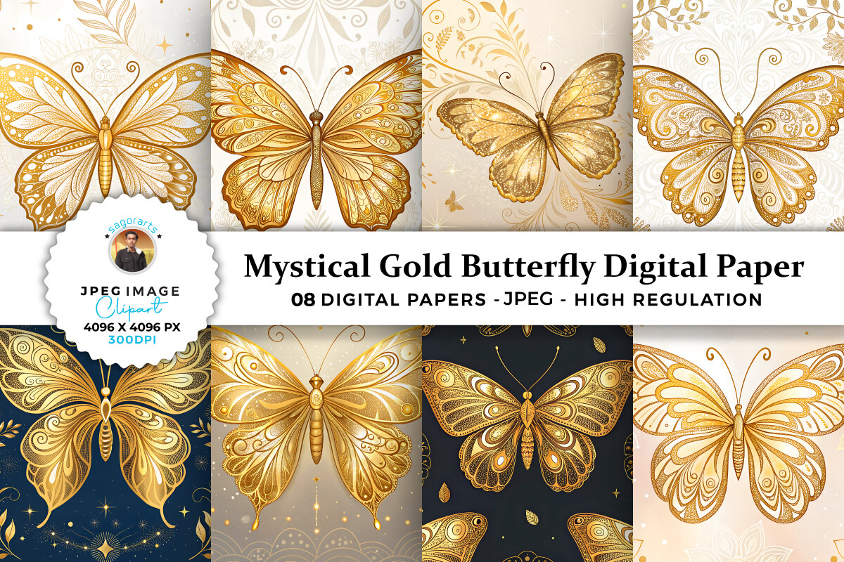
I didn’t buy this to print whole. I buy big gold papers like this to use as a backing layer, slip a smaller black moon print on top, and suddenly the cheap frame looks intentional. This one has these gold butterflies on a soft dark ground, and they catch the light without screaming.
My version lives behind a small sun print over the light switch, 5×7, and a coworker assumed I’d paid a designer. I’d paid four dollars and a lunch break.
One gripe. The gold reads a touch greenish if you print it on bright white stock. On the dark matte it’s fine, warm and right even. Print a corner test first, it saves you a sheet.
A celestial junk journal that taught me what luxe black actually looks like
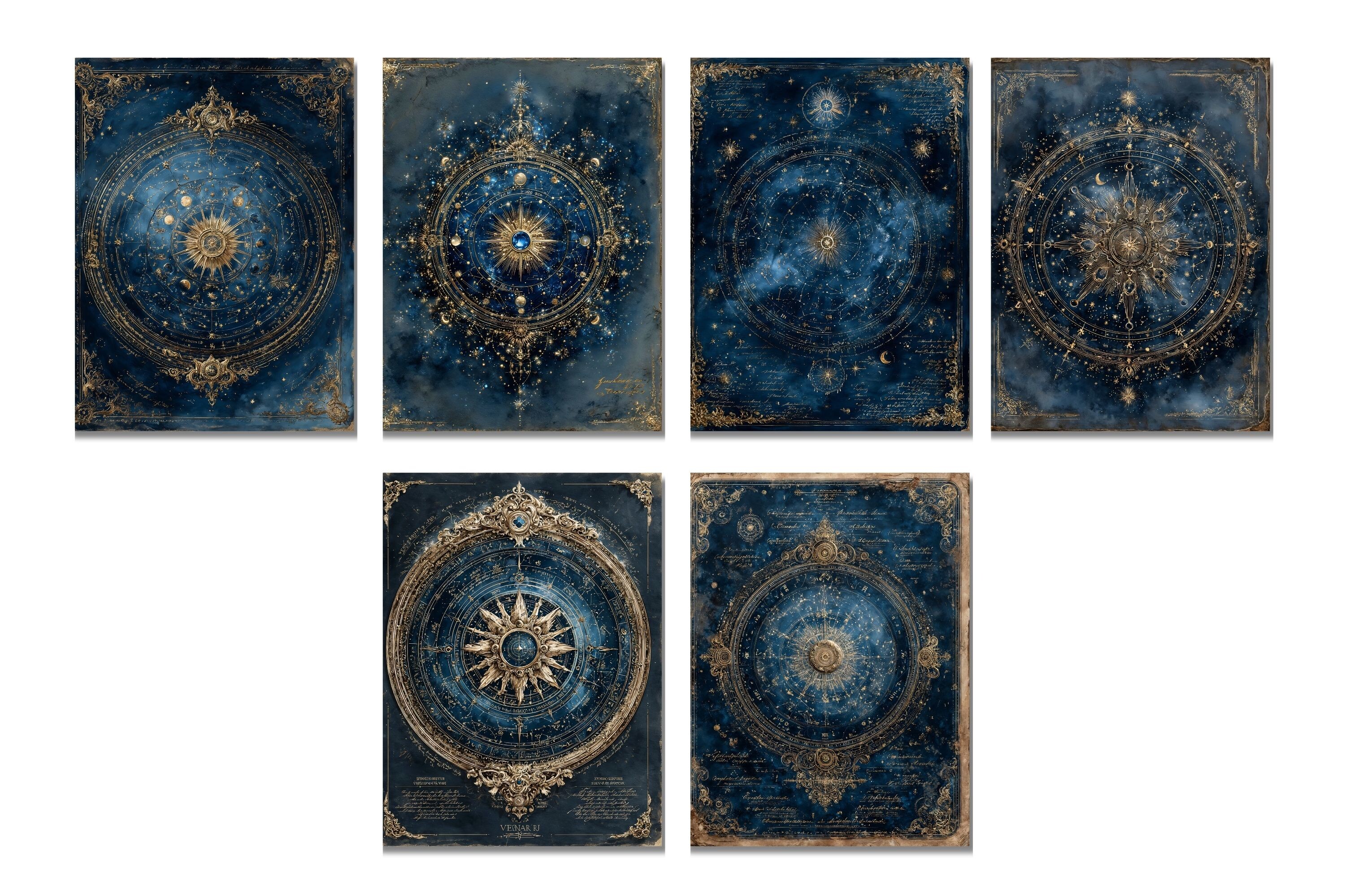
This isn’t going on a wall and I don’t care. I tore two pages out, the aged star-chart spread and a gold-edged moon one, and framed them. They look like something out of a $300 antique shop. They cost me the price of the journal and ten minutes with a craft knife.
The whole thing is built around that deep aged black with gold flourishes, and it taught me more about the gold-on-black look than any print did. Black that’s slightly warm, not flat. That’s the secret.
If you only want the framing pages it feels a little wasteful to buy the full journal. But I’ve used the rest. Birthday card on a Sunday, a gift tag for my landlady, scrap collage. It earns out.
A printed tile that does the gold-and-black thing in three dimensions
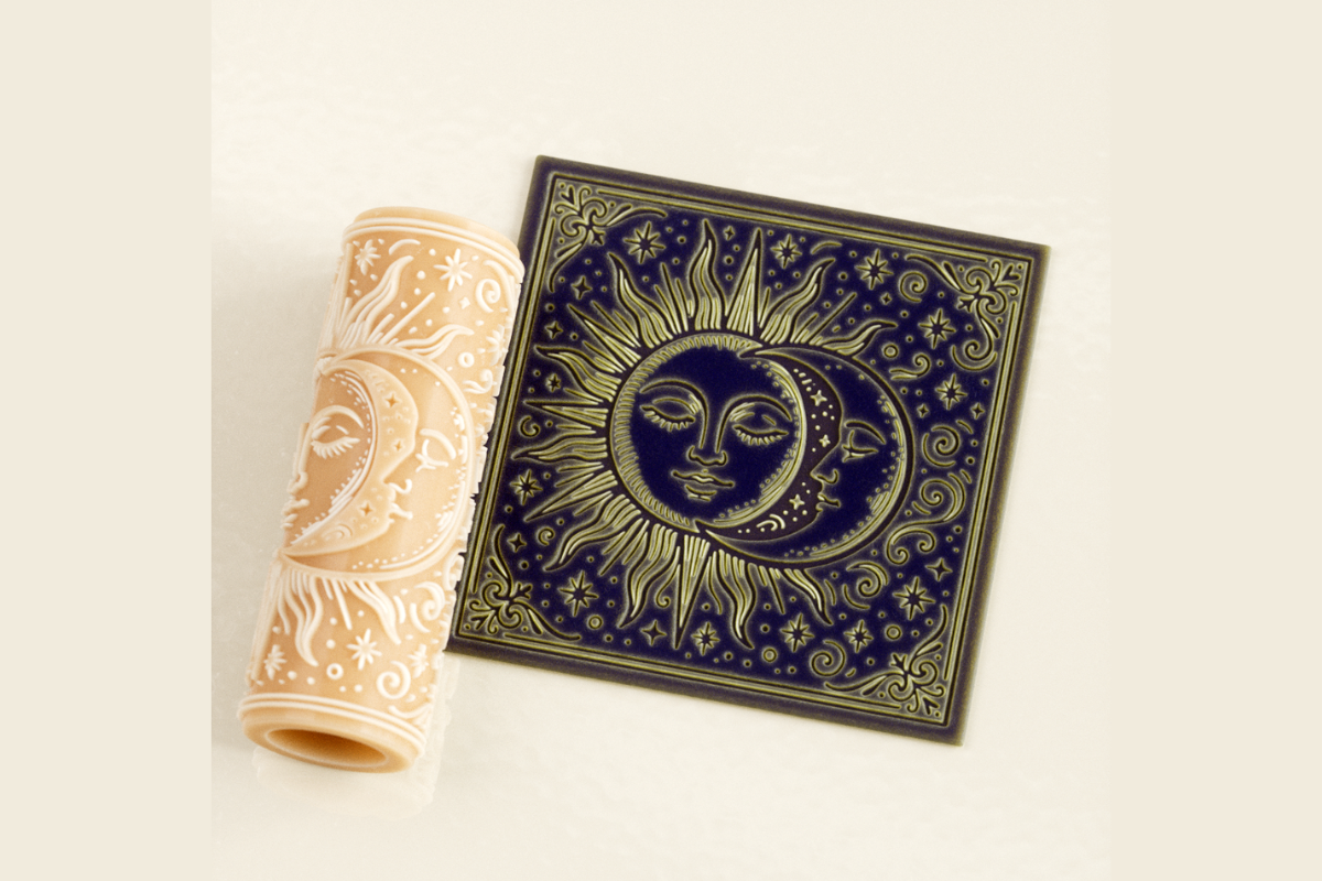
My neighbor has a resin printer and owes me for a year of package-holding, so I sent him this. It came out as a small relief tile, sun and moon, and I painted the raised parts gold and the recesses matte black. Drybrush, cheap acrylic, one evening.
It sits on the shelf below my prints and ties the whole corner together. Texture next to flat paper is what stops a celestial wall from looking like a teenager’s poster grid.
The honest catch is you need someone with a printer, or the patience to find a print service. The file itself is clean, no failed overhangs when he ran it. Mine has one fingerprint baked into the gold forever. I’ve decided it’s charm.
Laser-cut lantern that throws gold light on a black wall
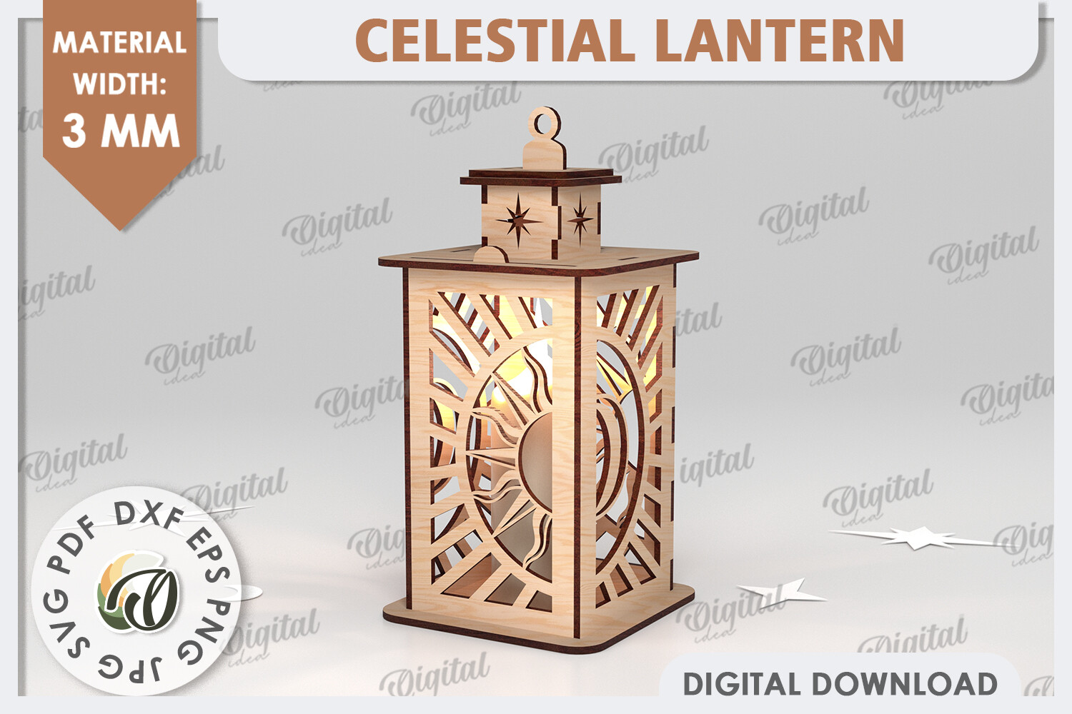
I had this cut from 3mm black ply at a little maker space off Tchoupitoulas, fifteen dollars including the offcut they gave me to test stain on. It assembles into a moon-and-star lantern, and the second you drop a warm bulb in it the whole thing glows like brushed gold.
That’s the cheat I keep coming back to for luxe. You don’t need metallic paint everywhere. You need warm light hitting black at the right angle. This lantern does it for you.
Fiddly assembly, I’ll warn you. I glued one panel backwards and had to soak it apart. Smelled like a campfire for a day. The finished thing on a dark shelf, though, makes the prints above it look ten times more expensive than they are.
Moon wrapping paper, except half of it ends up framed
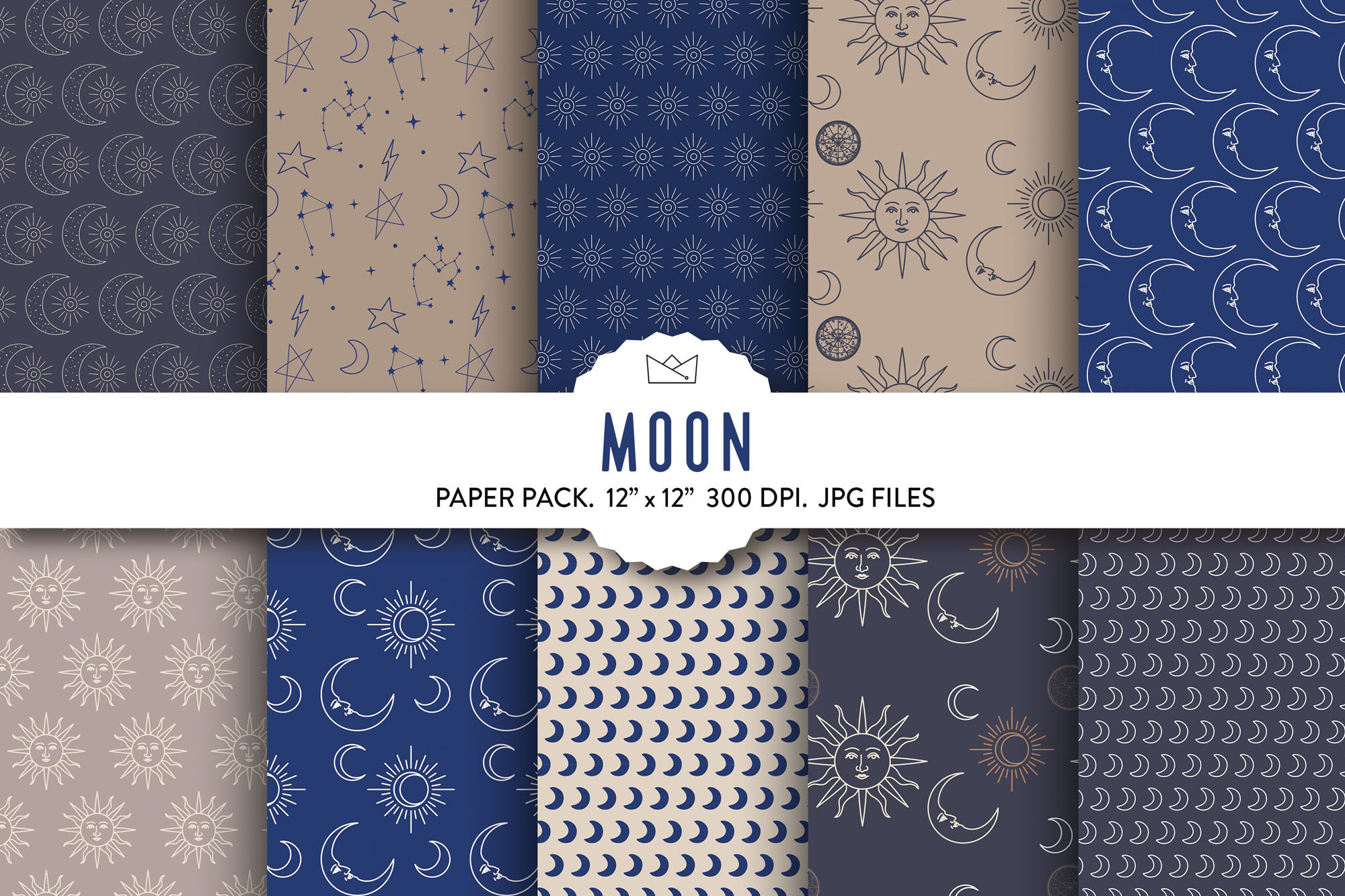
Technically wrapping paper. I use about a third of it as wrapping and the rest as cheap, dramatic art. Black ground, gold moons scattered like someone spilled them, and at 11×14 in a thin frame it looks like a gallery piece I’d never afford.
I wrapped my cousin’s birthday gift in the same sheet I framed for my hallway. She noticed. Now she’s mad I won’t tell her where it’s from. I’m telling you instead.
The pattern repeats, so if you go large you’ll see the seam if you stare. I just crop around one cluster of moons and frame that. Nobody’s ever clocked it from the couch, which is the only distance that counts.
The black star map that anchors the whole gold gallery
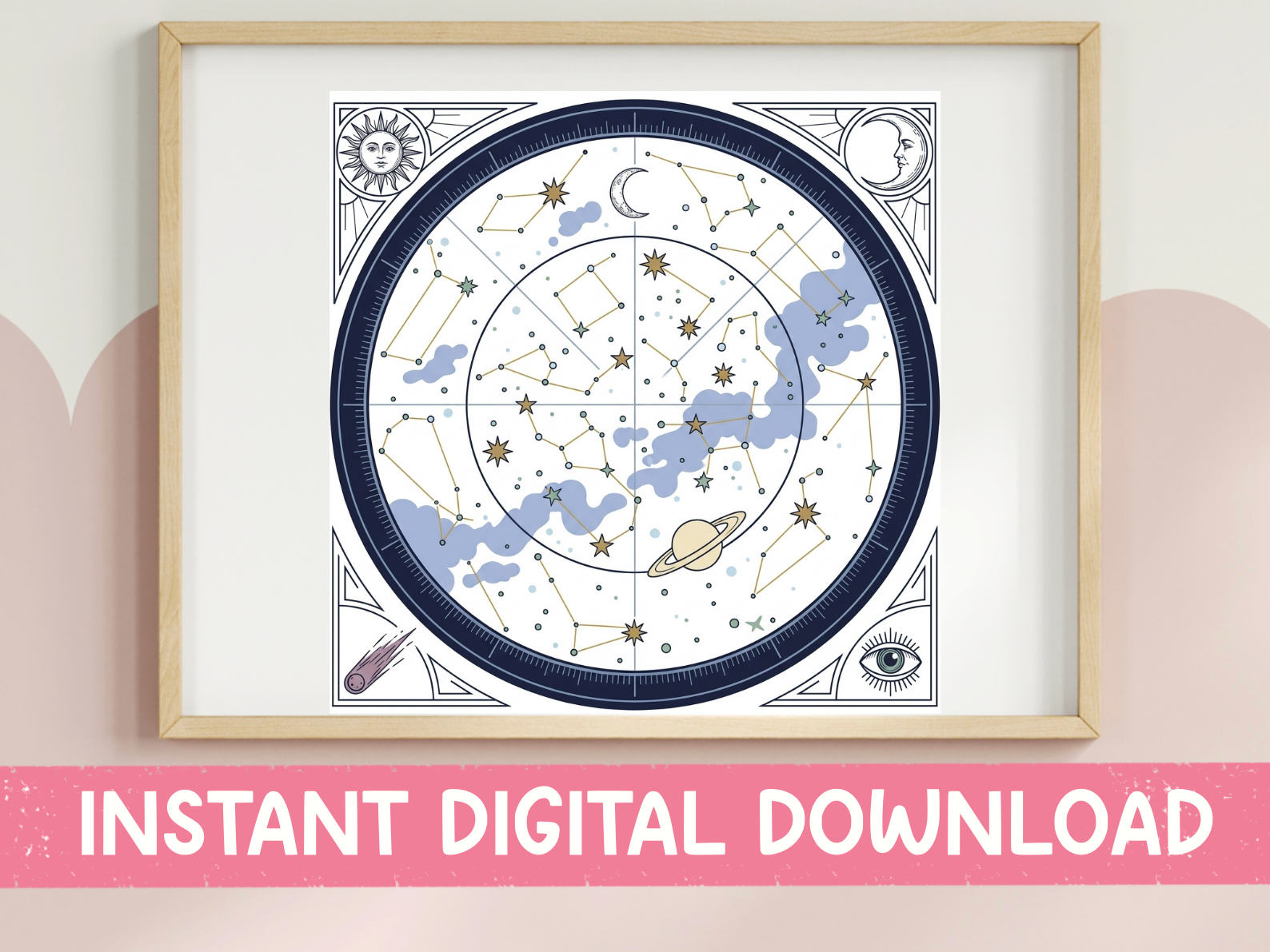
Every gold-and-black wall needs one quiet piece that isn’t trying, and this is mine. A constellation chart, gold lines on near-black, no clutter. I ran it large, 11×14, matte, and hung it dead center so the busier gold pieces orbit around it.
It’s the one I point people to when they ask why my wall looks calm instead of chaotic. Restraint. One detailed piece, everything else simpler. This carries the detail so the rest can breathe.
My only nitpick is the labels are small. From the hallway you read them as texture, not words, which I actually prefer. If you want legible constellation names up close, print it bigger than you think. I learned that after squinting at a 5×7 like a fool.
Sun and moon tumbler wrap that quietly matches the wall
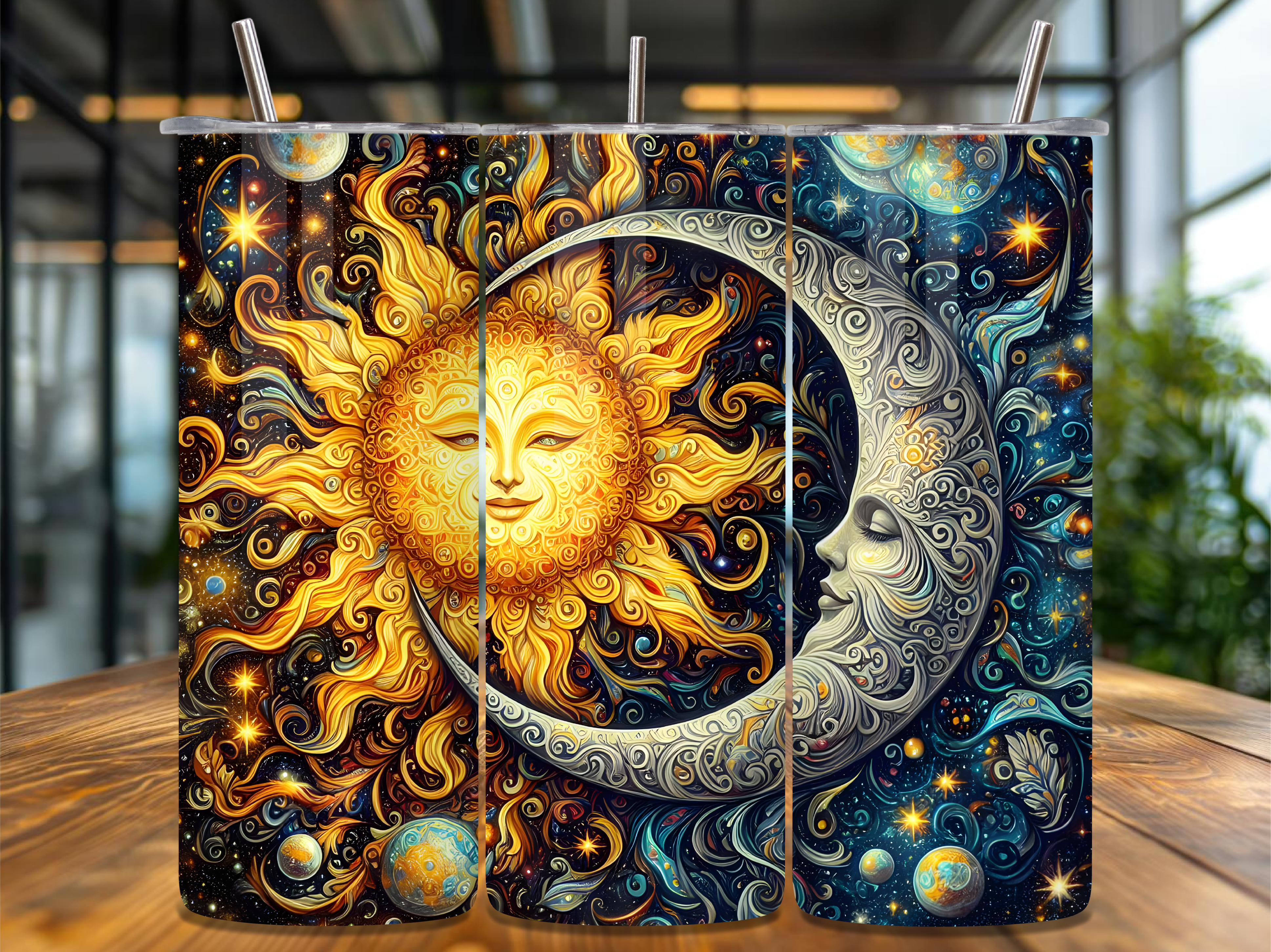
Last one and yes, it’s for a cup. But hear me out. The same gold sun-and-moon faces I have on the wall now ride around on the steel tumbler on my desk, and the little echo makes the whole corner feel designed instead of accidental.
I sent the wrap to the same neighbor with the cutter and he ran it on adhesive vinyl. Slapped it on a plain black tumbler from the dollar store. Looks like a thirty-dollar boutique cup.
The gold doesn’t survive the dishwasher, learned that the hard way on a hungover Monday. Hand wash and it holds. Worth the extra thirty seconds for a cup that matches my wall, which is a sentence I never thought I’d defend.
Questions I Get About These
How do I style gold celestial prints?
Less gold than you think. I made that mistake early, hung four shimmery pieces together and it looked like a casino. Now I run mostly black with gold as the accent, one busy piece, the rest quiet.
A buyer once messaged me convinced she needed metallic frames too. Talked her out of it. Plain black frames, a dark wall, warm light from the side. The gold does the showing off so nothing else has to.
Does black wall art work in a small room?
Yep, and better than you’d guess. My hallway is the width of an ironing board and black prints make it feel deliberate, not cramped. The mistake is hanging them on a white wall where they float like holes.
Paint the wall behind them something dark, or even just a darker neutral, and the black art melts in instead of stamping the room with rectangles. I did a charcoal patch behind mine one Thursday and it changed everything.
What frame suits gold and black celestial art?
Honestly? Thin black, every time. I went through a phase buying gold frames to match the gold ink and it was too much, like the art was wearing two necklaces.
Thin black frame, or even frameless with binder clips while you decide, lets the gold inside be the only metallic thing. I thrift mine and spray them flat black on the fire escape. Three dollars, looks like more.
Before You Tape Anything Up
The luxe part was never the foil. It was picking matte black stock, one warm gold, and leaving most of the wall alone. Took me a winter of overdoing it to land there.
Print a corner test, live with it taped up for a week, then frame. That’s the whole method. The cup matching the wall is optional, but I’m not sorry.