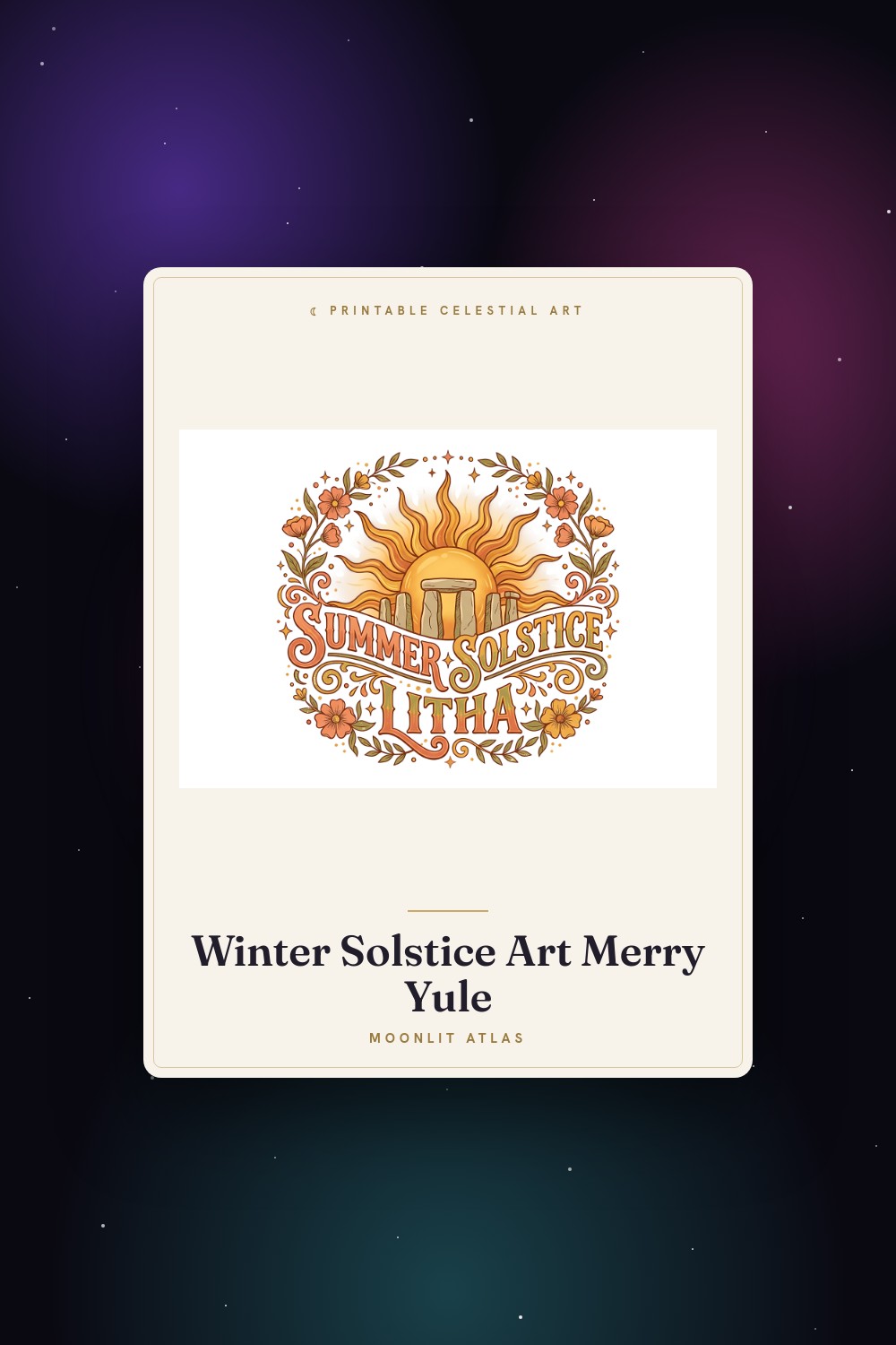
A buyer in Sacramento ordered the same moon set from me three times. Once for herself, twice as gifts, all timed to land before the new year. Not January first. The lunar one, late winter, the one her grandmother counted by. She told me she’d been hanging celestial decor for years and never once thought about which calendar it was tracking. That stuck with me.
So I went down a hole. I wanted prints I could put up in February without it feeling like leftover December, things tied to the moon and the turning year rather than a tidy grid of months. Some of what I found was genuinely a lunar calendar piece. Some was solstice art that happened to sit right next to it on the shelf, and honestly looked better in my hallway than the literal calendars did.
These are the ones I printed, taped up, lived with for a week, and didn’t take down. A few of the links below are affiliate links, so if you grab one a little something comes back to me. Doesn’t change your price.
A few links below are affiliate links. If you grab a print through one, it sends a little something my way at no extra cost to you.
The candle piece that anchored my February wall

I bought this one thinking solstice, hung it thinking lunar new year. Funny how that works. The candle warmth in it reads less like Christmas and more like the quiet middle of winter when the days are technically getting longer but you can’t tell yet. My cousin saw it and asked if it was for the Year of the Snake. I said sure, why not. It fit the mood she meant.
Printed it at 8×10 on the heavier matte stock from the place on Burnside. The warm tones held. I’d worried they’d go orange and cheap, the way warm prints sometimes do.
One gripe. The lightest highlights nearly vanished when I printed small. At 8×10 they came back. Below that, skip it.
A bat mandala that earned its spot near the door
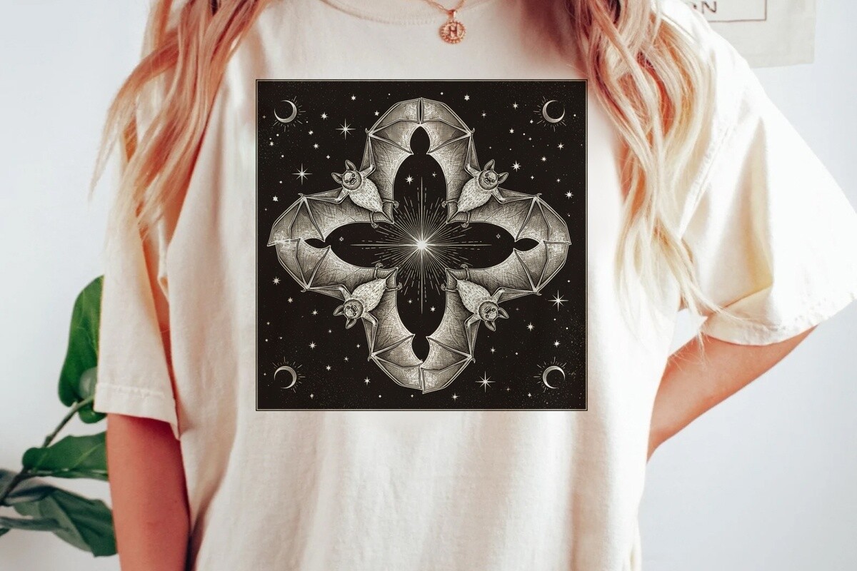
This is the one people ask about. A celestial mandala built around a bat, which sounds like a Halloween thing until you see how the linework circles like a calendar wheel. In a lot of lunar traditions the bat means luck, good fortune, the kind of detail I only learned because a customer corrected me in an email and I went and read about it after. Now I mention it and sound informed.
I ran it in deep navy at 11×14 and it pulled the whole entry together. The symmetry does a lot of quiet work.
The catch is the detail. Print it too small and the fine spokes muddy into a blob. Big or not at all.
Sun, dancers, and the other end of the wheel
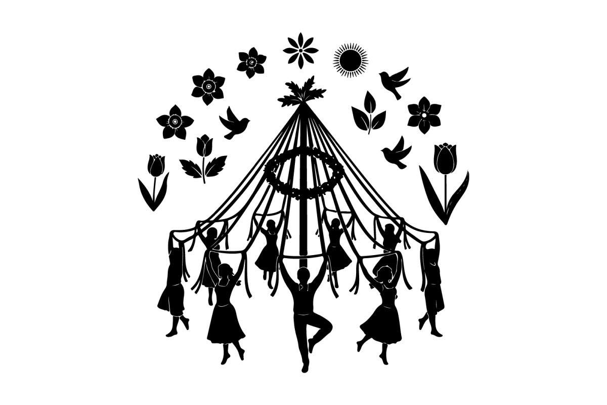
If the bat mandala is the dark half of the year, this is the bright one. Tiny figures circling a maypole under a sun, all movement and warmth. I put it up across from the mandala so the hallway reads like the two ends of the calendar facing off. My neighbor’s kid called it the happy one. Accurate.
I did it at 5×7 first, then decided it deserved more room and reprinted at 8×10. The figures need the space to actually look like they’re dancing instead of crowding.
My one complaint, the sun’s center prints a touch heavy. On glossy it can blow out a little. Matte fixed it.
A thin-line sun for people who hate clutter
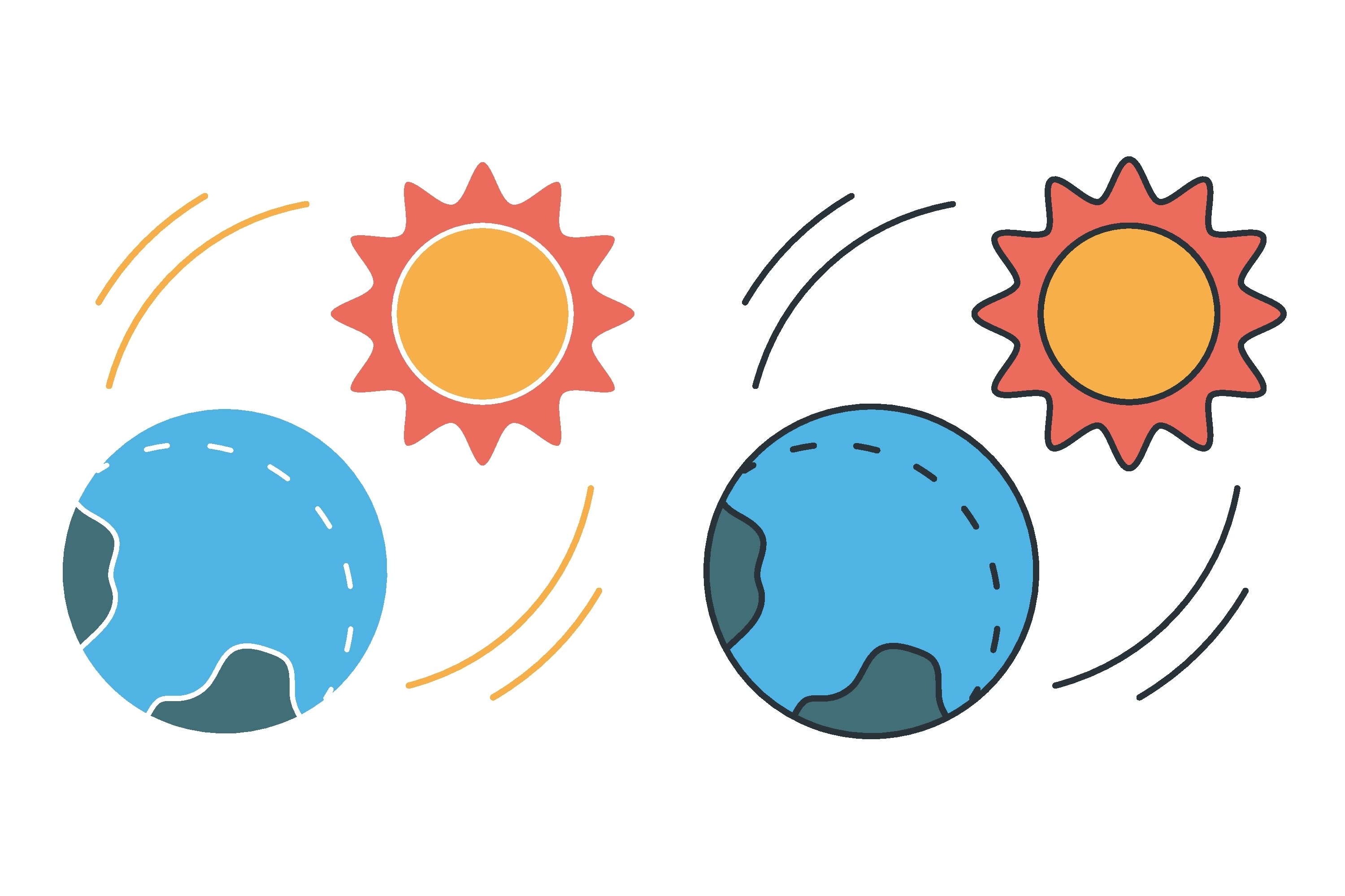
My friend Priya hates anything busy on a wall. Drives her up the wall, no pun. So I gave her this, a single linear icon of the sun warming the earth, all clean strokes, nothing fussy. She framed it in a plain oak frame and it’s the only art in her entryway. Looks like she planned her whole apartment around it.
For a lunar-calendar corner it works as a kind of anchor, the sun half of the sky next to the moon pieces. Printed crisp at 8×10 on regular weight, no bleed.
The downside is it’s almost too minimal. On a big empty wall it can read lonely. It wants a small frame and a tight grouping.
Return of the light, hung in the dead of winter
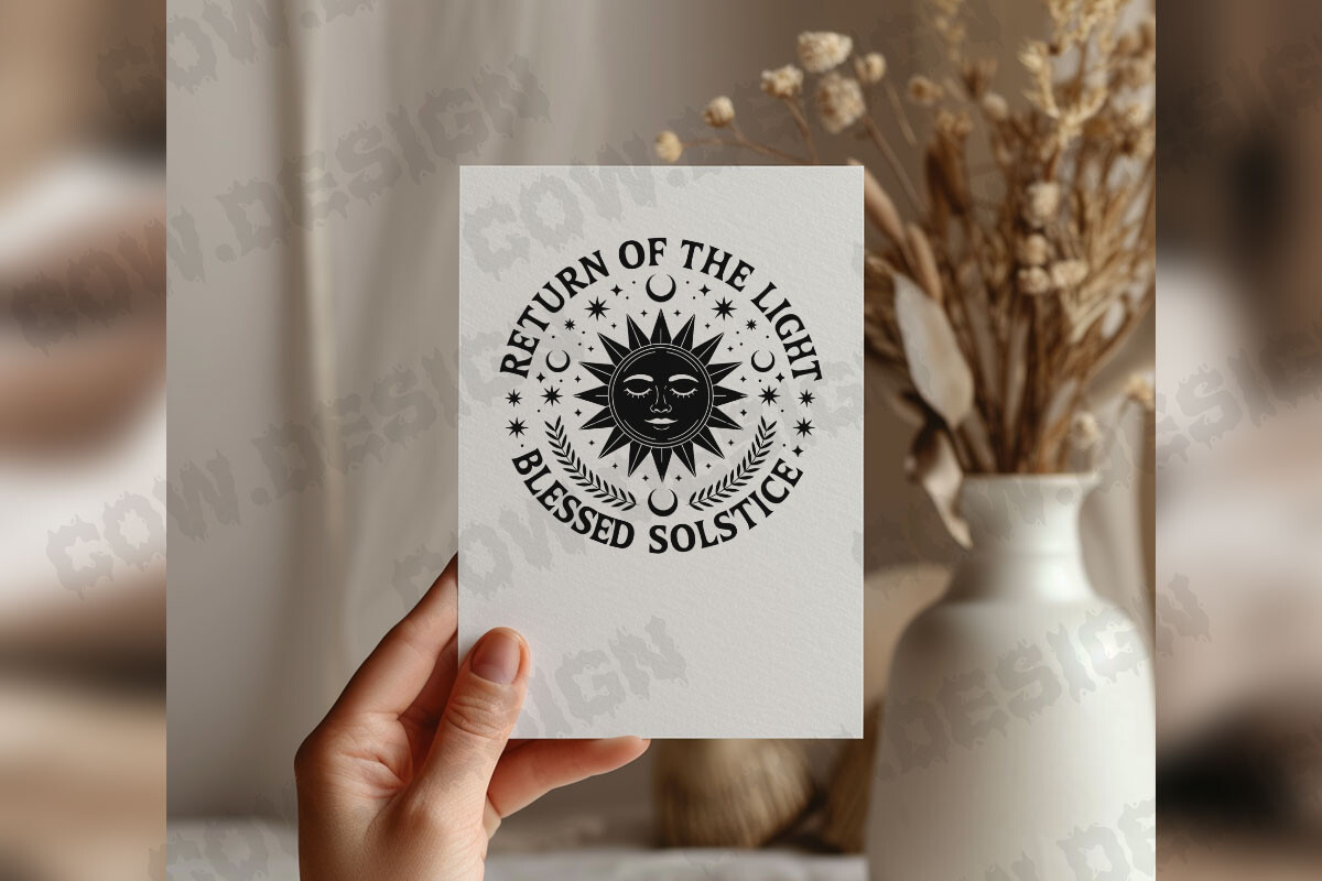
I have a thing about this phrase. Return of the light. My grandmother used to say something close to it in a different language, around the same point in the lunar year, and seeing it on a print did something to me. I bought it on a Wednesday in January after a long week and printed it that night on whatever paper was in the tray.
The layout breathes. Text up top, light radiating below, nothing crammed. I matted it in cream and it looks far more expensive than it was.
The one thing, the file is enormous. My laptop fan screamed opening it. Worth the noise.
The Yule print I keep up past the season
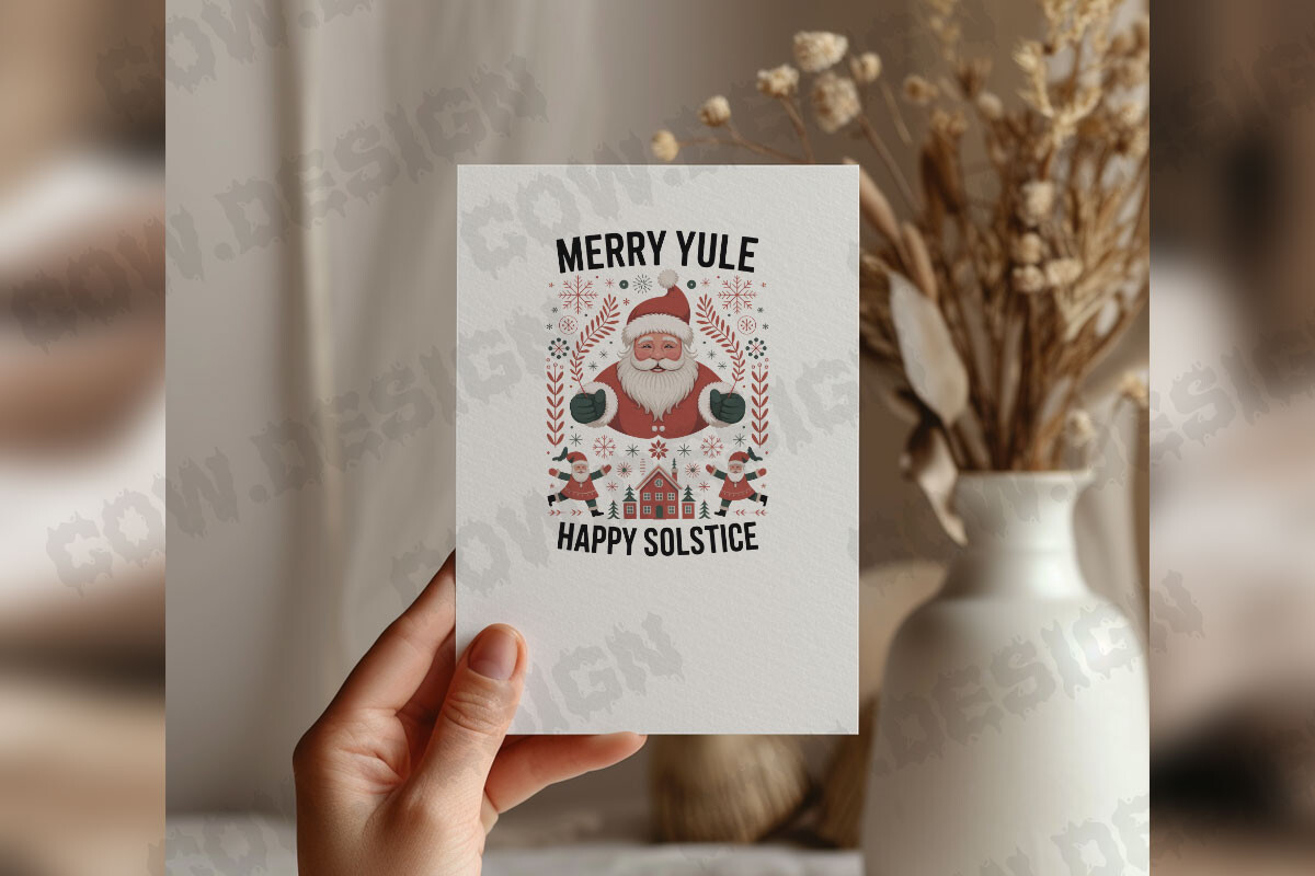
Most holiday prints I rotate out by mid January. This one stays. Merry Yule, happy solstice, but the design leans more turning-of-the-year than tinsel, which means it survives into the lunar new year stretch without looking stale. My coworker borrowed the file to print for her own place and now we have matching walls, which is either sweet or a problem.
I ran it at 8×10 in a thin black frame. The contrast is strong, reads well from across a room.
Gripe, the typography is bold. If you want something soft and airy this isn’t it. I happen to like loud. Your wall, your call.
The quieter sibling of the Yule pair
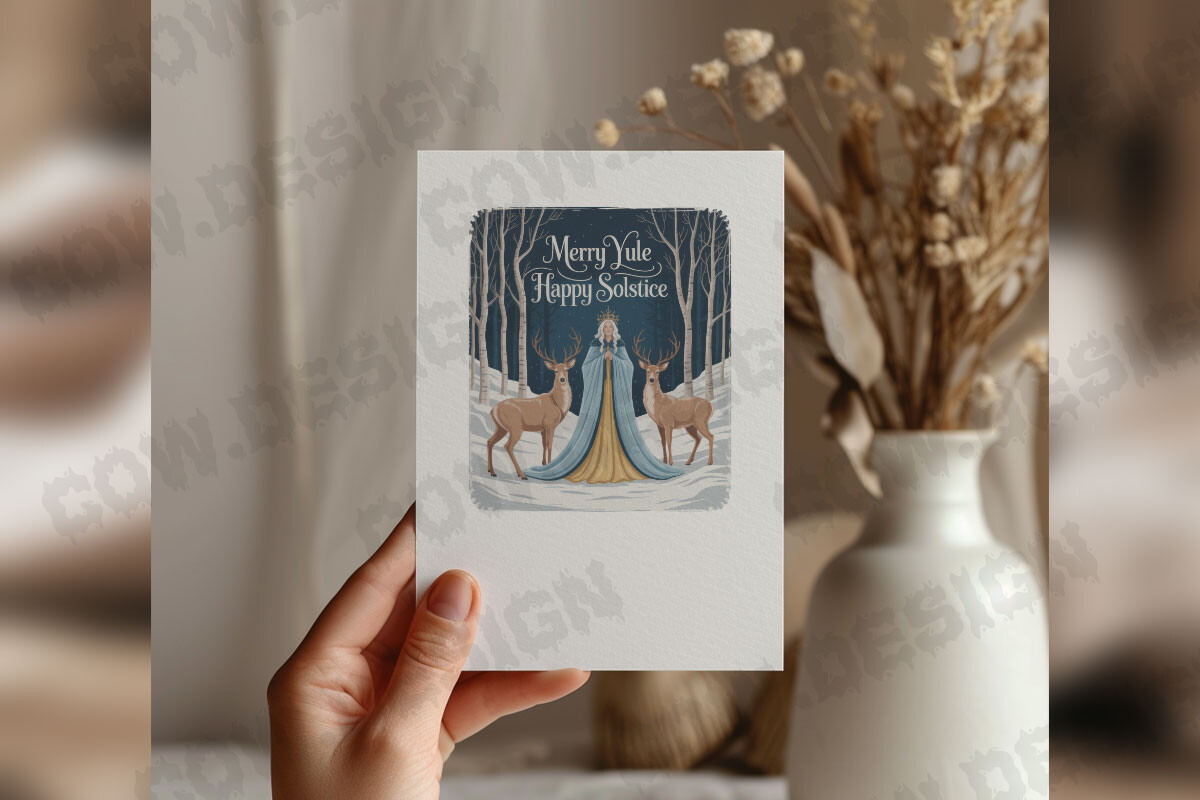
There are two versions of this floating around and I own both, which is embarrassing. This is the calmer one. Same merry Yule, happy solstice idea, but the spacing is gentler and it sits better in a room that already has a lot going on. I gave this version to my aunt, who counts the year by the moon and not much else, and she hung it in her kitchen by the window.
Printed at 5×7 it makes a tidy little piece for a gallery cluster. I tucked mine between two moon-phase cards.
The catch is it’s subtle to the point of shy. Across a big hallway it disappears. Keep it close, at eye level, where someone will actually read it.
Questions I Get About These
What is a Chinese celestial calendar?
A customer once argued with me over this for a whole email thread, so I finally read up. The short of it, it’s a lunar calendar, the year measured by the moon’s cycles instead of the sun, with the twelve animals attached to it. The one her grandmother used, the one that lands the new year somewhere in late winter rather than January first.
What threw me at first was that it isn’t just dates. It carries the animal years, lucky symbols, the whole sky tied to the season. That’s why the art around it leans celestial, moons and mandalas and the turning wheel, not just numbers in boxes.
What does a celestial calendar mean?
Honestly? For most of my buyers it means a pretty way to feel connected to the sky without doing math. A celestial calendar tracks time by the moon, the sun, the longer rhythms overhead instead of the page you flip on your fridge.
I didn’t get it until I started hanging the prints. Living with a moon-phase set for a month, you actually start noticing the real moon out the window matching the wall. That’s the whole point, I think. Time you can see.
How is a lunar calendar different from a universal celestial calendar?
Yep, people mix these up constantly. A lunar calendar counts months by the moon, which is why its dates drift against the ordinary calendar every year. The Chinese new year wandering around in late winter is the lunar calendar doing its thing.
A universal celestial calendar is broader, it’s tracking the whole sky, solstices, equinoxes, the sun’s path, not only the moon. When I decorate a corner I usually pair both, a lunar piece for the moon side and a sun or solstice print for the rest of the sky. The wall ends up telling the fuller story that way.
Before You Tape Anything Up
I started this looking for a literal Chinese lunar calendar to frame and ended up with a hallway full of moons, suns, bats, and dancers that together feel more like the calendar than any grid ever did. The buyer in Sacramento was right. It was never about the dates.
If you’re building a corner around the turning year, grab one moon-leaning piece and one sun-leaning one and let them argue across the wall. Print a test on cheap paper first, squint from across the room, then commit to a frame. That’s the only method I trust.