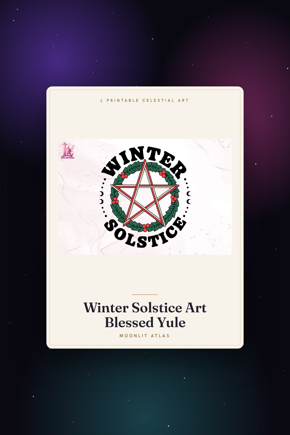
I have one good frame. Walnut, a little heavy, the only one in the flat that doesn’t look like it came from a checkout aisle. So instead of buying more I started swapping what goes inside it four times a year, on the days the sky genuinely shifts. Two solstices, two equinoxes. The wall changes, the frame stays, the rent stays the same.
It started by accident. My cousin gave me a summer solstice print in June, a loud sunny thing, and by the time the September equinox rolled around it looked wrong against the dimming light, so I pulled it and slid in something quieter. Then I just kept doing it. Now the frame above my entryway tells me where the year is without a calendar. Longest day, balance, shortest day, balance again.
What follows are seven I cycled through this past year. Most lean solstice, because that’s what the makers print most, but I’ll flag how I’d stretch them across the four turning points so one set carries the whole loop. A couple of these links are affiliate links, so if you grab a file it sends a little my way. Your price doesn’t move.
A few links below are affiliate links. If you grab a print through one, it sends a little something my way at no extra cost to you.
The one I hang for the longest day
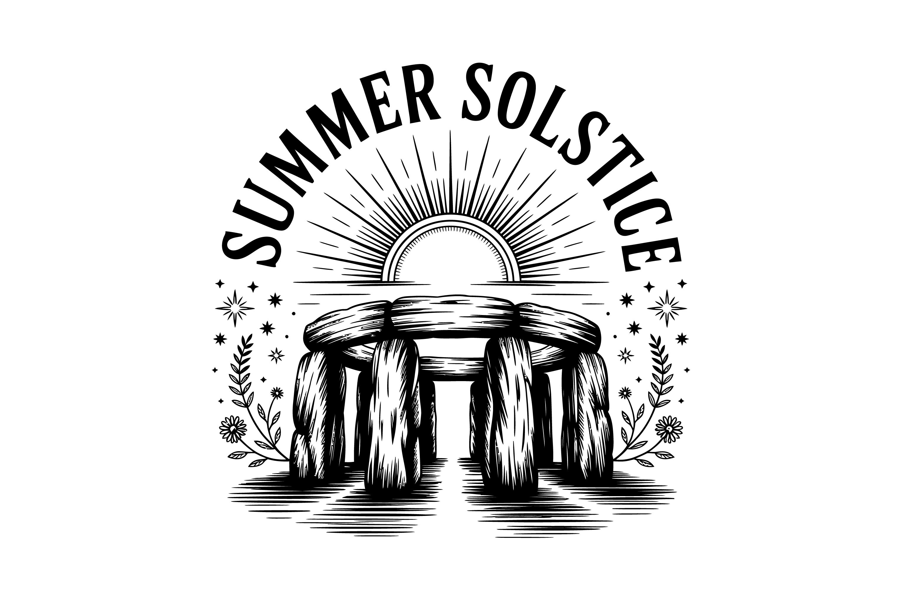
Stonehenge at sunrise is the obvious summer solstice image, and I braced for it to be corny. It isn’t. The stones read as flat blocks against a low sun, more graphic than postcard, and at 8×10 in the walnut frame it anchored June without trying to be a tourist photo. I put it up the night before the solstice and left it through July.
This is my June-21 piece, the one that says longest day better than any sun-with-rays cliche. The trick I found is it pairs with the retro sun further down to make a matched summer pair if you’ve got two frames going. Against a white wall the stone shapes feel almost architectural.
My gripe is the sky behind the stones printed darker than the proof showed on screen, so the contrast between stone and sky flattened a bit. I lightened it in the copy-shop software on the second pass and it sat right.
My quiet swap for the autumn equinox

This one’s a moon over a short blessing line, and even though it says solstice on the file I use it for the September equinox, when I want the wall calmer and the days are evening out. The moon motif suits that in-between light better than a blaring sun does. I ran it at 5×7 and it slipped into the frame like it was made for the balance point of the year.
Good for the equinox rotation precisely because it’s restrained. The blessing text is small and doesn’t shout. I had it up the week the light went level and golden through the kitchen, and it matched that exactly, which I did not plan.
What bugs me is the moon sits high in the composition, so there’s a lot of empty space at the bottom of the frame. I cropped tighter to balance it. If you don’t crop, the moon floats up near the top edge and looks a little lost.
Dated, on purpose, for one season only

A minimal “Solstice Crew 2026” line, clean type, almost no ornament. The 2026 stamp means I’d only run this for one cycle, which sounds like a flaw until you treat it as a feature. I keep a small print like this in the frame for the actual solstice week and then retire it, the way you’d keep a ticket stub. Mine went up at 5×7 the week of the winter solstice last year.
Reach for this if you like the idea of marking the specific year you started the four-season swap habit. It’s a record, not a forever piece. My downstairs neighbor saw it and asked if I was hosting something, which, fair.
The catch is the date locks it. Past 2026 it reads stale unless you frame it as a keepsake. And the minimal type wants a true-white paper, because on the slightly cream stock my copy shop on Vance Street defaults to, the design looked a touch dingy.
Loud sun for the peak of the year
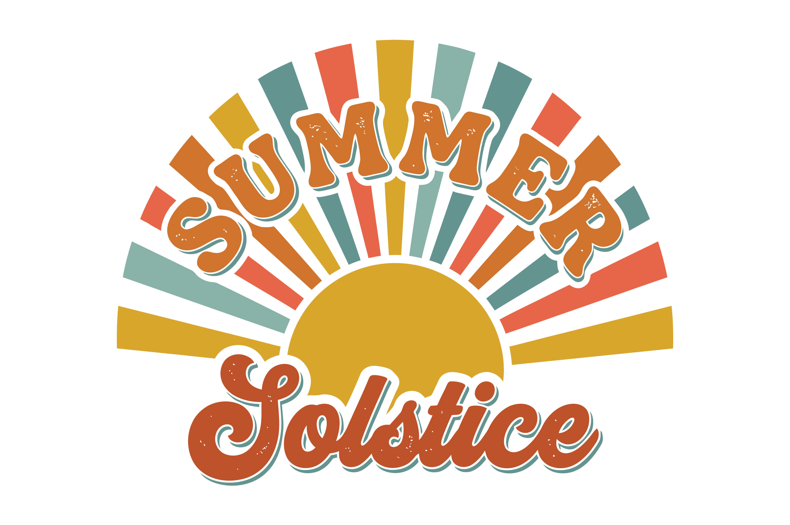
Retro sun, fat rays, the warm orange-and-rust palette that screams June without apology. This is the one I pull out at the summer solstice when I want the wall to be a little obnoxious about the longest day. It pairs with the Stonehenge print as a matched summer set, the way I rig two solstice pieces side by side and let the season be loud for three weeks.
Works for the high point of the rotation and nowhere else, which is the whole point. I would not leave this up past the August lull. By the autumn equinox it fights the lower light and looks like it’s trying too hard.
My honest nitpick is the rust tone printed muddier than the screen showed. The rays lost some of their snap. I bumped the saturation on the reprint at the copy shop and it came back, but straight from the file it’s a hair flat.
The fuller-bodied cousin of the minimal one

Same Solstice Crew 2026 idea, but with more going on, a heavier graphic treatment instead of the stripped-back type. Where the minimal version is a stub, this one wants to hold its own as the main thing in the frame. I tried both in the same week to see which I’d keep, and this one won for the actual solstice itself because it carried the wall alone.
Good as the centerpiece print for the solstice swap, especially if you only run one piece and want it to feel like an occasion. A friend who teaches put it in her classroom corner around the winter solstice and the kids actually asked what a solstice was, which is a win.
The annoyance is the heavier graphic eats ink, so my home printer streaked the bottom band and I gave up on it for the copy shop. At 8×10 on their thicker stock it came out clean. The 2026 date issue applies here too, so it’s a one-cycle piece for me.
Retro sun, take two, the one I kept
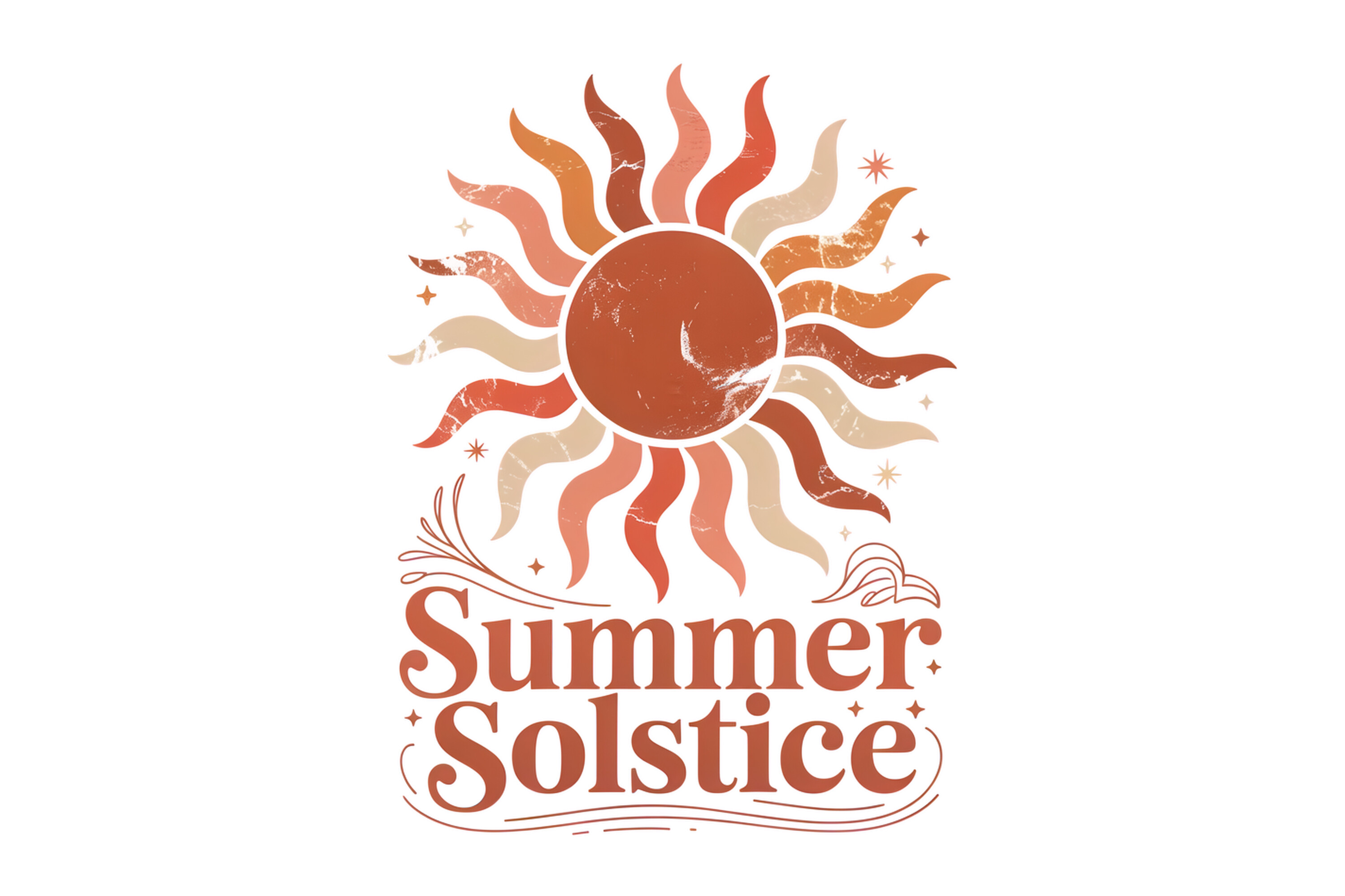
Another retro summer-solstice sun, slightly different hand than the first retro one, a touch more geometric in the rays. I ended up preferring this for the June rotation because the cleaner ray shapes held up better when I shrank the file. At 5×7 it stayed crisp where the looser retro design softened.
This is my real summer-solstice keeper, the piece I cycle in when the year hits its peak and I want warmth without total chaos. It’s loud but disciplined. I rotate it out the moment the autumn equinox lands and the blessing moon goes back in.
What I’ll knock it for is the color again, these retro suns all lean warm and dark on paper, and I had to lift the brightness a notch at print time. Once corrected it sang. Out of the file, slightly dim. I print a test on plain paper first every single time now because of these.
String lights for the dark end of the loop

A little string-of-lights motif with a merry solstice line, which lands somewhere between holiday card and wall art. I use it for the winter solstice slot, the dark end of the year, because the lights read as warmth against the long night the way the summer suns never could in December. Ran it at 5×7 above the radiator the week before the shortest day.
Reach for this to close the four-season loop, the cozy bookend to the loud summer suns. It’s the one piece in the batch that openly leans festive, so it’s the one I’d swap out by mid-January before it tips into looking like leftover decorations.
My gripe is the lights are rendered in a warm yellow that went slightly green on the cream copy-shop stock. On true-white paper it was fine. I learned to specify the brighter white sheet for this one specifically, because the green tint cheapened the whole thing on the default paper.
Questions I Get About These
What is the difference between astronomical and calendar seasons?
I genuinely did not know this until a buyer emailed annoyed that my summer print went up in late June instead of June 1. Turns out calendar seasons just chop the year into tidy three-month blocks starting on the first, which is what weather forecasters use because it’s neat. Astronomical seasons start on the actual solstices and equinoxes, when the sky does its thing, which drifts around the 20th to the 22nd. For the wall-swap habit I go by the astronomical dates, because the whole point is hanging the print on the day the year actually turns, not on an admin date someone picked to make the calendar look tidy.
How do you draw a summer solstice scene?
I don’t draw, I just stare at enough of these files to have opinions. The ones that work keep the sun low and big and skip the clutter. The Stonehenge piece nails it by letting flat stone shapes block the light instead of drawing rays on everything. The retro suns go the other way, all fat geometric rays, and those work too as long as the maker resists adding birds and clouds and a beach. The summer solstice scenes that flop are the ones that pile on every warm-weather thing at once. If I were drawing one, I’d put a single oversized sun near the horizon and stop. The longest day is about the sun being huge and high. Let it be the only thing.
What art pairs with the winter solstice for a full set?
This is the question that started my whole four-frame-but-only-one-frame habit. A summer solstice piece on its own looks orphaned, so to make a full set I pair the loud summer sun with a quieter winter piece and then slide an equinox-ish moon print in between for balance. In this batch the string-lights design is my winter anchor, the retro suns carry summer, and the blessing moon does equinox duty. Run them through one frame across the year if you’re short on wall, or hang all four at once if you’ve got the space and want the whole turning year on display. Either way the moon or a wordless mark is what keeps the summer and winter pieces from clashing when they sit side by side.
Before You Tape Anything Up
The four-turning-point swap is the only seasonal decorating I’ve stuck with, because it costs me one frame and four print files instead of a closet full of holiday bins. The year tells me when to change it. Longest day, balance, shortest day, balance, and back around.
If you want to start, grab one loud summer sun and one quieter winter piece, plus a wordless moon for the two equinoxes, and run them all through whatever single frame you already own. Print tests on plain paper first, because these solstice files all skew warm and dark and need a brightness nudge. Then just let the sky tell you when it’s time to swap. It always does, right on schedule, whether the calendar agrees or not.