The harvest moon caught me off guard last year. I was carrying groceries up from the car, looked east over the rooftops on Bellweather, and there it sat, fat and orange and lower than it had any right to be. I stood in the stairwell holding a bag of leaking peaches and just looked at it.
That’s when I started swapping my walls for fall. Not the whole place. Just the narrow hallway, where the winter-white moon phases I’d had up since January suddenly looked cold and a little clinical. Autumn wants warmer. Burnt orange, ochre, that bruised plum you get right at dusk in October. The moon doesn’t change but the mood around it does, and the print on your wall should know that.
So here are the ones I printed, taped up, lived with, and kept for the September-through-November stretch. A few of these links are affiliate links, which means if you grab one I get a small cut. Doesn’t cost you a thing.
A few links below are affiliate links. If you grab a print through one, it sends a little something my way at no extra cost to you.
The little quote print that earns its spot by the door
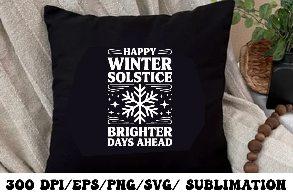
I’m usually allergic to word art. Most of it reads like a throw pillow that learned to talk. This one I made an exception for, partly because the lettering is restrained and partly because I needed something to break up a run of three moons that were starting to feel like a science fair.
I ran it at 5×7 at the copy shop on Fenwick, the one with the printer that smells faintly of burnt toner. Held it up next to my front door, where everyone’s coat hooks are. It sits there now, a small warm reminder right at eye level when you’re shoving your feet into boots.
One gripe. The font is a touch thin, so at the small size the letters go a little ghosty if your printer’s low on ink. Bump it to 8×10 and the problem vanishes.
The one I never framed, because it lives on a cup
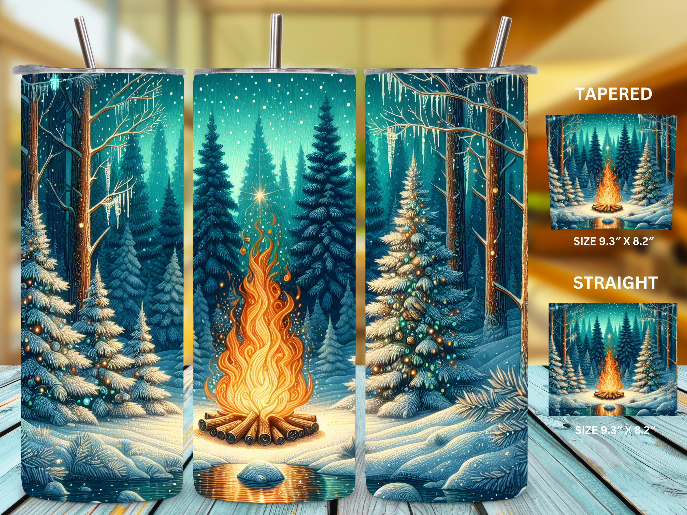
This one’s a cheat in a wall-art roundup, and I know it. It’s a tumbler wrap. But hear me out. By late November my fall hallway is already tipping toward winter, and I’m not ready to retire the warm palette, so this lands as a bridge. Forest, snow, a bonfire glow. The orange of the fire keeps it talking to the autumn prints next to it.
I didn’t even put it on a tumbler at first. I printed a panel of it flat and tucked it into a thrifted frame, just to see. Looked oddly good on the kitchen shelf next to the kettle. Then my neighbor Dolores saw it, asked, and I ended up actually wrapping a cup for her birthday in December.
The catch is registration. If your wrap is even slightly off when you apply it, the bonfire ends up with a seam right through the flame. Measure twice. I did not, the first time.
A whole season’s worth of warm sky in one folder
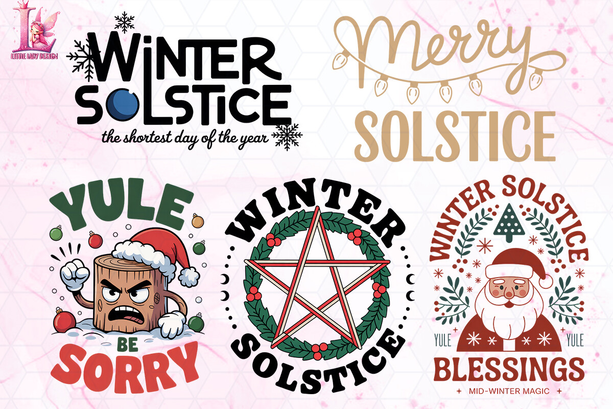
If you only grab one thing here, this is the workhorse. A bundle, so you’re not buying a single print and praying it fits the wall. I dragged the lot into my flat-print template on a rainy Thursday and just printed contact-sheet style on cheap paper to see what spoke to me.
Three of them made it to frames. The rest I’m saving for the equinox table next year, the one I set up with dried wheat and a couple of beeswax candles my cousin keeps gifting me. Having the whole set means the hallway and the table actually match for once, which sounds fussy but reads as deliberate to anyone who walks through.
The files are hefty. My laptop, which is roughly the age of a high schooler, groaned opening a few of them. Coffee got cold during. Still worth the wait.
The sun that anchors the moon wall so it isn’t all night
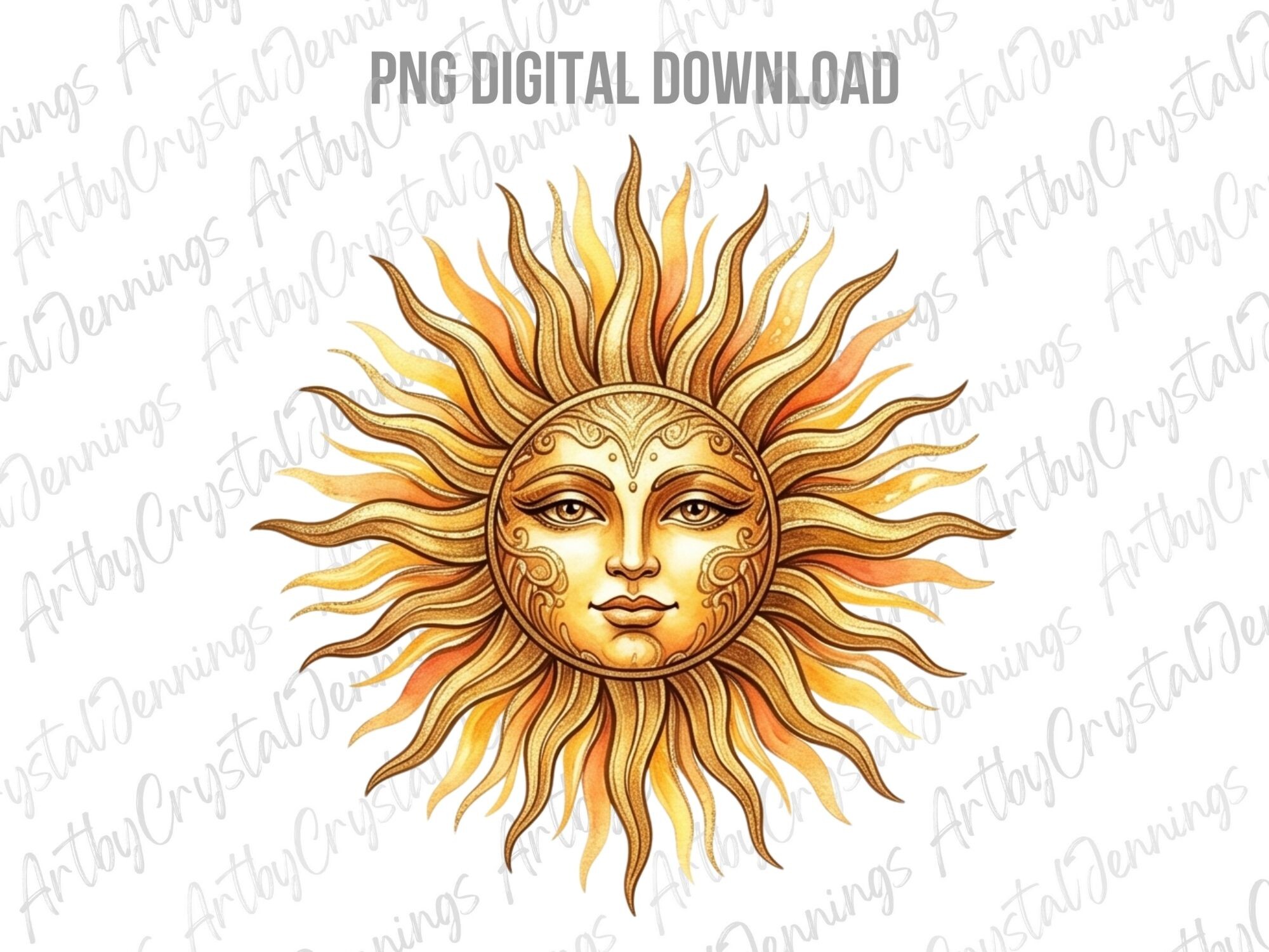
Pure night sky in a hallway can start to feel like a planetarium gift shop. I needed a sun in the mix to warm it up, and this face does the job. It’s got that old almanac look, the kind you’d see carved into the corner of a 1700s star chart, with a steady gaze that’s friendly rather than smug.
I printed it at 8×10 and hung it as the keystone, dead center, with two small moon prints flanking. The warm gold of the face pulls the whole September palette together. A friend who restores furniture said it looked like something off an old weathervane, which I took as the highest compliment.
Gripe: it’s built for sublimation, so on plain matte paper the gold reads a little flat. I had mine printed on a heavier coated stock and the metallic feel came back.
Borrowed from summer, kept for the warm fall light
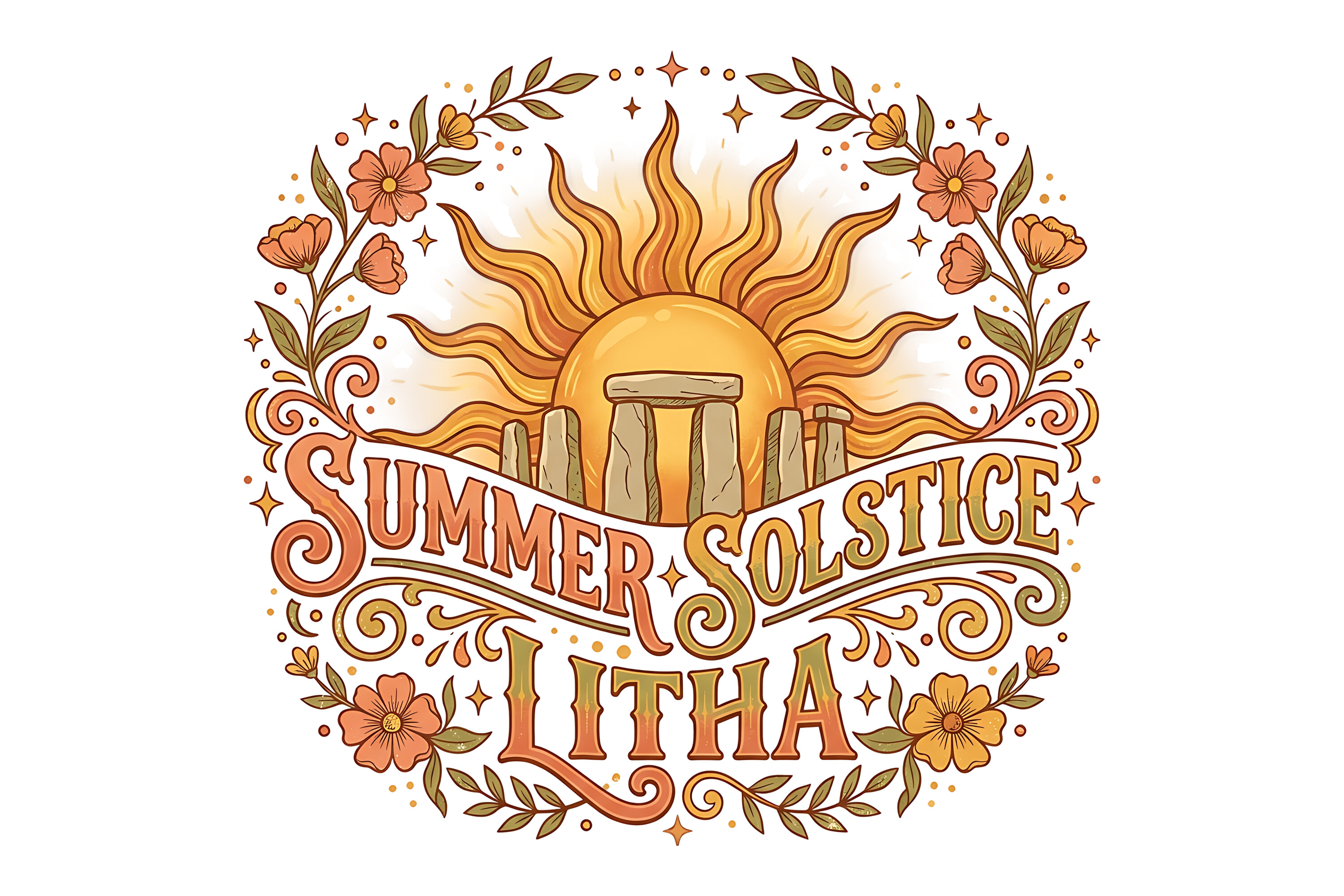
Yes, it says solstice. Yes, that’s June. I’m using it in autumn anyway and I’d do it again. The thing about Litha sun art is the color story, all marigold and honey and deep amber, which happens to be exactly what a harvest sky throws at you in late September. Nobody walking through my hallway is checking the calendar against my wall.
I set it across from a window that gets a hard slant of afternoon light around four o’clock this time of year. When the real sun hits the printed one, the whole corner goes gold for about ten minutes. Accidental, but I plan my tea around it now.
One honest catch. The detail in the sun’s rays is fine and a little busy, so it loses some punch below 5×7. Print it 8×10 or bigger and let it breathe.
The soft-edged sun for when the line work feels too sharp
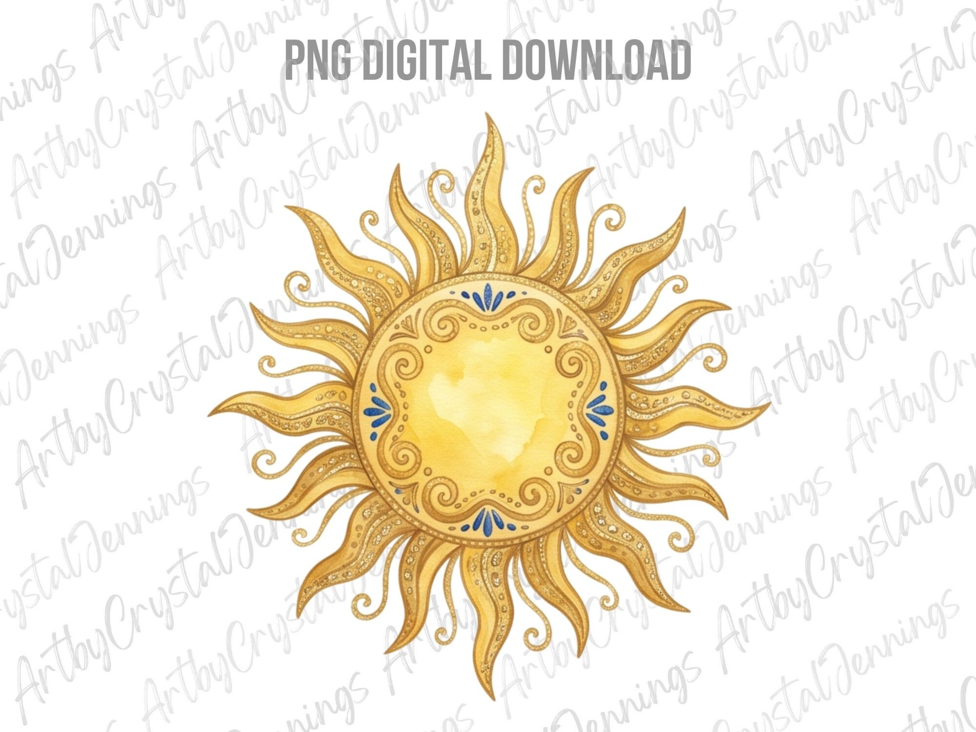
Some days the crisp graphic stuff feels too loud, and that’s when this watercolor sun goes up instead. The edges bleed the way real watercolor does, gold washing into pale cream, and it sits quieter on the wall than the hard-line pieces. Good for a bedroom, or any corner where you don’t want the art shouting.
I gave a printed-and-framed one to a coworker who’d just moved into a tiny studio with one sad bare wall. She texted me a photo of it hung above her bed the same night. That’s the whole game, really. Print, frame, give, get a photo back.
The one thing to watch is the white. It’s not transparent in the soft parts, it’s near-white, so on cream paper the edges can disappear. I printed mine on bright white and the wash kept its glow.
The 70s-rec-room sun that somehow reads as fall
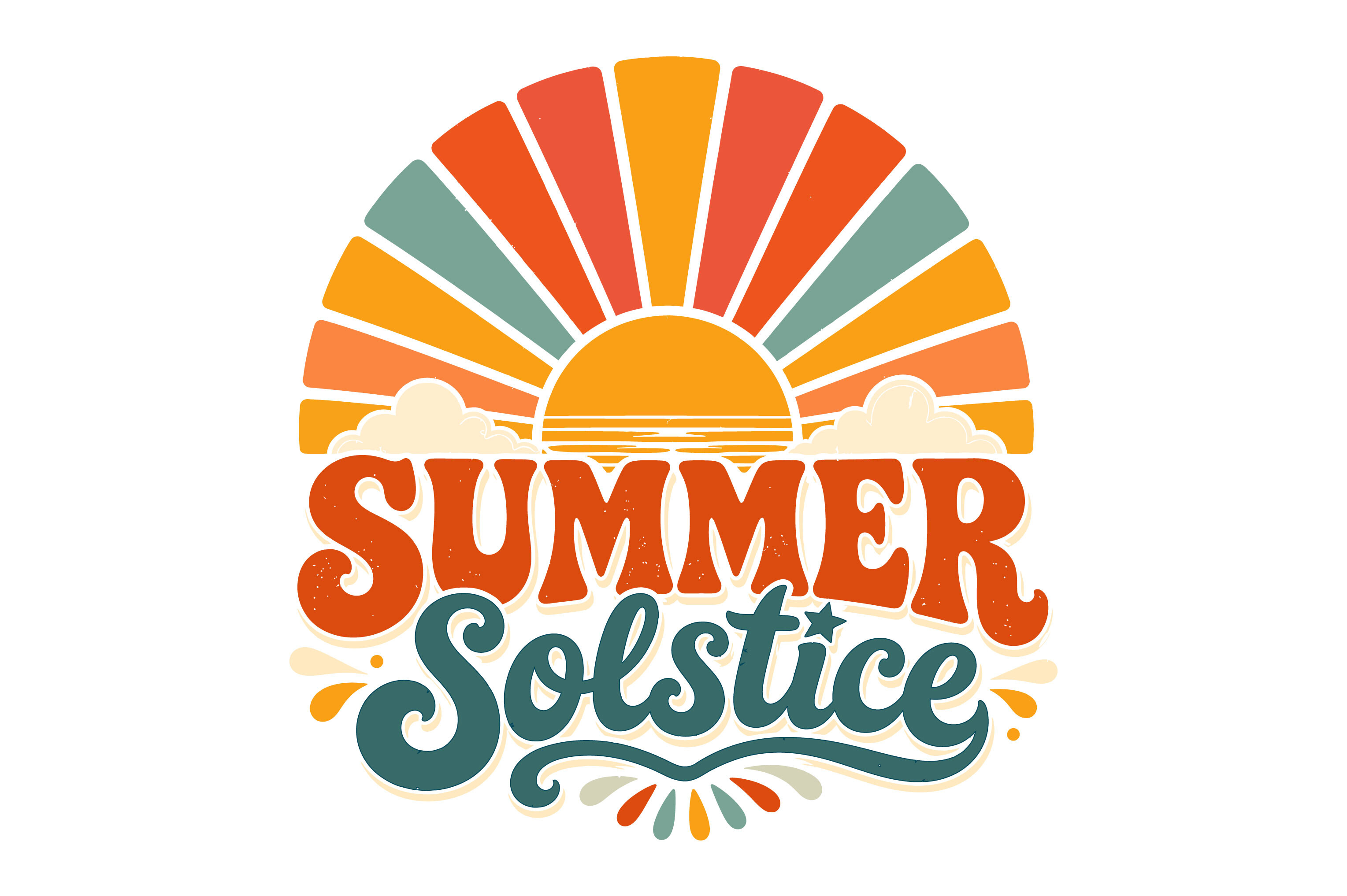
This one’s all retro, the kind of sunburst you’d find printed on a macrame wall hanging in somebody’s wood-paneled den circa 1974. Rust, mustard, a bit of cream. I bought it half as a joke and it ended up being the print people ask about most.
I hung it in the hallway at the turn near the bathroom, low, where you catch it on the way past. The earthy retro palette is doing autumn’s work without ever drawing a single leaf or pumpkin. My downstairs neighbor called it groovy with a completely straight face and I’ve decided to keep that.
The quibble: the retro tones are warm but flat, so on a glossy frame the whole thing gets a glare that washes the rust out. Matte glass or no glass at all. Mine’s leaning, no frame, against the baseboard. Looks better than it has any right to.
Questions I Get About These
What is the difference between the autumn moon and a moonrise?
A moonrise is just the moon coming up over the horizon, which happens every single night whether you notice or not. The autumn moon is a season’s worth of those moonrises, and the famous one is the harvest moon, the full moon closest to the September equinox.
What makes the autumn version special is timing. Around the equinox the moon rises only a little later each night instead of the usual big gap, so for several evenings in a row you get a bright moon coming up right around sunset. That low angle and the haze of fall air are what give it the warm orange cast everyone tries to capture.
When is the autumn moon in 2026?
The harvest moon in 2026 falls in late September, the full moon nearest the autumn equinox on the 22nd. So look for it in the days right around then, give or take.
If you miss it, the October full moon, the hunter’s moon, carries the same low, golden, sits-on-the-rooftops quality. I usually have my fall prints up by the first week of September so I’m not scrambling, and I leave them through November.
What colors suit autumn moon wall art?
Warm and a little muted is the rule I go by. Burnt orange, ochre, mustard, rust, and that deep dusty plum the sky turns just after sunset. Those pull a print toward fall without needing a single literal leaf.
Keep your golds on the warmer, brassier side rather than bright lemon, and let cream or oatmeal do the work of white. If a print leans cool blue or stark black-and-white, save it for winter. It’ll read clinical against the autumn light.
Before You Tape Anything Up
None of these are precious. I print them cheap, live with them taped to the wall for a week, and only commit to a frame once I’ve stopped noticing them in a good way. The hallway on Bellweather has worn maybe four different versions of this exact lineup, and the leaning, unframed retro sun by the baseboard has outlasted every careful framed thing.
That’s the only advice that’s ever held up for me. Tape it, walk past it for a few days, and trust the one you stop fussing over. The harvest moon will be back next September regardless, low and orange over the rooftops, and your wall might as well be ready for it.