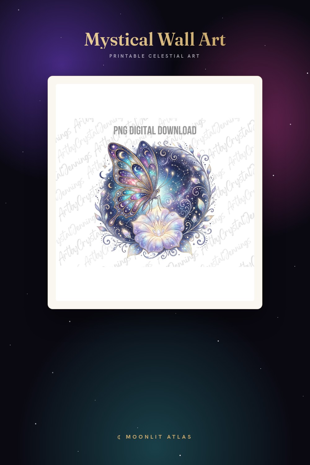
My hallway used to be a mood board for a person I’m not. Foil. Glitter stars. A constellation map I bought at midnight and never even unrolled. It sat in the tube for a year.
Then I stripped it all down to one thing: black ink, white paper, the moon and not much around it. Suddenly the wall stopped shouting. A friend walked in last month and asked if I’d repainted. I hadn’t. I’d just taken the noise off.
These are the minimalist ones I actually run and frame, not the screenshots rotting in a folder called LATER. I print them flat at the copy shop on Fulton, hold the proof up in the bad afternoon light, and live with it for a few days before I commit. A couple of links here are affiliate links, so if one ends up on your wall it sends a little back my way. No cost to you.
A few links below are affiliate links. If you grab a print through one, it sends a little something my way at no extra cost to you.
One moon, eight quiet phases
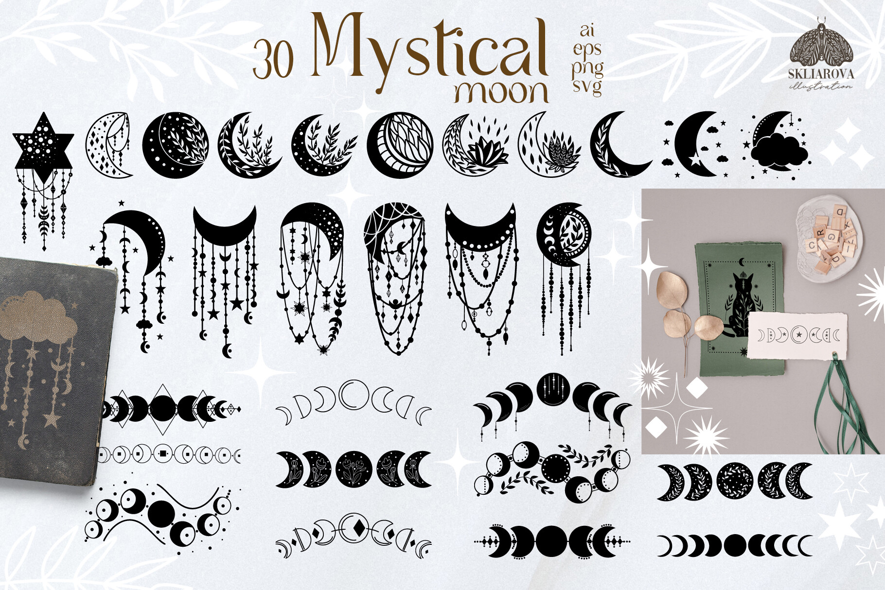
This is the file I open when a wall feels off and I can’t name why. Full moon, the slivers, the gap where the new moon almost disappears. I print it in plain black on bright white, no gray, no texture. It reads clean from the far end of the room, which is the only place anyone actually stands.
I did a single 8×10 of just the full moon over my light switch and a row of the smaller phases beside the door. Looks planned. Took me three tries to get the spacing.
One gripe. The phase shapes run a touch heavy at large sizes, so the new moon can look like a smudge instead of a circle. Shrink it and it’s perfect.
When you want the moon to hold a little structure

A mandala usually breaks my minimalist rule on sight. Too busy. This one doesn’t, because the line is thin and the whole thing is built on the phases instead of a thousand petals. Black on white, it almost looks like a technical drawing of the sky.
I hung a single large print over the dresser in the bedroom, centered, no frame at first, just washi tape while I decided. It stayed taped for two weeks. My neighbor thought that was the final look. Honestly it nearly was.
The catch is it wants space. Crowd it next to other art and the detail turns to mush. Give it a blank wall and it earns the room.
The tiny stars I sprinkle so the moon doesn’t feel lonely
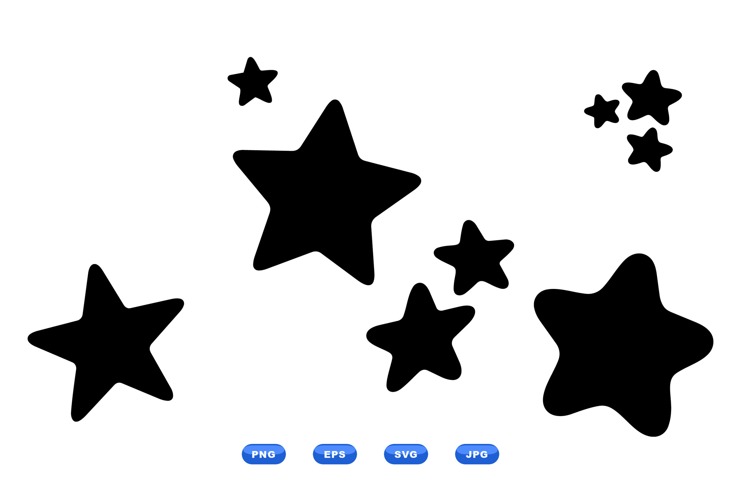
Pure minimalism can tip into bare. A few small stars fix that without dragging me back to teenage-ceiling territory. I pull two or three from this pack, scale them way down, and float them off to one side of a moon print. That’s it. Restraint is the whole trick.
I used them once on a little 5×7 I made for a coworker who’d just moved into a studio with one good wall. Single moon, three pinpoint stars, black and white. She texted me a photo of it framed before I’d even gotten home.
There are more shapes in here than I’ll ever use, and a handful are too cute for my taste. I just ignore those and keep the simple four-point ones.
Not for the wall, but it lives under the moon prints

This one isn’t art I hang. It’s a journal, fifty prompts, the kind of thing that sounds heavier than it is. I keep it on the little shelf right below my phase prints, so the corner of the room reads as one calm idea instead of decor plus clutter.
I printed mine, hole-punched it, dropped it in a plain black binder. Black cover, white pages, sits with the prints like it belongs. I gave a second copy to a cousin who’s into all of this far more than I am. She actually filled hers in. Mine has coffee rings.
Fair warning, some prompts get intense fast. I skip around. Not every Sunday is a deep-feelings Sunday.
Glitter in the name, but I print it dead flat
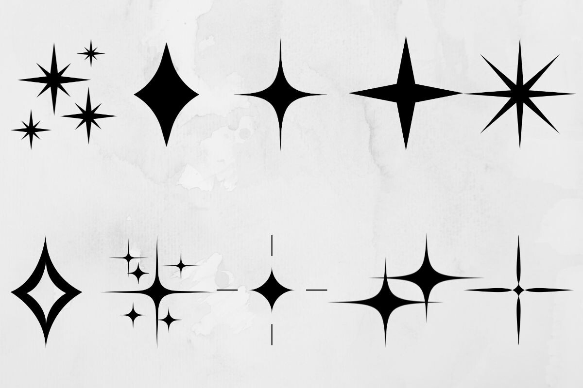
The word glitter almost made me close the tab. I’m glad I didn’t. Stripped of any shimmer and run in solid black, these sparks are just clean little star bursts, and that’s exactly what a too-empty corner sometimes needs. I print them matte. No foil ever touches my hallway.
I scattered three of the four-point ones around a single small moon, all black on white, in a cheap thrifted frame I spray-painted white on the fire escape. The grouping cost me under ten dollars and it’s the thing guests ask about most.
Downside, a few of the designs really do lean sparkly and ornate. I use maybe a third of the bundle and leave the rest.
A faint star field for when one moon isn’t enough
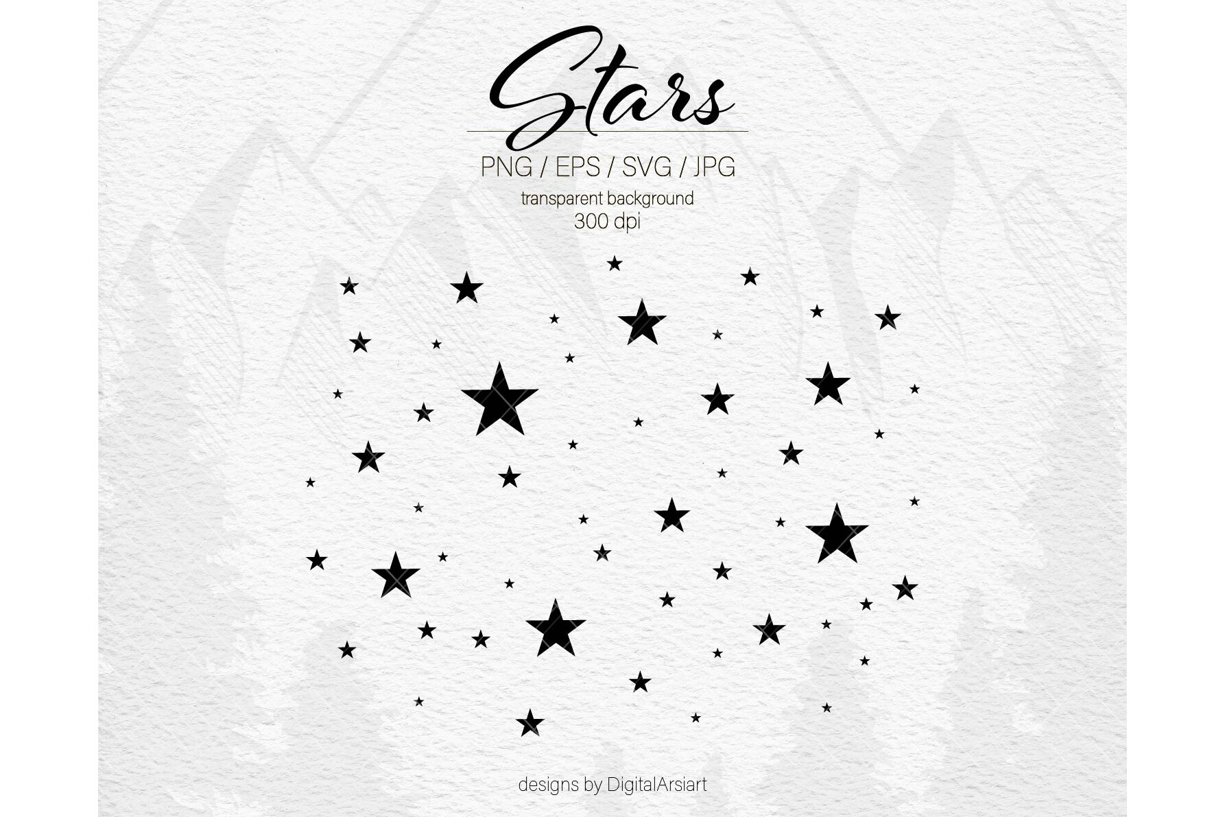
Most galaxy files are a wall of noise. This one I can thin out. I drop the density way down, keep it black on white, and let a scatter of small stars sit behind a single moon so the print has depth without going busy. Minimal, but not flat.
I ran a tall 11×14 of this for the narrow strip of wall by the front door, where nothing else ever fit right. Vertical, sparse, just enough sky. It finally made that awkward sliver of wall look intentional.
The one annoyance is the default version comes packed dense. You have to delete a lot of dots to get the quiet look. Took me a slow afternoon with the radio on.
The backdrop I save for a single statement frame
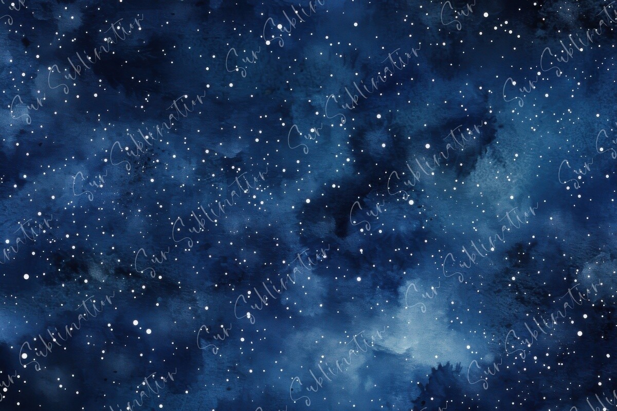
This is my one allowed indulgence in an otherwise spare room. A full night sky, but I keep it strictly black and white and let it be the only thing on its wall. No gallery cluster, no companions. One frame, big, breathing room on all sides.
I printed it at the largest size my copy shop offers and leaned it on the floor against the bedroom wall for a month before I trusted it. Never did hang it properly. Floor-leaning won. It looks like a window into a very quiet night.
The heavy part is the file. My old laptop groaned opening it and the fan ran like a jet. Worth the wait.
Questions I Get About These
Why choose black and white moon prints?
Because color dates fast and black and white doesn’t argue with anything. My walls change, the couch changes, the mood of the room changes. The black moon on white paper just keeps being calm through all of it.
There’s also the printing. Solid black runs clean on cheap paper at any copy shop. No worrying about a teal going muddy or a gold looking plasticky. What you see on screen is what tapes to the wall.
How do I keep a moon wall looking minimal?
Subtract. The temptation is always to add one more star, one more frame, one more little something. I do the opposite. One moon as the anchor, maybe a few tiny stars off to the side, and a lot of empty wall doing the heavy lifting.
Matching frames help more than people expect. Same color, same width, evenly spaced. The eye reads it as one quiet idea instead of a pile of separate prints.
What frame suits minimalist moon art?
Thin and boring, honestly. A slim black frame or a slim white one, nothing carved, nothing wide. The frame should disappear so the moon is the only thing you notice.
I’ve had good luck with cheap thrifted frames spray-painted a flat white. Sometimes I skip the frame entirely and just tape the print up with the edges clean. On a bare wall that can look more deliberate than glass ever does.
Before You Tape Anything Up
Minimalist moon art is mostly about what you leave out. The black, the white, the breathing room. Get those right and a single small print can settle a whole wall.
Start with one. Print it flat, hold it up in the worst light your place gets, live with it a few days. If it still looks calm by the weekend, frame it. If it doesn’t, you only spent a sheet of paper finding out.