A moon calendar poster is a different animal from the little printable one I keep taped inside the kitchen cabinet. That one is for checking. This one is for looking at. I figured that out the hard way after I framed a full functional grid, all 365 days, tiny moons in tiny boxes, and my cousin Dela walked in and asked why I had a spreadsheet on the wall. Fair.
So for 2026 I went the other way. Big poster, lots of breathing room, the phases arranged like they actually matter instead of crammed into a planner. I run them at the print bureau over on Calloway because my home printer chokes on anything past 24lb, and I live with the proof taped up for a few days before I commit to glass. Half the time the proof tells me the thing is too cold on its own. A pure moon grid in January reads like a tide table.
That’s why most of what’s below isn’t a calendar at all. It’s the seasonal stuff I hang next to the calendar so the corner has some warmth to it. Winter watercolors, a couple of cozy quote prints, a tumbler wrap I cheated and turned into wall art. One or two of these links are affiliate links, so if you grab something it tosses a few cents my way. Your price stays the same.
A few links below are affiliate links. If you grab a print through one, it sends a little something my way at no extra cost to you.
The tumbler wrap I never put on a tumbler
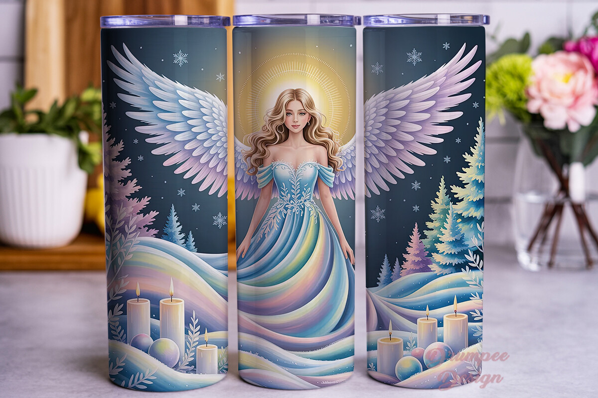
This was meant for a cup. I know. But the snow scene on it is the exact soft blue I wanted next to a stark moon poster, so I printed the wrap flat on 8×10 matte and framed it like that. Nobody who visits has ever guessed. The angel sits in falling snow and the whole thing has this hush to it that a moon grid alone never gives you.
I hung it to the left of my January phase poster and suddenly the corner stopped looking like a planetarium gift shop. It looked lived in. Warm light, cold sky, that contrast.
One gripe. Because it’s drawn to wrap around a curve, the edges of the artwork pull slightly when you flatten it, so I had to crop a thin sliver off the right side to keep it square. Took ten minutes in Canva. Not the end of the world.
Same angel, different snow, and yes I bought both
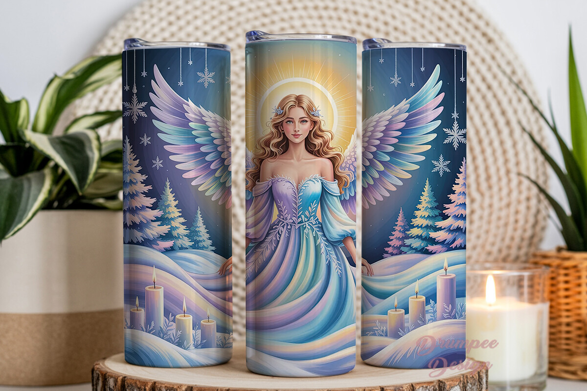
There are two versions of this snow scene and I am the kind of person who buys both and tells herself she’ll pick one later. This is the other one. The snowfall pattern is heavier here, the angel a touch smaller in the frame, more sky around her. Which, for sitting beside a moon calendar, actually works better. The empty sky echoes the empty space I left around the phases.
I printed this at 5×7 and slid it into a thrifted frame my neighbor was throwing out. Cost me nothing. Looks like it cost something.
The catch is the same as its twin. It’s a wrap file, so the proportions assume a cup, not a wall. I had to nudge the image down and add a hair of white at the top to center the angel for a portrait frame. Minor. Worth doing before you print, not after.
Frosted plum, for when the moon needs a little color
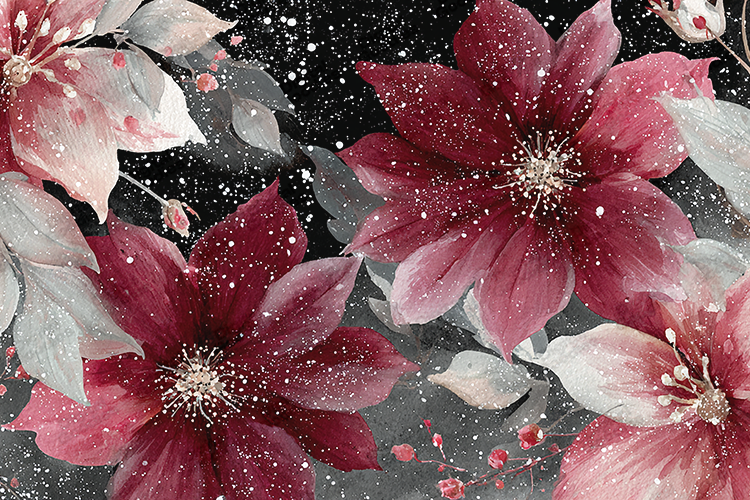
Pure phase posters are mostly black and white. Beautiful, but bloodless after a while. This watercolor set is how I sneak color into the wall without breaking the calm. Dusty plum, a faded rose, that bruised winter purple you see in the sky right after the sun drops. It rhymes with a full moon better than I expected.
I did a single bloom at 11×14 and hung it under the calendar so your eye lands soft instead of hitting a grid straight on. The wash bleeds at the edges in a way that feels hand-done, not printed.
The downside, and it’s a real one, the files are huge and the colors run a touch darker on cheap copy paper than on screen. My first test print looked muddy. Bumped it to a slightly better stock on the second pass and the plum came back. So test before you frame.
A foggy forest that makes the moon look like it belongs
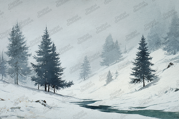
Here’s the trick nobody tells you. A moon poster floating on a wall by itself can look like it was beamed in from nowhere. Give it a landscape nearby and suddenly the moon has somewhere to hang. This misty forest does that job. Pale trees, frozen ground, fog that eats the horizon. Put a moon above it in your head and it just works.
I ran it long, almost panoramic, and laid it sideways above a doorway near my phase chart. The proof sat there a week. I kept walking past and not hating it, which for me is high praise.
Gripe. The mist is so pale that on a screen it looks like the file is half empty. It isn’t. It prints fine, all the subtle grays show up on paper. But if you preview it small you’ll panic and think you got a blank. I almost asked for a refund. Glad I didn’t.
The red one I only hang from December to February
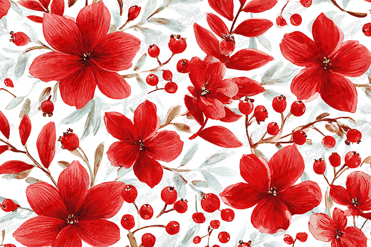
This is a loud print and I respect it for knowing what it is. Deep red blooms, dark berries, the kind of color that would fight a moon calendar most of the year. But for the dead of winter, around the cold full moons, it’s the warm punch the corner needs. I treat it like a seasonal swap. Up for the deep winter weeks, then back in the drawer.
I framed one bloom at 5×7 and stood it on the shelf right under my poster instead of on the wall. Leaning, not hung. Reads as casual on purpose.
My one complaint is that the set gives you a lot of arrangements and they blur together at thumbnail size. I opened the folder and stared at six near-identical reds trying to pick. Just print two test crops and decide on paper. Squinting at the screen got me nowhere.
Snowflake dream catcher, the odd one that ties it together
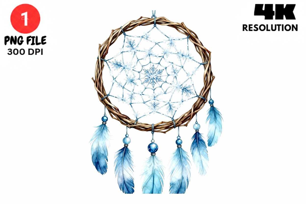
I did not expect to like this. A dream catcher felt too dorm-room for a wall I was trying to keep grown-up. But the snowflake build of it, all crystalline and symmetric, actually echoes the circular logic of a moon phase wheel. Hang the two near each other and they start a quiet conversation. Round, round, ice, moon.
I printed it on a transparent-looking stock and framed it with a little gap behind the glass so it casts a faint shadow. Sounds fussy. Took five minutes. Looks deliberate now.
The snag is sizing. It’s drawn tight to the edges, so if you print it as-is the snowflake points nearly touch the frame and it feels cramped. I scaled it down to about 80 percent inside an 8×10 and gave it air. Much better. Do that first.
A quote print I’d normally mock, hung anyway
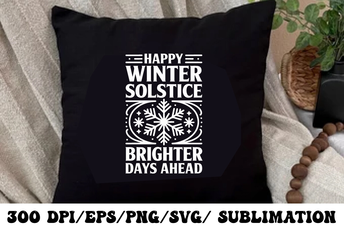
Happy Winter, Brighter Days Ahead. I rolled my eyes when I first saw it. I am not a quote-on-the-wall person. And yet. Hung beside a moon calendar, where the whole point is watching the cycle turn from dark back toward light, the line stopped reading as a fridge magnet and started reading as, well, accurate. The waning moons literally do mean brighter days ahead. That got me.
I did it small, 5×7, tucked low near the light switch so it’s a thing you read on the way out, not a billboard. My friend Reyes saw it and didn’t make fun of me, which is the bar.
The one flaw is the typeface. It’s a bit sweet, slightly too rounded for the clean line of a phase poster. If you’ve got a stark minimalist calendar it’ll clash a little. Mine leans illustrated so it got away with it. Match your calendar’s mood before you commit.
Questions I Get About These
What is the difference between a moon calendar and a sun calendar?
A moon calendar tracks the lunar cycle, the run from new moon to full and back, which takes about 29 and a half days. So it drifts against the regular dated calendar we hang in the kitchen. A sun calendar, the one almost everyone uses, is built on the Earth going around the sun, which is what gives us the 365-day year and fixed dates like the solstice.
For a wall poster the practical difference is what you’re looking at. A moon calendar shows you phases and rhythm. A sun calendar shows you dates and seasons. I hang the moon one because the shapes are prettier and it makes me look up more.
When was the last new moon in Libra?
New moons in Libra fall when the sun is moving through Libra, which is roughly late September into October. The one most people mean is the early-October new moon, since that’s when the sun and moon line up in that sign and the sky goes properly dark for a night or two.
If you want the exact date for your year, a dated lunar poster will mark it for you, or any decent moon-phase chart will. That’s half the reason I keep one framed. I stop having to look it up on my phone every time someone asks.
What is a lunar planting calendar used for?
Gardeners use a lunar planting calendar to time what they do in the garden against the moon phases. The old idea is that you sow and plant certain things as the moon waxes toward full, and do your pruning and root work as it wanes. Whether it actually changes your harvest is an argument I will not be wading into.
What I can say is they make handsome posters. A planting calendar packs the phases together with little seasonal notes, so even if you never grow a thing, it’s a warm, busy print that pairs well next to a plainer phase chart.
Before You Tape Anything Up
The thing I’d tell anyone framing a moon calendar for 2026 is that the calendar is rarely enough on its own. It wants a neighbor. A bit of color, a foggy landscape, a snow scene, something with warmth so the corner reads as a room and not a chart on a wall.
My own setup right now is one big phase poster, the plum watercolor under it, and the snow-angel print off to the side. Took me four tries and one frame I’ll never get the dent out of. Still crooked by a degree. I’ve decided I like it that way.