Last January I missed the Quadrantids because an app pinged me at 4am and I swiped it away in my sleep. Gone. So in February I gave up on phones for this and printed the whole year flat, taped it next to the kettle where I stand half-awake anyway. Now I see the meteor showers coming weeks out. Low-tech. It works.
A paper sky calendar does one thing an app refuses to do. It sits there. No notification to dismiss, no battery, no “allow location.” Just eclipses and full moons and the August Perseids in ink, at eye level, in the one spot in my flat where I’m guaranteed to look. I run mine at the copy place on Eldridge because my home printer chokes on anything past 24lb and the year-grid needs to be readable from the couch.
These are the ones I printed for 2026 and the add-ons I paired with them. A calendar poster wants company, so I mixed in a solstice piece, a wolf-moon set, some forest things for the cold months. Some links below are affiliate links. If you grab one it sends a little my way and costs you nothing.
A few links below are affiliate links. If you grab a print through one, it sends a little something my way at no extra cost to you.
The aurora piece that started the whole wall
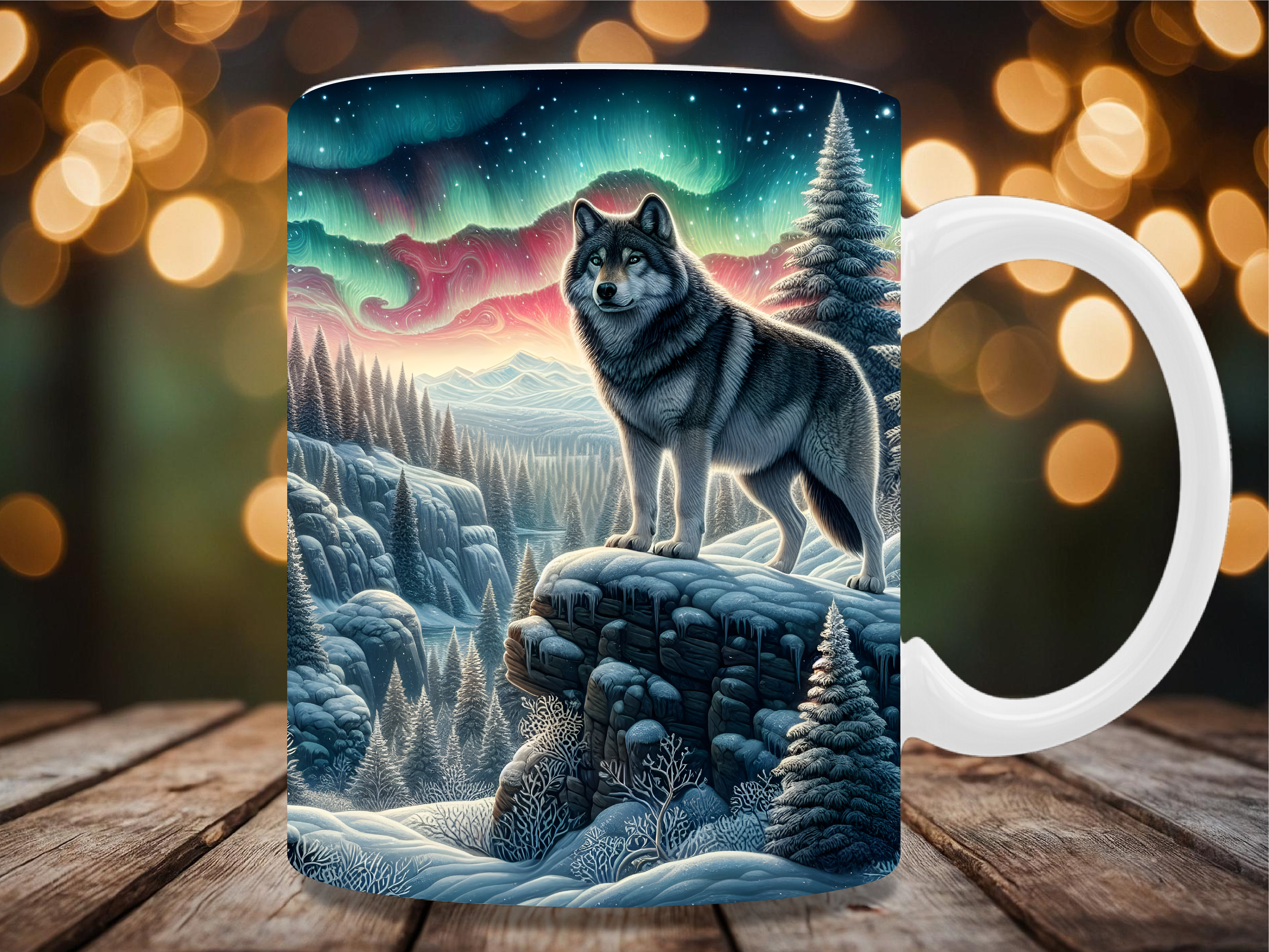
I wasn’t planning to buy this. I came for a calendar grid and left with a wolf standing under green light. The aurora bands have this soft gradient that I half-expected to band ugly when printed small. It didn’t. Held together at 4×6, which is the size I tested first because I’m cheap with the good paper.
It’s marketed as a mug wrap. I never put it on a mug. I cropped the wolf-and-sky section, ran it flat, and tacked it beside the January row of my calendar because January is wolf-moon month and it rhymed. Looked intentional. My one gripe: the file wants a dark background to sing, and on plain white copy paper the greens go a touch flat. Print it on something with a hint of grey if you can.
December needed a marker, this became it

The winter solstice falls on a Monday in 2026 and I wanted the calendar to actually celebrate the turn, not just list it. This solstice piece does that. Warm sun rays, that hand-lettered “return of the light” phrasing. I put it at the bottom of the December column like a little reward you earn by surviving the dark half.
I printed it twice. First pass the gold came out muddy on the cheap stock, more mustard than sun. Second pass at the copy place, glossy, and it finally glowed the way the preview promised. So budget for the good paper on this one. The lettering is the kind of thing that looks cheap when the print is cheap and looks expensive the second it isn’t.
A quiet forest for the long cold stretch
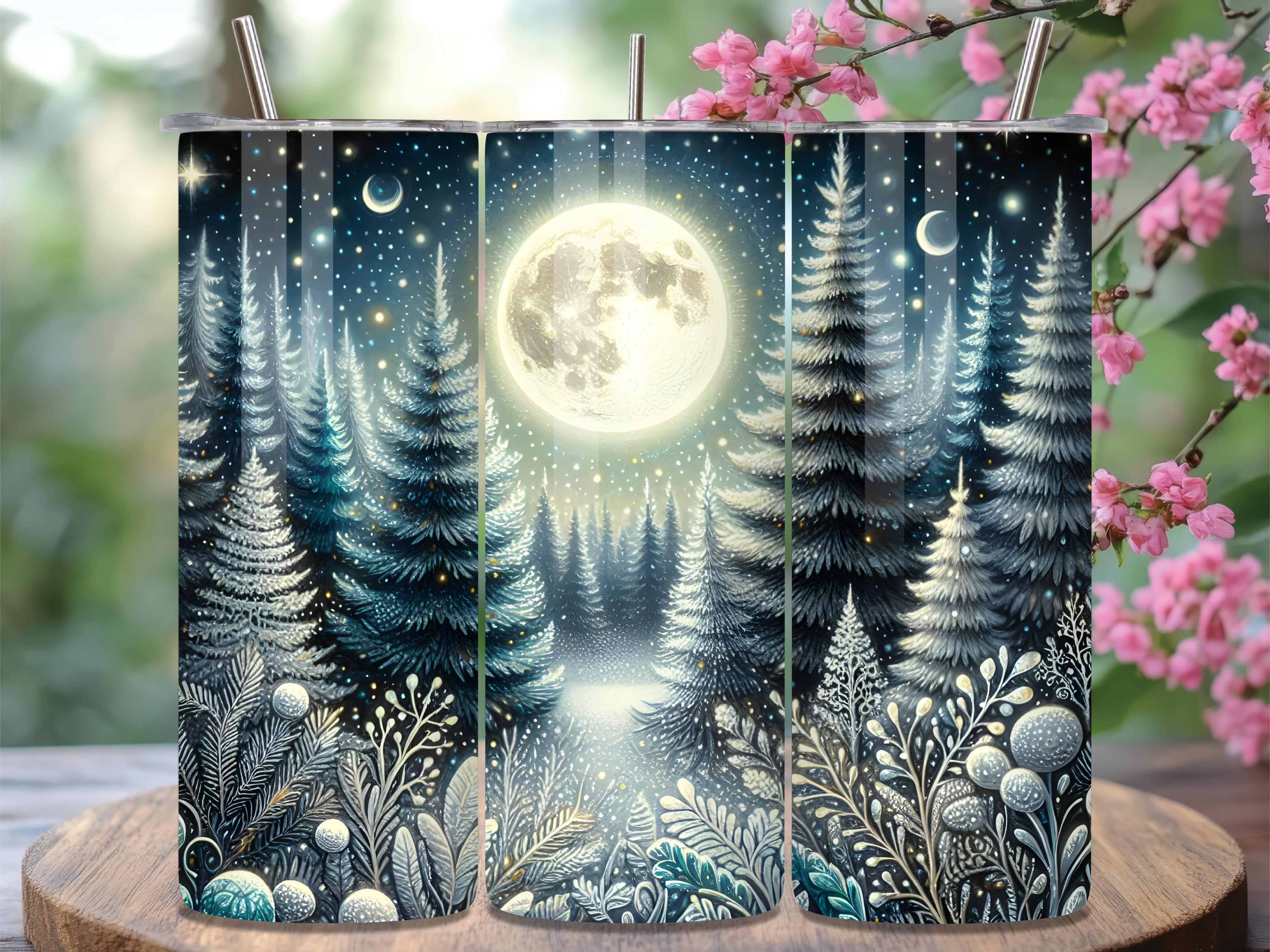
From January through March my calendar is mostly meteor showers and cold full moons, and the wall felt clinical. Just dates. This moonlit forest fixed that. Dark pines, a pale moon sitting low through the trees, the kind of blue that reads as 11pm in February. I ran a strip of it down the left margin and the whole top section stopped looking like a spreadsheet.
Sold as a tumbler wrap, so it’s built tall and narrow, which honestly suited a margin strip better than a square print would have. The catch is the proportions. If you want it as a standalone square poster you’ll be cropping out half the trees and it loses the depth. Use it long, the way it’s drawn, or skip it.
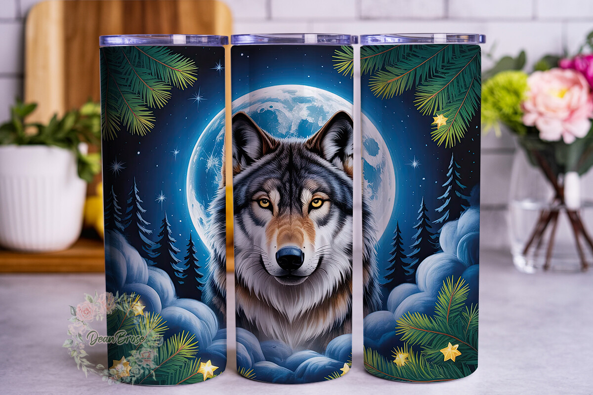
January’s full moon, four ways, and why I bought all four
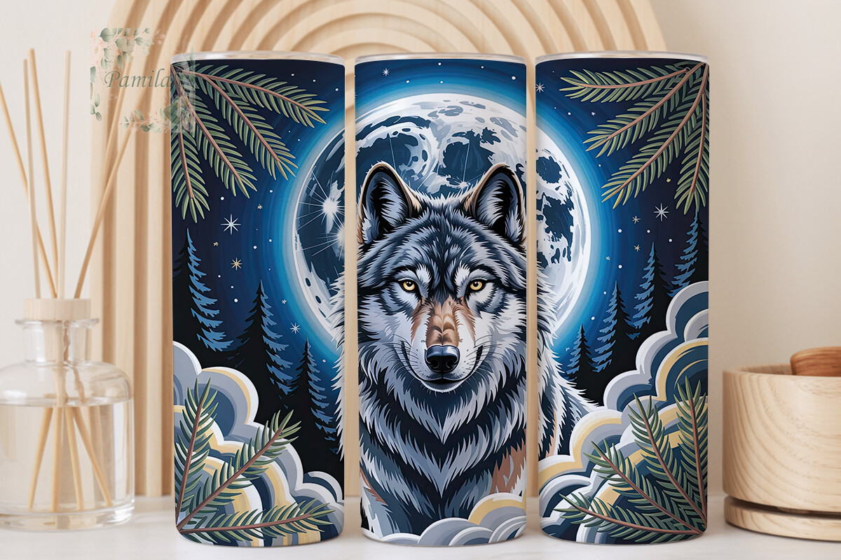
The January full moon is the wolf moon, and I went down a small rabbit hole buying wolf-moon designs to sit beside that row. This is the first of the set I kept. Howling wolf, full moon behind it, a cooler palette than the others. Steely blues and a white moon that doesn’t blow out when you shrink it.
I’ll be honest about why there are four of these below. I couldn’t decide, the files were cheap, and I figured I’d test-print all of them and keep the survivor. This one survived for the calendar wall because the cool tone matched the meteor-shower section underneath it. A Tuesday’s worth of squinting at proofs went into that call. The line work is clean. Prints small without turning the wolf into a blob, which is more than I can say for one of its siblings.
The warmer wolf I gave away
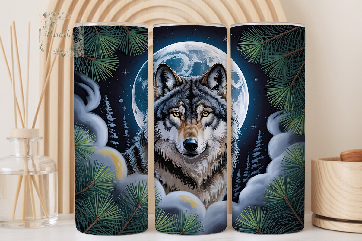
Same wolf-moon family, warmer cast. More amber in the sky, the moon leaning gold instead of white. I printed it back to back with the cool one above and held both up against the wall at the same time, which is the only way I can ever actually decide anything.
This warm version lost the calendar slot but won my sister’s kitchen. She liked the gold against her terracotta tiles, so it migrated. Tells you the design is good, just not for a wall that’s already running cool blues. If your space leans warm, this is the wolf to grab and the steel-blue one is the one to skip. One small note: the amber can creep toward orange if your printer over-saturates. Pull the warmth down a notch before you commit a full sheet to it.
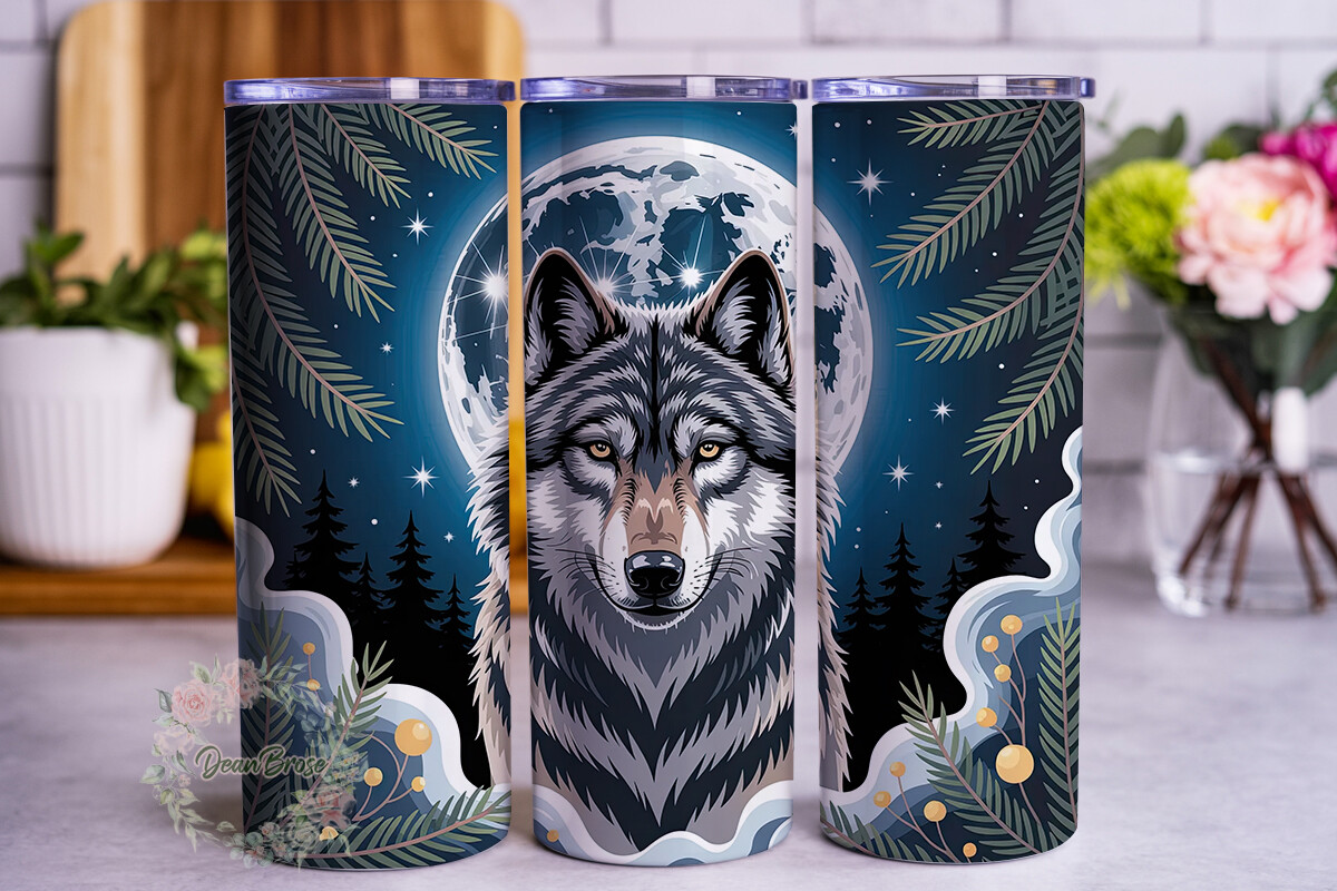
The one I almost kept for the bedroom
Third wolf. This one’s quieter. Less howl, more sit-and-stare, with a moon that takes up more of the frame and a softer edge to the whole thing. It reads less like a calendar accent and more like something you’d hang alone over a nightstand.
That’s exactly the problem it gave me. It was too calm for the busy calendar wall and not quite finished enough, on its own, for the bedroom, where I’d want a mat and a real frame and a Sunday I never spend framing. So it’s in the drawer, printed once, waiting. Good design, wrong job. If you want a single wolf-moon print to stand alone rather than pair with a date grid, this is the candidate. Mind that the soft edges mean it needs a frame or border to not look like it’s floating.
The runt of the litter, and what it taught me
Last of the four. I’m including it because it’s the one that didn’t make any wall, and that’s useful to know before you buy a set on impulse like I did. The composition is fine in the preview. Tighter crop, more detail packed in. But that’s the issue. Print it under about 5×7 and the dense detail turns to mush. The wolf’s face went soft on me at 4×6 and never recovered.
It’s not a bad file. It just wants to be big, and my hallway calendar doesn’t have room for a big wolf. At 8×10 on the good stock I suspect it’s lovely. I never tested that because by then I’d spent enough on copy-shop printing for one January. Buy this one if you’ve got a large frame waiting. Don’t buy it expecting a small accent piece, because that’s the exact thing it isn’t.
Questions I Get About These
What is a celestial events calendar?
It’s a calendar that marks the sky stuff instead of, or alongside, the usual dates. Eclipses, meteor showers, full moons, solstices, the occasional planet doing something worth a look. Mine lists every meteor shower peak and full-moon name for the year, and I tape it where I’ll actually see it. The point is you stop missing things you’d have loved to catch, like I missed the Quadrantids in 2025 because I trusted my phone and my phone lost.
Does a celestial event still happen every month in 2026?
Yes. Every single month of 2026 has at least a full moon, and most months stack a meteor shower or a notable conjunction on top of that. There’s never a dead month. That’s part of why a wall poster earns its space. You’ll be looking at it at least twelve times no matter what, so it may as well be something you printed nicely rather than a free PDF you forgot to open.
When is the next celestial event in 2026?
Depends on the day you’re reading this, but there’s always one close. The Quadrantids open the year in early January, the wolf moon follows soon after, and the calendar barely pauses from there. That’s the honest pitch for printing the whole year in one go. Whatever month you start in, the next thing is days away, not weeks, so a year-at-a-glance grid beats checking an app every time you get curious.
What sizes do printable celestial calendars come in?
Most come ready for the common frame sizes. I print mine large enough to read the meteor-shower rows from the couch, which for me means going past letter size at the copy place rather than fighting my home printer. The files usually scale clean, so you can do a big wall version and a small desk version off the same purchase. Test one small cheap print first, hold it up across the room, then commit to the good paper. That squint-from-across-the-hall test is the only one that’s ever mattered in my flat.
Before You Tape Anything Up
I started this wanting one thing, a calendar that wouldn’t ping me at 4am, and ended up with a small corner of sky by the kettle. One year-grid poster, a solstice marker for December, a forest strip for the cold months, and one wolf out of four that earned its slot. The other three taught me something each, which is its own kind of worth.
If you only print one thing for 2026, make it the grid and put it somewhere you stand half-awake. Pair it with a single moon piece you love and stop there. You can always add a wolf later. I clearly did. Print small first, squint from across the room, then spend the money on the good paper. That’s the whole method.